摘要:在开发的时候,我们的横坐标名称很长,横坐标就会挤到一起。显示会很不美观,那我们怎么处理呢?这里的数据以及横坐标都是我自己随便写的额,公司的不能泄露。但意思差不多了
实现:我能想到的3种方式如下:(如果你们有其他的方法可以对我说哦)
1、横坐标名称倾斜显示
2、横坐标名称换行显示
3、横坐标名称竖着显示
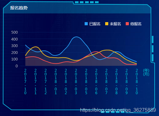
如果没有做处理的话,你的效果可能和我的这个差不多

一、横坐标名称倾斜显示。直接上代码啦(x轴上axisLabel添加rotate: 20)
<!DOCTYPE html>
<html>

<head>
    <meta charset="utf-8">
    <title>echart</title>
    <link rel="stylesheet" href="css/indexView.css">
</head>

<body>
       <div class="leftItem liftAge">
           <div class="liftAgeTitle">分类统计</div>
           <div id="elevatorAge" style="width: 472px; height: 280px;"></div>
       </div>
       <script src="js/echarts.js"></script>
       <script>
            var elevatorAgeEchart = echarts.init(document.getElementById('elevatorAge'));
            var elevatorAgeOption = {
                legend: {
                    data: ['已报名', '未报名', '待报名'],
                    icon: 'rect',
                    top: 22,
                    right: 24,
                    itemGap: 15,
                    itemWidth: 10,
                    itemHeight: 10,
                    textStyle: {
                        // padding: [0, 0, 0, 5],
                        color: 'rgba(255,255,255,0.87)'
                }
            },
            color: ['#289df5', '#fbc01b', '#ff5050'],
            grid: {
                left: 24,
                right: '6%',
                bottom: '30',
                containLabel: true
            },
            xAxis: {
                type: 'category',
                axisLine: {
                    show: false
                },
                axisTick: {
                    length: 0
                },
                axisLabel: {
                    interval: 0,
                    rotate: 20, // 20度角倾斜显示(***这里是关键)
                    textStyle: {
                        color: '#00c5d7'
                    }
                },
                data: ['幼儿英语兴趣班', '幼儿绘画兴趣班', '少年练字兴趣班', '少儿小提琴兴趣班', '少儿芭蕾蹈兴趣班']
            },
            yAxis: {
                type: 'value',
                axisLine: {
                    show: false
                },
                axisTick: {
                    length: 0 // 刻度线的长度
                },
                splitLine: {
                    lineStyle: {
                        color: ["#051d5f"],
                        width: 1,
                        type: 'solid'
                    }
                },
                axisLabel: {
                    textStyle: {
                        color: '#a3a4b2'
                    }
                }
            },
            series: [{
                name: '已报名',
                type: 'bar',
                barWidth: '8',
                data: ['162', '122', '170', '142', '162']
            },
            {
                name: '未报名',
                type: 'bar',
                barWidth: '8',
                data: ['42', '102', '90', '62', '92']
            }, {
                name: '待报名',
                type: 'bar',
                barWidth: '8',
                data: ['82', '72', '40', '32', '60']
            }]
        };
       </script>
</body>

</html>
效果为:

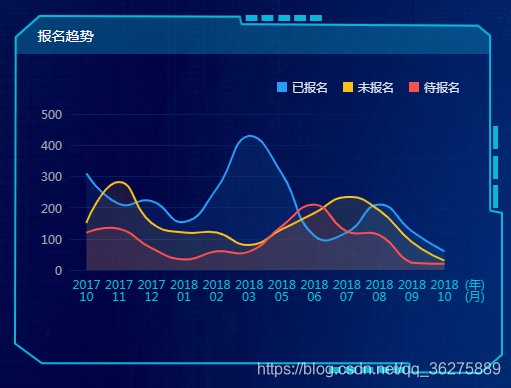
二、横坐标名称换行显示。直接上代码啦
<!DOCTYPE html>
<html>

<head>
    <meta charset="utf-8">
    <title>echart</title>
    <link rel="stylesheet" href="css/indexView.css">
</head>

<body>
       <div class="leftItem liftAge">
           <div class="faultRateTitle">报名趋势</div>
           <div id="faultRate" style="width: 472px; height: 280px;"></div>
       </div>
       <script src="js/echarts.js"></script>
       <script>
            var elevatorAgeEchart = echarts.init(document.getElementById('elevatorAge'));
            var elevatorAgeOption = {
                legend: {
                    data: ['已报名', '未报名', '待报名'],
                    icon: 'rect',
                    top: 22,
                    right: 24,
                    itemGap: 15,
                    itemWidth: 10,
                    itemHeight: 10,
                    textStyle: {
                        // padding: [0, 0, 0, 5],
                        color: 'rgba(255,255,255,0.87)'
                }
            },
            color: ['#289df5', '#fbc01b', '#ff5050'],
            grid: {
                left: 24,
                right: '6%',
                bottom: '30',
                containLabel: true
            },
            xAxis: {
                type: 'category',
                axisLine: {
                    show: false
                },
                axisTick: {
                    length: 0
                },
                axisLabel: {
                    interval: 0,
                    textStyle: {
                        color: '#00c5d7'
                    },
                    formatter: function(value) {
                        // console.log(value);
                        var valueDetal = value.split("-").join("");
                        console.log(valueDetal);
                        var ret = ""; //拼接加\n返回的类目项
                        var maxLength = 4; //每项显示文字个数
                        var valLength = valueDetal.length; //X轴类目项的文字个数
                        // console.log(valLength);
                        var rowN = Math.ceil(valLength / maxLength); //类目项需要换行的行数
                        if (rowN > 1) { //如果类目项的文字大于3,
                            for (var i = 0; i < rowN; i++) {
                                var temp = ""; //每次截取的字符串
                                var start = i * maxLength; //开始截取的位置
                                var end = start + maxLength; //结束截取的位置
                         //这里也可以加一个是否是最后一行的判断,但是不加也没有影响,那就不加吧
                                temp = valueDetal.substring(start, end) + "\n";
                                ret += temp; //凭借最终的字符串
                            }
                            return ret;
                        } else {
                            return valueDetal;
                    }
                },
                data: ['2017-10', '2017-11', '2017-12', '2018-01', '2018-02', '2018-03', '2018-05', '2018-06', '2018-07', '2018-08', '2018-09', '2018-10']
            },
            yAxis: {
                type: 'value',
                axisLine: {
                    show: false
                },
                axisTick: {
                    length: 0 // 刻度线的长度
                },
                splitLine: {
                    lineStyle: {
                        color: ["#051d5f"],
                        width: 1,
                        type: 'solid'
                    }
                },
                axisLabel: {
                    textStyle: {
                        color: '#a3a4b2'
                    }
                }
            },
            series: [{
                name: '已报名',
                type: 'line',
                smooth: true,
                symbol: 'circle', // 拐点类型
                symbolSize: 0, // 拐点圆的大小
                itemStyle: {
                    normal: {
                        color: '#289df5', // 折线条的颜色
                        borderColor: '#289df5', // 拐点边框颜色
                        areaStyle: {
                            type: 'default',
                            opacity: 0.1
                        }
                    }
                },
                data: [310, 212, 221, 154, 260, 430, 310, 110, 120, 210, 124, 60]
            },{
                name: '未报名',
                type: 'line',
                smooth: true,
                symbol: 'circle',
                symbolSize: 0,
                itemStyle: {
                    normal: {
                        color: '#fbc01b',
                        borderColor: '#fbc01b',
                        areaStyle: {
                            type: 'default',
                            opacity: 0.1
                        }
                    }
                },
                data: [151, 282, 151, 120, 120, 80, 130, 182, 234, 191, 90, 30]
            },{
                name: '待报名',
                type: 'line',
                smooth: true,
                symbol: 'circle',
                symbolSize: 0,
                itemStyle: {
                    normal: {
                        color: '#ff5050',
                        borderColor: '#ff5050',
                        areaStyle: {
                            type: 'default',
                            opacity: 0.1
                        }
                    }
                },
                data: [120, 132, 70, 34, 60, 59, 140, 210, 124, 112, 23, 20]
            }]
        };
       </script>
</body>

</html>
实现后的效果为:
三、横坐标名称竖着显示。(其实和换行差不多)直接上代码啦
就是将上述代码中的xAxis中axisLabel的formatter里面的内容换成下面的就可以了
return value.split("").join("\n"); 效果为:
备注:如果转载的话,希望小伙伴备注出处哦~
