Python的数据可视化
本文参考书籍:《Python编程:从入门到实践》
目录
生成数据
matplotlib:数学绘图库
Pygal包:专注于生成适合在数字设备上显示的图表
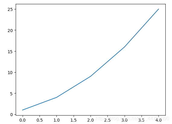
绘制简单的折线图
import matplotlib.pyplot as plt	#导入模块pyplot,并给它指定别名为plt
squares = [1, 4, 9, 16, 25]
#默认第一个数据点对应的x为0,以此类推
plt.plot(squares)	#(0,1) (1,4) (2,9) (3,16) (4,25)
plt.show()
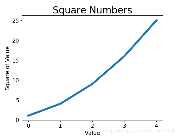
修改标签文字和线条粗细
import matplotlib.pyplot as plt
squares = [1, 4, 9, 16, 25]
#参数linewidth决定了plot()绘制的线条的粗细
plt.plot(squares, linewidth=5)
#设置图表标题,并给坐标轴加上标签
#函数title()给图表指定标题
#参数fontsize指定了图表中文字的大小
plt.title("Square Numbers", fontsize=24)
#函数xlabel(),ylabel()为每条轴设置标题
plt.xlabel("Value", fontsize=14)
plt.ylabel("Square of Value", fontsize=14)
#设置刻度标记的大小
#函数tick_params()设置刻度样式,
#其中指定的实参将影响x、y轴上的刻度(axis='both')
#并将刻度标记的字号设置为14(labelsize=14)
plt.tick_params(axis='both', labelsize=14)
plt.show()
给plot()同时提供输入和输出值
import matplotlib.pyplot as plt
input_values = [1, 2, 3, 4, 5]
squares = [1, 4, 9, 16, 25]
plt.plot(input_values, squares, linewidth=5)
plt.title("Square Numbers", fontsize=24)
plt.xlabel("Value", fontsize=14)
plt.ylabel("Square of Value", fontsize=14)
plt.tick_params(axis='both', labelsize=14)
plt.show()
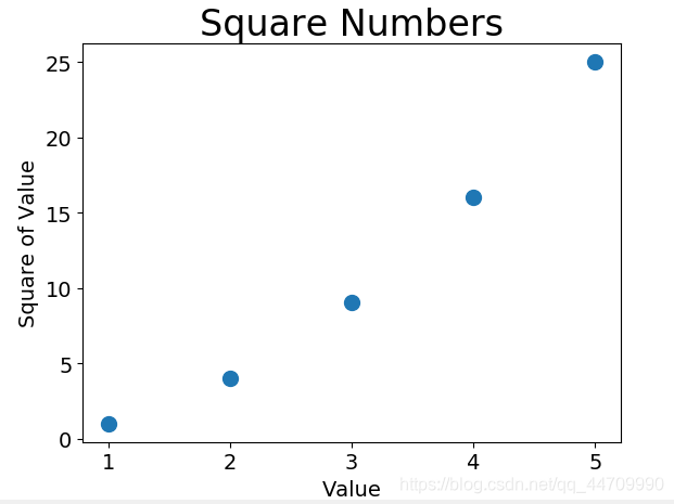
使用scatter()绘制散点图并设置样式
import matplotlib.pyplot as plt
#向函数scatter()传递一对x和y坐标,
#它将在指定位置绘制一个点
plt.scatter(2, 4)
plt.show()

#设置格式
import matplotlib.pyplot as plt
#实参s设置绘制图形时使用的点的尺寸
plt.scatter(2, 4, s=200)
plt.title("Square Numbers",fontsize=24)
plt.xlabel("Value",fontsize=14)
plt.ylabel("Square of Value",fontsize=14)
plt.tick_params(axis='both',which='major',labelsize=14)
plt.show()
使用scatter()绘制一系列点
import matplotlib.pyplot as plt
#向scatter()传递两个分别包含x和y值的列表
x_values = [1, 2, 3, 4, 5]
y_values = [1, 4, 9, 16, 25]
plt.scatter(x_values, y_values, s=100)
plt.title("Square Numbers",fontsize=24)
plt.xlabel("Value", fontsize=14)
plt.ylabel("Square of Value", fontsize=14)
plt.tick_params(axis='both', which='major', labelsize=14)
plt.show()
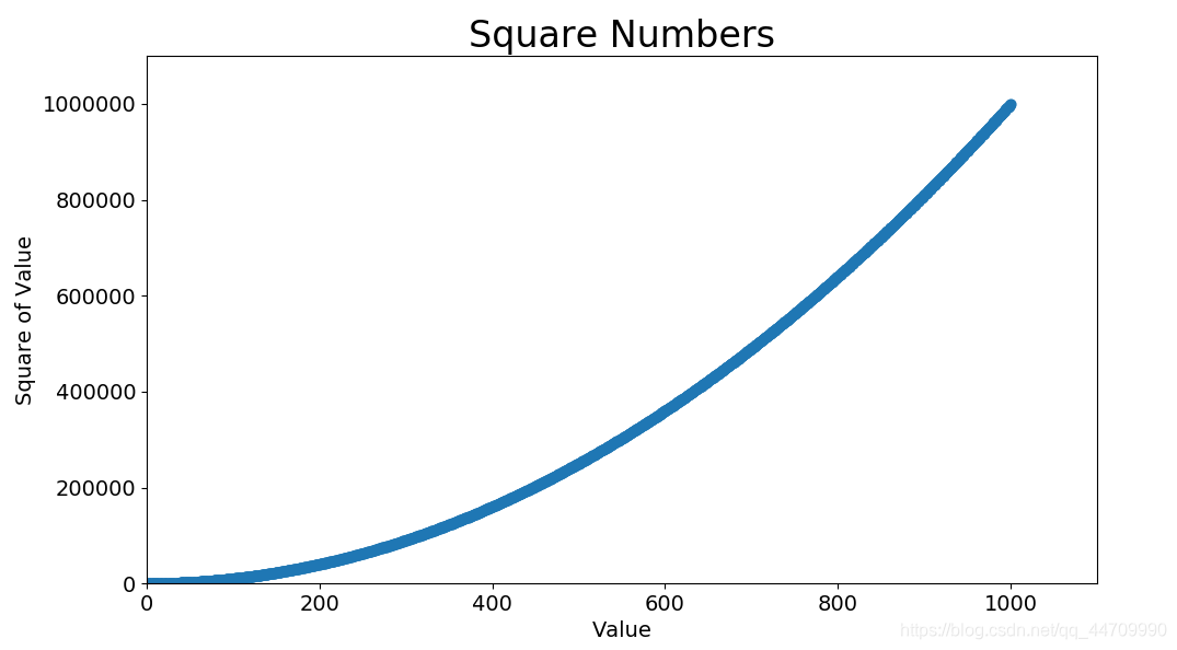
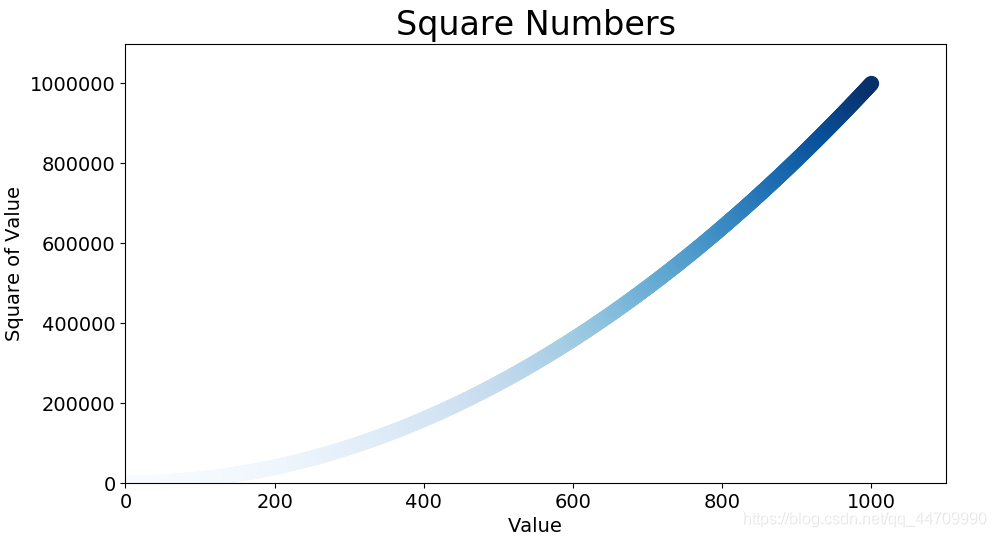
自动计算数据,绘制1000个散点
import matplotlib.pyplot as plt
x_values = list(range(1, 1001))
y_values = [x**2 for x in x_values]
plt.scatter(x_values, y_values, s=40)
plt.title("Square Numbers",fontsize=24)
plt.xlabel("Value", fontsize=14)
plt.ylabel("Square of Value", fontsize=14)
# 设置每个坐标轴的取值范围
# 函数axis()要求提供x和y轴的最小值和最大值
plt.axis([0, 1100, 0, 1100000])
plt.tick_params(axis='both', which='major', labelsize=14)
plt.show()
删除数据点的轮廓
matplotlib允许给散点图中的各个点指定颜色。默认为蓝色点和黑色轮廓。
# 在调用scatter()时传递实参edgecolor='none',删除数据点轮廓
plt.scatter(x_values,y_values,edgecolor='none',s=40)
自定义颜色
要修改数据点的颜色,可向scatter()传递参数c,并将其设置为要使用的颜色的名称
plt.scatter(x_values, y_values, c='red', s=100)
还可使用RGB颜色模式自定义颜色。要指定自定义颜色,可传递参数c,并将其设置为一个元组,其中包含三个0~1之间的小数值,分别代表红色、绿色、蓝色分量。值越接近于0,颜色越深,越接近1颜色越浅
plt.scatter(x_values, y_values, c=(1, 0.1, 1), s=100)
使用颜色映射
颜色映射是一系列颜色,它们从起始颜色渐变到结束颜色。在可视化中,颜色映射用于突出数据的规律,如可用较浅颜色显示较小的值,用较深颜色显示较大的值
模块pyplot内置了一组颜色映射。若需使用颜色映射,需告知pyplot该如何设置数据集中每个点的颜色

# 将参数c设置为一个y值列表,并使用参数cmap告诉pyplot使用哪个颜色映射
#以下将y值较小的点设置为浅蓝色,y值较大的点设置为深蓝色
plt.scatter(x_values, y_values, c=y_values, cmap=plt.cm.Blues, s=100)
自动保存图表
要让程序自动将图表保存到文件中,可进行plt.savefig()调用
#scatter_squares.py文件
#第一个实参指定要以什么样的文件名保存图表
#此文件将保存在scatter_squares.py所在的目录中
#第二个实参指定将图表多余的空白区域裁剪掉
plt.savefig('squares_plot.png',bbox_inches='tight')
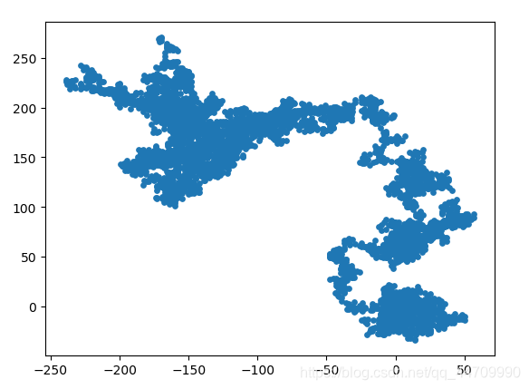
随机漫步
随机漫步是这样行走得到的路径:每次行走都完全是随机的,没有明确的方向,结果是由一系列随机决策决定的
创建RandomWalk()类
RandomWalk类随机地选择前进方向,这个类需三个属性,其一为存储随机漫步次数的变量,其他两个为列表,分别存储随机漫步经过的每个点的x和y坐标
from random import choice
#在每次决策时使用choice()来决定使用哪种选择
class RandomWalk():
	def __init__(self,num_points=5000):
		#初始化随机漫步的属性
		self.num_points=num_points
		#所有随机漫步都始于(0,0)
		self.x_values=[0]
		self.y_values=[0]
选择方向
在RandomWalk类中添加fill_walk()来生成漫步包含的点,并决定每次漫步的方向
def fill_walk(self):
	#计算随机漫步包含的所有点
	#不断漫步,直到列表达到指定的长度
	while len(self.x_values)<self.num_points:
		#决定前进方向以及沿这个方向前进的距离
		x_direction=choice([1,-1])
		#给x_direction选择一个值
		#表示向右走1或向左走1
		x_distance=choice([0,1,2,3,4])
		#随机选择一个0~4之间的整数
		#告知沿指定的方向走多远
		x_step=x_direction*x_distance
		#将移动方向乘以移动距离
		#确定沿x轴移动的距离
		y_direction=choice([1,-1])
		y_distance=choice([0,1,2,3,4])
		y_step=y_direction*y_distance
		#拒绝原地踏步情况
		if x_step==0 and y_step==0:
			continue
		#计算下一个点的x和y值
		#将x_step和x_values中最后一个值相加
		next_x=self.x_values[-1]+x_step
		next_y=self.y_values[-1]+y_step
		#获得下一个点的x、y后,附加到列表末尾
		self.x_values.append(next_x)
		self.y_values.append(next_y)
绘制随机漫步图
import matplotlib.pyplot as plt
from random_walk import RandomWalk
#创建一个RandomWalk实例,并将其包含的点都绘制出来
rw = RandomWalk()
rw.fill_walk()
plt.scatter(rw.x_values, rw.y_values, s=15)
plt.show()
模拟多次随机漫步
import matplotlib.pyplot as plt
from random_walk import RandomWalk
#只要程序处于活动状态,就不断进行模拟随机漫步
while True:
    rw = RandomWalk()
    rw.fill_walk()
    plt.scatter(rw.x_values, rw.y_values, s=15)
    plt.show()

    keep_running = input("Make another walk? (y/n): ")
    if keep_running == 'n':
        break
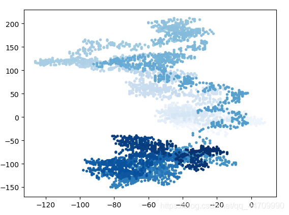
设置随机漫步图的样式
给点着色
使用颜色映射指出漫步中各点的先后顺序,并删除每个点的黑色轮廓
为根据漫步中各点的先后顺序进行着色,传递参数c,并将其设置为一个列表,其中包含各点的先后顺序。由于这些点是按顺序绘制的,给参数c指定的列表只需包含数字1~5000
import matplotlib.pyplot as plt
from random_walk import RandomWalk
while True:
    rw = RandomWalk()
    rw.fill_walk()
    point_numbers = list(range(rw.num_points))
    plt.scatter(rw.x_values, rw.y_values, c=point_numbers, cmap=plt.cm.Blues, edgecolors='none', s=15)
    plt.show()

    keep_running = input("Make another walk? (y/n): ")
    if keep_running == 'n':
        break
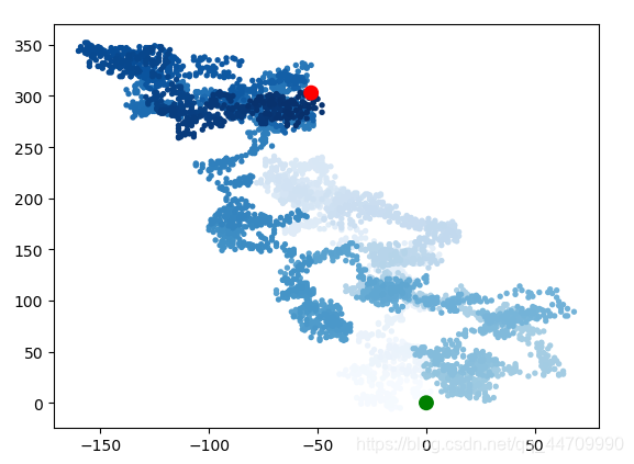
重新绘制起点和终点
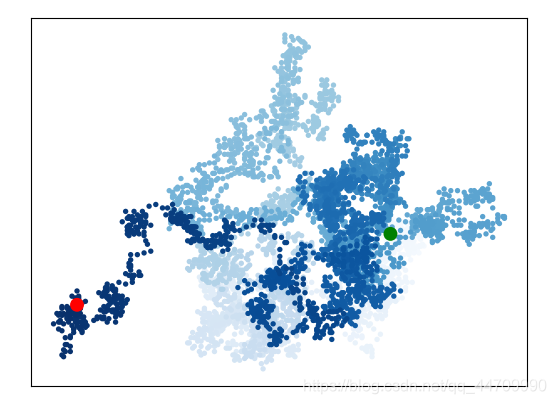
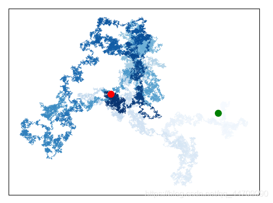
让起点和终点变得更大,并显示为不同的颜色
import matplotlib.pyplot as plt
from random_walk import RandomWalk
while True:
    rw = RandomWalk()
    rw.fill_walk()
    point_numbers = list(range(rw.num_points))
    plt.scatter(rw.x_values, rw.y_values, c=point_numbers, cmap=plt.cm.Blues, edgecolors='none', s=15)
    plt.scatter(0, 0, c='green', edgecolors='none', s=100)
    plt.scatter(rw.x_values[-1], rw.y_values[-1], c='red', edgecolors='none', s=100)
    plt.show()

    keep_running = input("Make another walk? (y/n): ")
    if keep_running == 'n':
        break
隐藏坐标轴
使用函数plt.axes()将每条坐标轴的可见性设为False
import matplotlib.pyplot as plt
from random_walk import RandomWalk
while True:
    rw = RandomWalk()
    rw.fill_walk()
    point_numbers = list(range(rw.num_points))
    plt.scatter(rw.x_values, rw.y_values, c=point_numbers, cmap=plt.cm.Blues, edgecolors='none', s=15)
    plt.scatter(0, 0, c='green', edgecolors='none', s=100)
    plt.scatter(rw.x_values[-1], rw.y_values[-1], c='red', edgecolors='none', s=100)
    #隐藏坐标轴
    plt.axes().get_xaxis().set_visible(False)
    plt.axes().get_yaxis().set_visible(False)
    plt.show()

    keep_running = input("Make another walk? (y/n): ")
    if keep_running == 'n':
        break
增加点数
在创建RandomWalk实例时增加new_points的值,并调整每个点的大小
import matplotlib.pyplot as plt
from random_walk import RandomWalk
while True:
    rw = RandomWalk(50000)
    rw.fill_walk()
    point_numbers = list(range(rw.num_points))
    plt.scatter(rw.x_values, rw.y_values, c=point_numbers, cmap=plt.cm.Blues, edgecolors='none', s=1)
    plt.scatter(0, 0, c='green', edgecolors='none', s=100)
    plt.scatter(rw.x_values[-1], rw.y_values[-1], c='red', edgecolors='none', s=100)
    plt.axes().get_xaxis().set_visible(False)
    plt.axes().get_yaxis().set_visible(False)
    plt.show()

    keep_running = input("Make another walk? (y/n): ")
    if keep_running == 'n':
        break
调整尺寸以适合屏幕
函数figure()用于指定图表的宽度、高度、分辨率和背景色。需给形参figsize指定一个元组,向matplotlib指出绘图窗口的尺寸,单位为英寸
import matplotlib.pyplot as plt
from random_walk import RandomWalk
while True:
    rw = RandomWalk(50000)
    rw.fill_walk()
    # 设置绘图窗口的尺寸
    plt.figure(figsize=(10, 6))
    point_numbers = list(range(rw.num_points))
    plt.scatter(rw.x_values, rw.y_values, c=point_numbers, cmap=plt.cm.Blues, edgecolors='none', s=1)
    plt.scatter(0, 0, c='green', edgecolors='none', s=100)
    plt.scatter(rw.x_values[-1], rw.y_values[-1], c='red', edgecolors='none', s=100)
    plt.axes().get_xaxis().set_visible(False)
    plt.axes().get_yaxis().set_visible(False)
    plt.show()

    keep_running = input("Make another walk? (y/n): ")
    if keep_running == 'n':
        break
还可用形参dpi向figure()传递分辨率
plt.figure(dpi=128, figsize=(10, 6))
使用Pygal模拟掷骰子
创建Die类
下面的类模拟掷一个骰子
from random import randint

class Die():

    def __init__(self, num_sides=6):
        self.num_sides = num_sides

    def roll(self):
    	# 返回一个位于1和骰子面数之间的随机值
        return randint(1, self.num_sides)
方法__init__()接受一个可选参数,创建这个类的实例时,若没有指定任何实参,面数默认为6;若指定了实参,这个值将用于设置骰子的面数。
掷骰子
from die import Die
die = Die()
# 掷几次骰子,并将结果存储在一个列表中
results = []
for roll_num in range(100):
    result = die.roll()
    results.append(result)

print(results)
分析结果
计算每个点数出现的次数
from die import Die
die = Die()
results = []
for roll_num in range(1000):
    result = die.roll()
    results.append(result)

frequencies = []
for value in range(1,die.num_sides+1):
    frequency = results.count(value)
    frequencies.append(frequency)

print(frequencies)
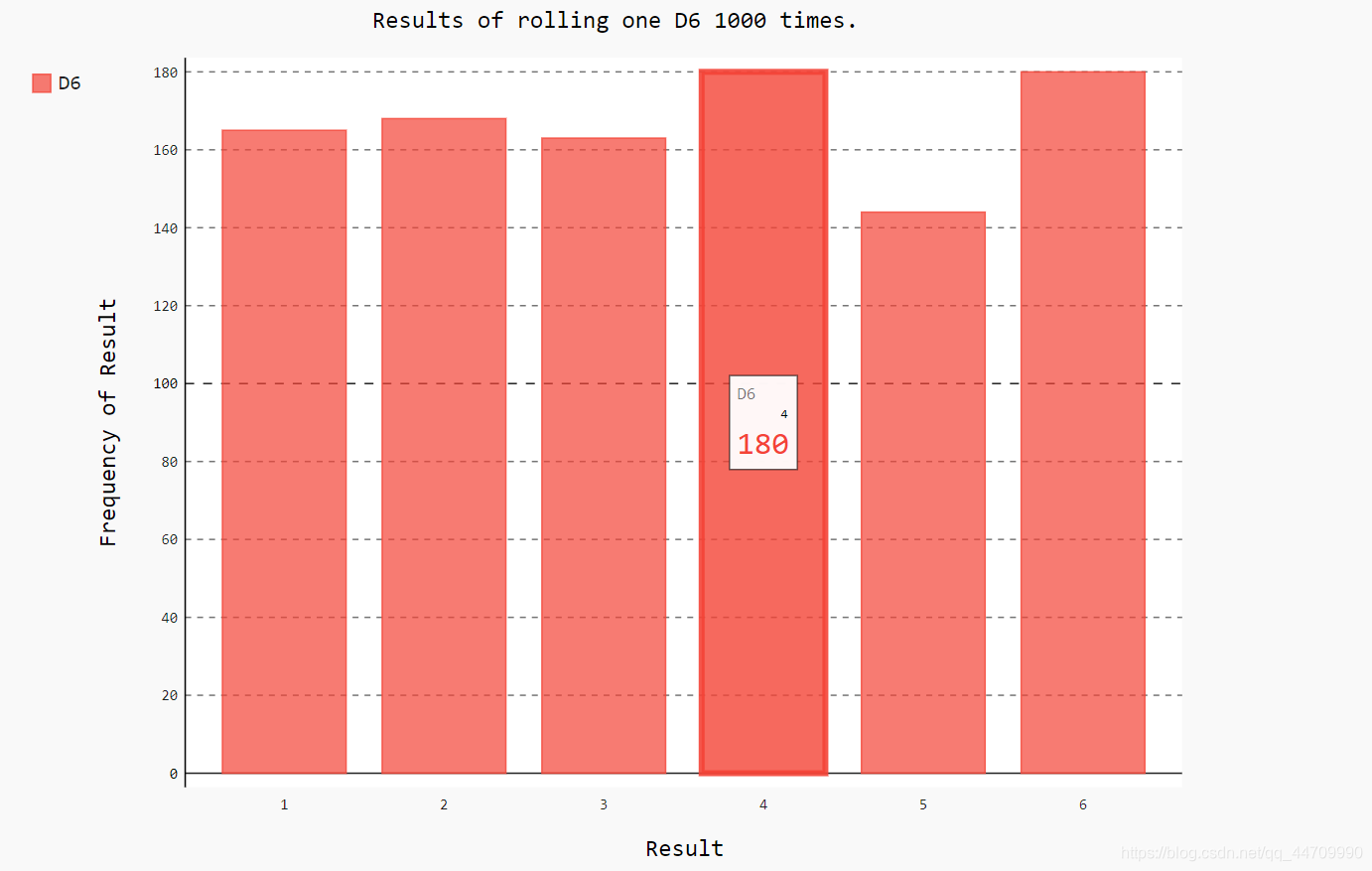
绘制直方图
import pygal
from die import Die
die = Die()
results = []
for roll_num in range(1000):
    result = die.roll()
    results.append(result)

frequencies = []
for value in range(1, die.num_sides+1):
    frequency = results.count(value)
    frequencies.append(frequency)
# 创建条形图,创建pygal.Bar()实例
hist = pygal.Bar()

hist.title = "Results of rolling one D6 1000 times."
hist.x_labels = ['1', '2', '3', '4', '5', '6']
hist.x_title = "Result"
hist.y_title = "Frequency of Result"

# 使用add()将一系列值添加到图表中(向它传递要给添加的值指定的标签,还有
# 一个列表,其中包含将出现在图表中的值)
hist.add('D6', frequencies)
# 将直方图渲染为SVG文件
hist.render_to_file('die_visual.svg')
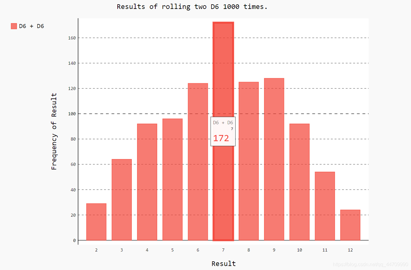
同时掷两个骰子
import pygal
from die import Die
die_1 = Die()
die_2 = Die()
results = []
for roll_num in range(1000):
    result = die_1.roll() + die_2.roll()
    results.append(result)

frequencies = []
max_result = die_1.num_sides + die_2.num_sides
for value in range(2, max_result+1):
    frequency = results.count(value)
    frequencies.append(frequency)

hist = pygal.Bar()

hist.title = "Results of rolling two D6 1000 times."
hist.x_labels = ['2', '3', '4', '5', '6', '7', '8', '9', '10', '11', '12']
hist.x_title = "Result"
hist.y_title = "Frequency of Result"

hist.add('D6 + D6', frequencies)
hist.render_to_file('dice_visual.svg')
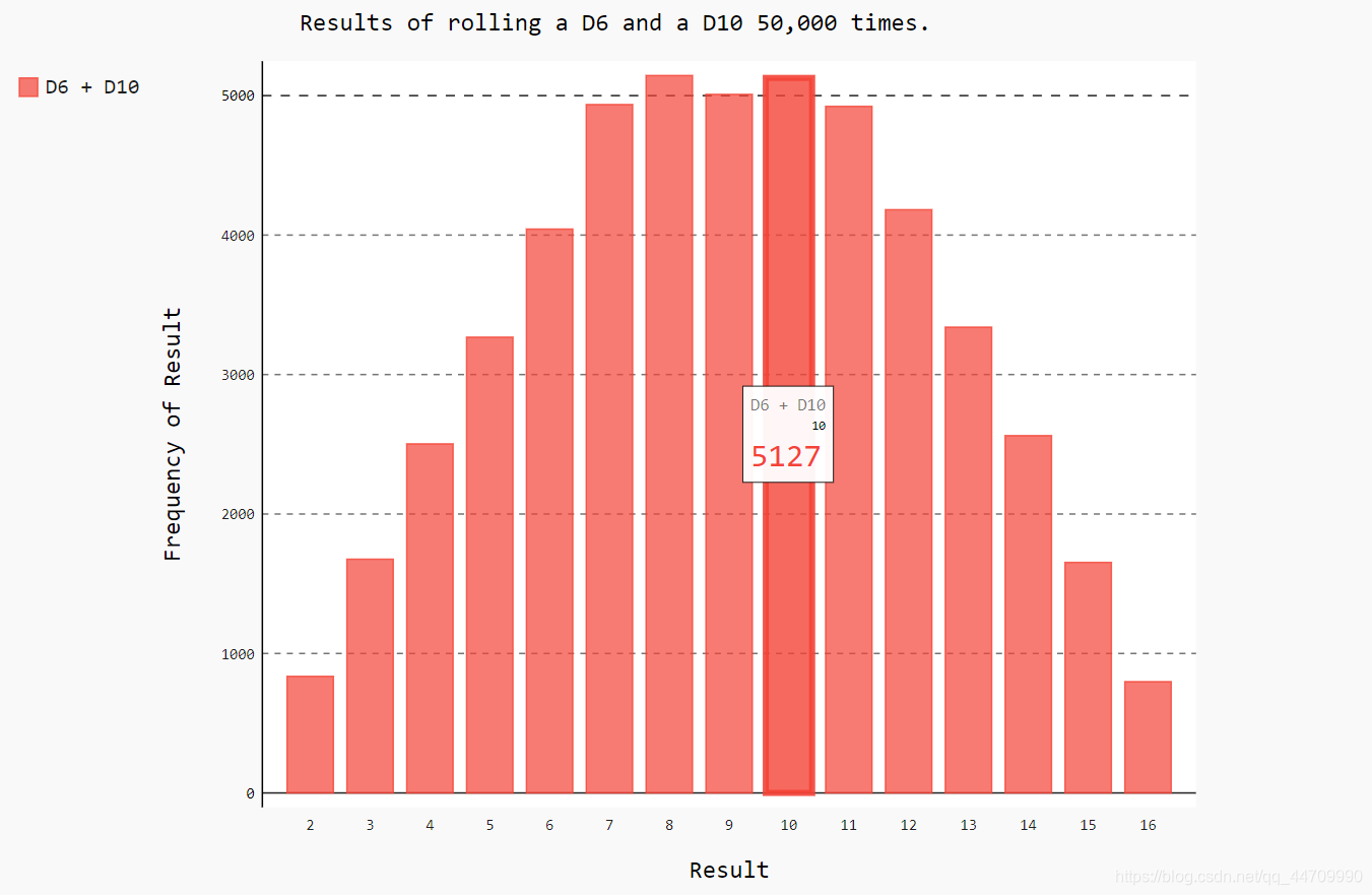
同时掷两个面数不同的骰子
import pygal
from die import Die
die_1 = Die()
die_2 = Die(10)
results = []
for roll_num in range(50000):
    result = die_1.roll() + die_2.roll()
    results.append(result)

frequencies = []
max_result = die_1.num_sides + die_2.num_sides
for value in range(2, max_result+1):
    frequency = results.count(value)
    frequencies.append(frequency)

hist = pygal.Bar()

hist.title = "Results of rolling a D6 and a D10 50,000 times."
hist.x_labels = ['2', '3', '4', '5', '6', '7', '8', '9', '10', '11', '12', '13', '14', '15', '16']
hist.x_title = "Result"
hist.y_title = "Frequency of Result"

hist.add('D6 + D10', frequencies)
hist.render_to_file('dice_visual.svg')
下载数据
CSV文件格式
要在文本文件中存储数据,可将数据作为一系列以逗号分隔的值(CSV)写入文件,这样的文件称CSV文件
如:
2014-1-5,61,44,26,18,7,-1,56,30,9,30.34,30.27,30.15,,,,10,4,,0.00,0,,195
分析CSV文件头
csv模块包含在Python标准库中,可用于分析CSV文件中的数据行
import csv

# 将要使用的文件名称存储在filename中
filename = 'sitka_weather_07-2014.csv'
# 打开这个文件,并将结果文件对象存储在f中
with open(filename) as f:
# 调用csv.reader(),并将前面存储的文件对象作为实参传递
# 给它,从而创建一个与该文件相关联的阅读器(reader)对# 象。将这个阅读器对象存储在reader中
    reader = csv.reader(f)
# 模块csv的reader类包含next()方法,调用内置函数next()
# 并将一个reader作为参数传递给它时,将调用reader的
# next()方法,从而返回文件的下一行。此处只调用了next()
# 一次,因此得到的是文件的第一行,其中包含文件头。将
# 返回的数据存储在header_row中
# reader处理文件中以逗号分隔的第一行数据,并将每项数据
# 都作为一个元素存储在列表中
    header_row = next(reader)
    print(header_row)
打印文件头及其位置
将列表中的每个文件头及其位置打印出来
import csv

filename = 'sitka_weather_07-2014.csv'
with open(filename) as f:
    reader = csv.reader(f)
    header_row = next(reader)

# 对列表调用了enumerate()来获取每个元素的索引及其值
    for index, column_header in enumerate(header_row):
        print(index, column_header)
提取并读取数据
import csv

# 从文件中获取最高气温
filename = 'sitka_weather_07-2014.csv'
with open(filename) as f:
    reader = csv.reader(f)
    header_row = next(reader)

    highs = []
    for row in reader:
# 阅读器对象从其停留的地方继续向下读取CSV文件,每次都
# 自动返回当前所处位置的下一行
        highs.append(row[1])

    print(highs)
使用int()将这些字符串转换为数字,让matplotlib能读取它们:
    for row in reader:
        high = int(row[1])
        highs.append(high)
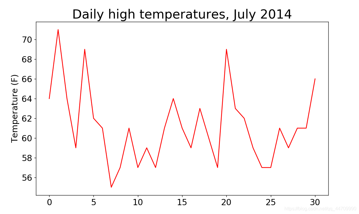
绘制气温图表
使用matplotlib创建一个显示每日最高气温的简单图形:
import csv

from matplotlib import pyplot as plt
filename = 'sitka_weather_07-2014.csv'
with open(filename) as f:
    reader = csv.reader(f)
    header_row = next(reader)

    highs = []
    for row in reader:
        high = int(row[1])
        highs.append(high)

    fig = plt.figure(dpi=128, figsize=(10, 6))
    # 将最高气温列表传给plot()
    plt.plot(highs, c='red')
    plt.title("Daily high temperatures, July 2014",fontsize=24)
    plt.xlabel('', fontsize=16)
    plt.ylabel("Temperature (F)", fontsize=16)
    plt.tick_params(axis='both', which='major', labelsize=16)

    plt.show()
模块datetime
在图表中添加日期
应将日期字符串转换为一个表示相应日期的对象,可使用模块datetime中的方法strptime()
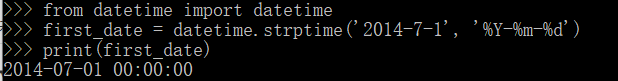
导入m-模块datetime中的datetime类,然后调用方法strptime(),并将包含所需日期的字符串作为第一个实参。第二个实参告知如何设置日期的格式。
在此示例中,’%Y-‘将字符串中第一个连字符前面的部分视为四位的年份;’%m-‘将第二个连字符前面的部分视为表示月份的数字;’%d-'将字符串的最后一部分视为月份中的一天
模块datetime中设置日期和时间格式的实参:
%A			# 星期的名称,如Monday
%B			# 月份名,如January
%m			# 用数字表示的月份(01~12)
%d			# 用数字表示月份中的一天(01~31)
%Y			# 四位的年份,如2015
%y			# 两位的年份,如15
%H			# 24小时制的小时数(00~23)
%I			# 12小时制的小时数(01~12)
%p			# am或pm
%M			# 分钟数(00~59)
%S			# 秒数(00~61)
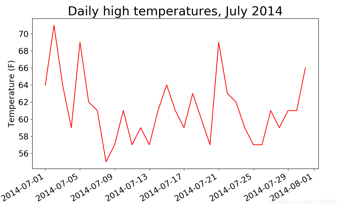
在图表中添加日期
import csv
from datetime import datetime
from matplotlib import pyplot as plt
filename = 'sitka_weather_07-2014.csv'
with open(filename) as f:
    reader = csv.reader(f)
    header_row = next(reader)

    dates, highs = [], []
    for row in reader:
        current_date = datetime.strptime(row[0], "%Y-%m-%d")
        dates.append(current_date)
        high = int(row[1])
        highs.append(high)

    fig = plt.figure(dpi=128, figsize=(10, 6))
    plt.plot(dates, highs, c='red')
    plt.title("Daily high temperatures, July 2014",fontsize=24)
    plt.xlabel('', fontsize=16)
    #调用斜的日期标签,以免彼此重叠
    fig.autofmt_xdate()
    plt.ylabel("Temperature (F)", fontsize=16)
    plt.tick_params(axis='both', which='major', labelsize=16)

    plt.show()
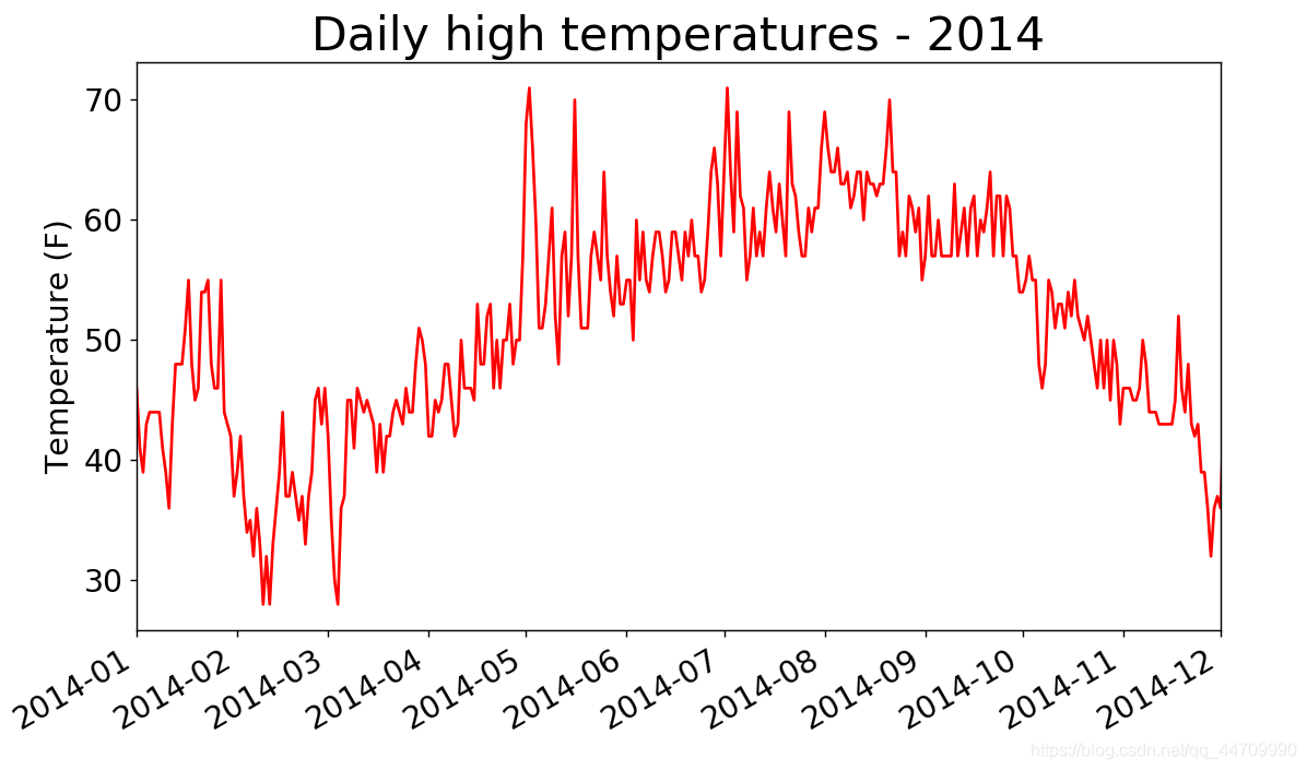
涵盖更长的时间
import csv
from datetime import datetime
from matplotlib import pyplot as plt
filename = 'sitka_weather_2014.csv'
with open(filename) as f:
    reader = csv.reader(f)
    header_row = next(reader)

    dates, highs = [], []
    for row in reader:
        current_date = datetime.strptime(row[0], "%Y-%m-%d")
        dates.append(current_date)
        high = int(row[1])
        highs.append(high)

    fig = plt.figure(dpi=128, figsize=(10, 6))
    plt.plot(dates, highs, c='red')
    xlim1 = datetime.strptime("2014-1", "%Y-%m")
    xlim2 = datetime.strptime("2014-12", "%Y-%m")
    plt.xlim([xlim1, xlim2])
    plt.title("Daily high temperatures - 2014", fontsize=24)
    plt.xlabel('', fontsize=16)
    fig.autofmt_xdate()
    plt.ylabel("Temperature (F)", fontsize=16)
    plt.tick_params(axis='both', which='major', labelsize=16)

    plt.show()
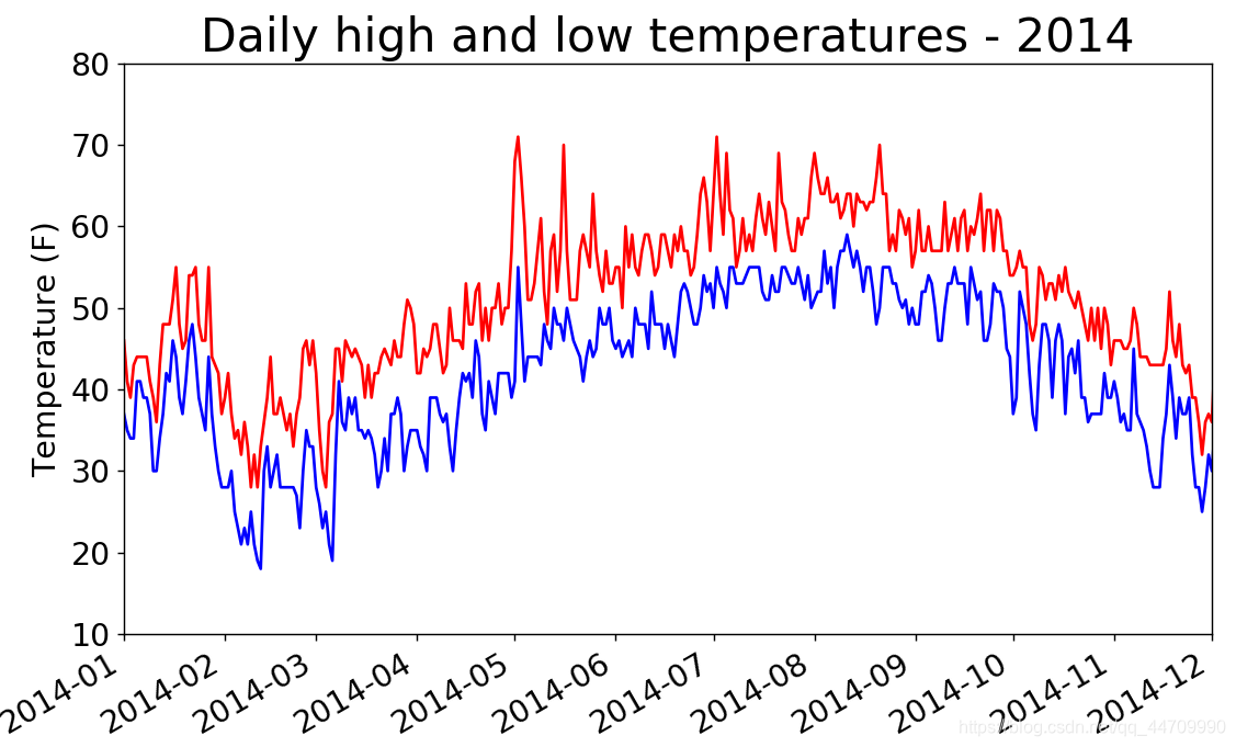
再绘制一个数据系列
添加最低温数据
import csv
from datetime import datetime
from matplotlib import pyplot as plt
filename = 'sitka_weather_2014.csv'
with open(filename) as f:
    reader = csv.reader(f)
    header_row = next(reader)

    dates, highs, lows = [], [], []
    for row in reader:
        current_date = datetime.strptime(row[0], "%Y-%m-%d")
        dates.append(current_date)
        high = int(row[1])
        highs.append(high)
        low = int(row[3])
        lows.append(low)

    fig = plt.figure(dpi=128, figsize=(10, 6))
    plt.plot(dates, highs, c='red')
    plt.plot(dates, lows, c='blue')
    xlim1 = datetime.strptime("2014-1", "%Y-%m")
    xlim2 = datetime.strptime("2014-12", "%Y-%m")
    plt.xlim([xlim1, xlim2])
    plt.ylim([10, 80])
    plt.title("Daily high and low temperatures - 2014", fontsize=24)
    plt.xlabel('', fontsize=16)
    fig.autofmt_xdate()
    plt.ylabel("Temperature (F)", fontsize=16)
    plt.tick_params(axis='both', which='major', labelsize=16)

    plt.show()
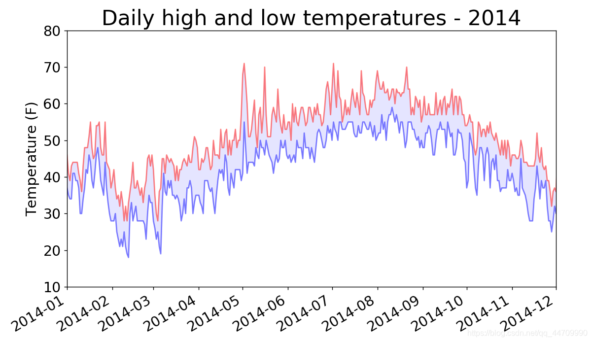
给图表区域着色
通过着色呈现每天的气温范围
使用方法fill_between(),它接受一个x值系列和两个y值系列,并填充两个y值系列之间
import csv
from datetime import datetime
from matplotlib import pyplot as plt
filename = 'sitka_weather_2014.csv'
with open(filename) as f:
    reader = csv.reader(f)
    header_row = next(reader)

    dates, highs, lows = [], [], []
    for row in reader:
        current_date = datetime.strptime(row[0], "%Y-%m-%d")
        dates.append(current_date)
        high = int(row[1])
        highs.append(high)
        low = int(row[3])
        lows.append(low)

    fig = plt.figure(dpi=128, figsize=(10, 6))
    # alpha指定颜色的透明度,alpha=0表示完全透明,1(默认设置)表示完全
    # 不透明
    plt.plot(dates, highs, c='red', alpha=0.5)
    plt.plot(dates, lows, c='blue', alpha=0.5)
    #实参facecolor指定了填充区域的颜色
    plt.fill_between(dates, highs, lows, facecolor='blue', alpha=0.1)
    xlim1 = datetime.strptime("2014-1", "%Y-%m")
    xlim2 = datetime.strptime("2014-12", "%Y-%m")
    plt.xlim([xlim1, xlim2])
    plt.ylim([10, 80])
    plt.title("Daily high and low temperatures - 2014", fontsize=24)
    plt.xlabel('', fontsize=16)
    fig.autofmt_xdate()
    plt.ylabel("Temperature (F)", fontsize=16)
    plt.tick_params(axis='both', which='major', labelsize=16)

    plt.show()
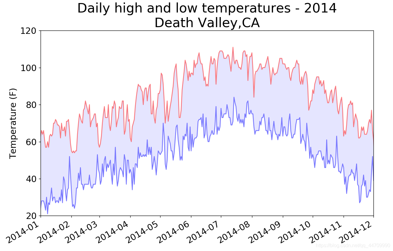
错误检查
在从CSV文件中读取值时执行错误检查代码,对分析数据集时可能出现的异常进行处理
import csv
from datetime import datetime
from matplotlib import pyplot as plt
filename = 'death_valley_2014.csv'
with open(filename) as f:
    reader = csv.reader(f)
    header_row = next(reader)

    dates, highs, lows = [], [], []
    for row in reader:
        try:
            current_date = datetime.strptime(row[0], "%Y-%m-%d")
            high = int(row[1])
            low = int(row[3])
        # 打印一条错误信息,指出缺失数据的日期。打印错误信息后,循环将
        # 接着处理下一行
        except ValueError:
            print(current_date, 'missing data')
        # 若获取特定日期的所有数据时没有发生错误,将运行else代码块
        else:
            dates.append(current_date)
            highs.append(high)
            lows.append(low)

    fig = plt.figure(dpi=128, figsize=(11, 7))
    plt.plot(dates, highs, c='red', alpha=0.5)
    plt.plot(dates, lows, c='blue', alpha=0.5)
    plt.fill_between(dates, highs, lows, facecolor='blue', alpha=0.1)
    xlim1 = datetime.strptime("2014-1", "%Y-%m")
    xlim2 = datetime.strptime("2014-12", "%Y-%m")
    plt.xlim([xlim1, xlim2])
    plt.ylim([20, 120])
    plt.title("Daily high and low temperatures - 2014\nDeath Valley,CA", fontsize=24)
    plt.xlabel('', fontsize=16)
    fig.autofmt_xdate()
    plt.ylabel("Temperature (F)", fontsize=16)
    plt.tick_params(axis='both', which='major', labelsize=16)

    plt.show()
运行后显示:

制作交易收盘价走势图:JSON格式
下载收盘价数据
1.使用函数urlopen来下载数据
from __future__ import (absolute_import, division, print_function, unicode_literals)
from urllib.request import urlopen
import json
json_url = 'https://raw.githubusercontent.com/muxuezi/btc/master/btc_close_2017.json'
# urlopen(json_url)是将json_url网址传入urlopen函数
response = urlopen(json_url)
# 读取数据
req = response.read()
# 将数据写入文件
with open('btc_close_2017_urllib.json','wb') as f:
    f.write(req)
# 加载json格式
# 用函数json.load()将文件内容转换成Python能处理的格式
file_urllib = json.loads(req)
print(file_urllib)
2.第三方模块requests可更简单的下载数据
import requests

json_url = 'https://raw.githubusercontent.com/muxuezi/btc/master/btc_close_2017.json'
# requests通过get方法向GitHub服务器发送请求
# GitHub服务器响应请求后,返回的结果存储在req变量中
req = requests.get(json_url)
# 将数据写入文件
with open('btc_close_2017_request.json','w') as f:
# req.text属性可以直接读取文件数据,返回格式是字符串
    f.write(req.text)
# 直接用req.json()可将btc_close_2017.json文件的数据转换为
# Python列表file_requests
file_requests = req.json()
提取相关的数据
import json
# 将数据加载到一个列表中
filename = 'btc_close_2017_request.json'
with open(filename) as f:
# 将数据存储在btc_data中

    btc_data = json.load(f)

# 遍历btc_data中的每个元素,每个元素都是一个字典,包含5个键值对
# btc_dict用于存储字典中的每个键值对,之后取出所有键的值

# 打印每一天的信息
for btc_dict in btc_data:
    date = btc_dict['date']
    month = btc_dict['month']
    week = btc_dict['week']
    weekday = btc_dict['weekday']
    close = btc_dict['close']
    print("{} is month {} week {},{},the close price is {} RMB".format(date, month, week, weekday, close))
将字符串转换为数字值
Python不能直接将包含小数点的字符串转换为整数,需先将字符串转换为浮点数,再将浮点数转换为整数(截尾取整)
import json

filename = 'btc_close_2017_request.json'
with open(filename) as f:
    btc_data = json.load(f)
for btc_dict in btc_data:
    date = btc_dict['date']
    month = int(btc_dict['month'])
    week = int(btc_dict['week'])
    weekday = btc_dict['weekday']
    close = int(float(btc_dict['close']))
    print("{} is month {} week {},{},the close price is {} RMB".format(date, month, week, weekday, close))
绘制收盘价折线图
使用Pygal绘制折线图
import json
import pygal
filename = 'btc_close_2017_request.json'
with open(filename) as f:
btc_data = json.load(f)
# 创建5个列表,分别存储日期和收盘价
dates = []
months = []
weeks = []
weekdays = []
close = []
# 每一天的信息
for btc_dict in btc_data:
dates.append(btc_dict['date'])
months.append(int(btc_dict['month']))
weeks.append(int(btc_dict['week']))
weekdays.append(btc_dict['weekday'])
close.append(int(float(btc_dict['close'])))
# 在创建Line实例时,分别设置了x_label_rotation与
# show_minor_x_labels作为初始化参数
# x_label_rotation=20让x轴上的日期标签顺时针旋转20度
# show_minor_x_labels=False告知图形不用显示所有的x标
# 签
line_chart = pygal.Line(x_label_rotation=20, show_minor_x_labels=False)
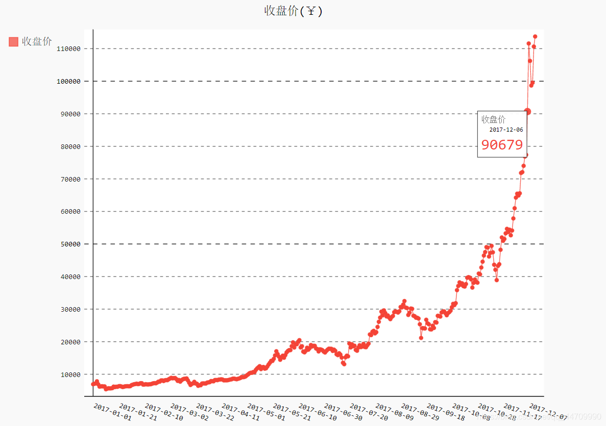
line_chart.title = '收盘价(¥)'
line_chart.x_labels = dates
N = 20
# 配置x_labels_major属性,让x轴坐标每隔20天显示一次
line_chart.x_labels_major = dates[::N]
line_chart.add('收盘价', close)
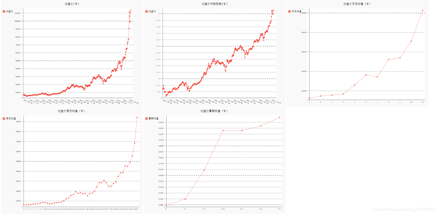
line_chart.render_to_file('收盘价折线图(¥).svg')
时间序列特征初探
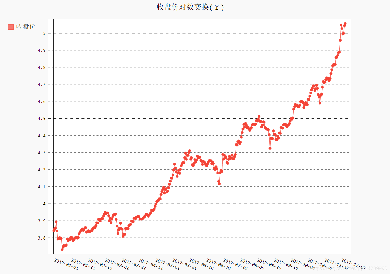
利用Pyhton标准库的数学模块math中的半对数变换
import json
import pygal
import math
filename = 'btc_close_2017_request.json'
with open(filename) as f:
    btc_data = json.load(f)
dates = []
months = []
weeks = []
weekdays = []
close = []
for btc_dict in btc_data:
    dates.append(btc_dict['date'])
    months.append(int(btc_dict['month']))
    weeks.append(int(btc_dict['week']))
    weekdays.append(btc_dict['weekday'])
    close.append(int(float(btc_dict['close'])))

line_chart = pygal.Line(x_label_rotation=20, show_minor_x_labels=False)
line_chart.title = '收盘价对数变换(¥)'
line_chart.x_labels = dates
N = 20
line_chart.x_labels_major = dates[::N]
close_log = [math.log10(_) for _ in close]
line_chart.add('收盘价', close_log)
line_chart.render_to_file('收盘价对数变换折线图(¥).svg')
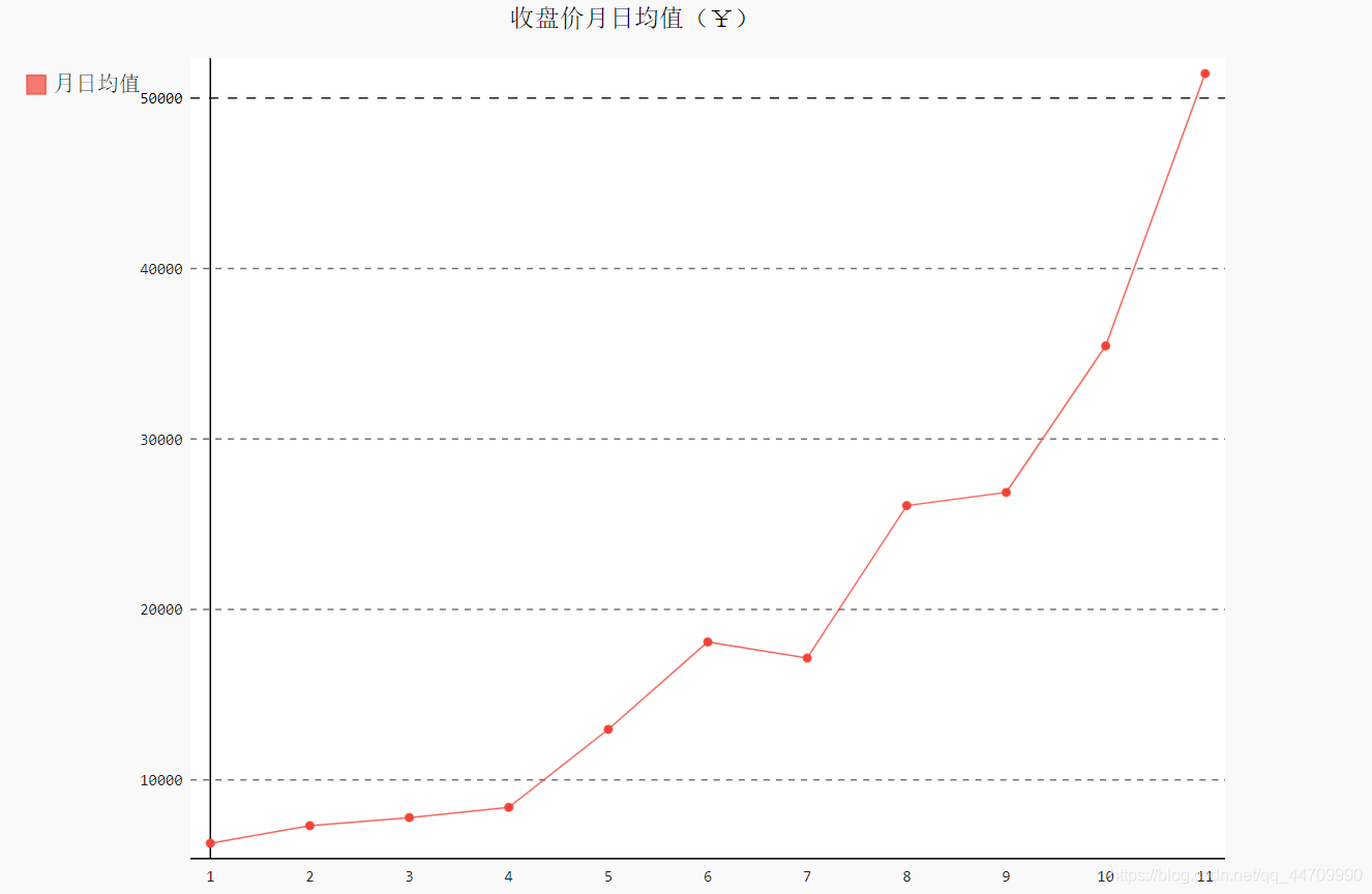
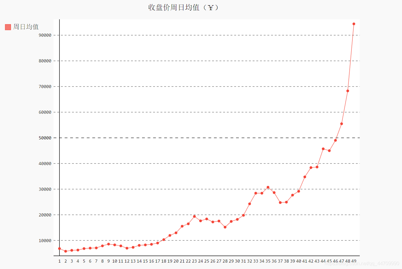
收盘价均值
绘制一段时间内的日均值
由于需将数据按月份、周数、周几分组,再计算每组的均值,因此导入模块
itertools的函数groupby
from itertools import groupby


def draw_line(x_date, y_data, title, y_legend):
    xy_map = []
    # 将x与y轴的数据合并、排序,再用函数groupby分组
    for x, y in groupby(sorted(zip(x_date,y_data)), key=lambda _: _[0]):
        y_list = [v for _, v in y]
        # 求出每组的均值,存储到xy_map变量中
        xy_map.append([x,sum(y_list) / len(y_list)])
    # 将xy_map中存储的x与y轴数据分离
    x_unique, y_mean = [*zip(*xy_map)]
    line_chart = pygal.Line()
    line_chart.title = title
    line_chart.x_labels = x_unique
    line_chart.add(y_legend, y_mean)
    line_chart.render_to_file(title+'.svg')
    return line_chart
绘制月日均值:
idx_month = dates.index('2017-12-01')
line_chart_month = draw_line(months[:idx_month], close[:idx_month], '收盘价月日均值(¥)', '月日均值')
line_chart_month
绘制周日均值:
idx_week = dates.index('2017-12-11')
line_chart_week = draw_line(weeks[1:idx_week], close[1:idx_week], '收盘价周日均值(¥)', '周日均值')
line_chart_week
绘制每周中各天的均值:
idx_week = dates.index('2017-12-11')
wd = ['Monday', 'Tuesday', 'Wednesday', 'Thursday', 'Friday', 'Saturday', 'Sunday']
# 将weekdays的内容替换为1~7的整数
weekdays_int = [wd.index(w) + 1 for w in weekdays[1:idx_week]]
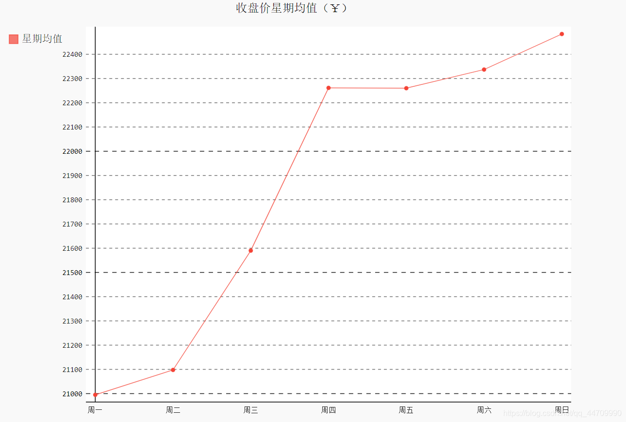
line_chart_weekday = draw_line(weekdays_int, close[1:idx_week], '收盘价星期均值(¥)', '星期均值')
line_chart_weekday.x_labels = ['周一', '周二', '周三', '周四', '周五', '周六', '周日']
line_chart_weekday.render_to_file('收盘价星期均值(¥).svg')
收盘价数据仪表盘
将前面绘制的图整合在一起
import json
with open('收盘价Dashboard.html', 'w', encoding='utf8') as html_file:
    html_file.write('<html><head><title>收盘价Dashboard</title><meta charset="utf-8"></head><body>\n')
    for svg in [
            '收盘价折线图(¥).svg', '收盘价对数变换折线图(¥).svg', '收盘价月日均值(¥).svg', '收盘价周日均值(¥).svg','收盘价星期均值(¥).svg'
    ]:
        html_file.write('<object type="image/svg+xml" data="{0}" height=500></object>\n'.format(svg))
    html_file.write('</body></html>')
使用API
使用Web应用编程接口(API)自动请求网站的特定信息而不是整个网页,再对这些信息进行可视化
使用Web API
Web API是网站的一部分,用于与使用非常具体的URL请求特定信息的程序交互。这种称为API调用。请求的数据将以易于处理的格式(json或csv)返回
使用API调用请求数据
https://api.github.com/search/repositories?q=language:python&sort=stars

# 此调用返回Github当前托管了多少个Python项目,
# 还有有关最受欢迎的Python仓库的信息

# 第一部分(https://api.github.com/)将请求发送到Github网站上响应API
# 调用的部分
# 接下来的一部分(search/repositories)让API搜索Github上的所有仓库
# repositories后的问号指出我们要传递一个实参。q表示查询,等号让我们能
# 开始指定查询。通过使用language:python,指出只想获取主要语言为
# Python的仓库的信息,最后一部分(&sort=stars)指定将项目按星级排序
requests
requests包能向网站请求信息以及检查返回的响应
处理API响应
import requests

# 执行API调用并存储响应
url = 'https://api.github.com/search/repositories?q=language:python&sort=stars'
r = requests.get(url)
# 响应对象包含一个名为status_code的属性,它让我们知道请求是否成功
# (状态码200表示请求成功)
print("Status code:", r.status_code)

# 将API响应存储在一个变量中
# 方法json()将信息转换为一个Python字典
response_dict = r.json()
# 打印字典中的键
print(response_dict.keys())
处理响应字典
import requests

url = 'https://api.github.com/search/repositories?q=language:python&sort=stars'
r = requests.get(url)
print("Status code:", r.status_code)

response_dict = r.json()
print("Total repositories:", response_dict['total_count'])

# 与'items'相关联的值是一个列表,其中包含很多字典,而每个字典
# 都包含有关一个Python仓库的信息,将此字典列表存储在repo_dicts中
repo_dicts = response_dict['items']
print("Repositories returned:", len(repo_dicts))

repo_dict = repo_dicts[0]
print("\nKeys:", len(repo_dict))
for key in sorted(repo_dict.keys()):
    print(key)
提取repo_dict中与一些键相关联的值:
import requests

url = 'https://api.github.com/search/repositories?q=language:python&sort=stars'
r = requests.get(url)
print("Status code:", r.status_code)

response_dict = r.json()
print("Total repositories:", response_dict['total_count'])

repo_dicts = response_dict['items']
print("Repositories returned:", len(repo_dicts))

repo_dict = repo_dicts[0]

print("\nSelected information about first repository:")
print('Name:', repo_dict['name'])
print('Owner:', repo_dict['owner']['login'])
print('Stars:', repo_dict['stargazers_count'])
print('Repository:', repo_dict['html_url'])
print('Created:', repo_dict['created_at'])
print('Updated:', repo_dict['updated_at'])
print('Description:', repo_dict['description'])
打印API调用返回的信息:概述最受欢迎的仓库
打印API调用返回的每个仓库的特定信息
import requests

url = 'https://api.github.com/search/repositories?q=language:python&sort=stars'
r = requests.get(url)
print("Status code:", r.status_code)

response_dict = r.json()
print("Total repositories:", response_dict['total_count'])

repo_dicts = response_dict['items']
print("Repositories returned:", len(repo_dicts))

print("\nSelected information about each repository:")
for repo_dict in repo_dicts:
    print('\nName:', repo_dict['name'])
    print('Owner:', repo_dict['owner']['login'])
    print('Stars:', repo_dict['stargazers_count'])
    print('Repository:', repo_dict['html_url'])
    print('Description:', repo_dict['description'])
使用Pygal可视化仓库信息
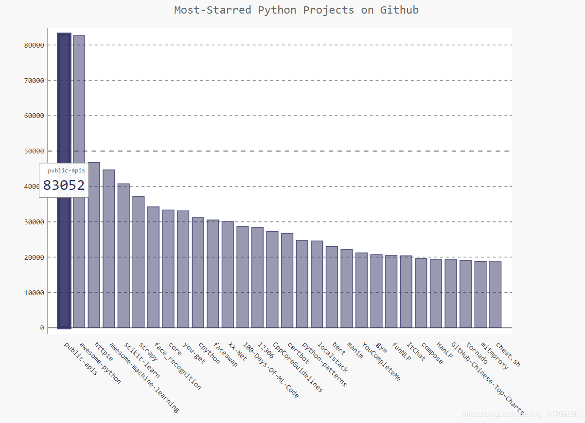
绘制交互式条形图,呈现Github上Python项目的受欢迎程度。条形的高度表示项目获得的star数,单击条形将进入项目在Github上的主页
import requests
import pygal
from pygal.style import LightColorizedStyle as LCS, LightenStyle as LS

url = 'https://api.github.com/search/repositories?q=language:python&sort=stars'
r = requests.get(url)
print("Status code:", r.status_code)

response_dict = r.json()
print("Total repositories:", response_dict['total_count'])

repo_dicts = response_dict['items']

# 创建两个空列表,用于存储图表中的信息
names, stars=[], []
for repo_dict in repo_dicts:
    names.append(repo_dict['name'])
    stars.append(repo_dict['stargazers_count'])

# 使用LightenStyle类定义了一种样式,并将其基色设为深蓝色
# 传递了实参base_style,以使用LightColorizedStyle类
my_style = LS('#333366', base_style=LCS)
# 使用Bar()创建条形图,并向它传递了my_style
# 还传递了两个样式实参:标签绕x轴旋转45度,并隐藏图例
chart = pygal.Bar(style=my_style, x_label_rotation=45, show_legend=False)
chart.title = 'Most-Starred Python Projects on Github'
chart.x_labels = names

# 由于不需添加标签,在添加数据时,将标签设为空字符
chart.add('', stars)
chart.render_to_file('python_repos.svg')
改进Pygal图表
创建一个配置对象,在其中包含要传递给Bar()的所有定制
import requests
import pygal
from pygal.style import LightColorizedStyle as LCS, LightenStyle as LS

url = 'https://api.github.com/search/repositories?q=language:python&sort=stars'
r = requests.get(url)
print("Status code:", r.status_code)

response_dict = r.json()
print("Total repositories:", response_dict['total_count'])

repo_dicts = response_dict['items']

names, stars=[], []
for repo_dict in repo_dicts:
    names.append(repo_dict['name'])
    stars.append(repo_dict['stargazers_count'])


my_style = LS('#333366', base_style=LCS)
# 创建一个Pygal类Config的实例my_config,通过修改它的属性,可定制图表的外观
my_config = pygal.Config()
my_config.x_label_rotation = 45
my_config.show_legend = False
# 设置图表标题、副标题和主标签的字体大小
my_config.title_font_size = 24
my_config.label_font_size = 14
my_config.major_label_font_size = 18
# 使用truncate_label将较长的项目名缩短为15个字符
# (将鼠标指向被截短的项目名,将显示完整的项目名)
my_config.truncate_label = 15
# 隐藏图表中的水平线
my_config.show_y_guides = False
# 自定义宽度
my_config.width = 1000

# 将my_config作为第一个实参,传递所有配置设置
chart = pygal.Bar(my_config, style=my_style)
chart.title = 'Most-Starred Python Projects on Github'
chart.x_labels = names

chart.add('', stars)
chart.render_to_file('python_repos.svg')
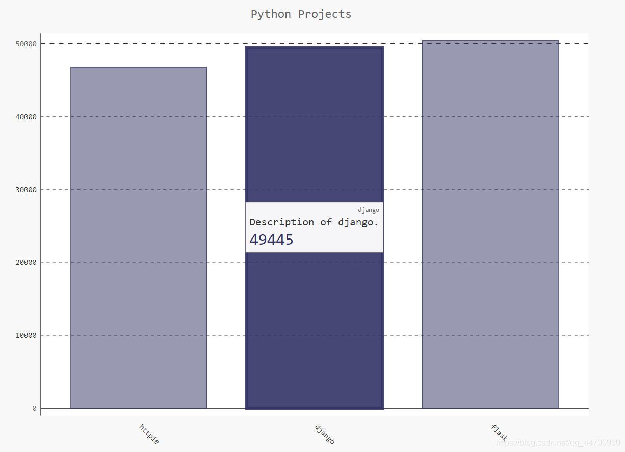
添加自定义工具提示
在Pygal中,将鼠标移向条形将显示它表示的信息,此通常称为工具提示
创建一个自定义工具提示,以同时显示项目的描述:
import pygal
from pygal.style import LightColorizedStyle as LCS, LightenStyle as LS

my_style = LS('#333366', base_style=LCS)
chart = pygal.Bar(style=my_style, x_label_rotation=45, show_legend=False)

chart.title = 'Python Projects'
chart.x_labels = ['httpie', 'django', 'flask']

# 定义一个名为plot_dicts的列表,其中包含3个字典,每个字典包含2个键
# Pygal根据与'label'相关联的字符串给条形创建工具提示
plot_dicts = [
    {'value': 46762, 'label': 'Description of httpie.'},
    {'value': 49445, 'label': 'Description of django.'},
    {'value': 50420, 'label': 'Description of flask.'},
    ]

# add()方法接受一个字符串和一个列表
chart.add('', plot_dicts)
chart.render_to_file('bar_descriptions.svg')
根据数据绘图
自动生成plot_dicts:
import requests
import pygal
from pygal.style import LightColorizedStyle as LCS, LightenStyle as LS

url = 'https://api.github.com/search/repositories?q=language:python&sort=stars'
r = requests.get(url)
print("Status code:", r.status_code)

response_dict = r.json()
print("Total repositories:", response_dict['total_count'])

repo_dicts = response_dict['items']

names, plot_dicts=[], []
for repo_dict in repo_dicts:
    names.append(repo_dict['name'])

    plot_dict = {
        'value': repo_dict['stargazers_count'],
        'label': repo_dict['description']
    }
    plot_dicts.append(plot_dict)

my_style = LS('#333366', base_style=LCS)
my_config = pygal.Config()
my_config.x_label_rotation = 45
my_config.show_legend = False
my_config.title_font_size = 24
my_config.label_font_size = 14
my_config.major_label_font_size = 18
my_config.truncate_label = 15
my_config.show_y_guides = False
my_config.width = 1000

chart = pygal.Bar(my_config, style=my_style)

chart.title = 'Most-Starred Python Projects on Github'
chart.x_labels = names

chart.add('', plot_dicts)
chart.render_to_file('python_repos.svg')
在图表中添加可单击的链接
Pygal允许将图表中的每个条形用作网站的链接
在为每个项目创建的字典中,添加一个键为’xlink’的键-值对
    plot_dict = {
        'value': repo_dict['stargazers_count'],
        'label': repo_dict['description'],
        'xlink': repo_dict['html_url']
    }
Hacker News网站的 API调用
使用Hacker News网站的API调用
返回最热门的文章信息:
https://hacker-news.firebaseio.com/v0/item/9884165.json
返回Hacker News上当前热门文章的ID,再查看每篇排名靠前的文章:
import requests

from operator import itemgetter

# 执行API调用并存储响应
# 此API调用返回hacker-news上最热门的500篇文章的id
url = 'https://hacker-news.firebaseio.com/v0/topstories.json'
r = requests.get(url)
print("Status code:", r.status_code)

# 将响应文本转换为python列表
submission_ids = r.json()
# submission_dicts用于存储字典
submission_dicts = []
# 遍历id,对于每篇文章都执行一次API调用
for submission_id in submission_ids[:30]:
	# url包含submission_id的当前值
    url = ('https://hacker-news.firebaseio.com/v0/item' + str(submission_id) + '.json')
    submission_r = requests.get(url)
    print(submission_r.status_code)
    response_dict = submission_r.json()

    # 为当前处理的文章创建字典
    # 存储文章标题、页面链接、评论数
    submission_dict = {
        'title': response_dict['title'],
        'link': 'http://news.ycombinator.com/item?id=' + str(submission_id),
        # 不确定某个键是否包含在字典中时,可使用方法dict.get()
        # 它在指定的键存在时返回与其关联的值,不存在时返回指定的值(此为0)
        'comments': response_dict.get('descendants', 0)
        }
    submission_dicts.append(submission_dict)

# 根据评论数对字典列表排序,使用了模块operator中的函数itemgetter()
# 向此函数传递了键'comments',它将从这个列表中的没个字典中提取与该键
# 关联的值,sorted()将根据这种值对列表进行排序(此处为降序排列)
submission_dicts = sorted(submission_dicts, key=itemgetter('comments'), reverse = True)

# 遍历排序后的列表,打印信息
for submission_dict in submission_dicts:
    print("\nTitle:", submission_dict['title'])
    print("Discussion link:", submission_dict['link'])
    print("Comments:", submission_dict['comments'])