目录
行内元素:
(1)在父元素设置 text-align:center
<!DOCTYPE html>
<html lang="en">
<head>
    <meta charset="UTF-8">
    <meta name="viewport" content="width=device-width, initial-scale=1.0">
    <meta http-equiv="X-UA-Compatible" content="ie=edge">
    <title>Document</title>
    <style>
        .box1 {


            height: 100px;
            background-color: deepskyblue;

            text-align: center;
        }
    </style>
</head>
<body>
    <div class="box1">行内元素水平居中</div>
</body>
</html>

块级元素:
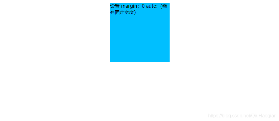
(1)设置 margin:0 auto;(需有固定宽度)
<!DOCTYPE html>
<html lang="en">
<head>
    <meta charset="UTF-8">
    <meta name="viewport" content="width=device-width, initial-scale=1.0">
    <meta http-equiv="X-UA-Compatible" content="ie=edge">
    <title>Document</title>
    <style>
        .box1 {


            width: 200px;
            height: 200px;
            background-color: deepskyblue;

            margin: 0 auto;
        }
    </style>
</head>
<body>
    <div class="box1">设置 margin:0 auto;(需有固定宽度)</div>
</body>
</html>
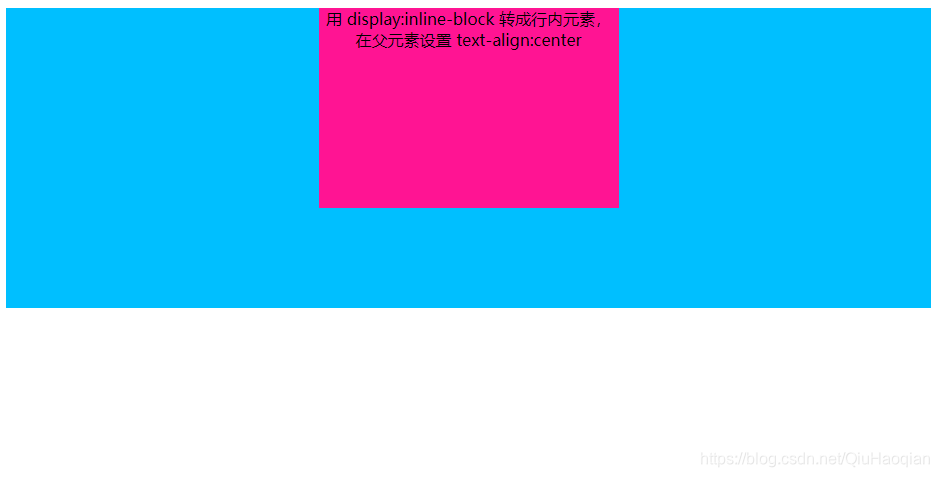
(2)用 display:inline-block 转成行内元素,在父元素设置 text-align:center。
<!DOCTYPE html>
<html lang="en">
<head>
    <meta charset="UTF-8">
    <meta name="viewport" content="width=device-width, initial-scale=1.0">
    <meta http-equiv="X-UA-Compatible" content="ie=edge">
    <title>Document</title>
    <style>
        .box1 {


            height: 300px;
            background-color: deepskyblue;

            text-align: center;
        }
        .box2 {


            width: 300px;
            height: 200px;
            background-color: deeppink;

            display: inline-block;
        }
    </style>
</head>
<body>
    <div class="box1">
        <div class="box2">
            用 display:inline-block 转成行内元素,在父元素设置  text-align:center
        </div>
    </div>
</body>
</html>
(3)绝对定位
<!DOCTYPE html>
<html lang="en">
<head>
    <meta charset="UTF-8">
    <meta name="viewport" content="width=device-width, initial-scale=1.0">
    <meta http-equiv="X-UA-Compatible" content="ie=edge">
    <title>Document</title>
    <style>
        .box1 {
            width: 200px;
            height: 200px;
            background-color: deepskyblue;

            position: absolute;
            left: 50%;
            transform: translateX(-50%); /* 移动元素本身50% */
        }
    </style>
</head>
<body>
    <div class="box1">绝对定位+translateX</div>
</body>
</html>

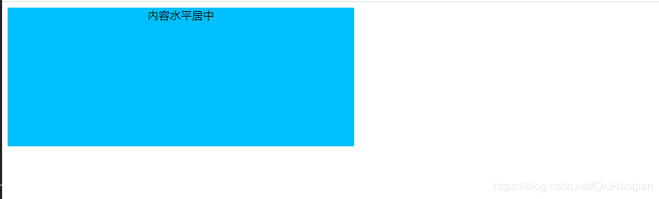
(3)用flex布局实现
方式一: display: flex; justify-content: center
<!DOCTYPE html>
<html lang="en">
<head>
    <meta charset="UTF-8">
    <meta name="viewport" content="width=device-width, initial-scale=1.0">
    <meta http-equiv="X-UA-Compatible" content="ie=edge">
    <title>Document</title>
    <style>
        .box1 {
            width: 500px;
            height: 200px;
            background-color: deepskyblue;

            display: flex;
            justify-content: center
        }
    </style>
</head>
<body>
    <div class="box1">内容水平居中</div>
</body>
</html>
方式二:父元素 display: flex; flex-direction: column; 子元素: align-self: center;
<!DOCTYPE html>
<html lang="en">
<head>
    <meta charset="UTF-8">
    <meta name="viewport" content="width=device-width, initial-scale=1.0">
    <meta http-equiv="X-UA-Compatible" content="ie=edge">
    <title>Document</title>
    <style>
        .box1 {
            width: 800px;
            height: 300px;
            background-color: deepskyblue;

            display: flex;
            flex-direction: column;
        }
        .box2 {
            width: 300px;
            height: 200px;
            background-color: deeppink;

            align-self: center;
        }
    </style>
</head>
<body>
    <div class="box1">
        <div class="box2">块元素水平居中</div>
    </div>
</body>
</html>
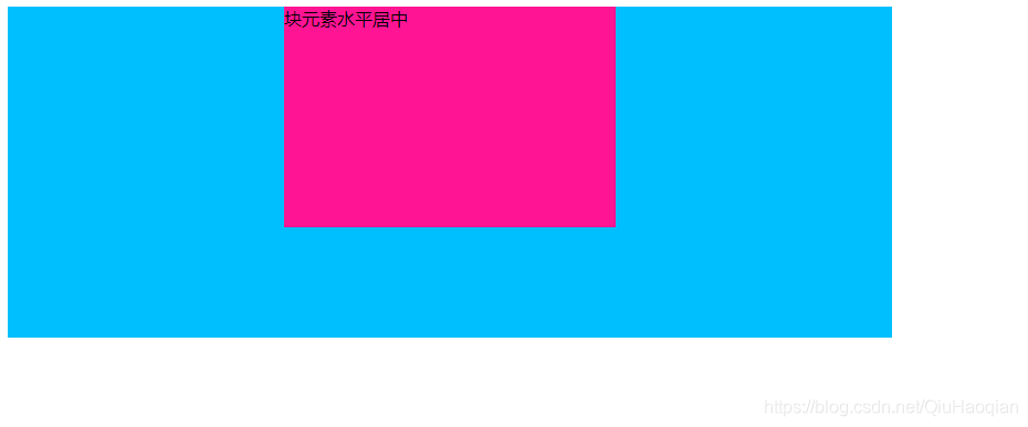
方式三:父元素 display: flex; 子元素: margin: 0 auto;
<!DOCTYPE html>
<html lang="en">
<head>
    <meta charset="UTF-8">
    <meta name="viewport" content="width=device-width, initial-scale=1.0">
    <meta http-equiv="X-UA-Compatible" content="ie=edge">
    <title>Document</title>
    <style>
        .box1 {
            width: 800px;
            height: 300px;
            background-color: deepskyblue;

            display: flex;
        }

        .box2 {
            width: 300px;
            height: 200px;
            background-color: deeppink;

            margin: 0 auto;
        }
    </style>
</head>
<body>
    <div class="box1">
        <div class="box2">块元素水平居中</div>
    </div>
</body>
</html>
