一个学前端的记录帖
2020.6.8
<!DOCTYPE html>
<html>
	<head>
		<meta charset="utf-8" />
		<title></title>
	</head>
	<body>
		论数学的重要性
	</body>
</html>
加粗放大
<!DOCTYPE html>
<html>
	<head>
		<meta charset="utf-8" />
		<title></title>
	</head>
	<body>
		<h1>论数学的重要性</h1>
	</body>
</html>
另外还有从h2到h6
变斜体 <i>
<hr>单标签 划横线
<p>文字独占一行
只加粗<b>
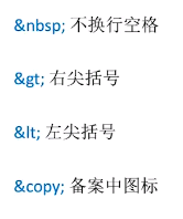
浏览器无法识别多个空格 只能识别1个
但可用 代表多个空格
2020.6.10
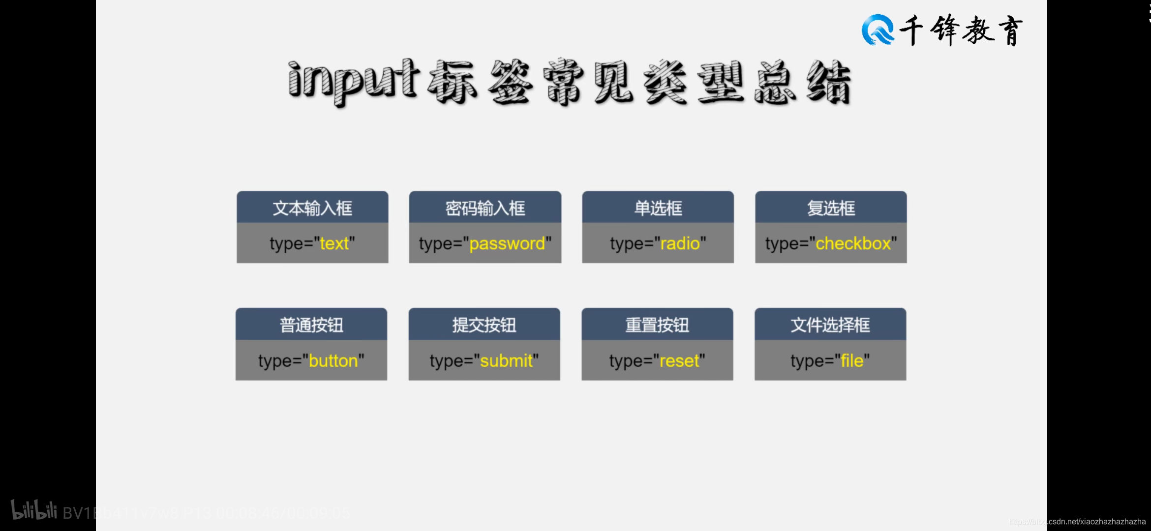
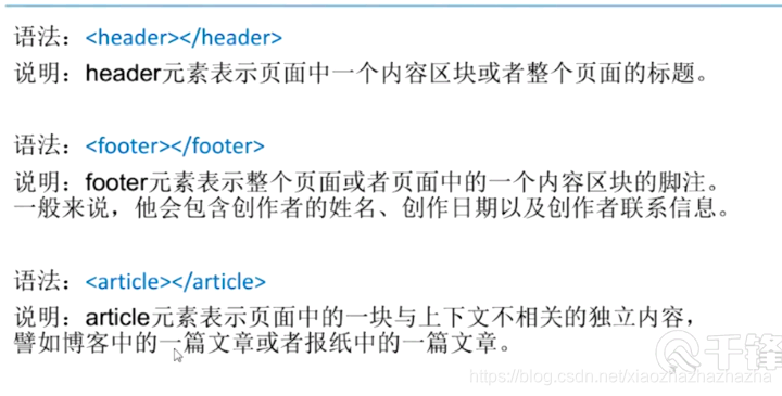
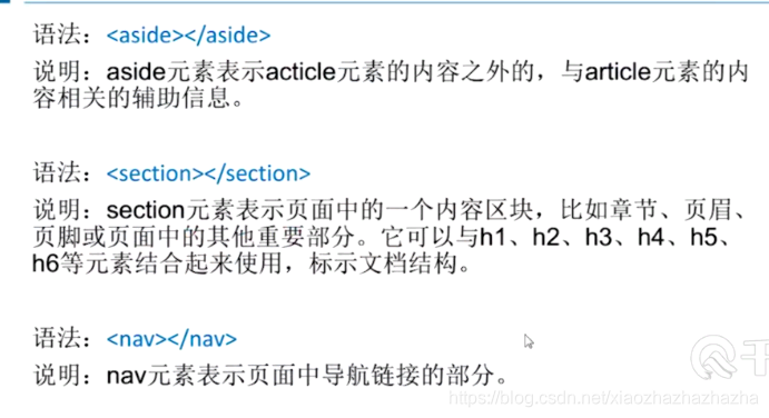
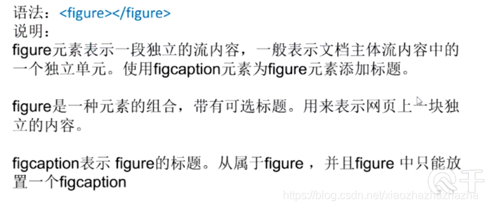
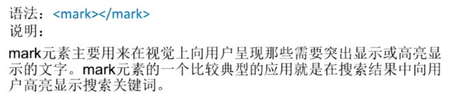
<h1>科技 <img src="img/图片1.png"></h1>
img src为图片地址的意思
<ul>
	<li> hahahah</li>
	<li>heheheh</li>
	<li>xixiiixixi</li>
	<li>heiheihei</li>

</ul>
<li>里面的字前面都会加一个点点 因为使用了 ul标签(ul type=“disc” /“circle”/“squre”)
<li>里面的字前面加数字 使用了 ol标签 (ol type=“1” / “a” / “A” / “i” / “I”)
只显示字 不能点击跳转到新页面怎么办呢
添加超链接方法 网址是随便找的
<a href =“网址”>字</a>
<li>
	<a href ="https://www.flaticon.com/">hahahah</a>
</li>
图片太大怎么办?
<img src = "img\3.jpg"width="100px">
图片太大超出窗口大小怎么办 width="100%"铺满窗口
<img src = "img\图片1.png"width="100%">
在新页面打开
<a href ="http:\\www.baidu.com"target = "_blank">百度链接</a>
<img src = "img/图1.png" title = "鼠标划上去的文字" alt = "加载失败的文字">
绝对路径和相对路径 注意 …/返回上一级目录
表格
table tr td
<!DOCTYPE html>
<html>
	<head>
		<meta charset="utf-8" />
		<title></title>
	</head>
	<body>
		<table border="1px" cellspacing = "0">
			<tr>
				<td></td>
				<td>啊不错的</td>
				<td>不错的发</td>
				<td>权威人物</td>
				<td>更健康锋利的</td>
			</tr>
			<tr>
				<td>1</td>
				<td>2</td>
				<td>3</td>
				<td>4</td>
				<td>5</td>
			</tr>
		</table>

	</body>
</html>
不好看 每一列不一样宽
每行都多加个这个width="200px“0
<td width="200px">啊不错的</td>
文字居中
<td width="200px" align="center">啊不错的</td>
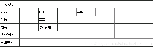
简历的制作
2020.6.12
<!DOCTYPE html>
<html>
	<head>
		<meta charset="utf-8">
		<title></title>
	</head>
	<body>
		<table border="1px" cellspacing="0">
			<col width="100px">
			<col width="100px">
			<col width="100px">
			<col width="100px">
			<col width="100px">
			<col width="100px">
			<col width="200px">
			<tr height="40px">
				<td>个人简历</td>
				<td></td>
				<td></td>
				<td></td>
				<td></td>
				<td></td>
				<td></td>
			</tr>
			<tr height="40px">
				<td>姓名</td>
				<td></td>
				<td>性别</td>
				<td></td>
				<td>年龄</td>
				<td></td>
				<td></td>
			</tr>
			<tr height="40px">
				<td>学历</td>
				<td></td>
				<td>籍贯</td>
				<td></td>
				<td></td>
				<td></td>
				<td></td>
			</tr>
			<tr height="40px">
				<td>电话</td>
				<td></td>
				<td>政治面貌</td>
				<td></td>
				<td></td>
				<td></td>
				<td></td>
			</tr>

			<tr height="40px">
				<td>毕业院校</td>
				<td></td>
				<td></td>
				<td></td>
				<td></td>
				<td></td>
				<td></td>
			</tr>

			<tr height="40px">
				<td>求职意向</td>
				<td></td>
				<td></td>
				<td></td>
				<td></td>
				<td></td>
				<td></td>
			</tr>


		</table>
	</body>
</html>
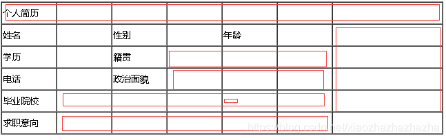
这些地方如何合并呢
<td colspan="7">个人简历</td>
让第一行的第一列占据七个单元格
接下来第3行 删掉第5 6列 留下第四列占据第5 6列
接下来就到列合并了
3-5行最后一个单元格都删掉
第二行最后一格 rowspan=“4”
<!DOCTYPE html>
<html>
<head>
<meta charset="utf-8">
<title></title>
</head>
<body>
<form action="http://baidu.com">
<table width = "600px" border="1px" cellspacing="0">
<tbody>
<tr height="40px">
<td rowspan="4" align="center">总体信息</td>
<td colspan="2"></td>
</tr>
<tr height="40px">
<td align="right">用户名:</td>
<td> <input type="text" name="loginame">
</td>
</tr>
<tr height="40px">
<td align="right">密码:</td>
<td><input type ="password" name="pad"></td>
</tr>
<tr height="40px">
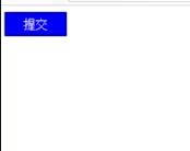
<td colspan="2" align = "center">
<input type = "submit" value="提交">
<input type = "reset" value="重置">
</td>
</tr>
</tbody>
</table>
</form>
</body>
</html>
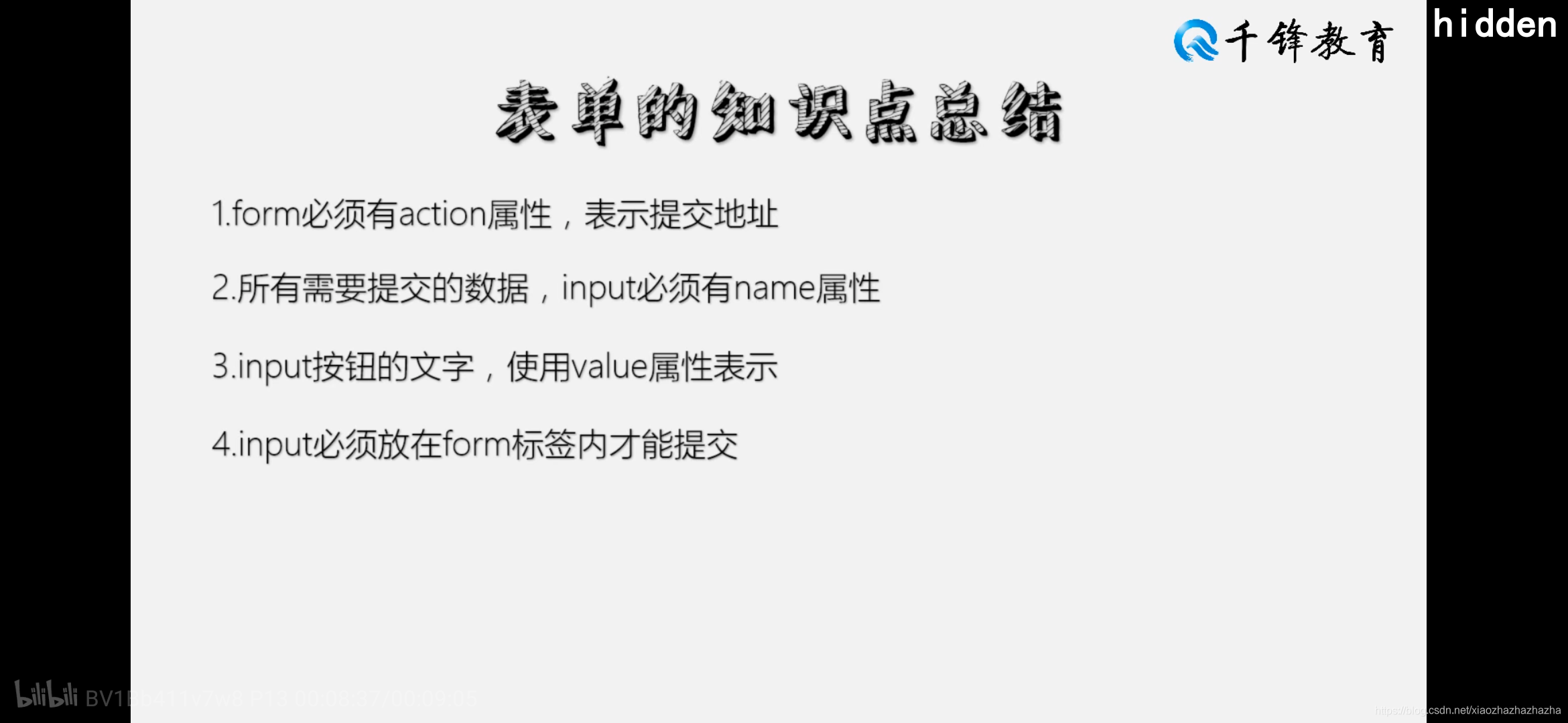
2020.6.13
改变文字颜色
<td rowspan="4" align="center" style ="color: red;">总体信息</td>
注意等号 冒号 分号的运用
<input type = "submit" value="提交"style="width:80px; height:30px;" >
<input type = "reset" value="重置"style="width:80px; height:30px;">
注意style里面冒号 分号 的运用
<input type = "submit" value="提交"style="width:80px; height:30px;background-color: darkseagreen;" >
用拾色器识别颜色
<input type = "submit" value="提交"style="width:80px; height:30px;background-color: #DEEBCE;" >
容器的使用
<!DOCTYPE html>
<html>
<head>
<meta charset="utf-8">
<title></title>
</head>
<body>
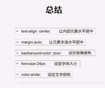
<p style="text-align: center;">
<span style="background-color: blue;color:white; font-size: 24px;">千锋简介</span>
</p>
<p>
<b>北京千锋互联科技有限公司(简称千锋)</b>
成立于2011年1月。公司总部位于北京,目前己在
<span style="color: cornflowerblue;">深圳、上海、郑州、广州、大连、武汉、成都、西安、杭州、青岛、重庆、长沙、哈尔滨、南京、太原</span>
建立分公司。
</p>
</body>
</html>
<!DOCTYPE html>
<html>
<head>
		<meta charset="utf-8">
		<title></title>
</head>
<body>
		<div style="margin:auto;width:500px;">
			<p style="text-align: center;">
			<span style="background-color: blue;color:white; font-size: 24px;">千锋简介</span>
			</p>
			<p>
			<b>北京千锋互联科技有限公司(简称千锋)</b>
			成立于2011年1月。公司总部位于北京,目前己在
			<span style="color: cornflowerblue;">深圳、上海、郑州、广州、大连、武汉、成都、西安、杭州、青岛、重庆、长沙、哈尔滨、南京、太原</span>
			建立分公司。
			</p>
		</div>

	</body>
</html>
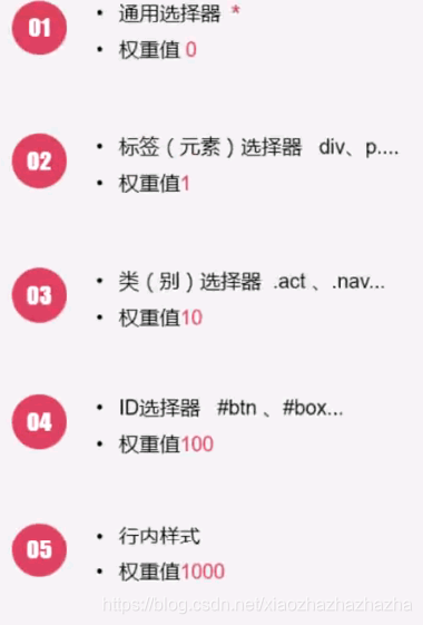
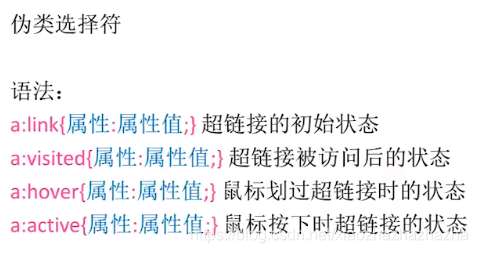
选择器 其实到这里学蒙了……
<!DOCTYPE html>
<html>
<head>
<meta charset="utf-8">
<title></title>
</head>
<body style="margin: 0;>
<div id="banner">
<img src="img/image_800.png" width="100%" ">
</div>
<div id="navigation" style="height: 80px;line-height: 80px; text-align: center;color: aqua;background-color: black;">
<a href="#"style="margin: 0 15px";>首页</a>
<a href="#"style="margin: 0 15px";>关于王力</a>
<a href="#"style="margin: 0 15px";>产品世界</a>
<a href="#"style="margin: 0 15px";>新闻中心</a>
<a href="#"style="margin: 0 15px";>网络事件</a>
<a href="#"style="margin: 0 15px";>联系我们</a>
<a href="#"style="margin: 0 15px";>关于我们</a>
<a href="#"style="margin: 0 15px";>网络新闻</a>
</div>
<div id="bottom" style="font-size: 16px;color: coral;text-align: center;line-height: 80px;height:80px">版权所有,浙江工力门业市限公司 技术支持派桑网络</div>
</body>
</html>
显得很乱 而且很多重复代码
修改后如下
<!DOCTYPE html>
<html>
<head>
<meta charset="utf-8">
<title></title>
<style>
body {
margin: 0;
}
#navigation{
height: 80px;line-height: 80px; text-align: center;color: aqua;background-color: black;}
#bottom{
font-size: 16px;color: coral;text-align: center;line-height: 80px;height:80px}
.nav{
margin: 0 15px}
#banner img{
width:100%}
</style>
</head>
<body>
<div id="banner">
<img src="img/image_800.png" >
</div>
<div id="navigation">
<a href="#"class="nav">首页</a>
<a href="#"class="nav">关于王力</a>
<a href="#"class="nav">产品世界</a>
<a href="#"class="nav">新闻中心</a>
<a href="#"class="nav">网络事件</a>
<a href="#"class="nav">联系我们</a>
<a href="#"class="nav">关于我们</a>
<a href="#"class="nav">网络新闻</a>
</div>
<div id="bottom">版权所有,浙江工力门业市限公司 技术支持派桑网络</div>
</body>
</html>
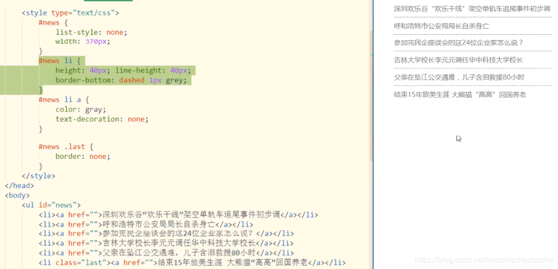
<!DOCTYPE html>
<html>
	<head>
		<meta charset="utf-8">
		<title></title>
		<style>
		#navigation{


			text-align: center;
		}
		#navigation .last{


			border:none;
		}
		.nav{


			text-decoration:none;
			color: black;
			border-right: solid blanchedalmond 1px;
			padding: 0 10px;
		}
		</style>
	</head>
	<body>
		<div id="navigation">
			        <a href="#"class="nav">首页</a>
					<a href="#"class="nav">关于产品</a>
					<a href="#"class="nav">产品世界</a>
					<a href="#"class="nav">新闻中心</a>
					<a href="#"class="nav">网络事件</a>
					<a href="#"class="nav">联系我们</a>
					<a href="#"class="nav">关于我们</a>
					<a href="#"class="nav last">网络新闻</a>
		</div>
	</body>
</html>
2020.6.14
<!DOCTYPE html>
<html>
	<head>
		<meta charset="utf-8">
		<title></title>
		<style type="text/css">
			.p1{

    color:red}
			.p2{

    font-family: "微软雅黑";}
			.p3{

    font-size: 26px;}
			.p4{

    font-weight: bold;}
			.p5{

    font-style: italic;}
			.p6{

    text-indent: 60px;}
			.p7{

    text-align: center;}
			.p8{

    line-height: 100px;}
			.p9{

    height: 100px;background-color: #FF0000;line-height: 100px;}
			.p10{

    text-decoration: underline;}
		</style>
	</head>
	<body>
		<ul>
			<li class="p1">“双十一”过去将近一个月,各大电商、物流平台和物流企业纷纷晒出今年的成绩单,</li>
			<li class="p2">其中物流平台和物流企业的成绩单直接关乎消费者享受的服务,因而更加引人注目。</li>
			<li class="p3">国家邮政局监测信息显示, 11月11日至16日业务高峰期间,全国邮政、快递企业共处理邮(快)件18.82亿件,</li>
			<li class="p4">截至21日20时,除边远地区外,主要寄递企业揽收的邮(快)件已妥投18.3亿件,妥投率超过97%。</li>
			<li class="p5">来自物流平台的统计数据同样具有说服力:今年天猫"双十一 "当日物流订单星突破10亿。</li>
			<li class="p6">2009年天猫“"双十- -”当日物流订单为26万, 2010年这个数字达100万, 2011年达2200万,2012年达到7200万时,</li>
			<li class="p7">单点运行的传统物流体系已不堪重负,爆合时有发生。</li>
			<li class="p8">2013年5月,阿里巴巴联合“三通一达"等企业成立菜鸟网络,</li>
			<li class="p9">着手打造智能物流骨干网.显著的改变和提升由此产生,</li>
			<li class="p10">2013年天猫“双十- ”当日物流订单达1.52亿,此后一 路飙升,今年突破10亿大关,</li>
		</ul>
	</body>
</html>
<!DOCTYPE html>
<html>
	<head>
		<meta charset="utf-8">
		<title></title>
		<style type="text/css">
			html,body{


				margin: 0;
				height: 100%;
				background-image:url(img/1.png);
				background-repeat: no-repeat;
				background-postion:center center;
			}
		</style>
	</head>
	<body>

	</body>
</html>
<!DOCTYPE html>
<html>
	<head>
		<meta charset="utf-8">
		<title></title>
		<style>
			.green{

    height: 100px;width: 200px;background-color:green;}
			.blue{

    height: 100px;width: 400px;background-color:blue;}
			.black{

    height: 50px;width: 300px;background-color:black;}
			.black,.blue,.green{

    float: left;}
		</style>
	</head>
	<body>
		<div class="green"></div>
		<div class="blue"></div>
		<div class="black"></div>

</html>
3个图片横向排列有了 但是如何把一张放到三张下面呢
<!DOCTYPE html>
<html>
	<head>
		<meta charset="utf-8">
		<title></title>
		<style>
			.green{

    width:20%;background-color:green;}
			.blue{

    width: 60%;background-color:blue;}
			.black{

    width: 20%;background-color:black;}
			.black,.blue,.green{

    float: left; height: 200px;}
			.hh{

    width: 100%;height: 360px;background: aqua;}
			.outer{

    height: 200px;}
		</style>
	</head>
	<body>
		<div class="outer">
			<div class="green"></div>
			<div class="blue"></div>
			<div class="black"></div>
		</div>

		<div class="hh"></div>
</html>
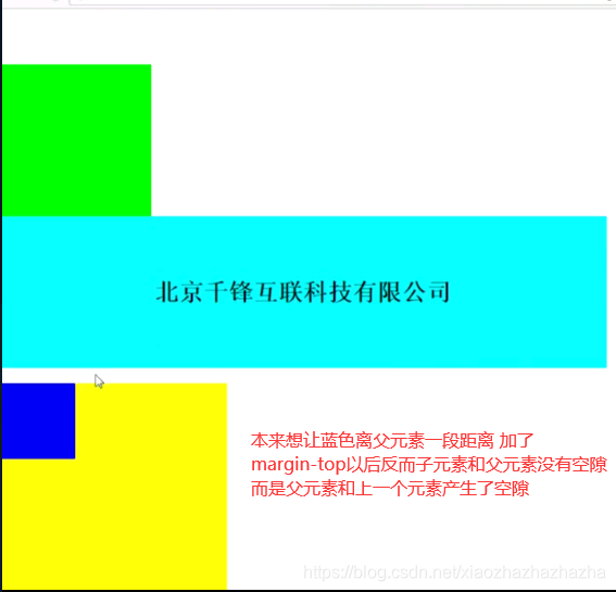
关于盒模型
<!DOCTYPE html>
<html>
<head>
<meta charset="utf-8">
<title></title>
<style type="text/css">
*{
margin: 0;}
.p1{
width: 210px;
height: 130px;
float: left;
margin-right: 20px;}
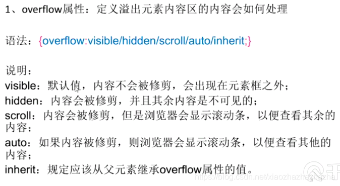
#box{
overflow: auto;
width: 750px;
margin: auto;
}
</style>
</head>
<body>
<div id="box">
<div class="p1" style="background: url(img/image_800.png);"></div>
<div class="p1" style="background: url(img/image_800.png);"></div>
<div class="p1" style="background: url(img/image_800.png);"></div>
</div>
</body>
</html>
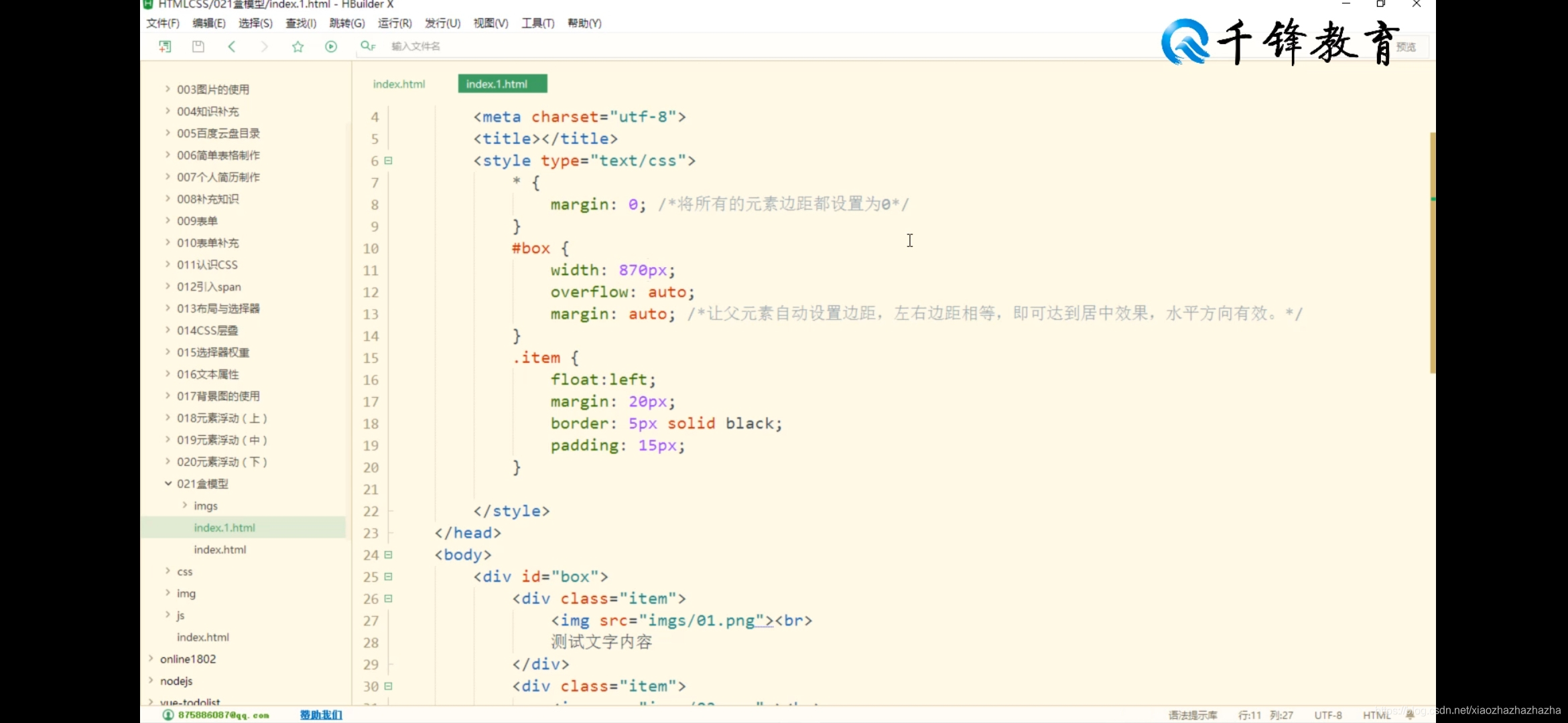
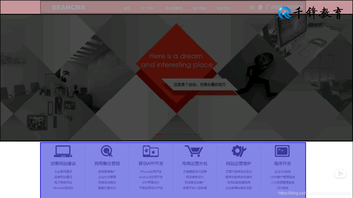

先判断每一个大小再填充 再把第一个容器的左填充去掉把最后一个容器的右填充去掉
<!DOCTYPE html>
<html>
<head>
<meta charset="utf-8">
<title></title>
<style>
*{
margin: 0;padding: 0;}
#header{
height: 50px;
background:#F74529 ;
}
#header .head{
width: 1005px;height:50px ;
background:blue;
margin: auto;
}
#banner{
height: 500px ;
background: blanchedalmond;
}
#category{
width: 1005px;
height: 200px;
margin: auto;background: aqua;
}
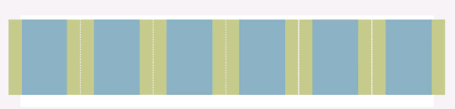
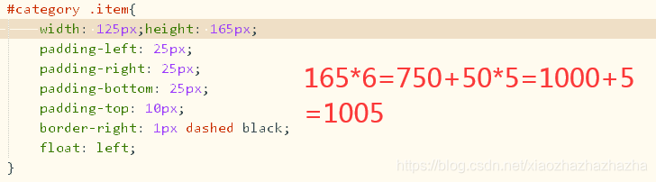
#category .item{
width: 125px;height: 165px;
padding-left: 25px;
padding-right: 25px;
padding-bottom: 25px;
padding-top: 10px;
border-right: 1px dashed black;
float: left;
}
#category .item.first{
/*注意空格的使用*/
padding-left: 0;
}
#category .item.last{
padding-right: 0;
border: 0;
}
#case{
height: 490px;
background: #eeeeee;
}
#case .title-text{
width: 1005px;
margin: auto;
padding-top: 20px ;
padding-bottom: 10px;
font-size: 45px;
}
#case .item-wrapper{
width: 1000px;
margin: auto;
overflow: auto;
}
#case .item-wrapper .item{
width: 320px;
height: 330px;
background: aquamarine;
float:left;
}
#case .item-wrapper .item.mg{
margin-left: 20px;
margin-right: 20px;
}
#case p{
width: 1005px;
margin-left: auto;
margin-right: auto;
margin-top: 15px;
height:40px; line-height: 40px;
text-align: center;
font-size: 30px;
color: dimgray;
}
</style>
</head>
<body>
<div id="header">
<div class="head"></div>
</div>
<div id="banner"></div>
<div id="category">
<div class="item first"></div>
<div class="item"></div>
<div class="item"></div>
<div class="item"></div>
<div class="item"></div>
<div class="item last"></div>
</div>
<div id="case">
<div class="title-text">
case
</div>
<div class="item-wrapper">
<div class ="item"></div>
<div class ="item mg"></div>
<div class ="item"></div>
</div>
<p>查看更多</p>
</div>
</body>
</html>

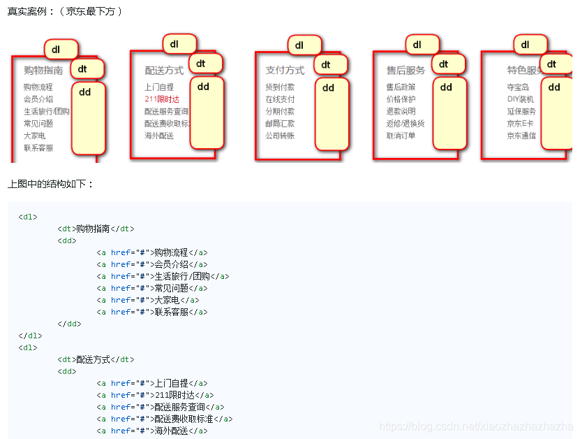
align与valign的用法
<!DOCTYPE html>
<html>
	<head>
		<meta charset="utf-8">
		<title></title>
	</head>
	<body>
		<table width="500px" height="300px"  border="1px"cellspacing="0"  cellpadding="" >
			<tr >
				<td align="right">1230</td>
				<td align="left">45612</td>
				<td align="center">456122</td>
			</tr>
			<tr>
				<td valign="bottom">7856</td>
				<td valign="center">123456</td>
				<td valign="top">1236</td>
			</tr>

		</table>
	</body>
</html>
2020.6.17
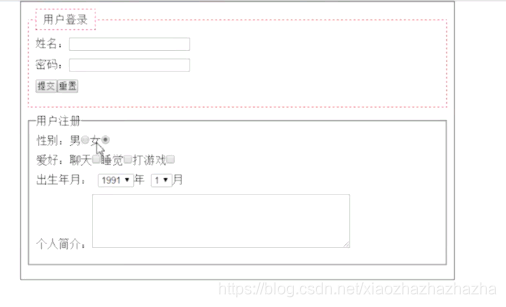
<p>性别:男<input type="radio" name="sex">女1<input type="radio" name="sex"></p>
<p>爱好:唱歌<input type="checkbox"name="like"> 跳舞<input type="checkbox"name="like"> 打游戏<input type="checkbox"name="like"></p>
<p>性别:男<input type="radio" name="sex" disabled="disabled">女1<input type="radio" name="sex"></p>
<p>性别:男<input type="radio" name="sex" checked="checked">女1<input type="radio" name="sex"></p>
<p>性别:男<input type="radio" name="sex" checked>女1<input type="radio" name="sex"></p>
<p>
			<select>
				<option>2001</option>
				<option>2002</option>
				<option>2003</option>
			</select>
			年

		</p>
<p>个人简介: <textarea cols="20" rows="5" ></textarea></p>
<link rel="stylesheet" type="text/css" href="new_file.css">
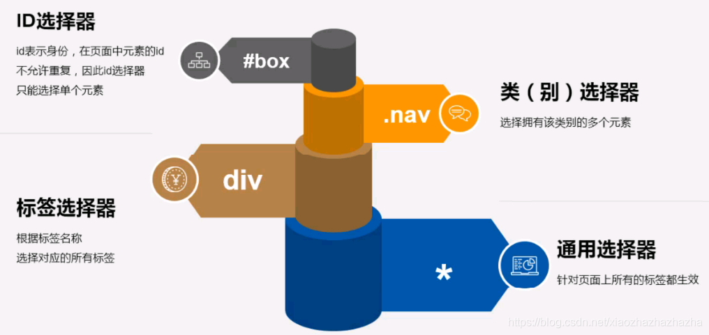
class 可以用多个
id只能作用于1个
<!DOCTYPE html>
<html>
<head>
<meta charset="utf-8">
<title></title>
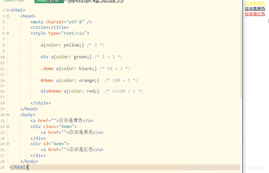
<style>
.box,h1,#fox{
width:600px;
height: 50px;
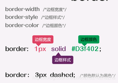
border: 5px #000 dashed;
}
.box{
background-color: #0ff;}
h1{
background-color: #FF0000;}
#fox{
background-color: antiquewhite;}
</style>
</head>
<body>
<div class="box">hahahah</div>
<h1>hahaha</h1>
<p id="fox">hahahah</p>
</body>
</html>
<!DOCTYPE html>
<html>
	<head>
		<meta charset="utf-8">
		<title></title>
		<style>
			a{

    color: aqua;}
			a:hover{

    color: coral;}
		</style>
	</head>
	<body>
		<h1><a href="#">hahahah</a></h1>
	</body>
</html>

2020 6.20
这几天准备期末考了 就回顾回顾 不学新的了
https://github.com/qianguyihao/Web/blob/master/01-HTML/03-%E5%88%9D%E8%AF%86HTML.md
vscode无法写入文件的问题https://www.cnblogs.com/qjuly/p/12091058.html
百度前端学院http://ife.baidu.com/course/all
2020.6.28
lorem用法
2020.7.8
全考完了
居然都一个月了 时间过得好快啊
对应视频
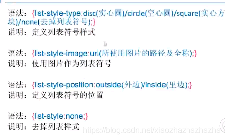
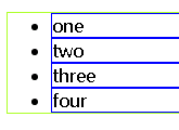
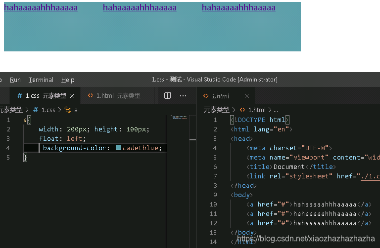
p289列表属性
<!DOCTYPE html>
<html lang="en">
<head>
  <meta charset="UTF-8">
  <meta name="viewport" content="width=device-width, initial-scale=1.0">
  <title>Document</title>
  <link rel="stylesheet" href="./1.css">
</head>
<body>
  <ul>
    <li>one</li>
    <li>two</li>
    <li>three</li>
    <li>four</li>

  </ul>
</body>
</html>
ul li{


    list-style-image:url(./image_933.png);
}

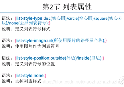
ul和li都加上边框时
ul li{


    border: 1px blue solid;
}
ul{


    border: 1px greenyellow solid;
}
加上*{margin: 0;padding: 0;}时 前面的点点没有了 但是这时候想让小黑点出来怎么办呢
ul li{


    border: 1px blue solid; list-style-position: inside;
}
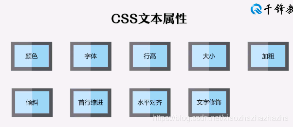
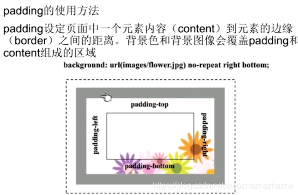
p290背景属性
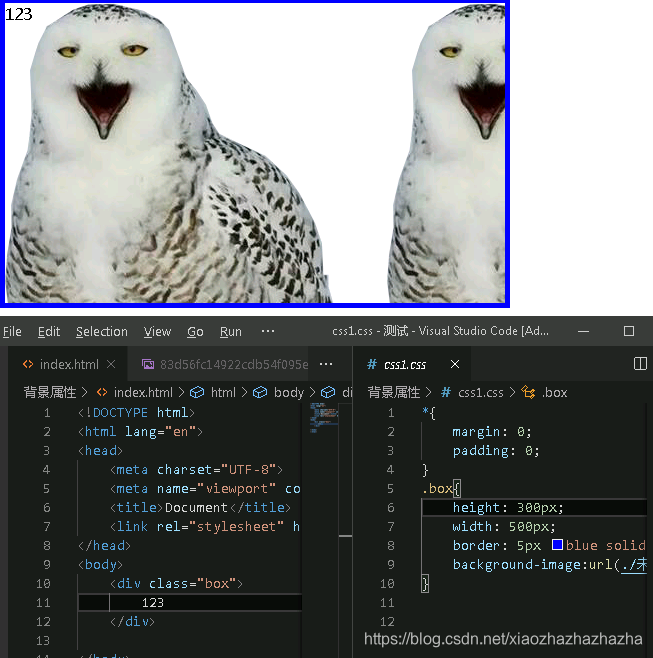
背景图片和插入图片的区别
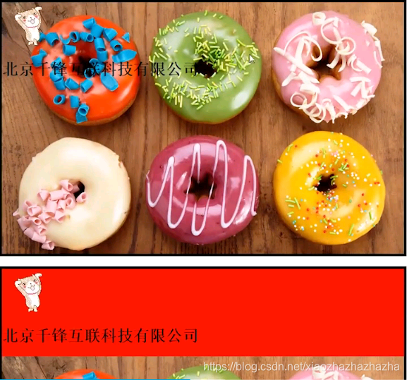
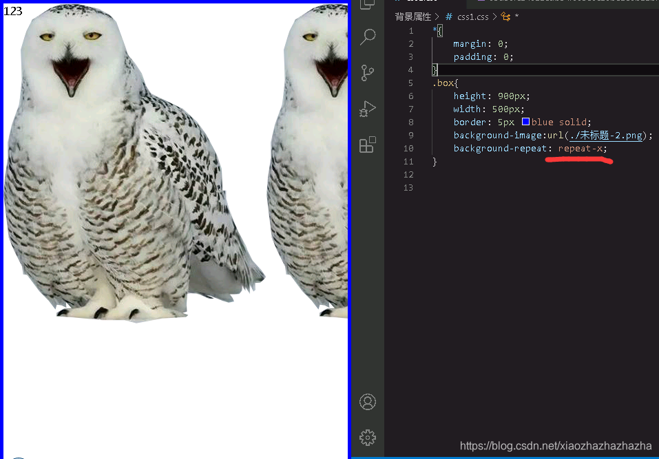
background-position 在容器位置
background-position:水平 垂直
background-position:50px 50px;
右下角
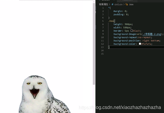
可以缩减为最后一行的样子
.box{


    height: 900px;
    width: 500px;
    border: 5px black;
    background-image:url(./未标题-2.png);
    background-repeat:no-repeat;
    background-position: right bottom;
    background-color: #fafafa;
    background: #fafafa url(./未标题-2.png) no-repeat right bottom;
}
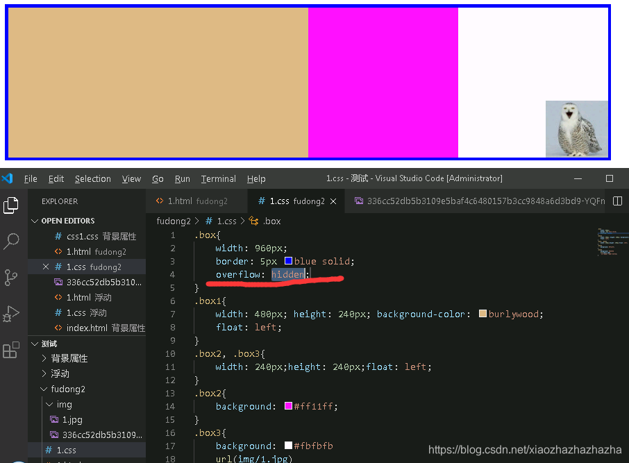
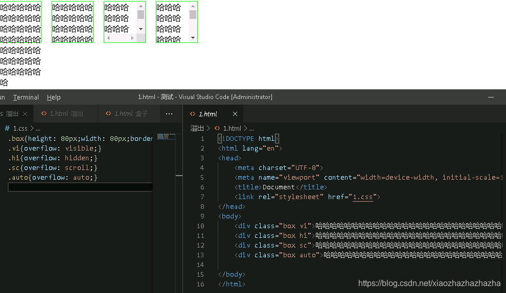
p291浮动属性

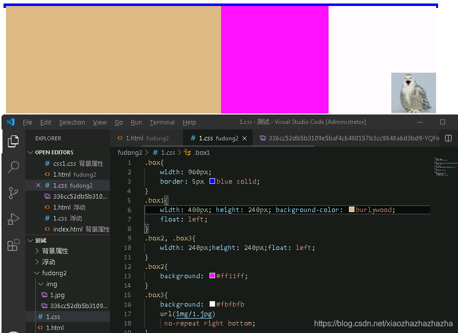
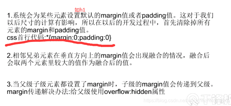
边框的高度没有了 因为都浮动了(高度塌陷)
方法1:给父元素添加声明overflow:hidden
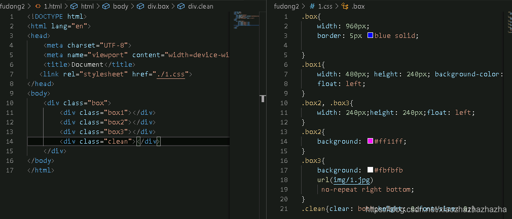
方法2:在浮动元素下方添加空div 并给该元素添加声明:clear:both;height:0;overflow:hidden(或font-size:0)
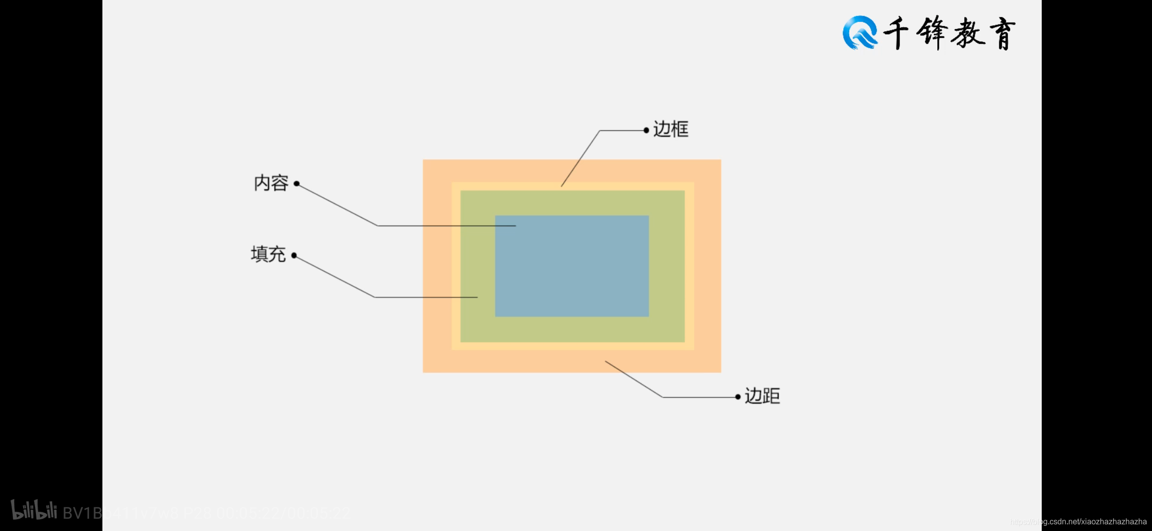
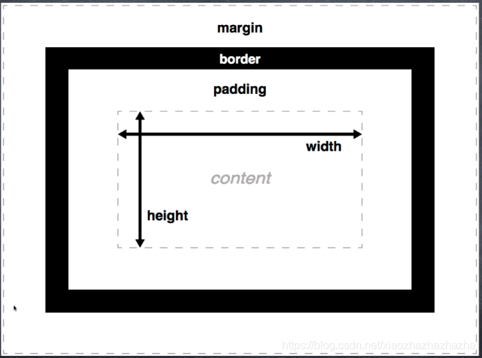
p292-293盒子模型
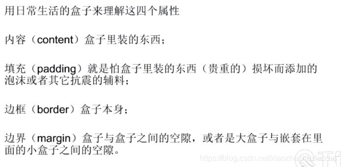
只围三面 可以先围4面再把另外一面设为none
关于组合式写法


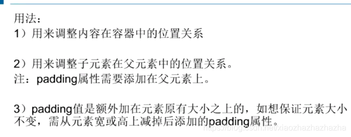
padding加上去会破坏盒子原有的结构 因此如要添加padding 则需要先计算好
关于第三点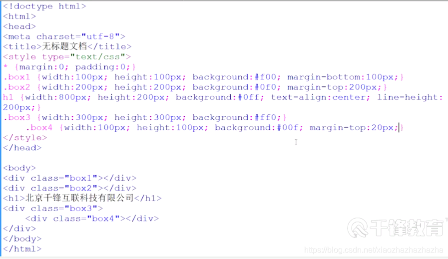
2020.7.9
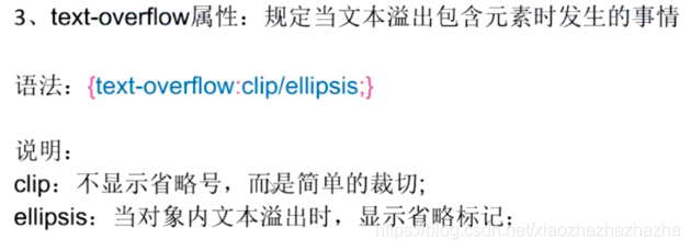
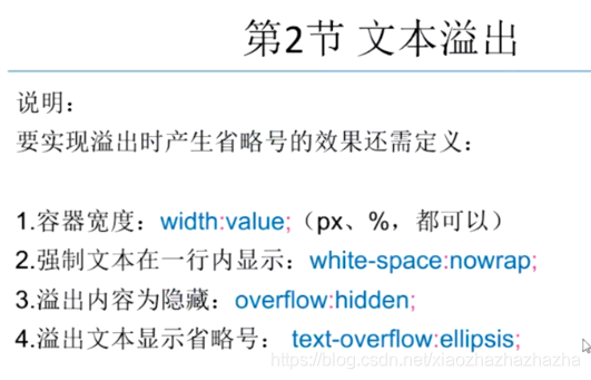
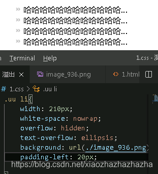
p294-295文本溢出
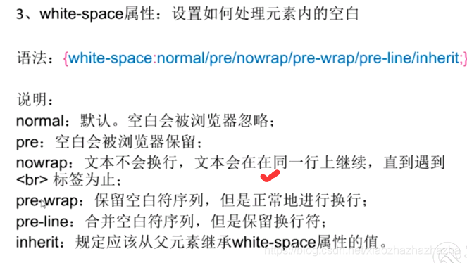

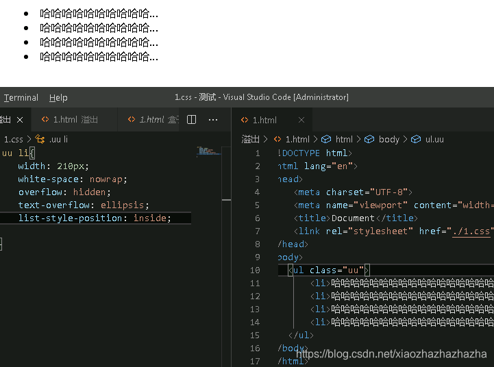
没有list-style-position:inside作用是把隐藏的点放到里面
现在不用点 用背景图代替前面的点
background 图片 no-repeat(背景图只剩一个) left 50% 靠右 垂直方向居中(不管字号多大 都可以上下居中)
padding-left:20px (防止背景图和图片重叠)
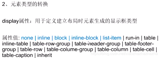
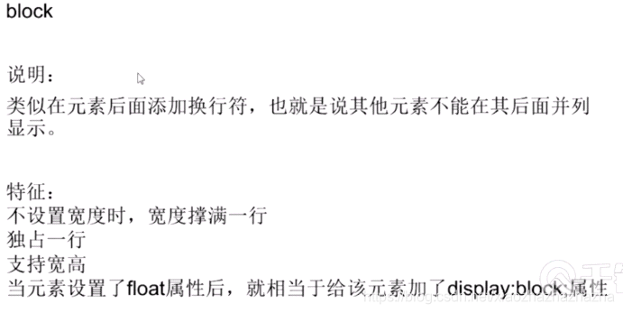
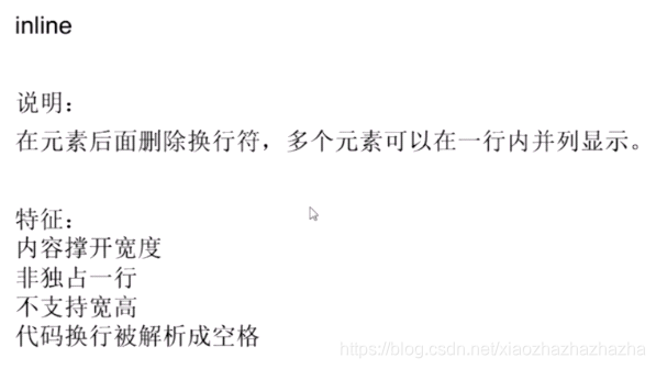
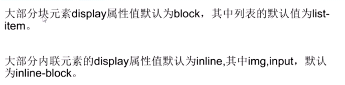
p296-297元素类型
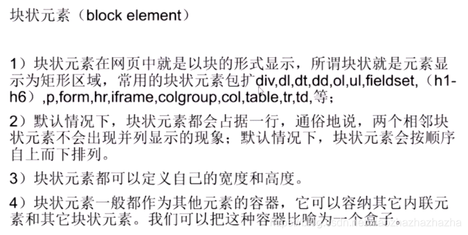
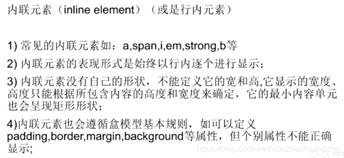
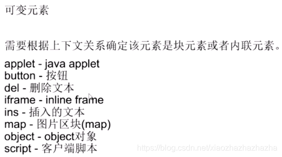

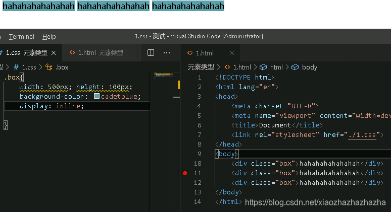
display:inline-block兼具上面两个特性
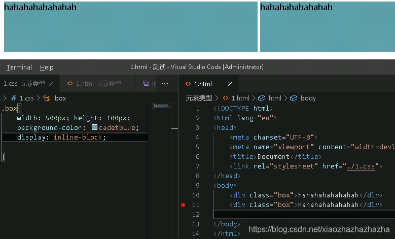
默认有这种属性值的有图片 input
display:none 隐藏
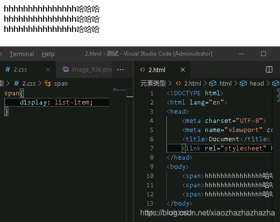
span本来应该横着排的 现在加了display:list-item 以后就竖着了 变成了列表
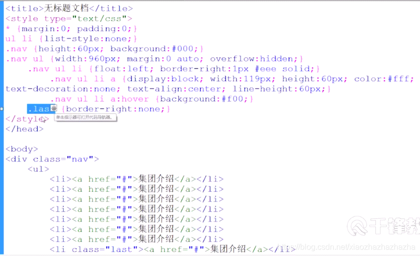
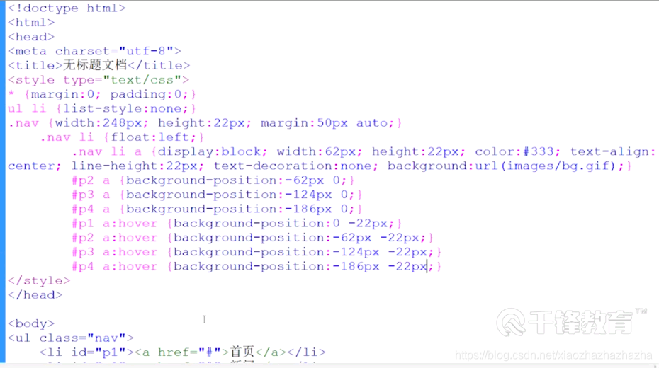
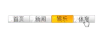
导航条的制作
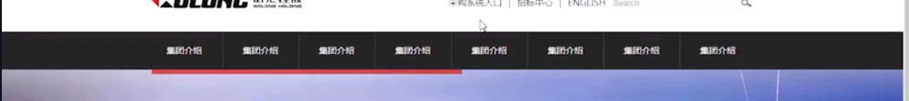
设一个div
总的margin padding去掉
定义盒子背景颜色和高
li的list-style 去掉
ul块元素 定义宽度960px 背景色(为了注意高度塌陷问题) margin:0 auto 在父元素左右居中 因为li在浮动会产生高度塌陷问题 应overflow:hidden
个li从上往下排 应浮动从左往右排 会发现ul背景色没有了 (高度塌陷)
设置a的颜色 去掉下划线
鼠标移上去a的背景色(颜色只在字的后面出现)给它加宽高就要在a里加display:block
a的高为60宽为120px 垂直水平居中
按钮和按钮之间有一根线 在li里面加右边框 所以a的宽度就变成了119
把最后一根线去掉 如果直接,last的话没有效果 权重问题 li.last注意没有空格
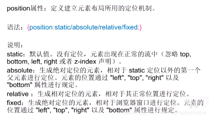
p296元素定位
自录视频
不知道为什么尺寸那么小
2020.7.10
p298元素的定位
接昨天
absolute相对父元素
relative 相对自己
z-index改变层叠关系
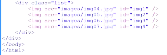
p299定位锚点
用锚点链接做一个简单的轮播图

<!DOCTYPE html>
<html lang="en">
<head>
    <meta charset="UTF-8">
    <meta name="viewport" content="width=device-width, initial-scale=1.0">
    <title>Document</title>
    <link rel="stylesheet" href="./1.css">
</head>
<body>
    <div class="box">
        <div class="btn">
            <a href="#img1">1</a>
            <a href="#img2">2</a>
            <a href="#img3">3</a>
        </div>
        <div class="list">
            <img src="./img/1.png" id="img1">
            <img src="./img/2.png" id="img2">
            <img src="./img/3.png" id="img3">
        </div>
    </div>

</body>
</html>
.box{


    width: 225px;
    height: 225px;
    border: 1px black solid;
    position: relative;
}
    .btn{


        position: absolute;
        bottom: 0;
        right: 0;

    }
    .list{


        width: 225px; height: 225px;
        overflow: hidden;
    }
        a{


            float: left;
            width: 30px; height: 30px;
            background: rgba(0, 0, 0, .5);
            margin-right:5px;
            text-align: center;
            color: blanchedalmond;
        line-height: 30px;
        }
        a:hover{


            background-color: black;
        }

img{


    display: block;
}
思路
html
box 包含 btn(按钮123)和list(图片123)
css
总的margin0 padding0 img display block
先把总体移到屏幕中间 box加边框 宽度为图片宽度225px
超链接改变样式:去掉下划线 加背景需要宽高(float) 背景色黑色透明 字体颜色 三个块之间的宽度 文字居中
把三个按钮放到右下角 box:btn position变成absolute right 0 bottom 0 box变成relative
box高度变成图片高度 会发现其他两张图片在框框外面
再改变list高度 并把overflow设成hidden 隐藏那两张图片
p300图片整合
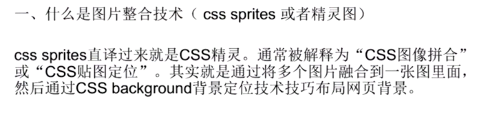
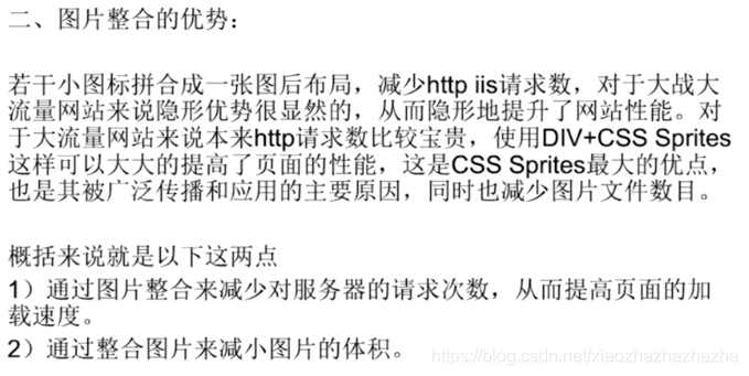

用一张图片就可以产生这种效果
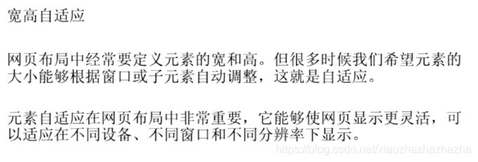
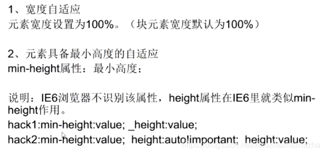
p301宽高自适应

p302浏览器兼容


2020.7.11今天写昨天的几个实例
1导航条 2轮播图 3图片整合
导航条的制作
简易轮播图
2020.7.12
p303表单表格高级
p304html5新增标签

2020.7.13
这几天有课程设计 再放一放
2020.7.19
报告写完啦 用c语言做了一个通讯录管理系统。
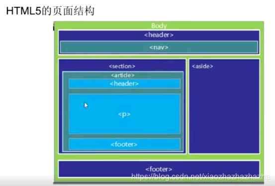
把上次的html5新增标签重新看一遍吧
更改前
更改后

2020.7.11
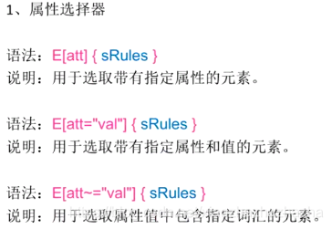
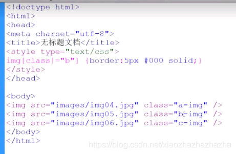
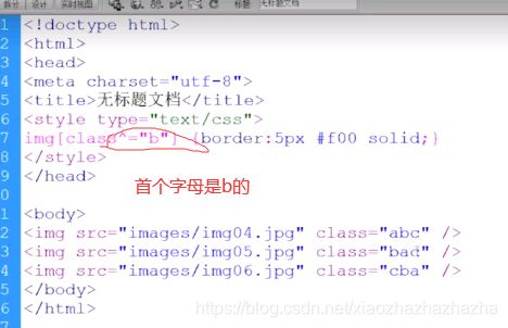
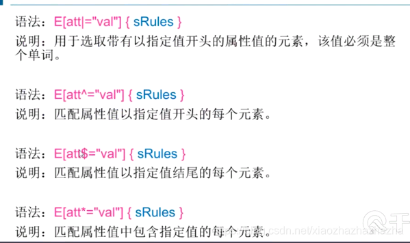
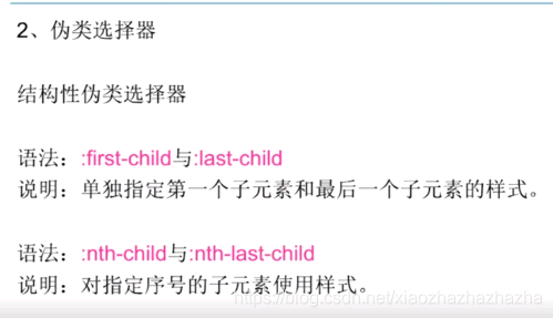
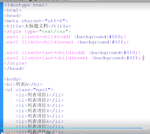
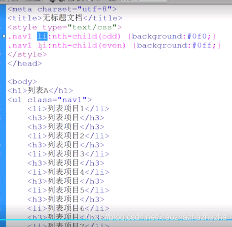
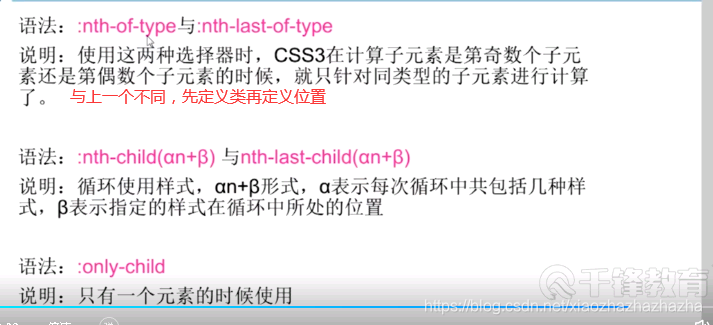
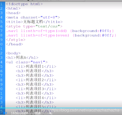
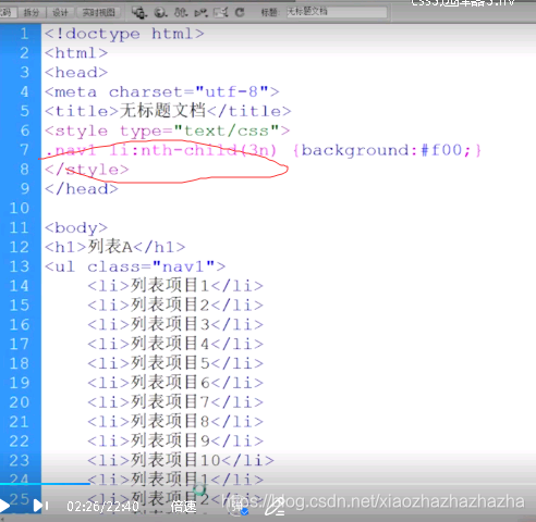
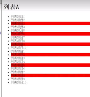
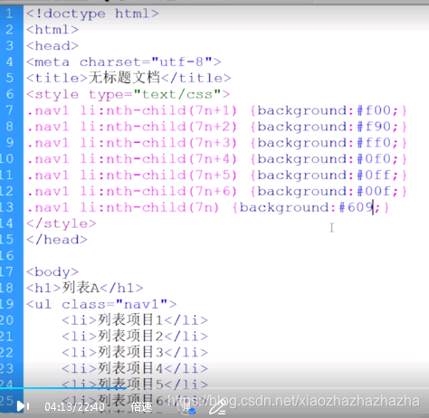
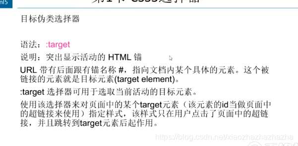
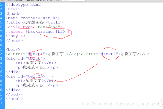
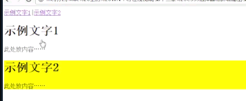
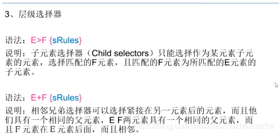
p305-307 CSS3选择器

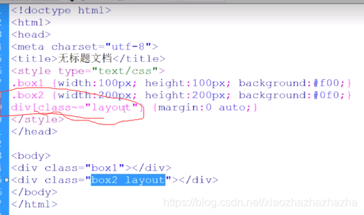

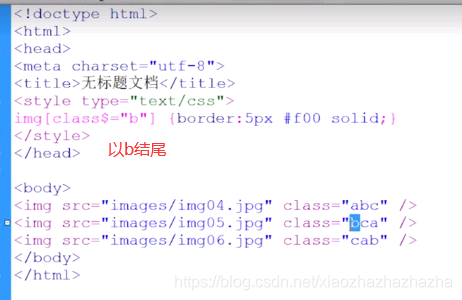
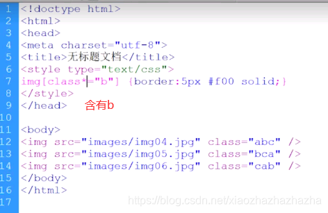
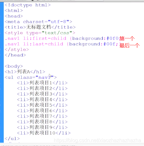
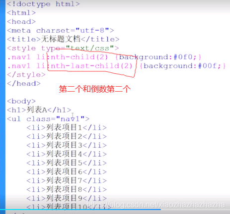
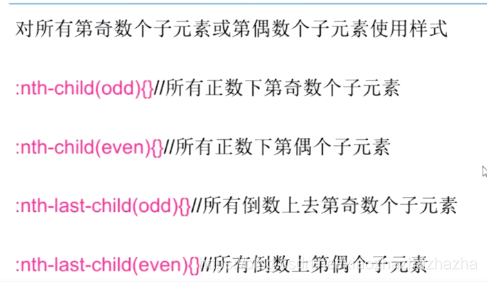

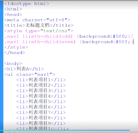
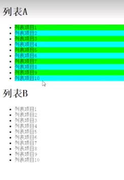
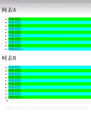
每个li后面都隔了个h3
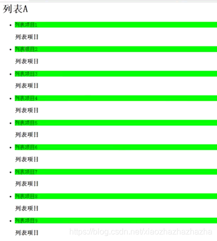
会发现偶数没有效果
这是因为ul里面把所有元素都编号 h3为偶数项,但是不是li所以不起作用,只有奇数行起作用。
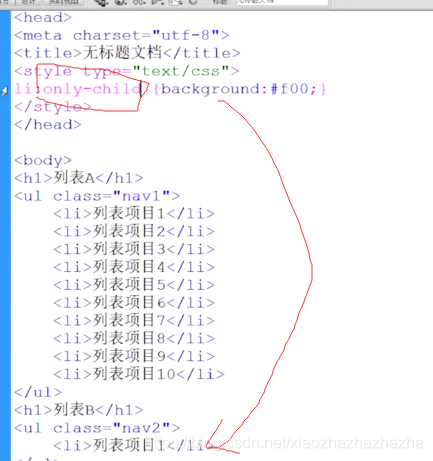
不受h3的影响
彩虹
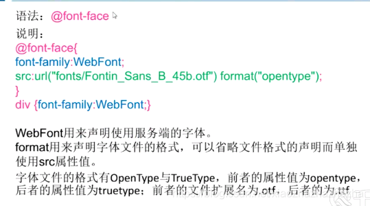
p308 服务器端字体
<!DOCTYPE html>
<html lang="en">
<head>
    <meta charset="UTF-8">
    <meta name="viewport" content="width=device-width, initial-scale=1.0">
    <title>Document</title>
    <link rel="stylesheet" href="./1.css">
</head>
<body>
    <p>由于温燥的杀伤力不强,所以肺病轻浅,会出现微微头痛、发烧不严重,微恶风寒的轻症。同时因为是燥邪为患,肺先受之,燥性干涩,伤及津液,就会出现咳嗽无痰或者痰少而黏、口渴咽干的情况。
        此时表现出的都是燥症,所以温热辛散的鸡汤和生姜汤都不适合服用了,用了以后不但不会有疗效,反而会加重燥热的症状。此时来碗清热润燥的桑杏汤,真是再适合不过了。
        桑杏汤:桑叶、象贝、香豉、栀皮、梨皮各3g,杏仁4.5g,沙参6g。水煎服,大火烧开,小火10分钟即可。
        </p>

</body>
</html>
@font-face{


    font-family: webfont;
    src: url(./fonts/禹卫书法行书简体.TTF) format("truetype");
}
body{


    font-family: webfont;
}
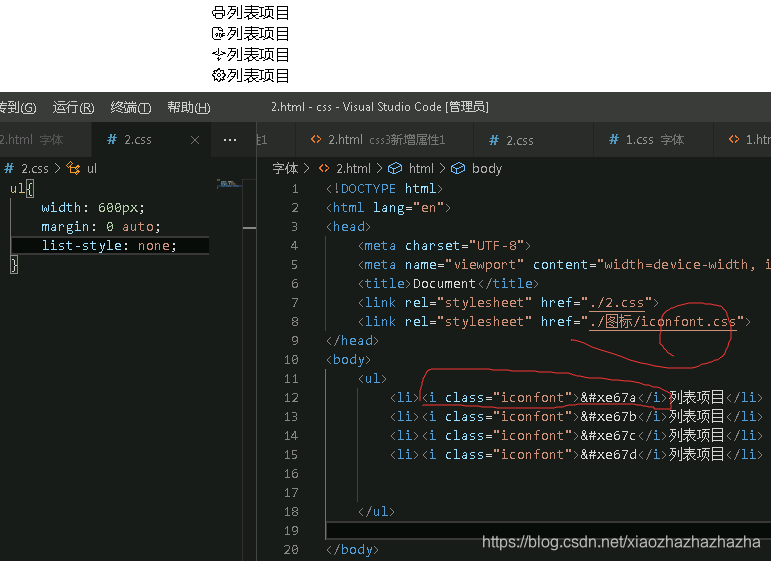
改变大小
 <style>
        .iconfont{

    font-size: 36px;}
    </style>
.iconfont:hover{

    font-size: 40px;}
2020.7.21
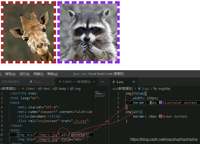
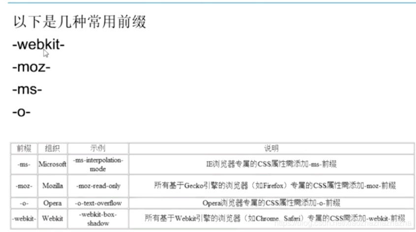
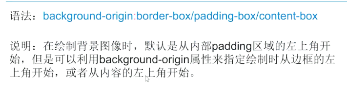
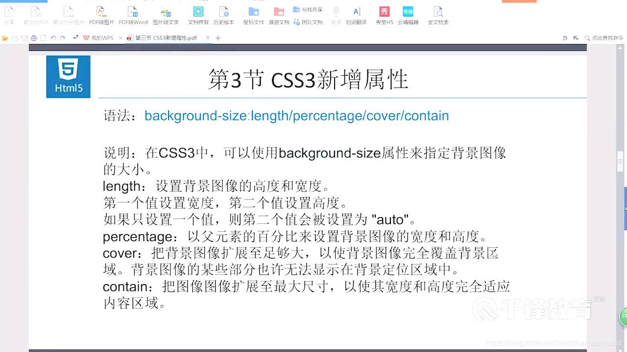
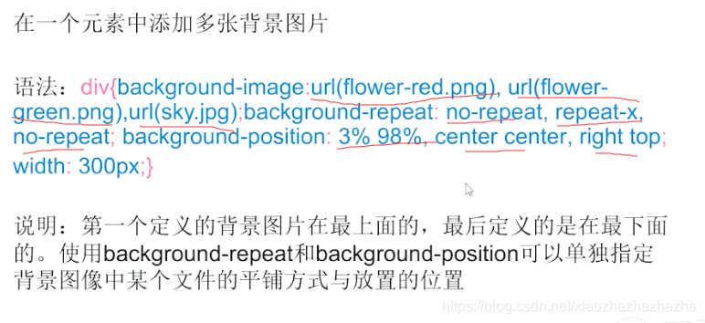
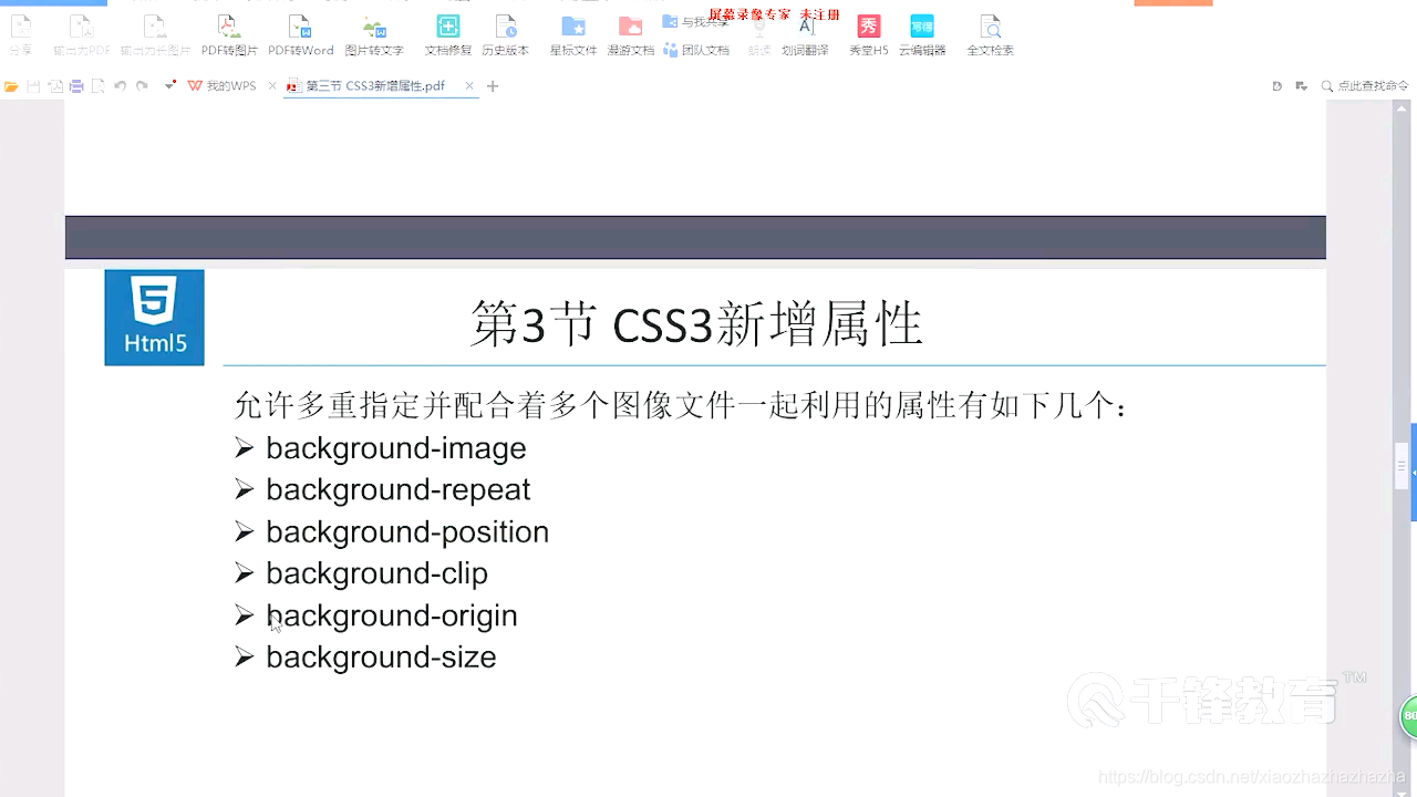
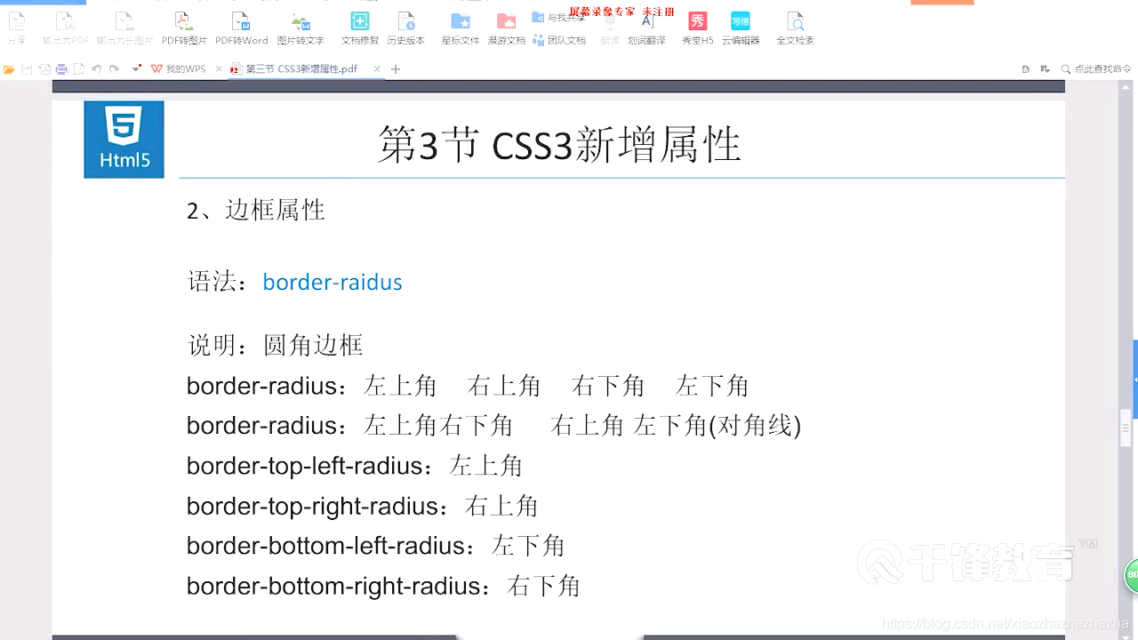
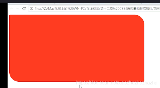
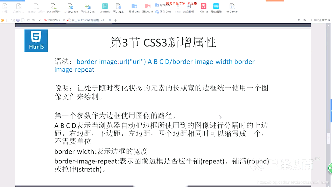
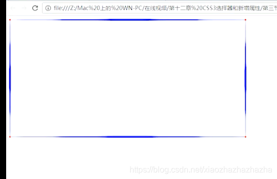
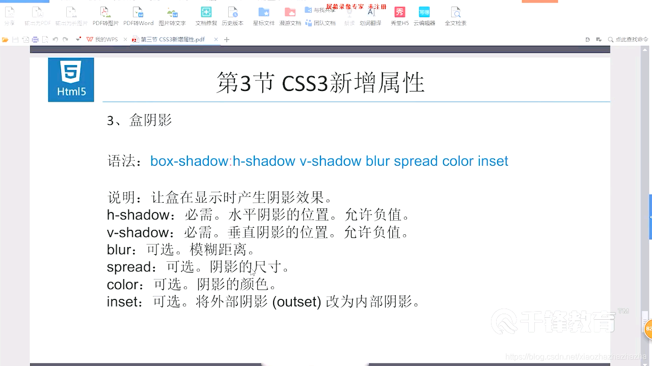
p309 css3新增属性


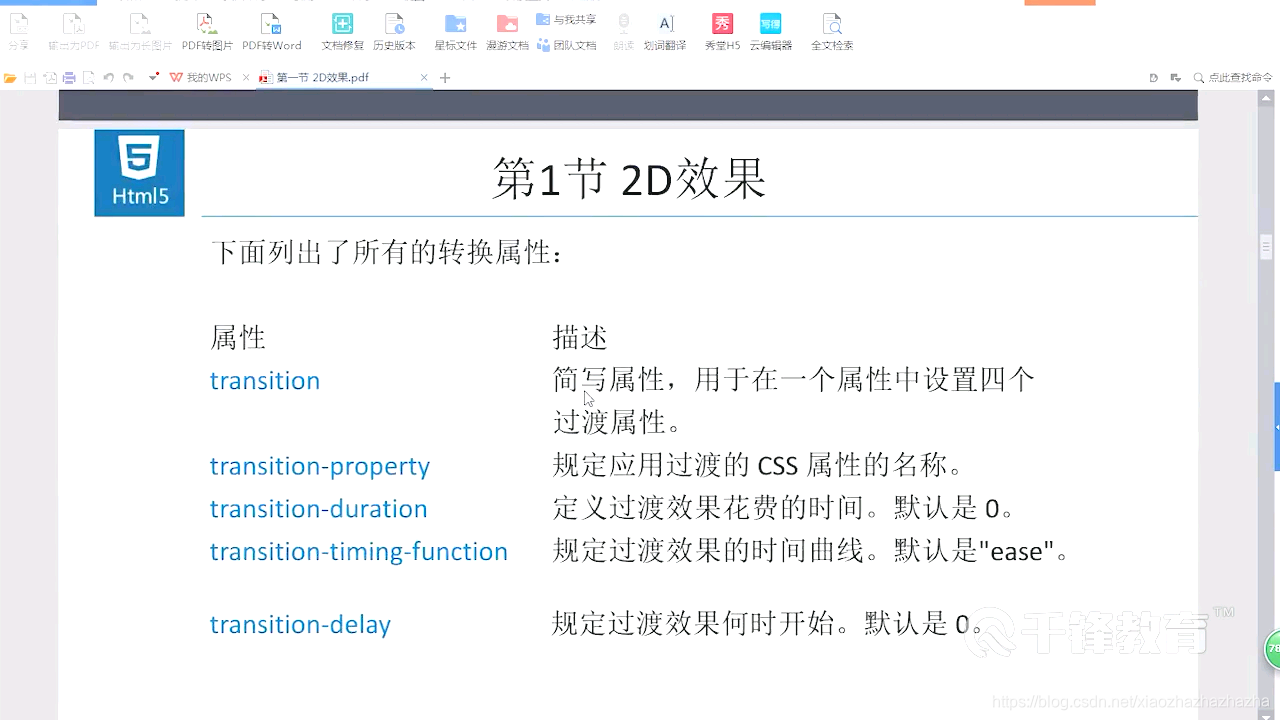
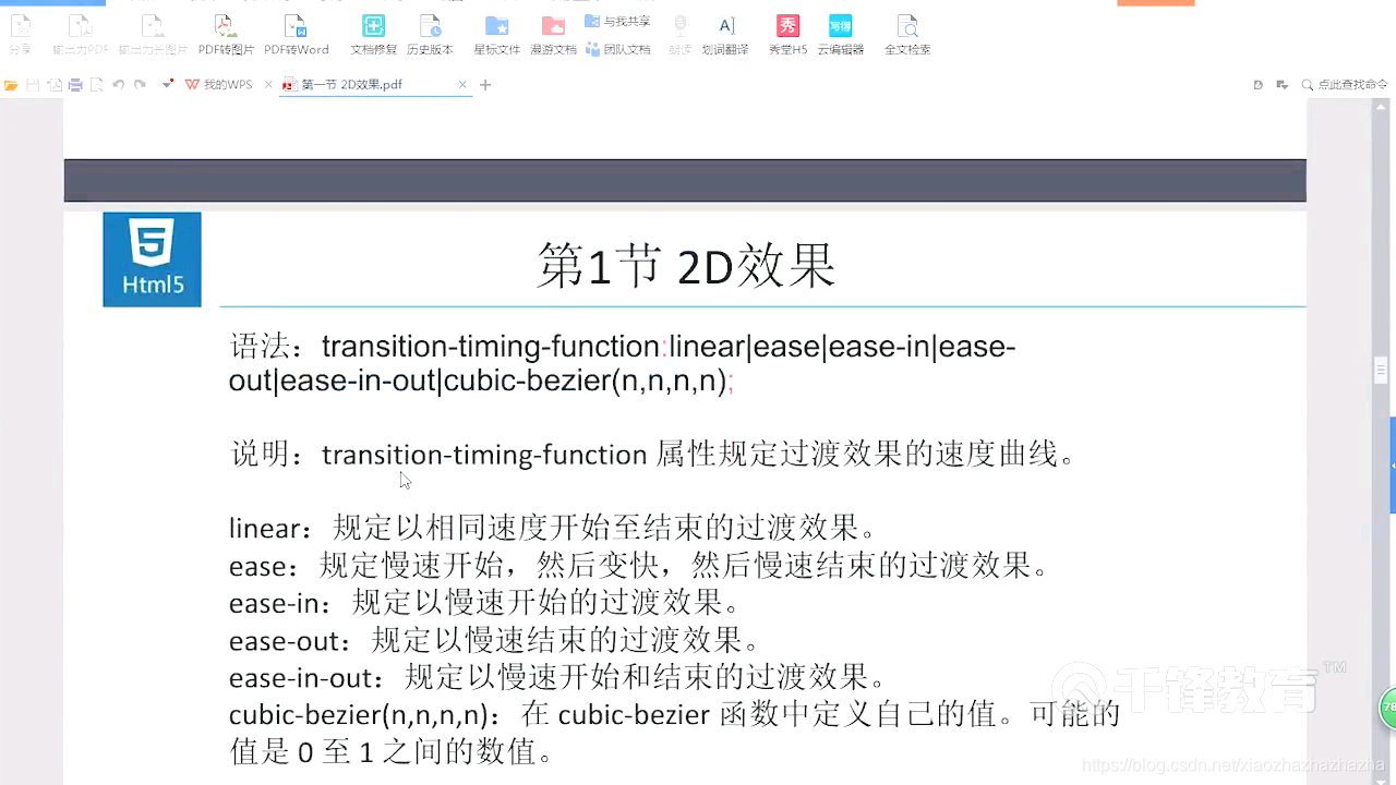
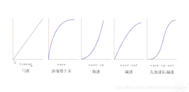
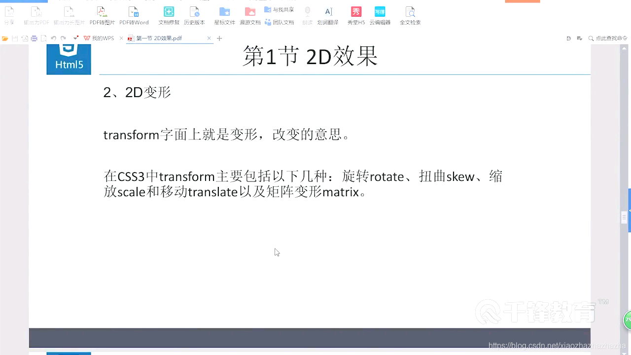
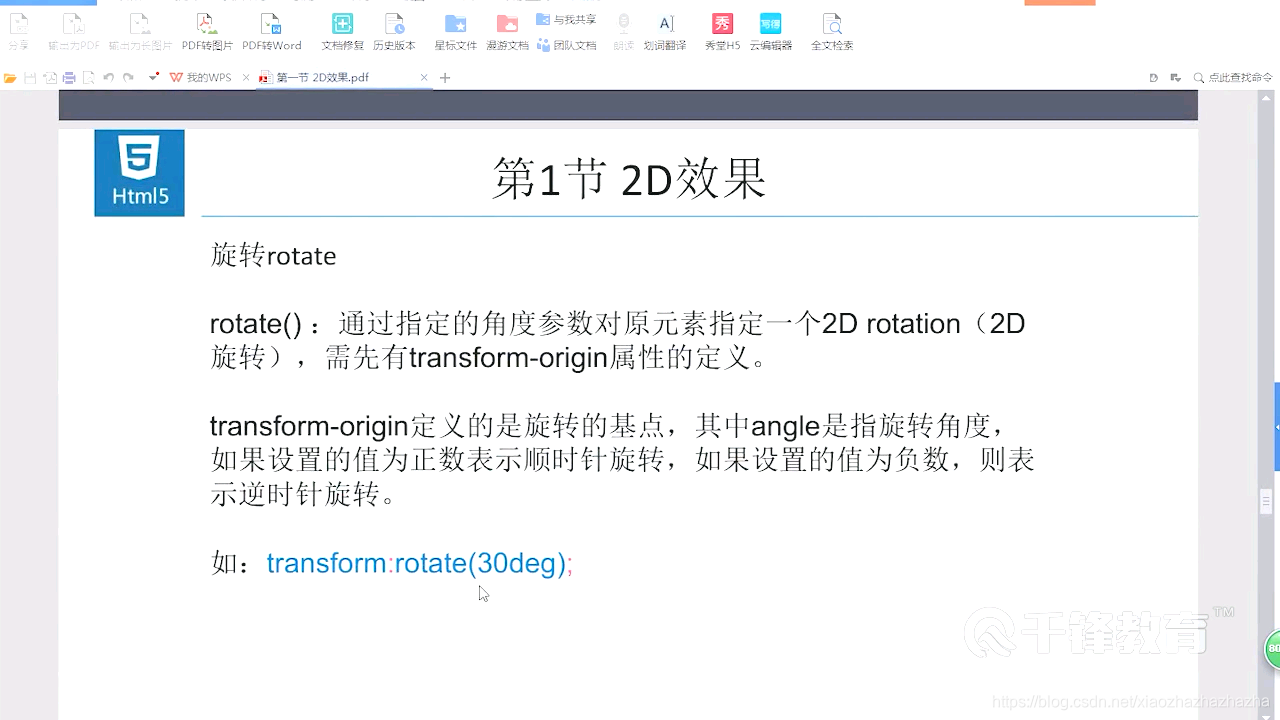
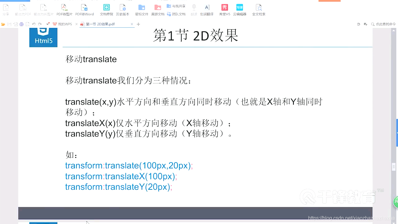
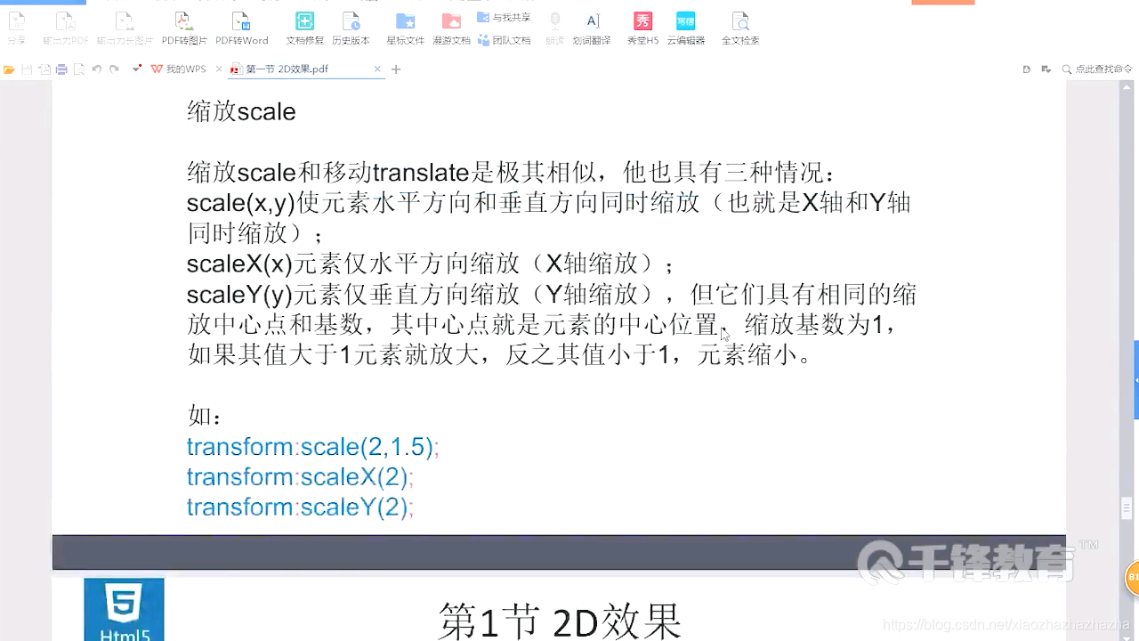
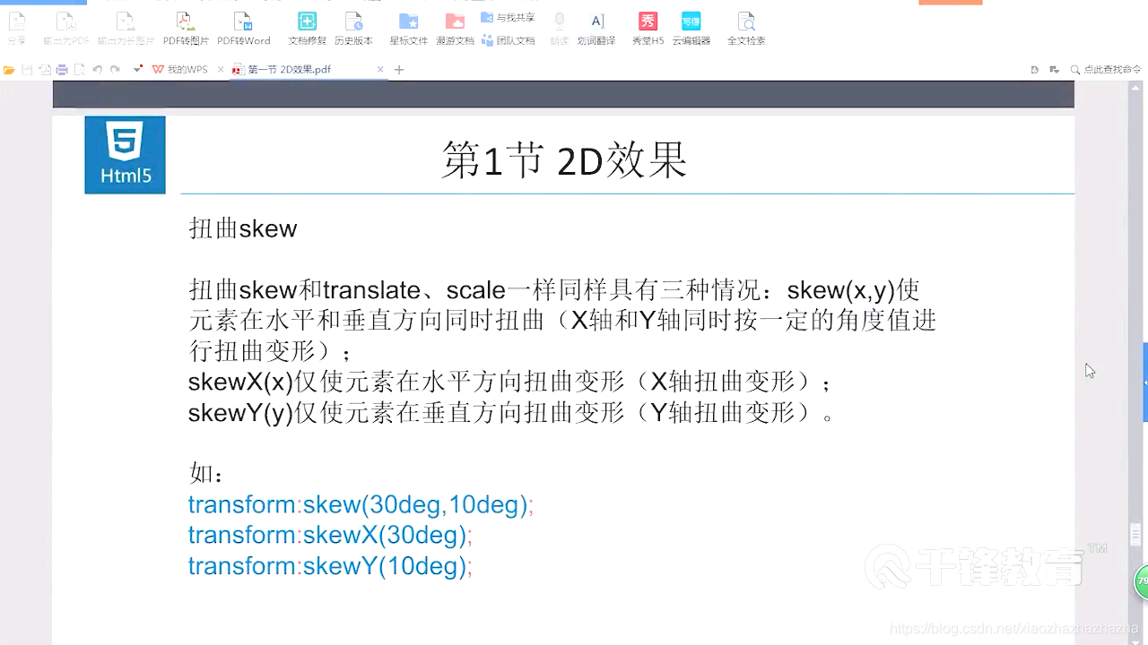
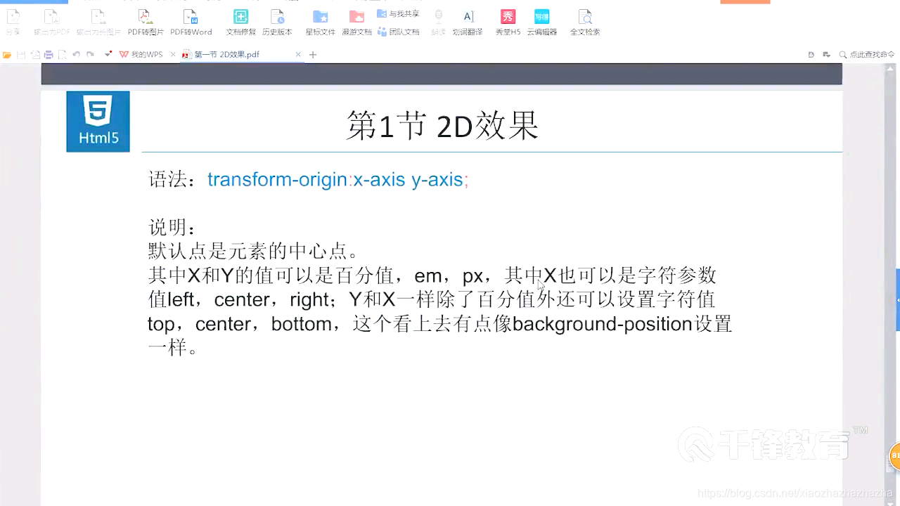
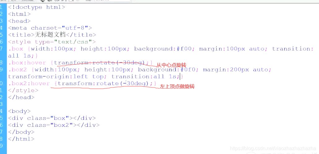
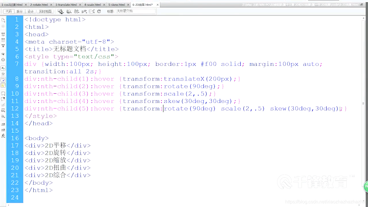
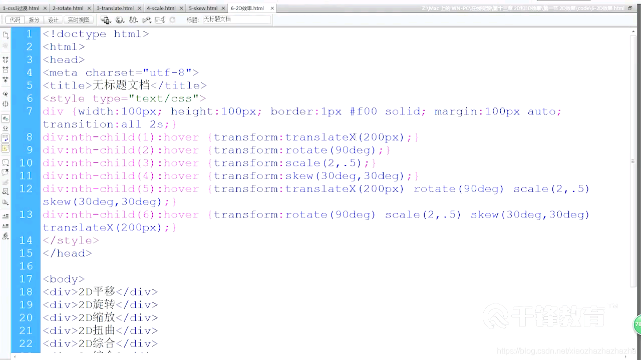
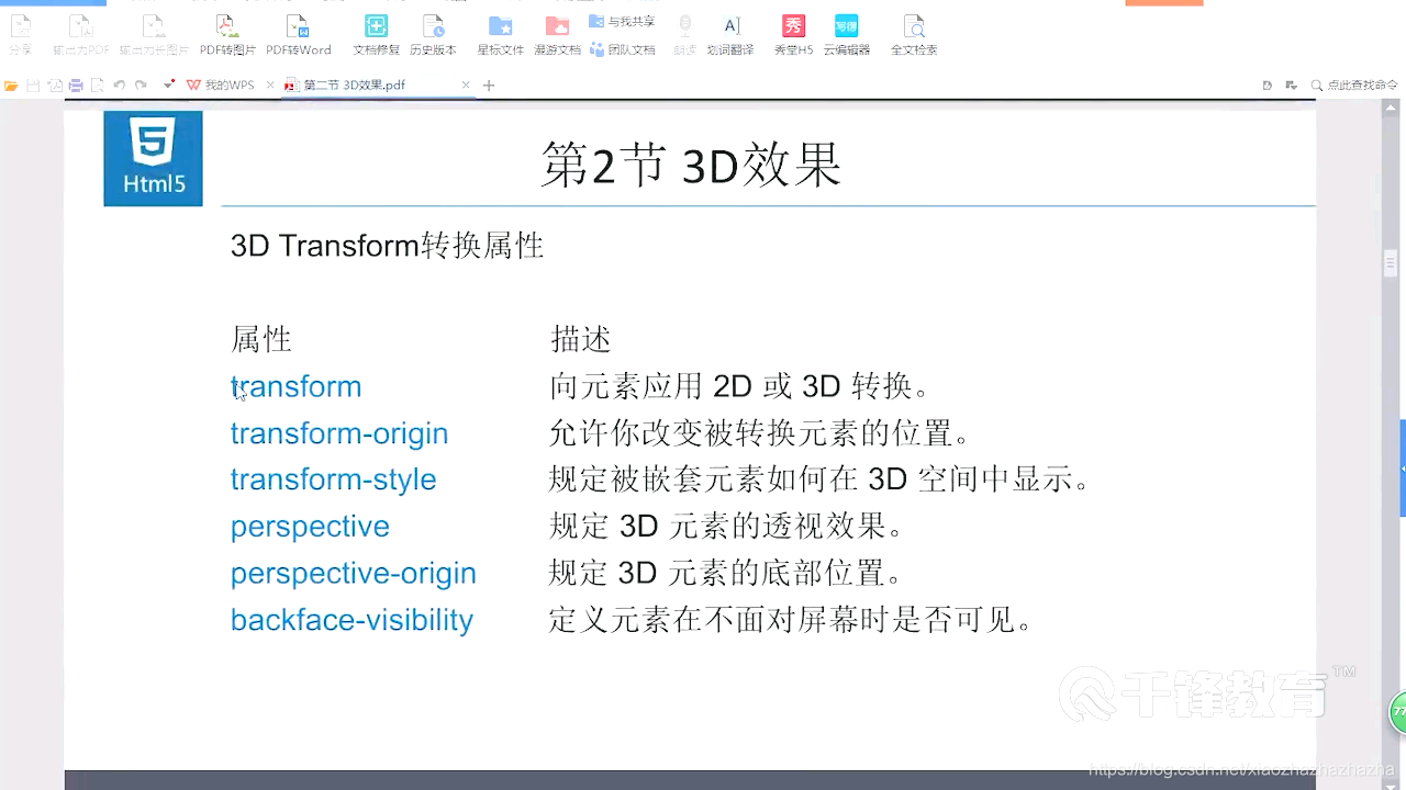
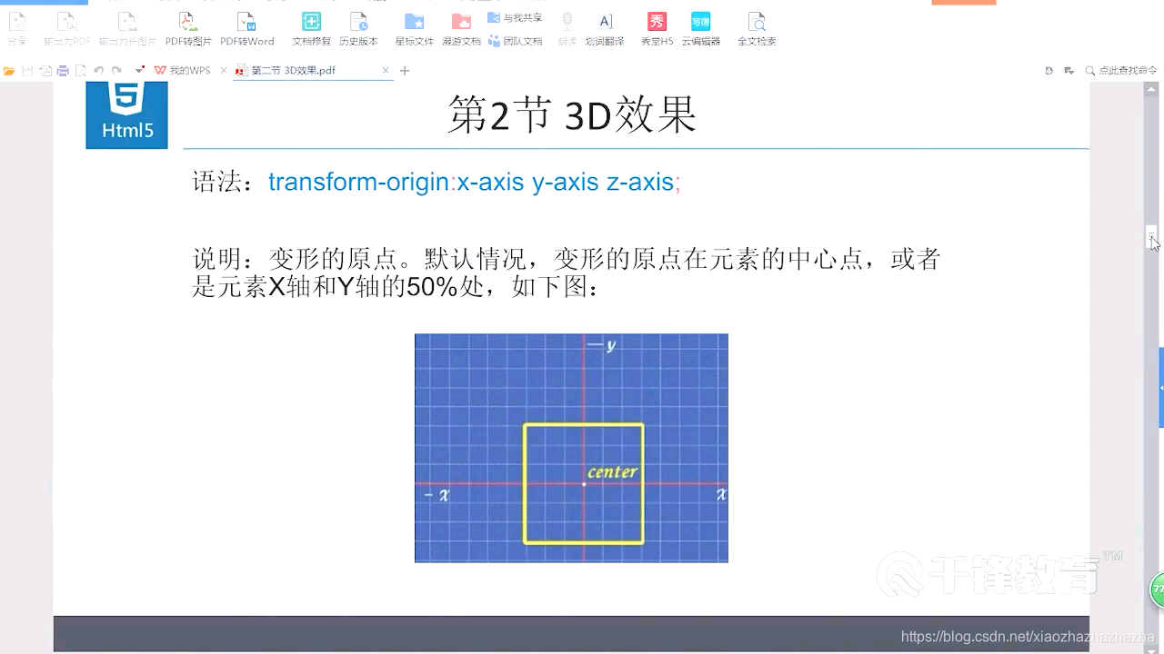
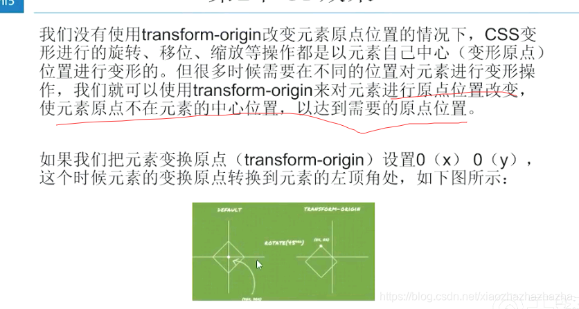
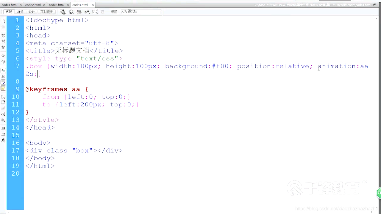
p310-311 2d效果

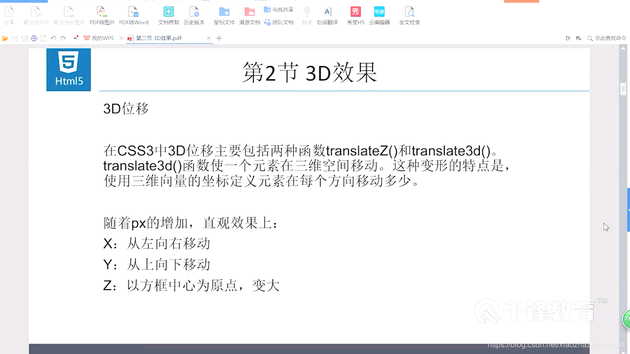
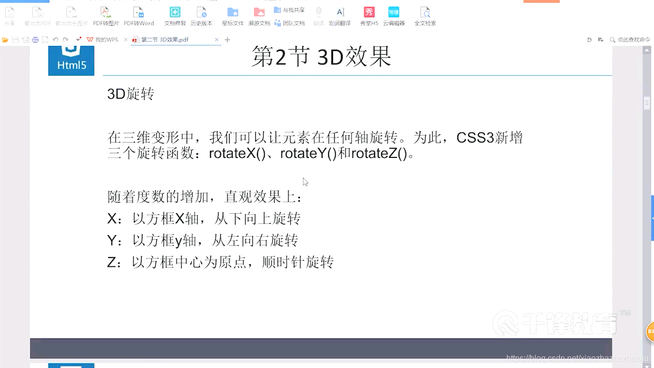
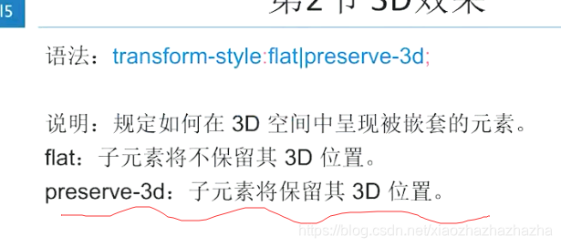
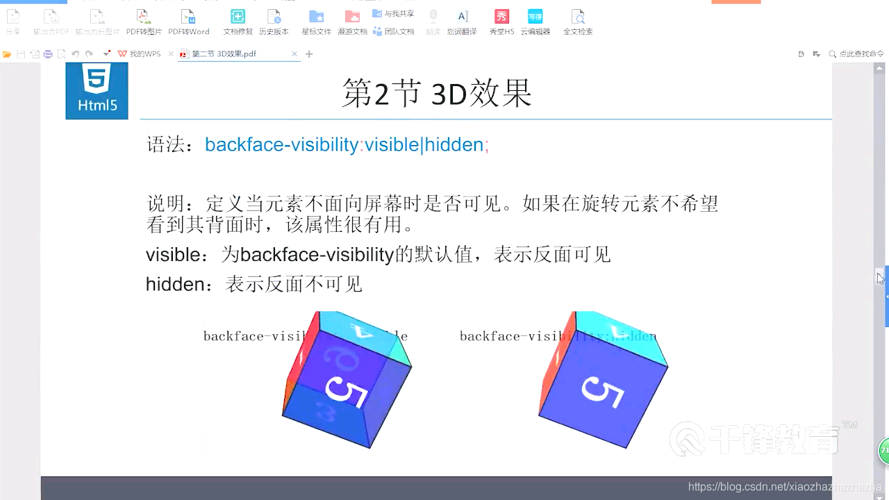
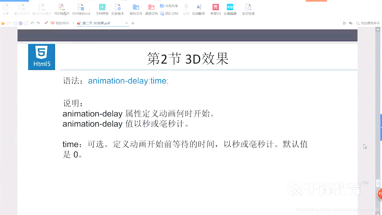
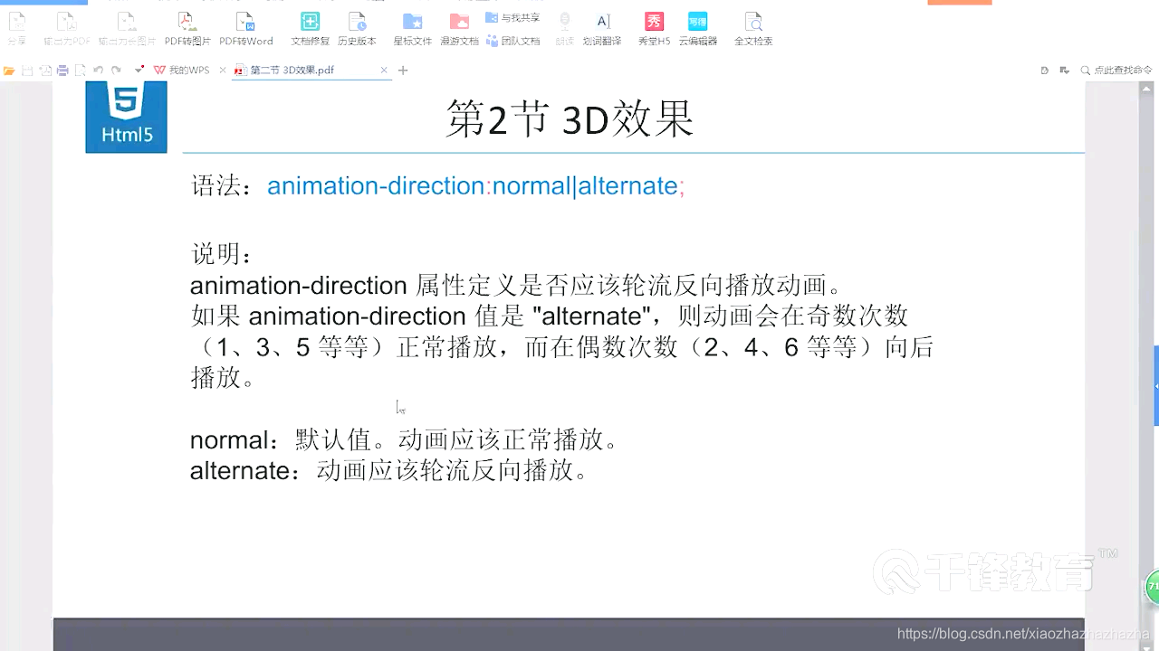
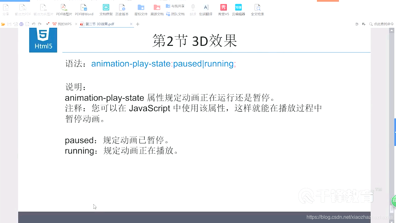
p312-313 3d效果


2020.7.23
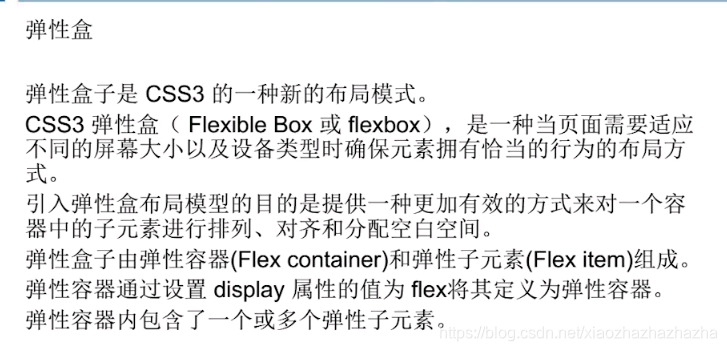
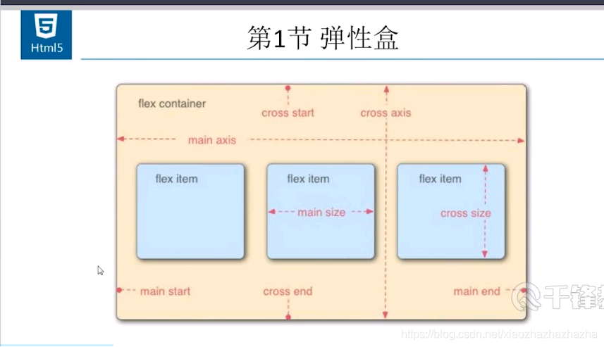
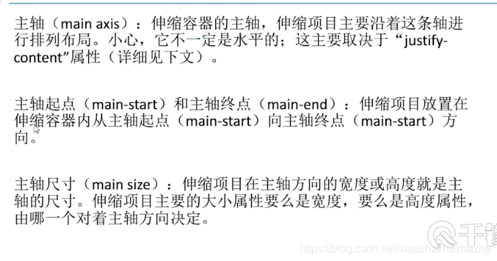
p314 弹性盒1
我决定看另外一个视频 是加百利老师讲的。看视频的同时也当做是在复习了