样式色彩
matplotlib的绘图样式style
在matplotlib中,要想设置绘制样式,最简单的方法是在绘制元素时单独设置样式。 但是有时候,当用户在做专题报告时,往往会希望保持整体风格的统一而不用对每张图一张张修改,因此matplotlib库还提供了四种批量修改全局样式的方式
matplotlib预先定义样式
matplotlib贴心地提供了许多内置的样式供用户使用,使用方法很简单,只需在python脚本的最开始输入想使用style的名称即可调用,尝试调用不同内置样式,比较区别
import matplotlib as mpl
import matplotlib.pyplot as plt
import numpy as np

plt.style.use('default')
plt.plot([1,2,3,4],[2,3,4,5])

plt.style.use('ggplot')
plt.plot([1,2,3,4],[2,3,4,5])

⭐那么matplotlib究竟内置了那些样式供使用呢?总共以下26种丰富的样式可供选择。
print(plt.style.available)

#['Solarize_Light2', '_classic_test_patch', 'bmh', 'classic', #'dark_background', 'fast', 'fivethirtyeight', 'ggplot', 'grayscale', #'seaborn', 'seaborn-bright', 'seaborn-colorblind', 'seaborn-dark', 'seaborn-#dark-palette', 'seaborn-darkgrid', 'seaborn-deep', 'seaborn-muted', 'seaborn-#notebook', 'seaborn-paper', 'seaborn-pastel', 'seaborn-poster', 'seaborn-#talk', 'seaborn-ticks', 'seaborn-white', 'seaborn-whitegrid', 'tableau-#colorblind10']
用户自定义stylesheet
在任意路径下创建一个后缀名为mplstyle的样式清单,编辑文件添加以下样式内容
axes.titlesize : 24
axes.labelsize : 20
lines.linewidth : 3
lines.markersize : 10
xtick.labelsize : 16
ytick.labelsize : 16
引用自定义stylesheet后观察图表变化。
plt.style.use(filepath)
plt.style.use('file/presentation.mplstyle')
plt.plot([1,2,3,4],[2,3,4,5])

覆盖问题
值得特别注意的是,matplotlib支持混合样式的引用,只需在引用时输入一个样式列表,若是几个样式中涉及到同一个参数,右边的样式表会覆盖左边的值。
plt.style.use(['dark_background', 'file/presentation.mplstyle'])
plt.plot([1,2,3,4],[2,3,4,5])

设置rcparams
我们还可以通过修改默认rc设置的方式改变样式,所有rc设置都保存在一个叫做 matplotlib.rcParams的变量中。
mpl.rcParams['lines.linewidth'] = 2
mpl.rcParams['lines.linestyle'] = '--'
plt.plot([1,2,3,4],[2,3,4,5])

mpl.rcParams  # 可查看有关样式设置的参数,太多就不在这里展示了
另外matplotlib也还提供了了一种更便捷的修改样式方式,可以一次性修改多个样式。
mpl.rc('lines', linewidth=4, linestyle='-.')
修改matplotlibc文件
由于matplotlib是使用matplotlibrc文件来控制样式的,也就是上一节提到的rc setting,所以我们还可以通过修改matplotlibrc文件的方式改变样式。
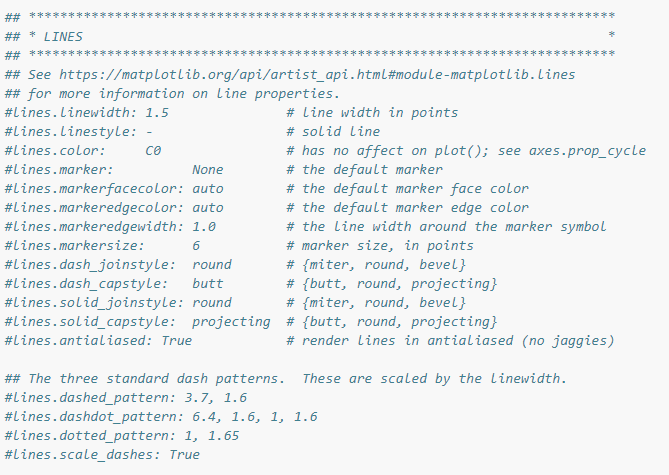
通过mpl.matplotlib_fname()查找matplotlibrc文件的路径,找到路径后,就可以直接编辑样式文件了,打开后看到的文件格式大致是这样的,文件中列举了所有的样式参数,找到想要修改的参数,比如lines.linewidth: 8,并将前面的注释符号去掉,此时再绘图发现样式以及生效了。
matplotlib的色彩设置color
RGB或RGBA
# 颜色用[0,1]之间的浮点数表示,四个分量按顺序分别为(red, green, blue, alpha),其中alpha透明度可省略
plt.plot([1,2,3],[4,5,6],color=(0.1, 0.2, 0.5))
plt.plot([4,5,6],[1,2,3],color=(0.1, 0.2, 0.5, 0.5))
HEX RGB 或RGBA
# 用十六进制颜色码表示,同样最后两位表示透明度,可省略
plt.plot([1,2,3],[4,5,6],color='#0f0f0f')
plt.plot([4,5,6],[1,2,3],color='#0f0f0f80')
灰度色阶
# 当只有一个位于[0,1]的值时,表示灰度色阶
plt.plot([1,2,3],[4,5,6],color='0.6')
单字符基本颜色
# matplotlib有八个基本颜色,可以用单字符串来表示,分别是'b', 'g', 'r', 'c', 'm', 'y', 'k', 'w',对应的是blue, green, red, cyan, magenta, yellow, black, and white的英文缩写
plt.plot([1,2,3],[4,5,6],color='c')
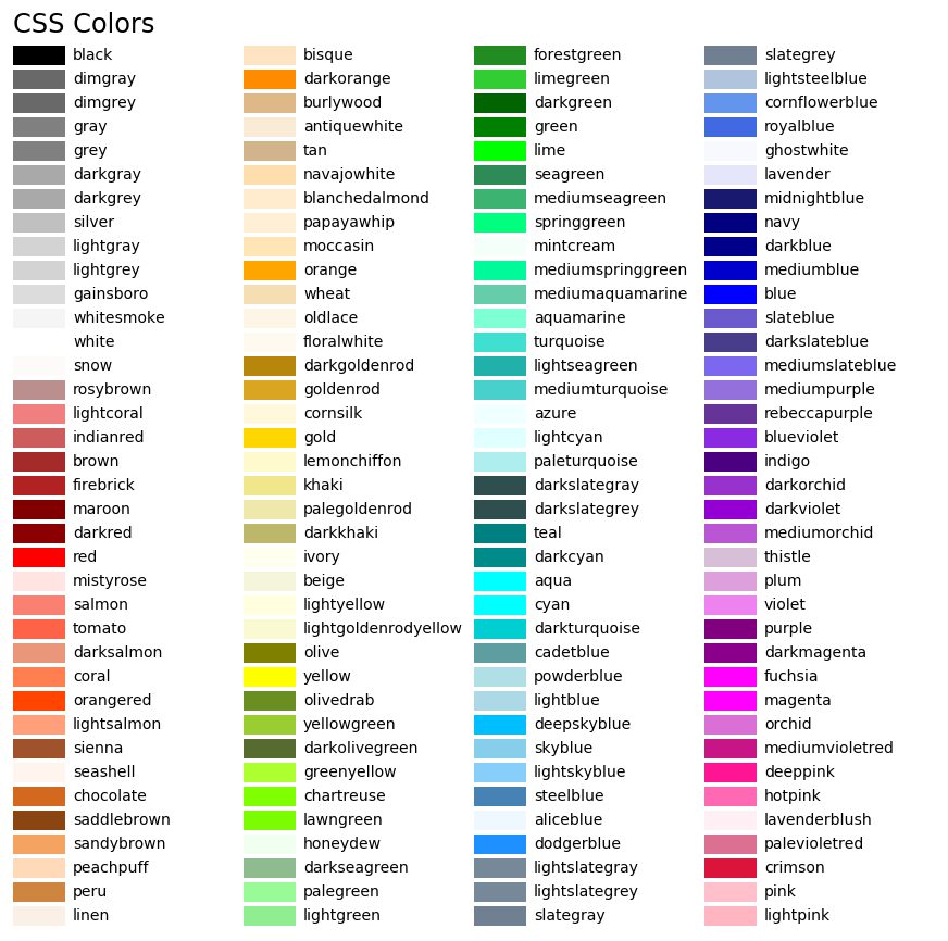
颜色名称
# matplotlib提供了颜色对照表,可供查询颜色对应的名称
plt.plot([1,2,3],[4,5,6],color='lightpink')

使用colormap设置一组颜色
有些图表支持使用colormap的方式配置一组颜色,从而在可视化中通过色彩的变化表达更多信息。
在matplotlib中,colormap共有五种类型:
- 顺序(Sequential)。通常使用单一色调,逐渐改变亮度和颜色渐渐增加,用于表示有顺序的信息
- 发散(Diverging)。改变两种不同颜色的亮度和饱和度,这些颜色在中间以不饱和的颜色相遇;当绘制的信息具有关键中间值(例如地形)或数据偏离零时,应使用此值。
- 循环(Cyclic)。改变两种不同颜色的亮度,在中间和开始/结束时以不饱和的颜色相遇。用于在端点处环绕的值,例如相角,风向或一天中的时间。
- 定性(Qualitative)。常是杂色,用来表示没有排序或关系的信息。
- 杂色(Miscellaneous)。一些在特定场景使用的杂色组合,如彩虹,海洋,地形等。
x = np.random.randn(50)
y = np.random.randn(50)
plt.scatter(x,y,c=x,cmap='RdPu')

实战
Ex1
列举出Sequential,Diverging,Cyclic,Qualitative,Miscellaneous分别有哪些内置的colormap,并以代码绘图的形式展现出来
import numpy as np
import matplotlib as mpl
import matplotlib.pyplot as plt
from matplotlib import cm
# from colorspacious import cspace_converter
from collections import OrderedDict

cmaps = OrderedDict()

cmaps['Perceptually Uniform Sequential'] = [
            'viridis', 'plasma', 'inferno', 'magma', 'cividis']

cmaps['Sequential'] = [
            'Greys', 'Purples', 'Blues', 'Greens', 'Oranges', 'Reds',
            'YlOrBr', 'YlOrRd', 'OrRd', 'PuRd', 'RdPu', 'BuPu',
            'GnBu', 'PuBu', 'YlGnBu', 'PuBuGn', 'BuGn', 'YlGn']

cmaps['Sequential (2)'] = [
            'binary', 'gist_yarg', 'gist_gray', 'gray', 'bone', 'pink',
            'spring', 'summer', 'autumn', 'winter', 'cool', 'Wistia',
            'hot', 'afmhot', 'gist_heat', 'copper']

cmaps['Diverging'] = [
            'PiYG', 'PRGn', 'BrBG', 'PuOr', 'RdGy', 'RdBu',
            'RdYlBu', 'RdYlGn', 'Spectral', 'coolwarm', 'bwr', 'seismic']

cmaps['Cyclic'] = ['twilight', 'twilight_shifted', 'hsv']

cmaps['Qualitative'] = ['Pastel1', 'Pastel2', 'Paired', 'Accent',
                        'Dark2', 'Set1', 'Set2', 'Set3',
                        'tab10', 'tab20', 'tab20b', 'tab20c']

cmaps['Miscellaneous'] = [
            'flag', 'prism', 'ocean', 'gist_earth', 'terrain', 'gist_stern',
            'gnuplot', 'gnuplot2', 'CMRmap', 'cubehelix', 'brg',
            'gist_rainbow', 'rainbow', 'jet', 'turbo', 'nipy_spectral',
            'gist_ncar']

nrows = max(len(cmap_list) for cmap_category, cmap_list in cmaps.items())
gradient = np.linspace(0, 1, 256)
gradient = np.vstack((gradient, gradient))


def plot_color_gradients(cmap_category, cmap_list, nrows):
    fig, axes = plt.subplots(nrows=nrows)
    fig.subplots_adjust(top=0.95, bottom=0.01, left=0.2, right=0.99)
    axes[0].set_title(cmap_category + ' colormaps', fontsize=14)

    for ax, name in zip(axes, cmap_list):
        ax.imshow(gradient, aspect='auto', cmap=plt.get_cmap(name))
        pos = list(ax.get_position().bounds)
        x_text = pos[0] - 0.01
        y_text = pos[1] + pos[3]/2.
        fig.text(x_text, y_text, name, va='center', ha='right', fontsize=10)

    # Turn off *all* ticks & spines, not just the ones with colormaps.
    for ax in axes:
        ax.set_axis_off()


for cmap_category, cmap_list in cmaps.items():
    plot_color_gradients(cmap_category, cmap_list, nrows)

plt.show()


Ex2
自定义colormap,并将其应用到任意一个数据集中,绘制一幅图像,注意colormap的类型要和数据集的特性相匹配
import numpy as np
import matplotlib.pyplot as plt
from matplotlib import cm
from matplotlib.colors import ListedColormap, LinearSegmentedColormap

# from color names
mycmp = ListedColormap(["lightcoral", "rosybrown", "gainsboro", "tan"])
x = np.random.randn(50)
y = np.random.randn(50)
plt.scatter(x,y,c=x,cmap=mycmp)

# from Nx4 numpy arrays [R,G,B,transparency]
redgreen=np.array([[113/256,174/256,70/256,1],
                  [150/256,183/256,68/256,1],
                  [196/256,204/256,56/256,1],
                  [235/256,225/256,42/256,1],
                  [234/256,176/256,38/256,1],
                  [227/256,133/256,43/256,1],
                  [216/256,93/256,42/256,1],
                  [206/256,38/256,38/256,1],
                  [172/256,32/256,38/256,1]])
redgreen=ListedColormap(redgreen)
x = np.random.randn(50)
y = np.random.randn(50)
plt.scatter(x,y,c=x,cmap=redgreen)

import pandas as pd
import seaborn as sns
from matplotlib import pyplot as plt
df = pd.read_csv("D:/data_train_1.csv")
cormatrix = df.iloc[:,12:22].corr()
plt.subplots(figsize=(9, 9))
sns.heatmap(cormatrix, annot=True, vmax=1, square=True, cmap=redgreen)
plt.show()

相关性越强颜色越红,反之越绿,这种配色本想做交通流量的图,但是地图的绘制还有待学习。