第四回:文字图例尽眉目
一、Figure和Axes上的文本
Matplotlib具有广泛的文本支持,包括对数学表达式的支持、对栅格和矢量输出的TrueType支持、具有任
意旋转的换行分隔文本以及Unicode支持。
下面的命令是介绍了通过pyplot API和objected-oriented API分别创建文本的方式。

1.text
pyplot API:matplotlib.pyplot.text(x, y, s, fontdict=None, **kwargs)
OO API:Axes.text(self, x, y, s, fontdict=None, **kwargs)
参数:此方法接受以下描述的参数:
s:此参数是要添加的文本。
xy:此参数是放置文本的点(x,y)。
fontdict:此参数是一个可选参数,并且是一个覆盖默认文本属性的字典。如果fontdict为None,则由
rcParams确定默认值。
返回值:此方法返回作为创建的文本实例的文本。

#fontdict学习的案例
#学习的过程中请尝试更换不同的fontdict字典的内容,以便于更好的掌握
import numpy as np
import matplotlib.pyplot as plt
#---------设置字体样式,分别是字体,颜色,宽度,大小
font1 = {

    'family': 'Times New Roman',
'color': 'purple',
'weight': 'normal',
'size': 16,
}
font2 = {

    'family': 'Times New Roman',
'color': 'red',
'weight': 'normal',
'size': 16,
}
font3 = {

    'family': 'serif',
'color': 'blue',
'weight': 'bold',
'size': 14,
}
font4 = {

    'family': 'Calibri',
'color': 'navy',
'weight': 'normal',
'size': 17,
}
#-----------四种不同字体显示风格-----
#-------建立函数----------
x = np.linspace(0.0, 5.0, 100)
y = np.cos(2*np.pi*x) * np.exp(-x/3)
#-------绘制图像,添加标注----------
plt.plot(x, y, '--')
plt.title('Damped exponential decay', fontdict=font1)
#------添加文本在指定的坐标处------------
plt.text(2, 0.65, r'$\cos(2 \pi x) \exp(-x/3)$', fontdict=font2)
#---------设置坐标标签
plt.xlabel('Y=time (s)', fontdict=font3)
plt.ylabel('X=voltage(mv)', fontdict=font4)
# 调整图像边距
plt.subplots_adjust(left=0.15)
plt.show()

2.title和set_title
pyplot API:matplotlib.pyplot.title(label, fontdict=None, loc=None, pad=None, *, y=None, **kwargs)
OO API:Axes.set_title(self, label, fontdict=None, loc=None, pad=None, *, y=None, **kwargs)
该命令是用来设置axes的标题。
参数:此方法接受以下描述的参数:
label:str,此参数是要添加的文本
fontdict:dict,此参数是控制title文本的外观,默认fontdict如下:
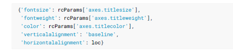
loc:str,{‘center’, ‘left’, ‘right’}默认为center
pad:float,该参数是指标题偏离图表顶部的距离,默认为6。
y:float,该参数是title所在axes垂向的位置。默认值为1,即title位于axes的顶部。
kwargs:该参数是指可以设置的一些奇特文本的属性。
返回值:此方法返回作为创建的title实例的文本。
#该例子展现了如何在title中使用fontdict参数。
import numpy as np
import matplotlib.pyplot as plt
#---------设置字体样式,分别是字体,透明度,颜色,宽度,大小
font1 = {

    'family': 'SimSun',#华文楷体
'alpha':0.7,#透明度
'color': 'purple',
'weight': 'normal',
'size': 16,
}
x = np.linspace(0.0, 5.0, 100)
y = np.cos(2*np.pi*x) * np.exp(-x/3)
#-------绘制图像,添加标注----------
plt.plot(x, y, '--')
plt.title('震荡曲线', fontdict=font1,pad=13,loc='right')
# 调整图像边距
plt.subplots_adjust(left=0.15)
plt.show()

3.figtext和text
pyplot API:matplotlib.pyplot.figtext(x, y, s, fontdict=None, **kwargs)
OO API:text(self, x, y, s, fontdict=None,**kwargs)
参数:此方法接受以下描述的参数:
x,y:float,此参数是指在figure中放置文本的位置。一般取值是在[0,1]范围内。使用transform关键字可以
更改坐标系。
s:str,此参数是指文本
fontdict:dict,此参数是一个可选参数,并且是一个覆盖默认文本属性的字典。如果fontdict为None,则由
rcParams确定默认值。
返回值:此方法返回作为创建的文本实例的文本。
4.suptitle
pyplot API:matplotlib.pyplot.suptitle(t, **kwargs)
OO API:suptitle(self, t, **kwargs)
参数:此方法接受以下描述的参数:
t: str,标题的文本
x:float,默认值是0.5.该参数是指文本在figure坐标系下的x坐标
y:float,默认值是0.95.该参数是指文本在figure坐标系下的y坐标
horizontalalignment, ha:该参数是指选择文本水平对齐方式,有三种选择{‘center’, ‘left’, right’},默认值是
‘center’
verticalalignment, va:该参数是指选择文本垂直对齐方式,有四种选择{‘top’, ‘center’, ‘bottom’,
‘baseline’},默认值是 ‘top’
fontsize, size:该参数是指文本的大小,默认值是依据rcParams的设置:rcParams[“figure.titlesize”]
(default: ‘large’)
fontweight, weight:该参数是用来设置字重。默认值是依据rcParams的设置:
rcParams[“figure.titleweight”] (default: ‘normal’)
fontproperties :None or dict,该参数是可选参数,如果该参数被指定,字体的大小将从该参数的默认值中
提取。
返回值:此方法返回作为创建的title实例的文本。
5.xlabel和ylabel
pyplot API:matplotlib.pyplot.xlabel(xlabel, fontdict=None, labelpad=None, , loc=None, **kwargs)
matplotlib.pyplot.ylabel(ylabel, fontdict=None, labelpad=None,, loc=None, **kwargs)
OO API: Axes.set_xlabel(self, xlabel, fontdict=None, labelpad=None, , loc=None, **kwargs)
Axes.set_ylabel(self, ylabel, fontdict=None, labelpad=None,, loc=None, **kwargs)
参数:此方法接受以下描述的参数:
xlabel或者ylabel:label的文本
labelpad:设置label距离轴(axis)的距离
loc:{‘left’, ‘center’, ‘right’},默认为center
**kwargs: 文本属性
#文本属性的输入一种是通过**kwargs属性这种方式,一种是通过操作
matplotlib.font_manager.FontProperties 方法
#该链接是FontProperties方法的介绍
https://matplotlib.org/api/font_manager_api.html#matplotlib.font_manager.FontPropertie
s
from matplotlib.font_manager import FontProperties
import matplotlib.pyplot as plt
import numpy as np
x1 = np.linspace(0.0, 5.0, 100)
y1 = np.cos(2 * np.pi * x1) * np.exp(-x1)
font = FontProperties()
font.set_family('serif')
font.set_name('Times New Roman')
font.set_style('italic')
fig, ax = plt.subplots(figsize=(5, 3))
fig.subplots_adjust(bottom=0.15, left=0.2)
ax.plot(x1, y1)
ax.set_xlabel('time [s]', fontsize='large', fontweight='bold')
ax.set_ylabel('Damped oscillation [V]', fontproperties=font)
plt.show()

6.annotate
pyplot API:matplotlib.pyplot.annotate(text, xy, *args,**kwargs)
OO API:Axes.annotate(self, text, xy, *args,**kwargs)
参数:此方法接受以下描述的参数:
text:str,该参数是指注释文本的内容
xy:该参数接受二维元组(float, float),是指要注释的点。其二维元组所在的坐标系由xycoords参数决定
xytext:注释文本的坐标点,也是二维元组,默认与xy相同
xycoords:该参数接受 被注释点的坐标系属性,允许的输入值如下:


annotation_clip : 布尔值,可选参数,默认为空。设为True时,只有被注释点在axes时才绘制注释;设为
False时,无论被注释点在哪里都绘制注释。仅当xycoords为‘data’时,默认值空相当于True。
**kwargs:该参数接受任何Text 的参数
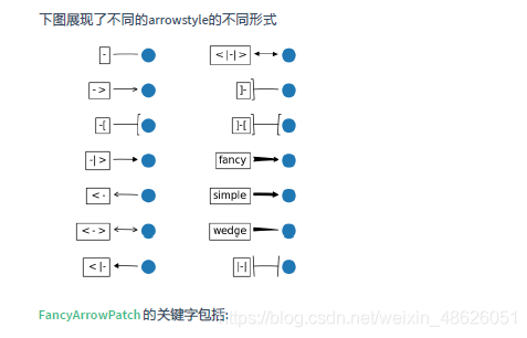
#此代码主要给示范了不同的arrowstyle以及FancyArrowPatch的样式
import matplotlib.pyplot as plt
import matplotlib.patches as mpatches
fig, axs = plt.subplots(2, 2)
x1, y1 = 0.3, 0.3
x2, y2 = 0.7, 0.7
ax = axs.flat[0]
ax.plot([x1, x2], [y1, y2], ".")
el = mpatches.Ellipse((x1, y1), 0.3, 0.4, angle=30, alpha=0.2)
ax.add_artist(el)#在axes中创建一个artist
ax.annotate("",
xy=(x1, y1), xycoords='data',
xytext=(x2, y2), textcoords='data',
arrowprops=dict(arrowstyle="-",#箭头的样式
color="0.5",
patchB=None,
shrinkB=0,
connectionstyle="arc3,rad=0.3",
),
)
#在整个代码中使用Transform=ax.transAx表示坐标相对于axes的bounding box,其中(0,0)是轴的左下角,
(1,1)是右上角。
ax.text(.05, .95, "connect", transform=ax.transAxes, ha="left", va="top")
ax = axs.flat[1]
ax.plot([x1, x2], [y1, y2], ".")
el = mpatches.Ellipse((x1, y1), 0.3, 0.4, angle=30, alpha=0.2)
ax.add_artist(el)
ax.annotate("",
xy=(x1, y1), xycoords='data',
xytext=(x2, y2), textcoords='data',
arrowprops=dict(arrowstyle="-",
color="0.5",
patchB=el,#箭头终点处的图形
shrinkB=0,
connectionstyle="arc3,rad=0.3",
),
)
ax.text(.05, .95, "clip", transform=ax.transAxes, ha="left", va="top")
ax = axs.flat[2]
ax.plot([x1, x2], [y1, y2], ".")
el = mpatches.Ellipse((x1, y1), 0.3, 0.4, angle=30, alpha=0.2)
ax.add_artist(el)
ax.annotate("",
xy=(x1, y1), xycoords='data',
xytext=(x2, y2), textcoords='data',
arrowprops=dict(arrowstyle="-",
color="0.5",
patchB=el,
shrinkB=5,
connectionstyle="arc3,rad=0.3",
),
)
ax.text(.05, .95, "shrink", transform=ax.transAxes, ha="left", va="top")
ax = axs.flat[3]
ax.plot([x1, x2], [y1, y2], ".")
el = mpatches.Ellipse((x1, y1), 0.3, 0.4, angle=30, alpha=0.2)
ax.add_artist(el)
ax.annotate("",
xy=(x1, y1), xycoords='data',
xytext=(x2, y2), textcoords='data',
arrowprops=dict(arrowstyle="fancy",
color="0.5",
patchB=el,
shrinkB=5,#箭头终点的缩进点数
connectionstyle="arc3,rad=0.3",),
)
ax.text(.05, .95, "mutate", transform=ax.transAxes, ha="left", va="top")
for ax in axs.flat:
ax.set(xlim=(0, 1), ylim=(0, 1), xticks=[], yticks=[], aspect=1)
plt.show()

import matplotlib.pyplot as plt
def demo_con_style(ax, connectionstyle):
x1, y1 = 0.3, 0.2
x2, y2 = 0.8, 0.6
ax.plot([x1, x2], [y1, y2], ".")
ax.annotate("",
xy=(x1, y1), xycoords='data',
xytext=(x2, y2), textcoords='data',
arrowprops=dict(arrowstyle="->", color="0.5",
shrinkA=5, shrinkB=5,
patchA=None, patchB=None,
connectionstyle=connectionstyle,
),
)
ax.text(.05, .95, connectionstyle.replace(",", ",\n"),
transform=ax.transAxes, ha="left", va="top")
fig, axs = plt.subplots(3, 5, figsize=(8, 4.8))
demo_con_style(axs[0, 0], "angle3,angleA=90,angleB=0")
demo_con_style(axs[1, 0], "angle3,angleA=0,angleB=90")
demo_con_style(axs[0, 1], "arc3,rad=0.")
demo_con_style(axs[1, 1], "arc3,rad=0.3")
demo_con_style(axs[2, 1], "arc3,rad=-0.3")
demo_con_style(axs[0, 2], "angle,angleA=-90,angleB=180,rad=0")
demo_con_style(axs[1, 2], "angle,angleA=-90,angleB=180,rad=5")
demo_con_style(axs[2, 2], "angle,angleA=-90,angleB=10,rad=5")
demo_con_style(axs[0, 3], "arc,angleA=-90,angleB=0,armA=30,armB=30,rad=0")
demo_con_style(axs[1, 3], "arc,angleA=-90,angleB=0,armA=30,armB=30,rad=5")
demo_con_style(axs[2, 3], "arc,angleA=-90,angleB=0,armA=0,armB=40,rad=0")
demo_con_style(axs[0, 4], "bar,fraction=0.3")
demo_con_style(axs[1, 4], "bar,fraction=-0.3")
demo_con_style(axs[2, 4], "bar,angle=180,fraction=-0.2")
for ax in axs.flat:
ax.set(xlim=(0, 1), ylim=(0, 1), xticks=[], yticks=[], aspect=1)
fig.tight_layout(pad=0.2)
plt.show()

#以下两个block懂了之后,annotate基本懂了
#如果想更深入学习可以参看官网案例学习
https://matplotlib.org/api/_as_gen/matplotlib.axes.Axes.annotate.html#matplotlib.axes.
Axes.annotate
import numpy as np
import matplotlib.pyplot as plt
# 以步长0.005绘制一个曲线
x = np.arange(0, 10, 0.005)
y = np.exp(-x/2.) * np.sin(2*np.pi*x)
fig, ax = plt.subplots()
ax.plot(x, y)
ax.set_xlim(0, 10)#设置x轴的范围
ax.set_ylim(-1, 1)#设置x轴的范围
# 被注释点的数据轴坐标和所在的像素
xdata, ydata = 5, 0
xdisplay, ydisplay = ax.transData.transform_point((xdata, ydata))
# 设置注释文本的样式和箭头的样式
bbox = dict(boxstyle="round", fc="0.8")
arrowprops = dict(
arrowstyle = "->",
connectionstyle = "angle,angleA=0,angleB=90,rad=10")
# 设置偏移量
offset = 72
# xycoords默认为'data'数据轴坐标,对坐标点(5,0)添加注释
# 注释文本参考被注释点设置偏移量,向左2*72points,向上72points
ax.annotate('data = (%.1f, %.1f)'%(xdata, ydata),
(xdata, ydata), xytext=(-2*offset, offset), textcoords='offset points',
bbox=bbox, arrowprops=arrowprops)
# xycoords以绘图区左下角为参考,单位为像素
# 注释文本参考被注释点设置偏移量,向右0.5*72points,向下72points
disp = ax.annotate('display = (%.1f, %.1f)'%(xdisplay, ydisplay),
(xdisplay, ydisplay), xytext=(0.5*offset, -offset),
xycoords='figure pixels',
textcoords='offset points',
bbox=bbox, arrowprops=arrowprops)
plt.show()

import numpy as np
import matplotlib.pyplot as plt
# 绘制一个极地坐标,再以0.001为步长,画一条螺旋曲线
fig = plt.figure()
ax = fig.add_subplot(111, polar=True)
r = np.arange(0,1,0.001)
theta = 2 * 2*np.pi * r
line, = ax.plot(theta, r, color='#ee8d18', lw=3)
# 对索引为800处画一个圆点,并做注释
ind = 800
thisr, thistheta = r[ind], theta[ind]
ax.plot([thistheta], [thisr], 'o')
ax.annotate('a polar annotation',
xy=(thistheta, thisr), # 被注释点遵循极坐标系,坐标为角度和半径
xytext=(0.05, 0.05), # 注释文本放在绘图区的0.05百分比处
textcoords='figure fraction',
arrowprops=dict(facecolor='black', shrink=0.05),# 箭头线为黑色,两端缩进5%
horizontalalignment='left',# 注释文本的左端和低端对齐到指定位置
verticalalignment='bottom',
)
plt.show()

7.字体的属性设置
字体设置一般有全局字体设置和自定义局部字体设置两种方法。
#首先可以查看matplotlib所有可用的字体
from matplotlib import font_manager
font_family = font_manager.fontManager.ttflist
font_name_list = [i.name for i in font_family]
for font in font_name_lis
为方便在图中加入合适的字体,可以尝试了解中文字体的英文名称,该链接告诉了常用中文的英文名称
#该block讲述如何在matplotlib里面,修改字体默认属性,完成全局字体的更改。
import matplotlib.pyplot as plt
plt.rcParams['font.sans-serif'] = ['SimSun'] # 指定默认字体为新宋体。
plt.rcParams['axes.unicode_minus'] = False # 解决保存图像时 负号'-' 显示为方块和报错的问题。
#局部字体的修改方法1
import matplotlib.pyplot as plt
import matplotlib.font_manager as fontmg
x = [1, 2, 3, 4, 5, 6, 7, 8, 9, 10]
plt.plot(x, label='小示例图标签')
# 直接用字体的名字。
plt.xlabel('x 轴名称参数', fontproperties='Microsoft YaHei', fontsize=16) # 设置x
轴名称,采用微软雅黑字体
plt.ylabel('y 轴名称参数', fontproperties='Microsoft YaHei', fontsize=14) # 设置Y
轴名称
plt.title('坐标系的标题', fontproperties='Microsoft YaHei', fontsize=20) # 设置坐标
系标题的字体
plt.legend(loc='lower right', prop={

    "family": 'Microsoft YaHei'}, fontsize=10) # 小
示例图的字体设置
#局部字体的修改方法2
import matplotlib.pyplot as plt
import matplotlib.font_manager as fontmg
x = [1, 2, 3, 4, 5, 6, 7, 8, 9, 10]
plt.plot(x, label='小示例图标签')
#fname为你系统中的字体库路径
my_font1 = fontmg.FontProperties(fname=r'C:\Windows\Fonts\simhei.ttf') # 读取系统中
的 黑体 字体。
my_font2 = fontmg.FontProperties(fname=r'C:\Windows\Fonts\simkai.ttf') # 读取系统中
的 楷体 字体。
# fontproperties 设置中文显示,fontsize 设置字体大小
plt.xlabel('x 轴名称参数', fontproperties=my_font1, fontsize=16) # 设置x轴名称
plt.ylabel('y 轴名称参数', fontproperties=my_font1, fontsize=14) # 设置Y轴名称
plt.title('坐标系的标题', fontproperties=my_font2, fontsize=20) # 标题的字体设置
plt.legend(loc='lower right', prop=my_font1, fontsize=10) # 小示例图的字体设

#这是以上学习内容的总结案例
import matplotlib
import matplotlib.pyplot as plt
fig = plt.figure()
ax = fig.add_subplot(111)
fig.subplots_adjust(top=0.85)
# Set titles for the figure and the subplot respectively
fig.suptitle('bold figure suptitle', fontsize=14, fontweight='bold')
ax.set_title('axes title')
ax.set_xlabel('xlabel')
ax.set_ylabel('ylabel')
# Set both x- and y-axis limits to [0, 10] instead of default [0, 1]
ax.axis([0, 10, 0, 10])
ax.text(3, 8, 'boxed italics text in data coords', style='italic',
bbox={

    'facecolor': 'red', 'alpha': 0.5, 'pad': 10})
ax.text(2, 6, r'an equation: $E=mc^2$', fontsize=15)
font1 = {

    'family': 'Times New Roman',
'color': 'purple',
'weight': 'normal',
'size': 10,
}
ax.text(3, 2, 'unicode: Institut für Festkörperphysik',fontdict=font1)
ax.text(0.95, 0.01, 'colored text in axes coords',
verticalalignment='bottom', horizontalalignment='right',
transform=ax.transAxes,
color='green', fontsize=15)
ax.plot([2], [1], 'o')
ax.annotate('annotate', xy=(2, 1), xytext=(3, 4),
arrowprops=dict(facecolor='black', shrink=0.05))

8.数学表达式
在文本标签中使用数学表达式。有关MathText的概述,请参见 写数学表达式,但由于数学表达式的联系想
必我们都在markdown语法和latex语法中多少有接触,故在此不继续展开,愿意深入学习的可以参看官方
文档.下面是一个官方案例,供参考了解。
import numpy as np
import matplotlib.pyplot as plt
t = np.arange(0.0, 2.0, 0.01)
s = np.sin(2*np.pi*t)
plt.plot(t, s)
plt.title(r'$\alpha_i > \beta_i$', fontsize=20)
plt.text(1, -0.6, r'$\sum_{i=0}^\infty x_i$', fontsize=20)
plt.text(0.6, 0.6, r'$\mathcal{A}\mathrm{sin}(2 \omega t)$',
fontsize=20)
plt.xlabel('time (s)')
plt.ylabel('volts (mV)')
plt.show()

二、Tick上的文本
设置tick(刻度)和ticklabel(刻度标签)也是可视化中经常需要操作的步骤,matplotlib既提供了自动生成刻度和刻度标签的模式(默认状态),同时也提供了许多让使用者灵活操控手动设置的方式。
1.简单模式
可以使用axis的set_ticks 方法手动设置标签位置,使用axis的set_ticklabels 方法手动设置标签格式
import matplotlib.pyplot as plt
import numpy as np
import matplotlib
x1 = np.linspace(0.0, 5.0, 100)
y1 = np.cos(2 * np.pi * x1) * np.exp(-x1)
#使用axis的set_ticks方法手动设置标签位置的例子
fig, axs = plt.subplots(2, 1, figsize=(5, 3), tight_layout=True)
axs[0].plot(x1, y1)
axs[1].plot(x1, y1)
axs[1].xaxis.set_ticks(np.arange(0., 10.1, 2.))
plt.show()

# 使用axis的set_ticklabels方法手动设置标签格式的例子
fig, axs = plt.subplots(2, 1, figsize=(5, 3), tight_layout=True)
axs[0].plot(x1, y1)
axs[1].plot(x1, y1)
ticks = np.arange(0., 8.1, 2.)
# list comprehension to get all tick labels...
tickla = [f'{tick:1.2f}' for tick in ticks]
axs[1].xaxis.set_ticks(ticks)
axs[1].xaxis.set_ticklabels(tickla)
#axs[1].set_xlim(axs[0].get_xlim())
plt.show()

2.Tick Locators and Formatters
除了上述的简单模式,还可以使用Tick Locators and Formatters 完成对于刻度位置和刻度标签的
设置。
其中Axis.set_major_locator 和Axis.set_minor_locator 方法用来设置标签的位置,
Axis.set_major_formatter 和Axis.set_minor_formatter 方法用来设置标签的格式。这种方式的好处是不用
显式地列举出刻度值列表。
set_major_formatter和set_minor_formatter这两个formatter格式命令可以接收字符串格式
(matplotlib.ticker.StrMethodFormatter)或函数参数(matplotlib.ticker.FuncFormatter)来设置刻度值的
格式 。
# 接收字符串格式的例子
fig, axs = plt.subplots(2, 2, figsize=(8, 5), tight_layout=True)
for n, ax in enumerate(axs.flat):
ax.plot(x1*10., y1)
formatter = matplotlib.ticker.FormatStrFormatter('%1.1f')
axs[0, 1].xaxis.set_major_formatter(formatter)
formatter = matplotlib.ticker.FormatStrFormatter('-%1.1f')
axs[1, 0].xaxis.set_major_formatter(formatter)
formatter = matplotlib.ticker.FormatStrFormatter('%1.5f')
axs[1, 1].xaxis.set_major_formatter(formatter)
plt.show()

# 接收函数的例子
def formatoddticks(x, pos):
"""Format odd tick positions."""
if x % 2:
return f'{x:1.2f}'
else:
return ''
fig, ax = plt.subplots(figsize=(5, 3), tight_layout=True)
ax.plot(x1, y1)
ax.xaxis.set_major_formatter(formatoddticks)
plt.show()

# 接收各种locator的例子
fig, axs = plt.subplots(2, 2, figsize=(8, 5), tight_layout=True)
for n, ax in enumerate(axs.flat):
ax.plot(x1*10., y1)
locator = matplotlib.ticker.AutoLocator()
axs[0, 0].xaxis.set_major_locator(locator)
locator = matplotlib.ticker.MaxNLocator(nbins=10)
axs[0, 1].xaxis.set_major_locator(locator)
locator = matplotlib.ticker.MultipleLocator(5)
axs[1, 0].xaxis.set_major_locator(locator)
locator = matplotlib.ticker.FixedLocator([0,7,14,21,28])
axs[1, 1].xaxis.set_major_locator(locator)
plt.show()

import matplotlib.dates as mdates
import datetime
# 特殊的日期型locator和formatter
locator = mdates.DayLocator(bymonthday=[1,15,25])
formatter = mdates.DateFormatter('%b %d')
fig, ax = plt.subplots(figsize=(5, 3), tight_layout=True)
ax.xaxis.set_major_locator(locator)
ax.xaxis.set_major_formatter(formatter)
base = datetime.datetime(2017, 1, 1, 0, 0, 1)
time = [base + datetime.timedelta(days=x) for x in range(len(x1))]
ax.plot(time, y1)
ax.tick_params(axis='x', rotation=70)
plt.show()

一些相关案例
#一般绘图时会自动创建刻度,而如果通过set_ticks创建刻度可能会导致tick的范围与所绘制图形的范围不一致的
问题。
在普通的绘图中,我们可以直接通过上图的set_ticks进行设置刻度的位置,缺点是需要自己指定或者接
受matplotlib默认给定的刻度。当需要更改刻度的位置时,matplotlib给了常用的几种locator的类型。如
果要绘制更复杂的图,可以先设置locator的类型,然后通过axs.xaxis.set_major_locator(locator)绘制即可
locator=plt.MaxNLocator(nbins=7)
locator=plt.FixedLocator(locs=[0,0.5,1.5,2.5,3.5,4.5,5.5,6])#直接指定刻度所在的位置
locator=plt.AutoLocator()#自动分配刻度值的位置
locator=plt.IndexLocator(offset=0.5, base=1)#面元间距是1,从0.5开始
locator=plt.MultipleLocator(1.5)#将刻度的标签设置为1.5的倍数
locator=plt.LinearLocator(numticks=5)#线性划分5等分,4个刻度
axs.xaxis.set_major_locator(locator)
#所以在下面的案例中,axs[1]中set_xtick的设置要与数据范围所对应,然后再通过set_xticklabels设置刻度
所对应的标签
import numpy as np
import matplotlib.pyplot as plt
fig, axs = plt.subplots(2, 1, figsize=(6, 4), tight_layout=True)
x1 = np.linspace(0.0, 6.0, 100)
y1 = np.cos(2 * np.pi * x1) * np.exp(-x1)
axs[0].plot(x1, y1)
axs[0].set_xticks([0,1,2,3,4,5,6])
axs[1].plot(x1, y1)
axs[1].set_xticks([0,1,2,3,4,5,6])#要将x轴的刻度放在数据范围中的哪些位置
axs[1].set_xticklabels(['zero','one', 'two', 'three', 'four', 'five','six'],#设置刻度对
应的标签
rotation=30, fontsize='small')#rotation选项设定x刻度标签倾斜30度。
axs[1].xaxis.set_ticks_position('bottom')#set_ticks_position()方法是用来设置刻度所在的位
置,常用的参数有bottom、top、both、none
print(axs[1].xaxis.get_ticklines())
plt.show()


import numpy as np
x = np.linspace(-3,3,50)
y1 = 2*x+1
y2 = x**2
plt.figure()
plt.plot(x,y2)
plt.plot(x,y1,color='red',linewidth=1.0,linestyle = '--')
plt.xlim((-3,5))
plt.ylim((-3,5))
plt.xlabel('x')
plt.ylabel('y')
new_ticks1 = np.linspace(-3,5,5)
plt.xticks(new_ticks1)
plt.yticks([-2,0,2,5],[r'$one\ shu$',r'$\alpha$',r'$three$',r'four'])
'''
上一行代码是将y轴上的小标改成文字,其中,空格需要增加\,即'\ ',$可将格式更改成数字模式,如果需要输入数
学形式的α,则需要用\转换,即\alpha
如果使用面向对象的命令进行画图,那么下面两行代码可以实现与 plt.yticks([-2,0,2,5],[r'$one\
shu$',r'$\alpha$',r'$three$',r'four']) 同样的功能
axs.set_yticks([-2,0,2,5])
axs.set_yticklabels([r'$one\ shu$',r'$\alpha$',r'$three$',r'four'])
'''
ax = plt.gca()#gca = 'get current axes' 获取现在的轴
'''
ax = plt.gca()是获取当前的axes,其中gca代表的是get current axes。
fig=plt.gcf是获取当前的figure,其中gcf代表的是get current figure。
许多函数都是对当前的Figure或Axes对象进行处理,
例如plt.plot()实际上会通过plt.gca()获得当前的Axes对象ax,然后再调用ax.plot()方法实现真正的绘图。
而在本例中则可以通过ax.spines方法获得当前顶部和右边的轴并将其颜色设置为不可见
然后将左边轴和底部的轴所在的位置重新设置
最后再通过set_ticks_position方法设置ticks在x轴或y轴的位置,本示例中因所设置的bottom和left是ticks
在x轴或y轴的默认值,所以这两行的代码也可以不写
'''
ax.spines['top'].set_color('none')
ax.spines['right'].set_color('none')
ax.spines['left'].set_position(('data',0))
ax.spines['bottom'].set_position(('data',0))#axes 百分比
ax.xaxis.set_ticks_position('bottom') #设置ticks在x轴的位置
ax.yaxis.set_ticks_position('left') #设置ticks在y轴的位置
plt.show()

三、legend(图例)
图例的设置会使用一些常见术语,为了清楚起见,这些术语在此处进行说明:
legend entry(图例条目)
图例有一个或多个legend entries组成。一个entry由一个key和一个label组成。
legend key(图例键)
每个 legend label左面的colored/patterned marker(彩色/图案标记)
legend label(图例标签)
描述由key来表示的handle的文本
legend handle(图例句柄)
用于在图例中生成适当图例条目的原始对象
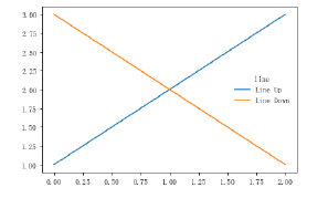
以下面这个图为例,右侧的方框中的共有两个legend entry;两个legend key,分别是一个蓝色和一个黄
色的legend key;两个legend label,一个名为‘Line up’和一个名为‘Line Down’的legend label
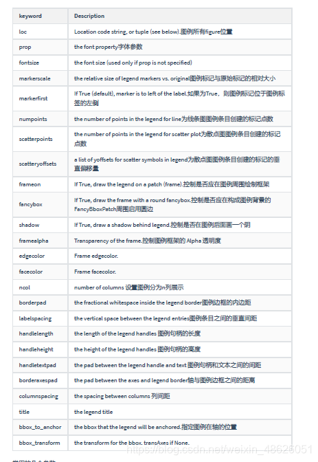
常用的几个参数:
(1)设置图列位置
plt.legend(loc=‘upper center’) 等同于plt.legend(loc=9)
| ----------------- | ||
| 0: ‘best’ |
1: ‘upper right’
2: ‘upper left’
3: ‘lower left’
4: ‘lower right’
5: ‘right’
6: ‘center left’
7: ‘center right’
8: ‘lower center’
9: ‘upper center’
10: ‘center’
(2)设置图例字体大小
fontsize : int or float or {‘xx-small’, ‘x-small’, ‘small’, ‘medium’, ‘large’, ‘x-large’, ‘xx-large’}
(3)设置图例边框及背景
plt.legend(loc=‘best’,frameon=False) #去掉图例边框
plt.legend(loc=‘best’,edgecolor=‘blue’) #设置图例边框颜色
plt.legend(loc=‘best’,facecolor=‘blue’) #设置图例背景颜色,若无边框,参数无效
(4)设置图例标题
legend = plt.legend([“CH”, “US”], title=‘China VS Us’)
(5)设置图例名字及对应关系
legend = plt.legend([p1, p2], [“CH”, “US”])
line_up, = plt.plot([1, 2, 3], label='Line 2')
line_down, = plt.plot([3, 2, 1], label='Line 1')
plt.legend([line_up, line_down], ['Line Up', 'Line Down'],loc=5,
title='line',frameon=False)#loc参数设置图例所在的位置,title设置图例的标题,frameon参数将图例边框给去掉
#这个案例是显示多图例legend
import matplotlib.pyplot as plt
import numpy as np
x = np.random.uniform(-1, 1, 4)
y = np.random.uniform(-1, 1, 4)
p1, = plt.plot([1,2,3])
p2, = plt.plot([3,2,1])
l1 = plt.legend([p2, p1], ["line 2", "line 1"], loc='upper left')
p3 = plt.scatter(x[0:2], y[0:2], marker = 'D', color='r')
p4 = plt.scatter(x[2:], y[2:], marker = 'D', color='g')
# 下面这行代码由于添加了新的legend,所以会将l1从legend中给移除
plt.legend([p3, p4], ['label', 'label1'], loc='lower right', scatterpoints=1)
# 为了保留之前的l1这个legend,所以必须要通过plt.gca()获得当前的axes,然后将l1作为单独的artist
plt.gca().add_artist(l1)
