正方形
以前有人问我怎么实现一个正方形,我就很纳闷!把块属性width和height设置成一样不就好了吗!
//这不就是个正方形
.div {


	width:100px;
	height:100px
}
但这不是他想要的答案。也许是考虑到自适应的问题吧。
于是,我想到了最近在b站Steven老师那看到他用过的vw vh单位
//vw单位把屏幕宽分为100(vh同理,高)
.div {


	width:20vw
	height:20vw
}
俺想,酱不就好了吗!
再稍微对样式补充一下,看一下具体效果
<!DOCTYPE html>
<html lang="en">
<head>
    <meta charset="UTF-8">
    <meta name="viewport" content="width=device-width, initial-scale=1.0">
    <title>Document</title>
    <style>
        .square {


            width: 20vw;
            height: 20vw;
            background-color: blueviolet;
            margin: 10px;
        }
        .flex {


            display: flex;
            flex-wrap: wrap
        }
    </style>
</head>
<body>
    <div class="flex">
        <div class="square"></div>

        <div class="square"></div>

        <div class="square"></div>

        <div class="square"></div>

        <div class="square"></div>
    </div>
</body>
</html>
全屏效果图(通过360悬浮穿作比较):
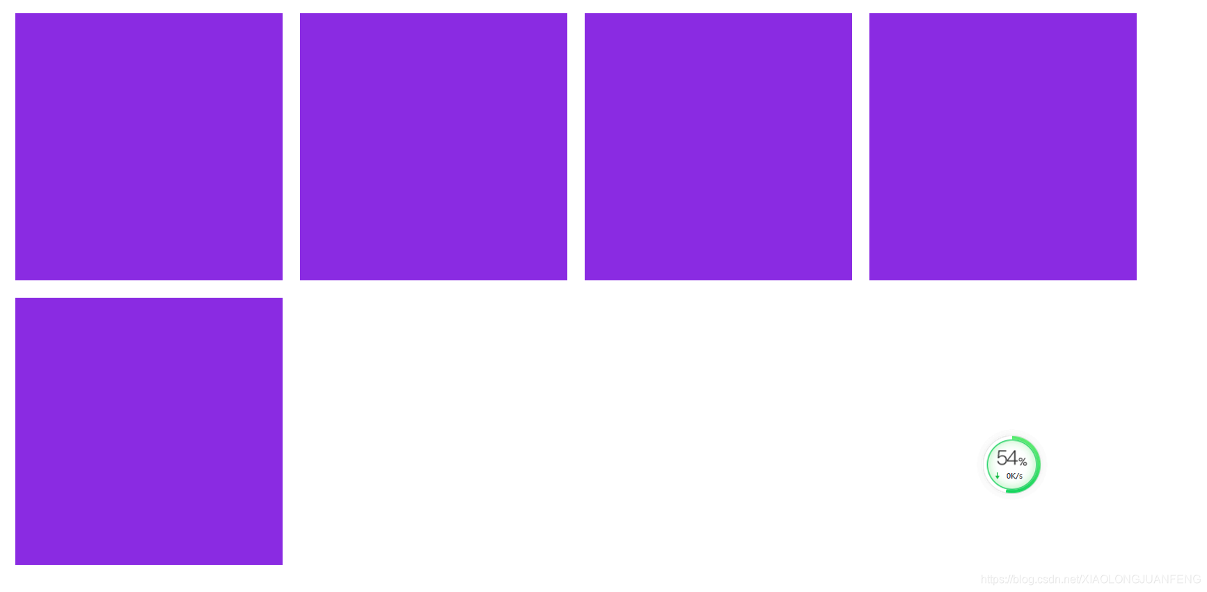
再缩小一下浏览器宽度(通过360悬浮穿作比较,通过margin也能看出来):

vw其实挺好用的嘛。另外提一点,这里margin未发生塌陷是因为display:flex会触发BFC(其实我还不太懂它)
但这还不是他想要的。到这里 俺只想说害要啥自行车!!!!
于是,我网上查了下其他人是怎么实现正方形的
- 将width设置的和padding-top(bottom)一样尺寸,并且将块的高度设置成0
.square {


	width:20%;
	padding-top:20%;
	height:0;
	background-color: brown;
}
为啥padding-top的%和width的一样呢?我特地查了下W3school:padding属性中的%是基于父元素的宽度的百分比。样式写的太少,这个细节一直没发现。
height设置为0是因为,由于需要将其他样式导致产生的高度置为0,否则就变成长方形了(其他样式可能是块本身加了内容,或者父级元素的样式啥的)
2.另一种是利用伪元素的方式,撑开高度
<!DOCTYPE html>
<html lang="en">

<head>
    <meta charset="UTF-8">
    <meta name="viewport" content="width=device-width, initial-scale=1.0">
    <meta http-equiv="X-UA-Compatible" content="ie=edge">
    <title>Document</title>
    <style>
        .square {


            width: 20%;
            background-color: burlywood;
            margin: 10px;
        }


        .flex {


            display: flex;
            flex-wrap: wrap;
            align-items: center;
        }

        .square:after {


            content: '';
            display: block;
            padding-top: 100%;
        }
    </style>
</head>
<body>
    <div class="flex">
        <div class="square"></div>
        <div class="square"></div>
        <div class="square"></div>
        <div class="square"></div>
        <div class="square"></div>
    </div>
</body>
</html>
首先先定一个宽度比如20%,然后伪元素里的padding-top设置成100%(父元素宽的100%)所以就成正方形了。但是在div里加内容,仍然会撑开高度。。。这种方案网上很多,实际使用还得看具体情况