css 实现简单的镂空渐变文字
html:
<body>
    <div class="box">
        hello
    </div>
</body>
css:
.box{


    width: 300px;
    height: 300px;
    border: 1px solid black;
    text-align: center;
    /*用line-height等于容器的高度实现容器内部垂直居中*/
    line-height: 300px;
    border-radius: 150px;
    font-size: 100px;
    /*将 box 绝对定位到屏幕中间,transform: translate(-50%, -50%) 为元素自身偏移*/
    position: absolute;
    left: 50%;
    top: 50%;
    transform: translate(-50%, -50%);
    font-weight: bold;
    /* 渐变文字颜色的关键*/
    background-image: linear-gradient(135deg, deeppink, dodgerblue);
    -webkit-background-clip: text;
    color: transparent;
}
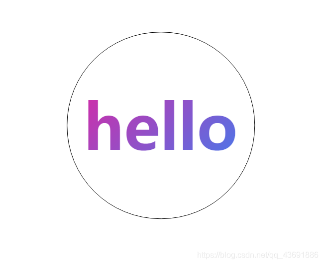
运行效果:
解释:
background-image: linear-gradient(direction, color-stop1, color-stop2, …);
direction:用角度值指定渐变的方向(或角度)
color-stop1, color-stop2,..: 用于指定渐变的起止颜色;
另外,如果将 background-image 指定为颜色较为绚丽的图片,效果可能会更好