1.导入依赖
fl_chart: ^0.12.2
如果你想进一步了解这个插件的话,可以去看一下它的源码。框架地址
关于如何导入依赖步骤如图所示:
pubspec.yaml文件->在dependencies下面添加依赖->点击pub get

2.饼图
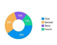
1.效果图
废话少说,先看一下效果
2.所有代码
import 'package:fl_chart/fl_chart.dart';
import 'package:flutter/material.dart';

import 'indicator.dart';

void main(){


  runApp(MaterialApp(
    home: PieChartSample2(),
  ));
}


class PieChartSample2 extends StatefulWidget {


  @override
  State<StatefulWidget> createState() => PieChart2State();
}

class PieChart2State extends State {


  int touchedIndex;

  @override
  Widget build(BuildContext context) {


    return Container(
      height: 100,
      child:Card(
        elevation: 5,//阴影
        shape: const RoundedRectangleBorder(//形状
          //修改圆角
          borderRadius: BorderRadius.all(Radius.circular(10)),
        ),
        color: Colors.white,
        child: Row(
          children: <Widget>[
            const SizedBox(
              height: 18,
            ),
            Expanded(
              child: AspectRatio(
                aspectRatio: 1,
                child: PieChart(
                  PieChartData(
                      pieTouchData: PieTouchData(touchCallback: (pieTouchResponse) {


                        setState(() {


                          if (pieTouchResponse.touchInput is FlLongPressEnd ||
                              pieTouchResponse.touchInput is FlPanEnd) {


                            touchedIndex = -1;
                          } else {


                            touchedIndex = pieTouchResponse.touchedSectionIndex;
                          }
                        });
                      }),
                      borderData: FlBorderData(
                        show: false,
                      ),
                      sectionsSpace: 0,
                      centerSpaceRadius: 40,
                      sections: showingSections()),
                ),
              ),
            ),
            Column(
              mainAxisSize: MainAxisSize.max,
              mainAxisAlignment: MainAxisAlignment.center,
              crossAxisAlignment: CrossAxisAlignment.start,
              children:<Widget>[
                Indicator(
                  color: Color(0xff0293ee),
                  text: 'First',
                  isSquare: true,
                ),
                SizedBox(
                  height: 4,
                ),
                Indicator(
                  color: Color(0xfff8b250),
                  text: 'Second',
                  isSquare: true,
                ),
                SizedBox(
                  height: 4,
                ),
                Indicator(
                  color: Color(0xff845bef),
                  text: 'Third',
                  isSquare: true,
                ),
                SizedBox(
                  height: 4,
                ),
                Indicator(
                  color: Color(0xff13d38e),
                  text: 'Fourth',
                  isSquare: true,
                ),
                SizedBox(
                  height: 18,
                ),
              ],
            ),
            const SizedBox(
              width: 28,
            ),
          ],
        ),
      ),
    );
  }

  List<PieChartSectionData> showingSections() {


    return List.generate(4, (i) {


      final isTouched = i == touchedIndex;
      final double fontSize = isTouched ? 25 : 16;
      final double radius = isTouched ? 60 : 50;
      switch (i) {


        case 0:
          return PieChartSectionData(
            color: const Color(0xff0293ee),
            value: 40,
            title: '40%',
            radius: radius,
            titleStyle: TextStyle(
                fontSize: fontSize, fontWeight: FontWeight.bold, color: const Color(0xffffffff)),
          );
        case 1:
          return PieChartSectionData(
            color: const Color(0xfff8b250),
            value: 30,
            title: '30%',
            radius: radius,
            titleStyle: TextStyle(
                fontSize: fontSize, fontWeight: FontWeight.bold, color: const Color(0xffffffff)),
          );
        case 2:
          return PieChartSectionData(
            color: const Color(0xff845bef),
            value: 15,
            title: '15%',
            radius: radius,
            titleStyle: TextStyle(
                fontSize: fontSize, fontWeight: FontWeight.bold, color: const Color(0xffffffff)),
          );
        case 3:
          return PieChartSectionData(
            color: const Color(0xff13d38e),
            value: 15,
            title: '15%',
            radius: radius,
            titleStyle: TextStyle(
                fontSize: fontSize, fontWeight: FontWeight.bold, color: const Color(0xffffffff)),
          );
        default:
          return null;
      }
    });
  }
}
3.代码解析
1.代码结构
dart的语法有点像俄罗斯套娃

3.组件作用
| 组件 | 功能 |
|---|---|
| Card | 类似于卡片式的布局 |
| Row | 横排列,不过一般只能排列一行,Wrap多行 |
| Column | 纵排列 |
| Expanded | Expanded使用与类似与Column,Row,Flex等展示多个组件集合的组件,Expanded包含的组件可以占据剩余的空间 |
| AspectRatio | AspectRatio作用于父控件,根据aspectRatio计算父控件的宽或者高,AspectRatio的子控件将填充满父控件,子控件的宽高无效 |
| Indicator | 主要实现饼图中的各部分的颜色注释作用 |
| PieChart | 实现饼图,还是比较容易理解其功能的作用 |
| SizeBox | 用来设置两个widget之间的间距 |