我们在做商城类项目时,时常会有开发优惠券的需求,那么我们如何通过纯 CSS 来实现类似京东、淘宝的优惠券样式。
下面给大家分享一个纯 CSS 写的优惠券边沿透明圆形镂空打孔效果。最终效果大致如下:

直接上代码:
HTML
<div class="coupon"></div>
css:
body {    background: #939393;
}
.coupon {    width: 590px;    height: 370px;    border-radius: 16px;    overflow: hidden;    background: #FFFFFF;    position: relative;
}
.coupon:before, .coupon:after {    content: '';    position: absolute;    width: 60px;    height: 60px;    border-radius: 50%;    top: 50%;    margin-top: -30px;    background: #939393; /* 和背景一样的颜色 */}.coupon:before {    left: -30px;
}
.coupon:after {    right: -30px;
}
效果如下: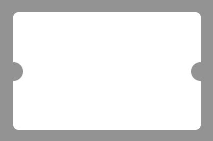
实现原理:在div中盖上两个和背景颜色一样的半圆达到镂空效果。
其实这是一种伪镂空,如果背景下面有其他元素,可能就会“露馅”了,请看下图: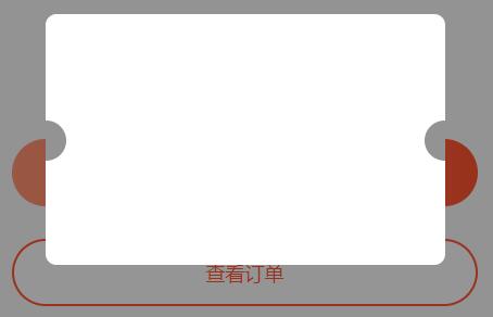
那么如何实现开篇的那种完全透明的镂空效果呢?我们可以把优惠券拆成上中下三块,中间那块通过构造透明半圆,白色背景用白色大边框替代,以达到相同效果,代码如下:
<div class="coupon">
    <div class="coupon-top"></div>
    <div class="coupon-middle">
        <div></div>
    </div>
<div class="coupon-bottom"></div>
</div>
body {    background: #939393;
}
.coupon {    width: 590px;    height: 370px;    border-radius: 16px;    overflow: hidden;    display: flex;    flex-direction: column;
}
.coupon-top, .coupon-bottom {    background: #FFFFFF;
}
.coupon-top {    flex: 1;
}
.coupon-bottom {    height: 120px;    padding: 0 38px;
}
.coupon-middle {    height: 64px;    position: relative;    overflow: hidden;
}
.coupon-middle div { /* 中间虚线 */
    position: absolute;    left: 36px;    right: 36px;    top: 29px;    border-top: 1px dashed #E6E6E6;    z-index: 9;
}
.coupon-middle:before, .coupon-middle:after {    content: '';    border: 300px solid #FFFFFF;    position: absolute;    width: 60px;    height: 60px;    border-radius: 50%;    top: 50%;    margin-top: -330px;
}
.coupon-middle:before {    left: -330px;
}
.coupon-middle:after {    right: -330px;
}
再看下运行效果,大功告成!
扫描二维码关注公众号,回复:
12482912 查看本文章
