实现五点布局
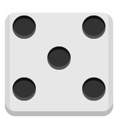
<div class="box">
  <div class="column">
    <span class="pip"></span>
    <span class="pip"></span>
  </div>
  <div class="column">
    <span class="pip"></span>
  </div>
  <div class="column">
    <span class="pip"></span>
    <span class="pip"></span>
  </div>
</div>
.box{
display: flex;
flex-direction: column;
}
.box .column {
display: flex;
justify-content: space-between;
}
.box .column:nth-of-type(2) {
justify-content: center;
}
body {
display: flex;
align-items: center;
justify-content: center;
vertical-align: center;
flex-wrap: wrap;
align-content: center;
font-family: 'Open Sans', sans-serif;
background: linear-gradient(top, #222, #333);
}
.box {
margin: 16px;
padding: 4px;
background-color: #e7e7e7;
width: 104px;
height: 104px;
object-fit: contain;
box-shadow:
inset 0 5px white,
inset 0 -5px #bbb,
inset 5px 0 #d7d7d7,
inset -5px 0 #d7d7d7;
border-radius: 10%;
}
.pip {
display: block;
width: 24px;
height: 24px;
border-radius: 50%;
margin: 4px;
background-color: #333;
box-shadow: inset 0 3px #111, inset 0 -3px #555;
}
- 或者换成row弹性,每个元素
flex-wrap: wrap; align-content: space-between;,中间的元素align-content: center;
.box {
display: flex;
flex-direction: row;
}
.box .column {
display: flex;
flex-wrap: wrap;
align-content: space-between;
}
.box .column:nth-of-type(2) {
align-content: center;
}
body {
display: flex;
align-items: center;
justify-content: center;
align-content: center;
background: linear-gradient(top, #222, #333);
}