1. 创建Vue项目
vue init webpack tabbar
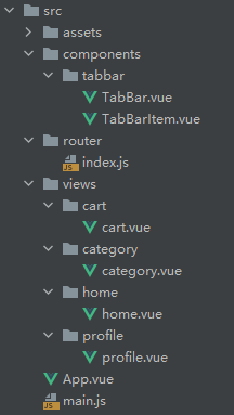
2. 文件目录
3. /router/index.js
import Vue from 'vue'
import Router from 'vue-router'

const Home = () => import('../views/home/home');
const Category = () => import('../views/category/category');
const Cart = () => import('../views/cart/cart');
const Profile = () => import('../views/profile/profile');


Vue.use(Router)

export default new Router({


  mode: "history",
  routes: [{


    path: '',
    redirect: '/home'
  }, {


    path: '/home',
    component: Home
  }, {


    path: '/category',
    component: Category
  }, {


    path: '/cart',
    component: Cart
  }, {


    path: '/profile',
    component: Profile
  }
  ]
})
4. TabBar.vue
<template>
  <div id="tab-bar">
    <slot></slot>
  </div>
</template>

<script>
export default {


  name: 'TabBar',
};
</script>

<style scoped>
#tab-bar {


  display: flex;
  background-color: #f6f6f6;
  box-shadow: 0 -1px 1px rgba(100, 100, 100, .2);
  position: fixed;
  left: 0;
  right: 0;
  bottom: 0;
}
</style>
5. TabBarItem.vue
<template>
  <div class="tab-bar-item" @click="itemClick">
    <div v-if="isActive">
      <slot name="item-icon-active"></slot>
    </div>
    <div v-else>
      <slot name="item-icon"></slot>
    </div>
    <div :style="activeStyle">
      <slot name="item-text"></slot>
    </div>
  </div>
</template>

<script>
export default {


  name: "TabBarItem",
  props: {


    path: String,
    activeColor: {


      type: String,
      default: "red"
    }
  },
  data() {


    return {

    }
  },
  computed: {


    isActive() {


      return this.$route.path.indexOf(this.path) !== -1;
    },
    activeStyle() {


      return this.isActive ? {

    color: this.activeColor} : {

    }
    }
  },
  methods: {


    itemClick() {


      this.$router.replace(this.path)
    }
  }
}
</script>

<style scoped>
.tab-bar-item {


  flex: 1;
  text-align: center;
  height: 49px;
}

.tab-bar-item img {


  width: 24px;
  height: 24px;
}

.active {


  color: red;
}
</style>
6. App.vue
<template>
  <div id="app">
    <router-view></router-view>
    <tab-bar>
      <tab-bar-item path="/home" :activeColor="activeColor">
        <template #item-icon-active>
          <img src="">
        </template>
        <template #item-icon>
          <img src="">
        </template>
        <template #item-text>
          <div>首页</div>
        </template>
      </tab-bar-item>
      <tab-bar-item path="/category" :activeColor="activeColor">
        <template #item-icon-active>
          <img src="">
        </template>
        <template #item-icon>
          <img src="">
        </template>
        <template #item-text>
          <div>分类</div>
        </template>
      </tab-bar-item>
      <tab-bar-item path="/cart" :activeColor="activeColor">
        <template #item-icon-active>
          <img src="">
        </template>
        <template #item-icon>
          <img src="">
        </template>
        <template #item-text>
          <div>购物车</div>
        </template>
      </tab-bar-item>
      <tab-bar-item path="/profile" :activeColor="activeColor">
        <template #item-icon-active>
          <img src="">
        </template>
        <template #item-icon>
          <img src="">
        </template>
        <template #item-text>
          <div>我的</div>
        </template>
      </tab-bar-item>
    </tab-bar>
  </div>
</template>

<script>

import TabBar from "./components/tabbar/TabBar"
import TabBarItem from "./components/tabbar/TabBarItem";

export default {


  name: "App",
  components: {


    TabBar,
    TabBarItem
  },
  data() {


    return {


      activeColor: 'blue'
    }
  }
};
</script>

<style>
body {


  margin: 0;
  padding: 0;
}
</style>
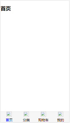
7. 运行截图