小米发布了新logo
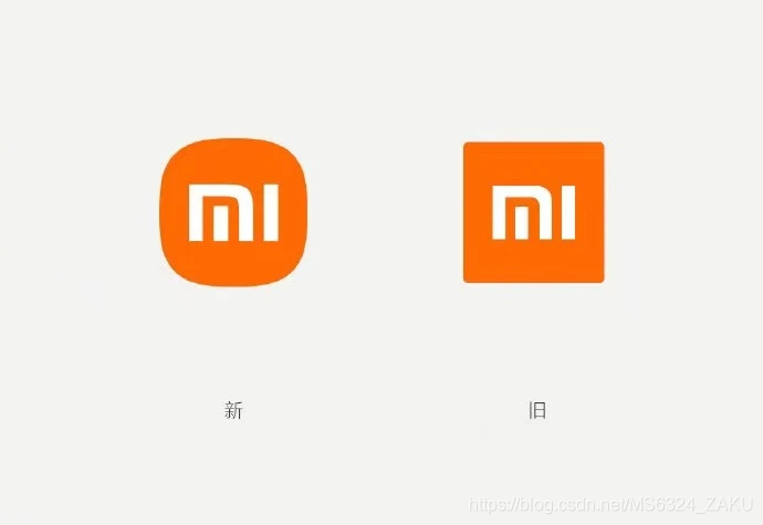
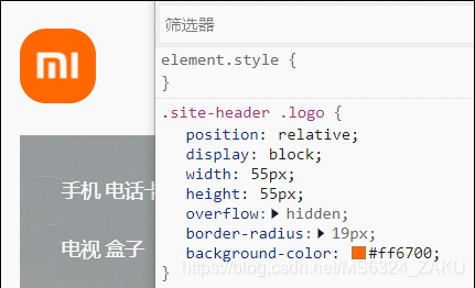
前段时间小米宣布了他们的新logo,但是细心的网友发现.小米的官网logo是这样实现的:
挺有趣的,我自己也实现一个试试
- 外边框使用border-box实现圆角(真logo是R角,即椭圆,border-box实现不了)
- 添加伪元素实现三个边框 ,
- 添加第二个伪元素实现M中间的那一点
- 再给那一点添加距离自己比较远的相同颜色的阴影
- 实现效果
- 没还原,只是像,r角border-box实现不了.
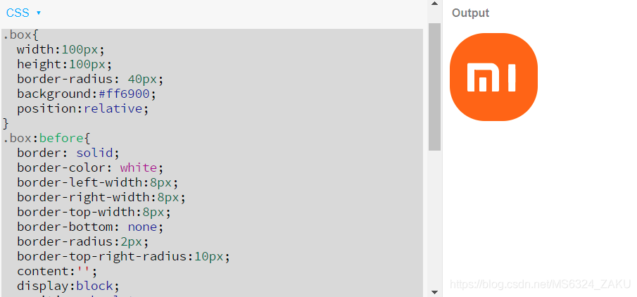
以下是代码
<body>
  <div class="box"></div>
</body>
.box{


  width:100px;
  height:100px;
  border-radius: 40px;
  background:#ff6900;
  position:relative;
}
.box:before{


  border: solid;
  border-color: white;
  border-left-width:8px;
  border-right-width:8px;
  border-top-width:8px;
  border-bottom: none;
  border-radius:2px;
  border-top-right-radius:10px;
  content:'';
  display:block;
  position:absolute;
  width:20px;
  height:25px;
  top:50%;
  left:20px;
  transform:translateY(-50%)
}
.box:after{


   content:'';
  display:block;
  position:absolute;
  top: 50%;
  left: 33.5px;
  width:8px;
  height:16px;
  background: white;
  border-radius:1px;
  box-shadow:  33px 0px 0px 0px white,
               33px -10px 0px 0px white,
               33px -15px 0px 0px white
      ;

}