import numpy as np
import matplotlib.pyplot as plt
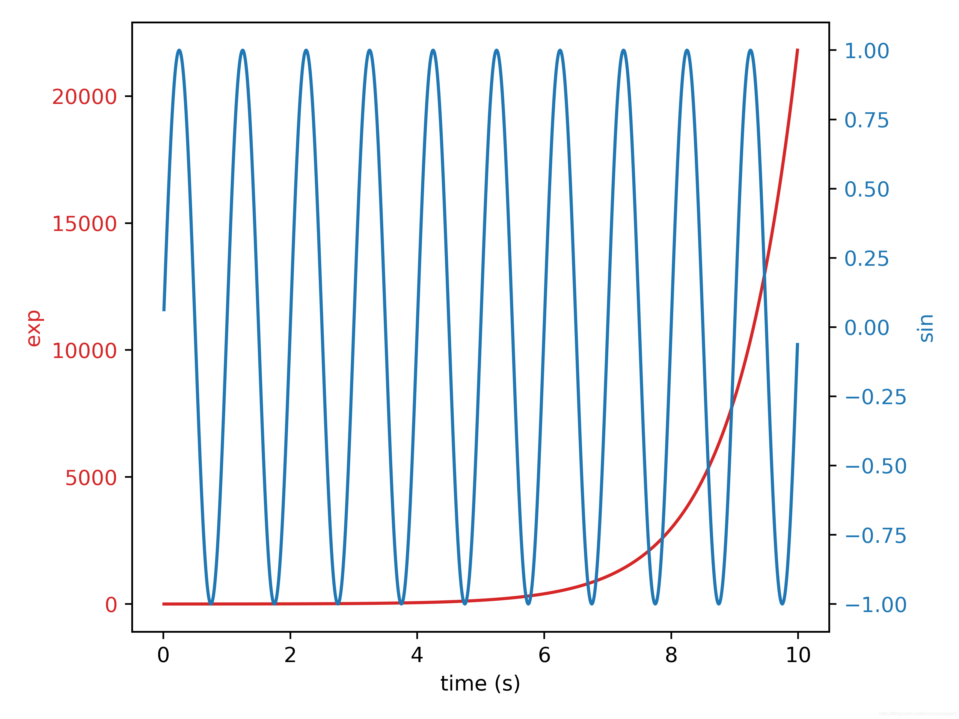
# 创建模拟数据
t = np.arange(0.01, 10.0, 0.01)
data1 = np.exp(t)
data2 = np.sin(2 * np.pi * t)
fig, ax1 = plt.subplots()
color = 'tab:red'
ax1.set_xlabel('time (s)')
ax1.set_ylabel('exp', color=color)
ax1.plot(t, data1, color=color)
ax1.tick_params(axis='y', labelcolor=color)
ax2 = ax1.twinx() # 创建共用x轴的第二个y轴
color = 'tab:blue'
ax2.set_ylabel('sin', color=color)
ax2.plot(t, data2, color=color)
ax2.tick_params(axis='y', labelcolor=color)
fig.tight_layout()
plt.show()
结果如下图:
Reference:matplotlib官方示例