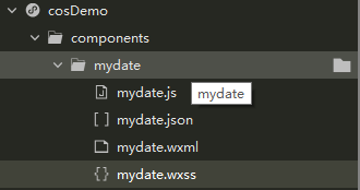
new2:自定义日期选择器:
自定义日期:只是做个整理,原创来源:https://blog.csdn.net/weixin_48201140/article/details/106603913
使用微信的picker-view和picker-view-column自定义日期选择器
wxml:
<view bindtap="dateOpen">
	date组件
</view>
<view class="propTimeBody" wx:if="{

   {propDate}}">
	<view class="propTimeMain">
		<view class="propTop clearfix">
			<text class="fl noBtn" bindtap="noBtnTime">取消</text>
			<!-- 第几周 -->
			<text>可以自己添加内容</text>
			<text class="fr okBtn" bindtap="okBtnTime">确定</text>
		</view>
		<picker-view indicator-style="height: 50px;" style="width: 100%; height: 300px;" value="{

   {value}}" bindchange="bindChange">
			<picker-view-column>
				<view wx:for="{

   {years}}" wx:key="years" style="line-height: 50px; text-align: center;">{

   {item}}年</view>
			</picker-view-column>
			<picker-view-column>
				<view wx:for="{

   {months}}" wx:key="months" style="line-height: 50px; text-align: center;">{

   {item}}月</view>
			</picker-view-column>
			<picker-view-column>
				<view wx:for="{

   {days}}" wx:key="days" style="line-height: 50px; text-align: center;">{

   {item}}日</view>
			</picker-view-column>
			<picker-view-column>
				<view class="icon-container" style="line-height: 50px; text-align: center;">
					上午
				</view>
				<view class="icon-container" style="line-height: 50px; text-align: center;">
					下午
				</view>
			</picker-view-column>
		</picker-view>
	</view>
</view>
wxss:
.propTimeBody{
  position: fixed;
  left: 0;
  top: 0;
  z-index: 99;
  height: 100%;
  width: 100%;
  background-color: rgba(0,0,0,.7);
}
.propTimeBody .propTimeMain{
  background-color: #fff;
  position: absolute;
  left: 0;
  bottom: 0;
  width: 100%;
  z-index: 111;
}
.propTimeBody .propTimeMain .propTop{
  text-align: center;
  padding: 30rpx 20rpx;
  font-size: 32rpx;
  color: #333;
}
.propTimeBody .propTimeMain .propTop .noBtn{
  color: #666;
}
.propTimeBody .propTimeMain .propTop .okBtn{
  color: #0084ff;
}
js:
const date = new Date(); //获取系统日期
const years = []
const months = []
const days = []
const bigMonth = [1, 3, 5, 7, 8, 10, 12]

//将日期分开写入对应数组

//年
var getYear = date.getFullYear()
var getMonth = date.getMonth()
var getDate = date.getDate()
for (let i = getYear - 20; i <= getYear + 20; i++) {
	years.push(i);
}

//月
for (let i = 1; i <= 12; i++) {
	months.push(i);
}

//日
for (let i = 1; i <= 31; i++) {
	days.push(i);
}
Component({
	properties: {

	},
	data: {
		years: years,
		year: getYear,
		months: months,
		month: getMonth + 1,
		days: days,
		day: getDate,
		value: [20, getMonth, getDate - 1],
		isDaytime: true,
		timeInput: {},
		propDate: false,
	},
	methods: {
		dateOpen() {
			let setYear = this.data.year;
			let setMonth = this.data.month;
			let setDay = this.data.day
			let dateTimeBody = setYear + '-' + setMonth + '-' + setDay
			let todays = this.data.isDaytime === true ? '上午' : '下午'
			this.setData({
				propDate: true,
				'timeInput.dateTimeBody':dateTimeBody,
				'timeInput.todays':todays
			})
		},
		okBtnTime() {
			this.setData({
				propDate: false,
				// timeInput: wx.getStorageSync('adminDate') + wx.getStorageSync('adminTodays'),
			})
			console.log(this.data.timeInput)
		},
		noBtnTime() {
			this.setData({
				propDate: false
			})
		},
		//判断元素是否在一个数组
		contains: function(arr, obj) {
			var i = arr.length;
			while (i--) {
				if (arr[i] === obj) {
					return true;
				}
			}
			return false;
		},
		setDays: function(day) {
			const temp = [];
			for (let i = 1; i <= day; i++) {
				temp.push(i)
			}
			this.setData({
				days: temp,
			})
		},
		//选择滚动器改变触发事件
		bindChange: function(e) {
			const val = e.detail.value;
			//判断月的天数
			const setYear = this.data.years[val[0]];
			const setMonth = this.data.months[val[1]];
			const setDay = this.data.days[val[2]]
			//console.log(setYear + '-' + setMonth + '-' + setDay);
			//闰年
			if (setMonth === 2) {
				if (setYear % 4 === 0 && setYear % 100 !== 0) {
					console.log('闰年')
					this.setDays(29);
				} else {
					console.log('非闰年')
					this.setDays(28);
				}
			} else {
				//大月
				if (this.contains(bigMonth, setMonth)) {
					this.setDays(31)
				} else {
					this.setDays(30)
				}
			}
			this.setData({
				year: setYear,
				month: setMonth,
				day: setDay,
				isDaytime: !val[3],
				'timeInput.dateTimeBody':setYear + '-' + setMonth + '-' + setDay,
				'timeInput.todays':!val[3] === true ? '上午' : '下午'
			})
			let dateTimeBody = setYear + '-' + setMonth + '-' + setDay
			let todays = !val[3] === true ? '上午' : '下午'
		},
	}
})
json:
{
	"component": true,
	"usingComponents": {}
}
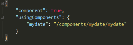
引用:在需要引用的父组件的json中加入组件路径如图:
wxml:直接调用即可

picker的多选择框设置日期时间:https://blog.csdn.net/lzy_520/article/details/103487786
new1:自定义的使用checkbox实现多选组件


代码:
wxml:
<view wx:if="{

   { houseApproval.length > 0 }}" class="cu-list menu sm-border margain-top zdy-card">
			<checkbox-group bindchange="change2">
				<view class="cu-item" wx:for="{

   {houseApproval}}" wx:key="{

   { item.id }}" data-item="{

   {item}}" wx:key="{

   {index}}">
					<view class="box">
						<view class="top flex-row">
							<view class="flex-row" style="align-items: center;">
								<checkbox style="margin:auto 0rpx;" id="item{

   { index }}" value="{

   { item.id }}" checked="{

   { item.checked }}"></checkbox>
								<text>申请人:{

   { item.userinfoName }}</text>
							</view>
							<text>{

   { item.addTime }}</text>
						</view>
						<label style="width: 100%;" for="item{

   { index }}">
							<view class="mycontent">
								<view class="text-gray text-df">
									<text class="margin-right-xs"></text>
									房间名称:{

   { item.labName }}
								</view>
								<view class="text-gray text-df">
									<text class="margin-right-xs"></text>
									申请日期:{

   { item.year }} {

   { item.time1 }}--{

   { item.time2 }}
								</view>
								<view class="text-gray text-df">
									<text class="margin-right-xs"></text>
									申请原因:{

   { item.des }}
								</view>
								<view class="text-gray text-df">
									<text class="margin-right-xs"></text>
									标签:{

   { item.tagName }}
								</view>
							</view>
							<view class="flex-row" style="width: 100%;padding-left: 15rpx;">
								<text></text>
								<view>
									<text>审批人:{

   {item.userName}}</text>
									<text class="{

   { item.isApply ? (item.isPass  ? 'tag' : 'curag') : 'curag1' }}">{

   { item.pass }}</text>
								</view>
							</view>
						</label>
					</view>
				</view>
			</checkbox-group>
		</view>
		<view class="nilist" wx:else>暂无数据</view>
wxss:
.list {
	width: 100%;
	height: 170rpx;
	display: flex;
	padding: 25rpx 20rpx;
	border-radius: 20rpx;
	background: #fff;
	overflow: hidden;
	position: relative;
	margin-bottom: 25rpx;
}
.right {
	width: 70%;
	display: flex;
	flex-direction: column;
}
js:
Component({
	properties: {
		remoteList: {
			type: Array,
			value: [],
		}
	},
	data: {
		all_checked: false,
		count: 0,
		arrids:[],
		arrnames:[],
		arrids1:[],
		arrnames1:[],
	},
	methods: {
		srue() {
			if(this.data.all_checked) {
				ids = this.data.houseIdArr.join(",") || this.data.houseIdArr1.join(",")
			}else {
				ids = this.data.houseIdArr.join(",")
			}
		},
		//多选
	change2:function(e) {
		let ids = e.detail.value
		let index1 = this.data.TabCur
		let length = index1 === 1 ? this.data.classApproval.length : this.data.houseApproval.length
		console.log(e.detail.value)
		// console.log(index1,length)
		if(ids.length >= length) {
			this.setData({all_checked:true})
		}else {
			this.setData({all_checked:false})
		}
		this.setData({ houseIdArr: ids })
	},
	change1:function() {
		if(this.data.houseApproval.length > 0 || this.data.classApproval.length > 0){
			this.setData({
				all_checked: !this.data.all_checked,
				count: 0,
				houseIdArr:[],
				houseIdArr1:[],
			})
			let index = this.data.TabCur
			let houseApproval = []
			if(index === 0) {
				houseApproval = this.data.houseApproval
			}else {
				houseApproval = this.data.classApproval
			}
			let arr1 = []
			houseApproval.forEach(ele => {
				ele.checked = this.data.all_checked
				if(ele.checked) {
					arr1.push(ele.id)
				}
			})
			this.setData({
				houseIdArr1: arr1,
				houseApproval: houseApproval,
				classApproval: houseApproval
			})
		}
	},
	},
})
json:
{
	"component": true,
	"usingComponents": {}
}
引用:可全局可局部,这里使用的局部引入,在需要引入的父组件对应的json文件中做如下修改:

在相应的wxml文件中直接引入,如下:
<duoxuan remoteList="{

   { remoteList }}" bind:choose="mychoose"></duoxuan>
js如下:
Page({
    remoteList: [{
			id: Math.random(),
			jiancheng: "简称1",
			status: "开",
			checked: false
		}, {
			id: Math.random(),
			jiancheng: "简称1",
			status: "关",
			checked: false
		}, {
			id: Math.random(),
			jiancheng: "简称1",
			status: "开",
			checked: false
		}, {
			id: Math.random(),
			jiancheng: "简称1",
			status: "关",
			checked: false
	}],
    mychoose(e) {
		console.log(e.detail)
	},

})1、下拉框:借鉴:https://www.cnblogs.com/similar/p/11469091.html,区别:在原有的基础上加上了多选

wxml:
<view class="select-box">
	<view class="select-current" catchtap="openClose">
		<text wx:if="{

   { !current.name }}">{

   { placeholder }}</text>
		<text wx:else class="current-name">{

   {current.name}}</text>
	</view>


	<view class="option-list" wx:if="{

   {isShow}}" catchtap="optionTap">
		<!-- <text class="option"
	  data-id="{

   {defaultOption.id}}"
	  data-name="{

   {defaultOption.name}}">{

   {defaultOption.name}}
	</text> -->
		<view wx:if="{

   { mul }}" >
			<label for=""><checkbox class="all" catchtap="allSelect"></checkbox>全选</label>
			<checkbox-group catchchange="checkboxChange">
				<view class="option" wx:for="{

   {result}}" wx:key="{

   {item.id}}" data-id="{

   {item.id}}" data-name="{

   {item.name}}">
					<checkbox catchtap value="{

   {item.name}}" checked="{

   { item.checked }}"></checkbox>
					<text >{

   {item.name}}</text>
				</view>
			</checkbox-group>
			<view class="mybtn" catchtap="chooseClas">确定</view>
		</view>
		<view wx:else>
			<text class="option" wx:for="{

   {result}}" wx:key="{

   {item.id}}" data-id="{

   {item.id}}" data-name="{

   {item.name}}">{

   {item.name}}
			</text>
		</view>

	</view>

</view>
wxss:
.select-box {
  position: relative;
  width: 100%;
  font-size: 24rpx;
}

.select-current {
  position: relative;
  width: 100%;
  padding: 0 10rpx;
  height: 50rpx;
  line-height: 50rpx;
  border: 1rpx solid #e5e5e5;
  border-radius: 6rpx;
  box-sizing: border-box;
}
checkbox {
	transform: scale(0.6);
}
checkbox-group checkbox .wx-checkbox-input.wx-checkbox-input-checked {
  background: #1cbbb4!important;
  border-color:#1cbbb4;
}
checkbox .wx-checkbox-input.wx-checkbox-input-checked::before {
  width: 20rpx;
  height: 20rpx;
  line-height: 20rpx;
  text-align: center;
  font-size: 22rpx;
  color: #fff;
  background: transparent;
  transform: translate(-50%, -50%) scale(1);
  -webkit-transform: translate(-50%, -50%) scale(1);
}

.mybtn {
	color: #fff;
	font-size: 24rpx;
	background: #1cbbb4;
	line-height: 45rpx;
	margin-left:20rpx ;
	text-align: center;
	border: 1rpx solid #1cbbb4;
}
.select-current::after {
  position: absolute;
  display: block;
  right: 16rpx;
  top: 22rpx;
  content: '';
  width: 0;
  height: 0;
  border: 10rpx solid transparent;
  border-top: 10rpx solid #999;
}

.current-name {
  display: block;
  width: 85%;
  height: 100%;
  word-wrap: normal;
  overflow: hidden;
}

.option-list {
  position: absolute;
  left: 0;
  top: 76rpx;
  width: 100%;
  padding: 12rpx 20rpx 10rpx 20rpx;
  border-radius: 6rpx;
  box-sizing: border-box;
  z-index: 99;
  box-shadow: 0rpx 0rpx 1rpx 1rpx rgba(0, 0, 0, 0.2) inset;
  background-color: #fff;
}

.option {
  display: block;
  width: 100%;
  line-height: 70rpx;
  border-bottom: 1rpx solid #eee;
}

.option:last-child {
  border-bottom: none;
  padding-bottom: 0;
}
json:
{
	"component": true,
	"usingComponents": {}
}
js:
Component({
	properties: {
		options: {
			type: Array,
			value: []
		},
		defaultOption: {
			type: Object,
			value: {
				// id: '000',
				// name: '全部城市'
			}
		},
		mul: { //判断是否可以多选
			type: Boolean,
			value: false
		},
		key: {
			type: String,
			value: 'id'
		},
		text: {
			type: String,
			value: 'name'
		},
		placeholder: {
			type: String,
			value: 'placeholder'
		}
	},
	data: {
		result: [],
		isShow: false,
		current: {},
		select_all: false,
		batchIds: ''
	},
	methods: {
		//全选与反全选
		allSelect(e) {
			var arr = []; //存放选中id的数组
			let result = this.data.result
			for (let i = 0; i < result.length; i++) {
				result[i].checked = (!this.data.select_all)

				if (result[i].checked == true) {
					// 全选获取选中的值
					arr = arr.concat(result[i].name.split(','));
				}
			}
			//   console.log(arr)
			this.setData({
				result: result,
				select_all: (!this.data.select_all),
				batchIds: arr
			})
		},
		//班级选择
		chooseClas() {
			this.triggerEvent("chooseClas", { ...this.data.batchIds})
		},
		//多选框事件
		checkboxChange(e) {
			console.log(e.detail.value)
		},
		optionTap(e) {
			let dataset = e.target.dataset
			this.setData({
				current: dataset,
				isShow: false
			});

			// 调用父组件方法,并传参
			this.triggerEvent("change", { ...dataset})
		},
		openClose() {
			this.setData({
				isShow: !this.data.isShow
			})
		},

		// 此方法供父组件调用
		close() {
			this.setData({
				isShow: false
			})
		}
	},
	lifetimes: {
		attached() {
			// 属性名称转换, 如果不是 { id: '', name:'' } 格式,则转为 { id: '', name:'' } 格式
			let result = []
			if (this.data.key !== 'id' || this.data.text !== 'name') {
				for (let item of this.data.options) {
					let {
						[this.data.key]: id, [this.data.text]: name
					} = item
					result.push({
						id,
						name
					})
				}
			}
			this.setData({
				current: Object.assign({}, this.data.defaultOption),
				result: result
			})
		}
	}
})
这里我把它定义为了全局组件:
在app.json中设置键值如下:
 "usingComponents": {
    "cu-custom": "/colorui/components/cu-custom",
	"select": "/components/select/select"
  },
直接在需要的地方引用:
<select style="width: 80%;" placeholder="请选择学期" name="sem" key="semid" text="sem" id="semesters" options="{

   {semesters}}" bind:change="semchange"></select>
<label for="" class="flex-row"><text class="name">班级:</text>
			<select style="width: 80%;" mul="{

   { true }}" bind:chooseClas="chooseClas"  placeholder="请选择班级" key="claid" text="myclass" id="classes" options="{

   {classes}}"
         bind:change="clachange"></select>
</label>
//data中设置,semid对应wxml中的key,sem对应wxml中的text
semesters: [{
semid: Math.random(),
sem: '学期一'
}, {
semid: Math.random(),
sem: '学期二'
}, {
semid: Math.random(),
sem: '学期三'
}], //学期下拉框数据
classes: [{
claid: Math.random(),
myclass: '班级一',
checked: false
}, {
claid: Math.random(),
myclass: '班级二',
checked: false
}, {
claid: Math.random(),
myclass: '班级三',
checked: false
}], //班级下拉框数据2、自定义可滑动tab页(这里没有将其封装成组件,有兴趣的可以根据上述下拉框进行封装)
js:
data: {
		tabList: [{
			id: Math.random(),
			value: "一单元"
		}, {
			id: Math.random(),
			value: "二单元"
		}, {
			id: Math.random(),
			value: "三单元"
		}, {
			id: Math.random(),
			value: "周四"
		}, {
			id: Math.random(),
			value: "四单元"
		}, {
			id: Math.random(),
			value: "五单元"
		}],
		currenttab: 0,
        courselist: [{
			type: "类型一",
			id: Math.random(),
			teacher: "老师一",
			mydate: "2020-17-01",
			sem: "学期一",
			batch: '批次一',
			myclass: '班级一',
			mylab: '实验室一'
		}, {
			type: "类型一",
			id: Math.random(),
			teacher: "老师二",
			mydate: "2020-17-01",
			sem: "学期二",
			batch: '批次二',
			myclass: '班级二',
			mylab: '实验室二'
		}], //模拟课程列表

},
// tab切换
tabSelect(e) {
	let index = e.currentTarget.dataset.index
	this.setData({
		currenttab: index
	})
},
//swiper
bindchange(e) {
	let index = e.detail.current
	this.setData({
		currenttab: index
	})
},
wxml:
<view class="mytab flex-row">
		<block wx:for="{

   { tabList }}" wx:key="{

   { item.id }}">
			<text class="{

   {index === currenttab?'text-cyan cur':''}}" data-index="{

   { index }}" data-item="{

   { item }}" bindtap="tabSelect">{

   { item.value }}</text>
		</block>
		{

   {item.value}}
	</view>
	<scroll-view scroll-y="true">
		<swiper style="height:{

   { (450*courselist.length)+'rpx' }}"  bindchange="bindchange" current="{

   { currettab }}">
			<block wx:for="{

   { tabList }}" wx:key="{

   { item.id }}">
				<swiper-item>
					<block wx:for="{

   { courselist }}" wx:key="{

   { item.id }}">
						<view class="course flex-row">
							<text class="type">{

   { item.type }}</text>
							<view class="left flex-col">
								<text>{

   { item.teacher }}</text>
							</view>
							<view class="right flex-col">
								<text>所选学期:{

   { item.sem }}</text>
								<text>所选批次:{

   { item.batch }}</text>
								<text>所选班级:{

   { item.myclass }}</text>
								<text>预约时间:{

   { item.mydate }}</text>
								<text>所选实验室:{

   { item.mylab }}</text>
							</view>
							<view class="operation">
								<text class="iconfont courseedit" bindtap="edit"></text>
								<text class="iconfont coursedel" bindtap="del"></text>
							</view>
						</view>
					</block>
				</swiper-item>
			</block>
		</swiper>
	</scroll-view>
wxss:
.flex-row {
	display: flex;
	flex-direction: row;
	justify-content: space-between;
	box-sizing: border-box;
}
.mytab {
	padding: 20rpx 0rpx 0rpx 0prx;
	font-size: 24rpx;
	border-bottom: 1rpx solid #e3e3e3;
	justify-content: space-evenly;
}
.mytab text {
	padding: 30rpx 10rpx 30rpx 10rpx;
}
.cur{
	border-bottom: 4rpx solid #1cbbb4;
}
scroll-view {
	padding: 20rpx;
	height: 820rpx;
	background: #fff;
	border-bottom: 1px solid rgba(243,243,243,0.8);
}
scroll-view  .course {
	margin-top: 30rpx;
	padding: 60rpx;
	position: relative;
	border-radius: 20rpx;
	box-sizing: border-box;
	justify-content: flex-start;
	box-shadow: 0 0 6rpx 6rpx rgba(0,0,0,.1);
	/* box-shadow: 0rpx 0rpx 18rpx 18rpx rgba(243,243,243,0.8); */
}
scroll-view .course .type {
	top: 10rpx;
	right: 20rpx;
	color: #1cbbb4;
	padding: 10rpx 20rpx;
	font-size: 24rpx;
	position: absolute;
	background: #d2f1f0;
}
scroll-view  .course .left text {
	margin: auto;
	width: 125rpx;
	color: #1cbbb4;
	text-align: center;
	padding: 10rpx 20rpx;
	line-height: 50rpx;
	border-radius: 20rpx;
	box-sizing: border-box;
	background: #d2f1f0;
	box-shadow: 0rpx 0rpx 2rpx 2rpx #d2f1f0;
}
scroll-view .course:last-child {
	margin-bottom: 20rpx;
}
scroll-view .course .right {
	font-size: 24rpx;
	margin-left: 100rpx;
}
scroll-view .course .right text {
	color: #666;
	line-height: 50rpx;
}
scroll-view .course .operation {
	right: 30rpx;
	bottom: 20rpx;
	position: absolute;
}
scroll-view .course .operation text {
	margin-right: 20rpx;
}3、js实现上一天和下一天:https://www.cnblogs.com/bingguang/p/4747215.html
//上一天
	upday() {
        //this.data.nowDate ---为获取的时间,格式为yyyy-mm-dd,dnday()同
		var curDate = new Date(this.data.nowDate);
		var preDate = new Date(curDate.getTime() - 24 * 60 * 60 * 1000);

		var strDate = preDate.getFullYear() + "-";
		if((preDate.getMonth() + 1) < 10) {
			strDate += '0'+preDate.getMonth() + 1 + "-";
		}else {
			strDate += preDate.getMonth() + 1 + "-";
		}
		if(preDate.getDate() < 10) {
			strDate += "0"+preDate.getDate();
		}else {
			strDate += preDate.getDate();
		}

		this.setData({ nowDate:strDate })
		// strDate += preDate.getHours() + ":";
		// strDate += preDate.getMinutes() + ":";
		// strDate += preDate.getSeconds();
	},
	//下一天
	dnday() {
		var curDate = new Date(this.data.nowDate);
		var nextDate = new Date(curDate.getTime() + 24 * 60 * 60 * 1000);
		var strDate = nextDate.getFullYear() + "-";
		if((nextDate.getMonth() + 1) < 10) {
			strDate += '0'+nextDate.getMonth() + 1 + "-";
		}else {
			strDate += nextDate.getMonth() + 1 + "-";
		}
		if(nextDate.getDate() < 10) {
			strDate += '0'+nextDate.getDate();
		}else {
			strDate += nextDate.getDate();
		}
		// strDate += nextDate.getHours() + ":";
		// strDate += nextDate.getMinutes() + ":";
		// strDate += nextDate.getSeconds();
		this.setData({ nowDate:strDate })
	},
有兴趣的朋友可以关注下:积跬步成江河