1.两列布局----左边固定,右边自适应
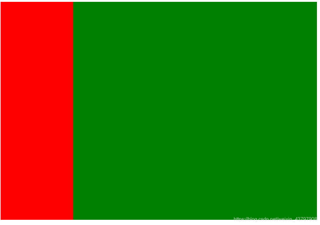
1. 使用float浮动解决
<!DOCTYPE html>
<html lang="en">
<head>
    <meta charset="UTF-8">
    <title>Title</title>
    <style>
        .left{
            height: 600px;
            width: 200px;
            float: left;
            background-color: red;
        }
        .right{
            height: 600px;
            background-color: green ;
        }
    </style>

</head>
<body>
<div>
    <div class="left"></div>
    <div class="right"></div>
</div>
</body>
</html>

2.使用弹性布局解决
<!DOCTYPE html>
<html lang="en">
<head>
    <meta charset="UTF-8">
    <title>Title</title>
    <style>
        .container{
            display: flex;
        }
        .left{
            height: 600px;
            width: 200px;

            background-color: red;
        }
        .right{
            flex: 1;
            height: 600px;
            background-color: black ;
        }
    </style>

</head>
<body>
<div class="container">
    <div class="left"></div>
    <div class="right"></div>
</div>
</body>
</html>
2.两列布局---左边自适应,右边固定

1. 弹性布局实现
<!DOCTYPE html>
<html lang="en">
<head>
    <meta charset="UTF-8">
    <title>Title</title>
    <style>
        .container{
            width: 100%;
            display: flex;
        }
        .left{
            height: 600px;
           flex: 1;
            background-color: black;
        }
        .right{
            width: 200px;

            height: 600px;
            background-color: red ;
        }
    </style>

</head>
<body>
<div class="container">
    <div class="left"></div>
    <div class="right"></div>
</div>
</body>
</html>
3.三栏布局---左右固定,中栏自适应

1. 使用弹性布局实现
<!DOCTYPE html>
<html lang="en">
<head>
<meta charset="UTF-8">
<title>Title</title>
<style>
.container{
width: 100%;
display: flex;
}
.left{
height: 600px;
width: 200px;
background-color: black;
}
.conten{
background-color: purple;
flex: 1;
}
.right{
width: 200px;
height: 600px;
background-color: red ;
}
</style>
</head>
<body>
<div class="container">
<div class="left"></div>
<div class="conten"></div>
<div class="right"></div>
</div>
</body>
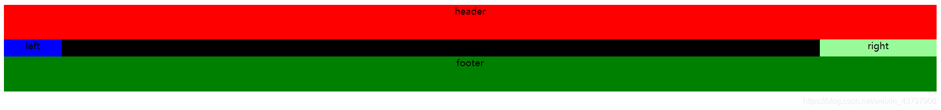
</html>4.圣杯布局与双飞翼布局
这两个展示的效果是一样的但是具体实现过程是不一样的
双飞翼布局:就跟他的名字一样,有两个翅膀 header middle left right footer
圣杯布局:header content(middle left right) footer
所以从最开始的DOM节点构建应该就是不一样的
4.1 双飞翼布局
三个盒子左浮动,左边盒子margin-left:-中间盒子宽度,右边盒子:margin-left:-自己盒子的宽度

<!DOCTYPE html>
<html lang="en">
<head>
    <meta charset="UTF-8">
    <title>Title</title>
    <style>
       header{
           width: 100%;
           height: 60px;
           background-color: red;
           text-align: center;
       }

       .middle{
           width: 100%;
           background-color: purple;
           float: left;
           height: 30px;
       }
        .left{
            width: 100px;
            height: 30px;
            background-color: green;
            float: left;
            margin-left: -100%;
        }
        .right{
            width: 200px;
            height: 30px;
            background-color: yellow;
            float: left;
            margin-left: -200px;
        }
        .content{
            padding: 0 200px 0 100px;
        }
       footer{
           width: 100%;
           height: 60px;
           background-color:black;
           text-align: center;
           clear:both;
       }
    </style>

</head>
<body>
<div class="container">
    <header>header</header>
    <div class="middle">
        <div class="content">middle</div>
    </div>
    <div class="left">left</div>
    <div class="right">right</div>
    <footer>footer</footer>
</div>
</body>
</html>
4.2圣杯布局
<!DOCTYPE html>
<html lang="en">
<head>
    <meta charset="UTF-8">
    <title>Title</title>
    <style>
        *{
            text-align: center;
        }
       header{
           width: 100%;
           height: 60px;
           background-color: red;
           text-align: #ccc;
       }
       footer{
           width: 100%;
           height: 60px;
           background-color:green;
           text-align: center;
           clear:both;
       }
       .middle{
           width: 100%;
           background-color: black;
           float: left;
           height: 30px;

       }
        .left{
            width: 100px;
            height: 30px;
            background-color: blue;
            float: left;
            margin-left: -100%;
            position: relative;
            left: -100px;
        }
        .right{
            width: 200px;
            height: 30px;
            background-color: palegreen;
            float: left;
            margin-left: -200px;
            position: relative;
            left: 200px;
        }
        .content{
            padding: 0 200px 0 100px;
        }

    </style>

</head>
<body>
<footer class="container">
    <header>header</header>
    <div class="content">
        <div class="middle">middle</div>
        <div class="left">left</div>
        <div class="right">right</div>
    </div>
    <footer>footer</footer>
</div>
</body>
</html>