深挖一下背景模糊效果的三种表现形式:
- 背景整体模糊
- 背景局部模糊
- 背景局部清晰
背景整体模糊:
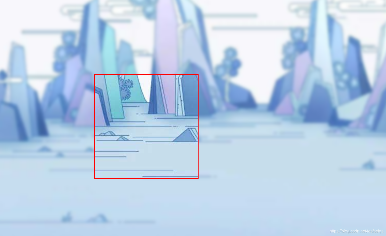
最近频繁出现一个需求,实现类似于这种效果,背景是商品图模糊后的样子,商品图出现在前面,我第一反应是通过定位position和滤镜filter实现,来看看吧
先定结构,有坑点:
  <div class="bg">
        <div class="content">我是内容</div>
  </div>
分析:,如果我们把background和filter直接写在bg上,这样写会使整个div的后代模糊并且还会出现白边,导致页面非常不美观,要想解决这个问题,我们可以使用伪元素,因为伪元素的模糊度不会被父元素的子代继承。
白边:
完整实现:
<!DOCTYPE html>
<html lang="zh">

	<head>
		<meta charset="UTF-8" />
		<meta name="viewport" content="width=device-width, initial-scale=1.0" />
		<meta http-equiv="X-UA-Compatible" content="ie=edge" />
		<title>Document</title>
	</head>
	<style>
		html,
		body {


			width: 100%;
			height: 100%;
		}

		* {


			margin: 0;
			padding: 0;
		}

		.bg {


			width: 100%;
			height: 100%;
			position: relative;
			background: url("./2.jpg") no-repeat;
			background-size: cover;
		}

		.bg:after {


			content: "";
			width: 100%;
			height: 100%;
			position: absolute;
			left: 0;
			top: 0;
			/* 从父元素继承 background 属性的设置 */
			background: inherit;
			/*背景模糊*/
			filter: blur(4px);
		}

		.content {


			position: absolute;
			left: 50%;
			top: 50%;
			transform: translate(-50%, -50%);
			width: 200px;
			height: 200px;
			text-align: center;
			z-index: 1;
		}
	</style>
	</head>

	<body>
		<div class="bg">
			<div class="content">我是清晰的文字</div>
		</div>
	</body>

</html>
效果图:
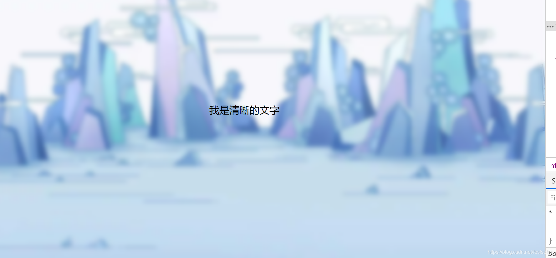
并没有白边:完美
还没完,背景整体模糊整完,来玩玩背景局部模糊
背景局部模糊
局部模糊比整体模糊,相对来说就简单很多了,我觉得最关键的一个代码是fixed
直接上代码:
<!DOCTYPE html>
<html lang="zh">

	<head>
		<meta charset="UTF-8" />
		<meta name="viewport" content="width=device-width, initial-scale=1.0" />
		<meta http-equiv="X-UA-Compatible" content="ie=edge" />
		<title>Document</title>
	</head>
	<Style>
		html,
		body {


			width: 100%;
			height: 100%;
		}

		* {


			margin: 0;
			padding: 0;
		}

		.bg {


			width: 100%;
			height: 100%;
			background: url("./2.jpg") no-repeat fixed;
		}

		.drag {


			position: absolute;
			top: 200px;
			left: 400px;
			width: 200px;
			height: 200px;
			background: inherit;
			filter: blur(15px);
		}
	</Style>
	</head>

	<body>
		<div class="bg">
			<div class="drag"></div>
		</div>
	</body>

</html>
效果图:
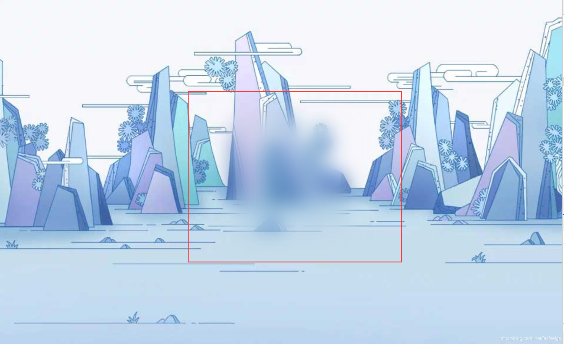
背景局部清晰:
这和背景局部模糊的原理一样,我觉得都是依赖一个很重要的属性
background-attachment:fixed,假如把这属性去掉,可以试下,就没有那种效果了
<!DOCTYPE html>
<html lang="zh">

	<head>
		<meta charset="UTF-8" />
		<meta name="viewport" content="width=device-width, initial-scale=1.0" />
		<meta http-equiv="X-UA-Compatible" content="ie=edge" />
		<title>Document</title>
	</head>
	<Style>
		html,
		body {


			width: 100%;
			height: 100%;
		}

		* {


			margin: 0;
			padding: 0;
		}

		.bg {


			width: 100%;
			height: 100%;
			background: url("./2.jpg") no-repeat fixed;
		}

		.bg:after {


			content: "";
			width: 100%;
			height: 100%;
			position: absolute;
			left: 0;
			top: 0;
			background: inherit;
			filter: blur(3px);
		}

		.show {


			position: absolute;
			top: 40%;
			left: 30%;
			width: 200px;
			height: 200px;
			background: inherit;
			border: 1px solid red;
			z-index: 1;
		}
	</Style>
	</head>

	<body>
		<div class="bg">
			<div class="show"></div>
		</div>
	</body>
</html>
效果图: