本教程代码下载地址:点击打开链接
如果感觉太复杂,可以看看基础教程>>>飞机坠落
效果图:
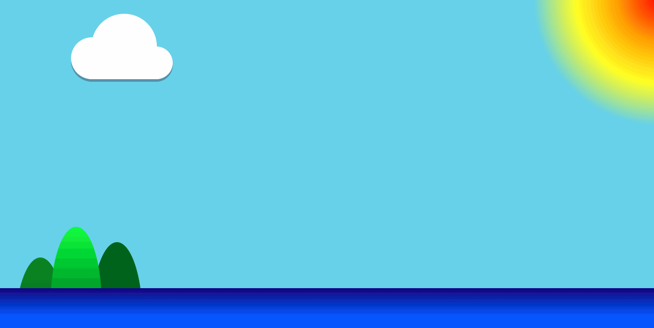
除了船是图片,其他都是代码生成的素材.
代码:
<!DOCTYPE html>
<html lang="en">

<head>
    <meta charset="UTF-8">
    <meta name="viewport" content="width=device-width, initial-scale=1.0">
    <meta http-equiv="X-UA-Compatible" content="ie=edge">
    <title>海贼船</title>
    <style>
        * {
            margin: 0;
            padding: 0;
        }

        html,
        body {
            /* 如果不设置body宽高,radial-gradient无效 */
            width: 100%;
            height: 100%;
        }

        body {
            /* 径向渐变的太阳 */
            background: radial-gradient(250px at right top, red, orange, yellow, skyblue);
            overflow: hidden;
        }

        /* 移动的船 */
        img {
            position: absolute;
            bottom: 100px;
            right: 100px;
            transform: translate(0px, 0px) rotate(3deg);
            animation: move 10s ease-in-out 0s forwards;
        }

        @keyframes move {
            20% {
                transform: translate(-500px, 0px) rotate(-3deg);
            }
            21% {
                transform: translate(-500px, 3px) rotate(-3deg);
            }
            25% {
                transform: translate(-450px, 0px) rotate(1deg);
            }
            26% {
                transform: translate(-450px, 3px) rotate(2deg);
            }
            27% {
                transform: translate(-450px, 0px) rotate(3deg);
            }
            50% {
                transform: translate(-450px, 50px) rotate(15deg);
            }
            80% {
                transform: translate(-300px, 200px) rotate(50deg);
            }
            100% {
                transform: translate(-300px, 400px) rotate(60deg);
            }
        }

        /* 线性渐变的海洋 */
        sea {
            width: 100%;
            height: 110px;
            background: linear-gradient(to top, #05f, #05f, #008);
            position: absolute;
            bottom: 0;
            z-index: 10;
        }

        /* 线性渐变的山 */
        mountain1 {
            width: 100px;
            height: 300px;
            border-radius: 50% 50%;
            background: linear-gradient(to bottom, #080, #050);
            position: absolute;
            bottom: -130px;
            left: 40px;
        }

        mountain2 {
            width: 100px;
            height: 300px;
            border-radius: 50% 50%;
            background: linear-gradient(to bottom, #0f0, #080, #050);
            position: absolute;
            bottom: -70px;
            left: 110px;
            z-index: 1;
        }

        mountain3 {
            width: 100px;
            height: 300px;
            border-radius: 50% 50%;
            background: linear-gradient(to bottom, #060, #050);
            position: absolute;
            bottom: -100px;
            left: 190px;
        }

        /* 飘动的云朵 */
        cloud {
            margin-left: 50px;
            width: 250px;
            height: 150px;
            position: relative;
            animation: 'cloud' 5s linear infinite;
        }

        /* 这里的通配符*的意思是cloud内部的所有元素都适配 */
        cloud * {
            position: absolute;
            background: #FFF;
            border-radius: 50%;
            box-shadow:0px 5px 0px #6695B0;
        }

        cloud .one {
            left: 60px;
            top: 30px;
            width: 128px;
            height: 128px;
        }

        cloud .two {
            left: 20px;
            top: 76px;
            width: 82px;
            height: 82px;
        }

        cloud .thr {
            left: 155px;
            top: 94px;
            width: 64px;
            height: 64px;
        }

        cloud .fou {
            left: 56px;
            top: 118px;
            width: 135px;
            height: 40px;
            border-radius: 0;
        }

        @keyframes cloud {
            0% {
                margin-left: 50px;
            }
            50% {
                margin-left: 150px;
            }
            100% {
                margin-left: 50px;
            }
        }
    </style>
</head>

<body>
    <img src="./imgs/1.png">
    <sea></sea>
    <!-- 山的排序是左中右 -->
    <mountain1></mountain1>
    <mountain2></mountain2>
    <mountain3></mountain3>
    <!-- 云朵是由大中小三个圆和一个矩形组合的 -->
    <cloud>
        <div class="one"></div>
        <div class="two"></div>
        <div class="thr"></div>
        <div class="fou"></div>
    </cloud>
</body>

</html>
转载请注明地址谢谢