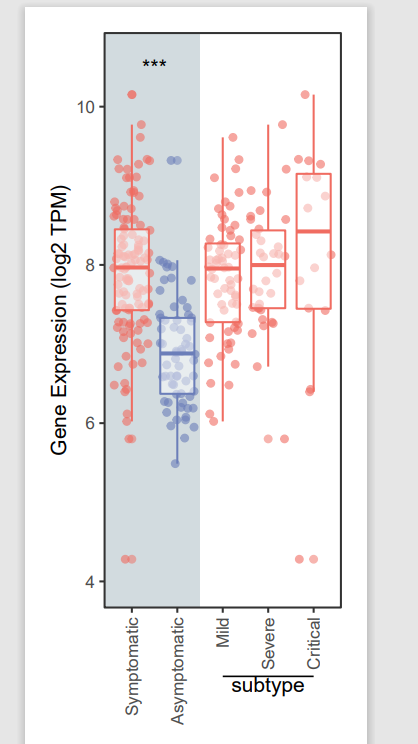
今天我们复现一幅2022年3月发表在Cell上的箱线图。
Title:Tissue-resident FOLR2+ macrophages associate with CD8+ T cell infiltration in human breast cancer
DOI:https://doi.org/10.1016/j.cell.2022.02.021
之前复现过的箱线图:

读图
本期箱线图亮点:
扫描二维码关注公众号,回复:
14227678 查看本文章

加上了亚组的比较
组间和组内背景不同
结果展示
示例数据和代码领取
点赞、在看 本文,分享至朋友圈集赞20个并保留30分钟,截图发至微信mzbj0002领取。
木舟笔记2022年度VIP可免费领取。
木舟笔记2022年度VIP企划
权益:
2022年度木舟笔记所有推文示例数据及代码(在VIP群里实时更新)。

木舟笔记科研交流群。
半价购买
跟着Cell学作图系列合集(免费教程+代码领取)|跟着Cell学作图系列合集。
收费:
99¥/人。可添加微信:mzbj0002 转账,或直接在文末打赏。

绘制
# 导入数据
mRNA<-read.csv("All_mRNA_FPKM.csv",header=T,row.names=1)
exp<-log2(mRNA+1)
bar_mat<-t(exp)
anno<-read.csv("sample_index.csv",header=T,row.names=1)
anno$type2<-anno$Type
anno <- anno[rownames(bar_mat),]
bar_mat<-bar_mat[rownames(anno),]
bar_mat<-as.data.frame(bar_mat)
bar_mat$sam=anno$Type

# 这里将"Mild","Severe","Critical" 三组合并为 symptomatic组
# 并对数据进行复制并合并
library(tidyverse)
plot_data <- data.frame(FOXO3 = bar_mat$FOXO3,
                        group = bar_mat$sam)

plot_data2 <- plot_data %>% filter(group != 'Asymptomatic')
plot_data2$group = 'Symptomatic'
plot_data = rbind(plot_data,plot_data2)
head(plot_data)

# 设置分组因子水平
plot_data$group<-factor(plot_data$group,
                        levels=c("Symptomatic","Asymptomatic","Mild","Severe","Critical"))
library(RColorBrewer)
library(ggpubr)
library(ggplot2)
color <-c("#f06c61","#6b7eb9","#f06c61","#f06c61","#f06c61")
# 自行设置差异比较分组
my_comparisons <- list(c("Symptomatic","Asymptomatic"))
range(bar_mat$FOXO3)
p <- ggplot(plot_data,aes(x = group, y = FOXO3, color = group)) +
  geom_rect(xmin = 0.4, xmax = 2.5,
            ymin = -Inf, ymax = Inf,
            fill ='#d2dbdf',
            inherit.aes = F)+
  geom_jitter(alpha = 0.6)+
  geom_boxplot(alpha = 0.5) +
  scale_color_manual(values = color)+
  # 先算一下显著性差异,再手动添加
  #geom_signif(comparisons = my_comparisons,
  #            test = "t.test",
  #            map_signif_level = T)+
  annotate("text", x = 1.5, y = 10.5, label ="***",size = 4)+
  theme_bw() +
  xlab("") +
  ylab("Gene Expression (log2 TPM)")+
  theme(panel.grid=element_blank(),
        legend.position = "none",
        axis.text.x = element_text(angle=90, hjust=1, vjust=.5))
p1 <- p +
  coord_cartesian(clip = 'off',ylim = c(4,10.6))+ #在非图形区域绘图,且要定好y轴范围
  theme(plot.margin = margin(0.5,0.5,1.5,0.5,'cm'))+ #自定义图片上左下右的边框宽度
  annotate('segment',x=3,xend=5,y=2.8,yend=2.8,color='black',cex=.4)+
  annotate('text',x=4,y=2.7,label='subtype',size=4,color='black')
p1
ggsave("p1.pdf",p1,width = 2.5,height = 6)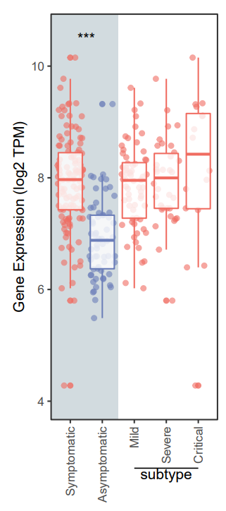
往期内容