前言
前段时间,在网上看到一个好玩的软件。里面很简单,就是一个UI布局控件,点击就会发出”鸡“声。很好玩,那这么一个简单的Android APP,是如何进行UI布局实现呢?我们接下来讲解它的制作原理。

布局类型
有一些Android提供的布局,可以使用在几乎所有的Android应用程序提供不同的视图,外观和风格。

布局属性
每个布局都有一组属性,它定义布局的视觉属性。所有布局中,有几个共同的属性和其他属性布局。以下是常见的属性并可以应用到所有的布局中:

这里布局/视图的宽度和高度的尺寸可以指定在DP(密度独立像素),SP(规模独立像素),PT(点为1/72英寸),PX(像素),mm(毫米),或(英寸)。
可以指定宽度和高度精确的测量,但更多的时候,使用这些常量作为宽度或高度设置:
-
android:layout_width=wrap_content 告诉视图,其内容所需要的尺寸大小本身。 -
android:layout_width=fill_parent 告诉视图如其父视图一样尺寸大小。
Gravity 属性定位视图对象中起着重要的作用,它可以采取一个或多个(“|”分隔)的恒定值,具体如下:

视图标识
一个视图对象有一个唯一的ID分配给它,用于唯一识别视图。ID在XML标签的语法是:
android:id="@+id/my_button"
以下是@+ 符号的简要说明:
-
在符号(@)开头的字符串表示XML解析器解析和扩展ID字符串的其余部分,将其识别为一个ID的资源。 -
加号(+)表示,这是一个新的资源名,必须创建并添加到资源中。要创建一个视图对象的实例,并捕捉到它的布局,使用以下命令:
Button myButton = (Button) findViewById(R.id.my_button);
常见用法
(1) 获取LinearLayout的宽高
a. 组件外无法获取组件宽高
下面的两种情况都是针对 View.getHeight() 和 View.getWidth() 方法 :
组件外无法获取 : 调用View.getHeight() 和**View.getWidth()**方法 是获取不到组件的宽度和高度的, 这两个方法返回的是0, Android的运行机制决定了无法在组件外部使用getHeight()和getWidth()方法获取宽度和高度;
组件内可以获取 : 在自定义的类中可以在View的类中通过调用这两个方法获取该View子类组件的宽和高;
b. 组件外部获取View对象宽高方法
外部获取 : 使用View.getMeasuredWidth() 和View.getMeasuredHeight()方法可以获取组件的宽和高, 在调用这个方法之前, 必须先调用View.measure()方法, 才可以, 否则也获取不到组件的宽高;
注意(特例) : 如果组件宽度或高度设置为 fill_parent, 使用 getMeasuredHeight() 等方法获取宽度和高度的时候, 并且组件中含有子元素时, 所获取的实际值是这些组件所占的最小宽度和最小高度.(没看懂)
示例:
- View view = getLayoutInflater().inflate(R.layout.main, null);
- LinearLayout layout = (LinearLayout) view.findViewById(R.id.linearlayout);
- //调用测量方法, 调用了该方法之后才能通过getMeasuredHeight()等方法获取宽高
- layout.measure(0, 0);
- //获取宽度
- int width = layout.getMeasuredWidth();
- //获取高度
- int height = layout.getMeasuredHeight();
c. 获取布局文件中组件的宽高
从LayoutParams中获取 : 调用View.getLayoutParams().width 和 View.getLayoutParams().height 获取宽高, 如果宽高被设定为 fill_parent, match_parent, warp_content 时, 这两个两边直接回返回 FILL_PARENT, MATCH_PARENT, WARP_CONTENT常量值;
规律 : 从View.getLayoutParams()中获取 width, height 值, 在布局xml文件中设置的是什么, 获取的时候就得到的是什么;
(2) 在LinearLayout中添加分隔线
a. 使用ImageView添加(低版本3.0以下)
垂直布局 横向宽度填满 : 如果布局是vertical, 那么设置一个ImageView宽度fill_parent, 高度2dp, 设置一个背景色;
水平布局 纵向高度填满 : 如果布局时horizontal, 那么设置一个ImageView宽度2dp, 高度fill_parent, 设置一个背景色;
1. <ImageView
2.   android:layout_width="fill_parent"
3.   android:layout_height="2dp"
4.   android:background="#F00"/>
b. 使用xml属性添加(3.0以上版本)
设置LinearLayout标签的 android:showDividers属性, 该属性有四个值 :
none :不显示分隔线;
beginning : 在LinearLayout开始处显示分隔线;
middle : 在LinearLayout中每两个组件之间显示分隔线;
end : 在LinearLayout结尾处显示分隔线;
设置android:divider属性, 这个属性的值是一个Drawable的id;
c. 使用代码添加(3.0以上版本)
设置显示分隔线样式 : linearLayout.setShowDividers(), 设置android:showDividers属性;
设置分隔线图片 : linearLayout.setDividerDrawable(), 设置android:divider属性;
实际案例
(1) 按钮排列

要点 :
底部 + 水平居中 对齐属性 : 左边的LinearLayout的android:gravity 属性为bottom|center_horizontal;
右部 + 垂直居中 对齐属性 : 右边的LinearLayout的android:gravity 属性为right|center_vertical;
代码 :
1. <?xml version="1.0" encoding="utf-8"?>
2. <LinearLayout xmlns:android="http://schemas.android.com/apk/res/android"
3. android:layout_width="fill_parent"
4. android:layout_height="fill_parent"
5. android:orientation="vertical"
6. android:gravity="bottom|center_horizontal">
7. <Button
8. android:layout_width="wrap_content"
9. android:layout_height="wrap_content"
10. android:text="按钮1"/>
11. <Button
12. android:layout_width="wrap_content"
13. android:layout_height="wrap_content"
14. android:text="测试按钮2"/>
15. <Button
16. android:layout_width="wrap_content"
17. android:layout_height="wrap_content"
18. android:text="按钮3"/>
19. <Button
20. android:layout_width="wrap_content"
21. android:layout_height="wrap_content"
22. android:text="测试按钮4"/>
23. <Button
24. android:layout_width="wrap_content"
25. android:layout_height="wrap_content"
26. android:text="按钮5"/>
27. </LinearLayout>
子元素对齐 : 通过修改 android:gravity 属性来控制LinearLayout中子元素的排列情况;
左边的图的属性为 bottom|center_horizontal , 右边的android:gravity的属性值为 right|center_vertical;
(2) 三个按钮各自对齐
三个水平方向的按钮, 分别左对齐, 居中对齐, 右对齐 :
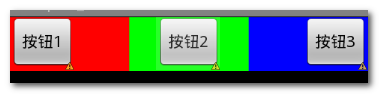
要点 :
水平线性布局 : 最顶层的LinearLayout的orientation是horizontal水平的;
等分三个线性布局 : 第二层的LinearLayout的orientation是vertical垂直的, 并且宽度是fill_parent , 依靠权重分配宽度;
设置按钮对齐方式 : 按钮的android:layout_gravity属性根据需求 left, center, right, 默认为left;
代码 :
1. <?xml version="1.0" encoding="utf-8"?>
2. <LinearLayout xmlns:android="http://schemas.android.com/apk/res/android"
3. android:layout_width="fill_parent"
4. android:layout_height="fill_parent"
5. android:orientation="horizontal" >
6.
7. <LinearLayout
8. android:layout_width="fill_parent"
9. android:layout_weight="1"
10. android:layout_height="wrap_content"
11. android:orientation="vertical"
12. android:background="#f00">
13. <Button android:layout_width="wrap_content"
14. android:layout_height="wrap_content"
15. android:text="按钮1"/>
16. </LinearLayout>
17.
18. <LinearLayout
19. android:layout_width="fill_parent"
20. android:layout_weight="1"
21. android:layout_height="wrap_content"
22. android:orientation="vertical"
23. android:background="#0f0">
24. <Button android:layout_width="wrap_content"
25. android:layout_height="wrap_content"
26. android:text="按钮2"
27. android:layout_gravity="center"/>
28. </LinearLayout>
29.
30. <LinearLayout
31. android:layout_width="fill_parent"
32. android:layout_weight="1"
33. android:layout_height="wrap_content"
34. android:orientation="vertical"
35. android:background="#00f">
36. <Button android:layout_width="wrap_content"
37. android:layout_height="wrap_content"
38. android:text="按钮3"
39. android:layout_gravity="right"/>
40. </LinearLayout>
41.
42. </LinearLayout>
UI高级源码深度解析,这里就是啦!
总结
文章到这里,一个简单的布局就出来了。快去试试看,更多高级ui进阶学习,尽在UI高级源码解析。