目录

1.CSS的作用
层叠样式表,基于HTML上面对页面进行布局修饰。CSS 能够对网页中元素位置的排版进行像素级精确控制, 实现美化页面的效果. 能够做到页面的样式和结构分离。
2.基本语句规范
选择器 + { 一条 /N 条声明 }选择器决定针对谁修改声明决定修改什么声明的属性是键值对 . 使用 ; 区分键值对 , 使用 : 区分键和值 .
CSS 要写到 style 标签中(后面还会介绍其他写法)style 标签可以放到页面任意位置. 一般放到 head 标签内.CSS 使用 /* */ 作为注释. (使用 ctrl + / 快速切换) .
<style>
    p {
        /* 设置字体颜色 */
        color: red;
        /* 设置字体大小 */
        font-size: 30px;
   }
</style>
<p>
hello
</p>
3.引入方式
3.1内部样式
<!DOCTYPE html>
<html lang="en">
<head>
    <meta charset="UTF-8">
    <meta http-equiv="X-UA-Compatible" content="IE=edge">
    <meta name="viewport" content="width=device-width, initial-scale=1.0">
    <title>Document</title>
</head>
<body>
    <!-- 内部样式 -->
    <!-- 对 p 标签标红,即标签选择器-->
    <style>
        p{
            color: red;
            font-size: 30px;
        }
    </style>
    <p>
        hello word
    </p>
    <p>
        HTML
    </p>
</body>
</html>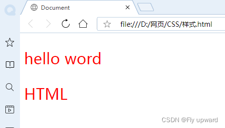
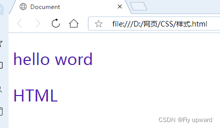
3.2外部样式
<!DOCTYPE html>
<html lang="en">
<head>
    <meta charset="UTF-8">
    <meta http-equiv="X-UA-Compatible" content="IE=edge">
    <meta name="viewport" content="width=device-width, initial-scale=1.0">
    <title>Document</title>
    <!-- 外部样式 -->
    <link rel="stylesheet" href="样式.css">
</head>
<body>
    <p>
        hello word
    </p>
    <p>
        HTML
    </p>
</body>
</html>
/* 外部样式 */
p {
color: rgb(79, 26, 177);
font-size: 30px;
}
3.3代码风格
1.紧凑风格
p{color: red; font-size: 30px;}2.展开风格
p {
    color: red;
    font-size: 30px;
}
3.样式大小
统一使用小写
4.空格规范
冒号后面带空格选择器和 { 之间也有一个空格 .
4.基础选择器
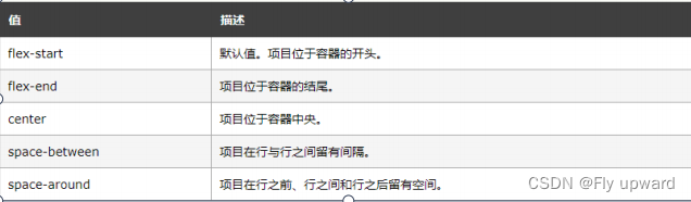
选择器的功能
选中页面中指定的标签元素 .要先选中元素 , 才能设置元素的属性 .
| 类型 | 作用 | 特点 |
|
标签选择器
|
能选出所有相同标
|
不能差异化选择
|
|
类选择器
|
能选出一个或多个标
|
根据需求选择
,
最灵活
,
最常用
|
|
id
选择器
|
能选出一个标签
|
同一个
id
在一个
HTML
中只能出现一次
|
|
通配符选择器
|
选择所有标签
|
特殊情况下使用
|
4.1标签选择器
<style>

    p{
        color: antiquewhite;
    }
 </style>

    <p>
        走吧
    </p>


</body>
4.2 类选择器
<body>
    <style>
        .red {
            color: red;
            font-size: 30px;
        }
    </style>
     <p class="red">
        你好
    </p>
    <p class="red">
        握手
    </p>
</body>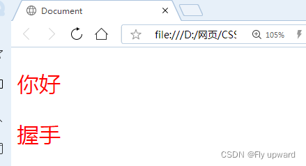
类名用 . 开头的下方的标签使用 class 属性来 调用 .一个类可以被多个标签使用 , 一个标签也能使用多个类 ( 多个类名要使用空格分割 , 这种做法可以让代码更好复用)如果是长的类名 , 可以使用 - 分割 .不要使用纯数字 , 或者中文 , 以及标签名来命名类名
还可以使用多个类名
<body>
    <style>
        .one {
            color: red;
            font-size: 30px;
        }
        .two {
            color: blueviolet;
        }
        .three {
            color: blue;
        }
    </style>
     <p class="one">
        你好
    </p>
    <p class="two">
        握手
    </p>
    <p class="three">
        走吧
    </p>
</body>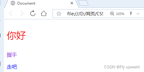
4.3 id选择器
CSS 中使用 # 开头表示 id 选择器id 选择器的值和 html 中某个元素的 id 值相同html 的元素 id 不必带 #id 是唯一的 , 不能被多个标签使用 ( 是和 类选择器 最大的区别 )
如下,对“你好”、“走吧” 的 id = cpp ,则将对其进行样式改变,其中“握手是默认形式”
<body>
    <style>
        #cpp {
            color: blue;
            font-size: 20px;
        }
    </style>
     <p id="cpp">
        你好
    </p>
    <p class="two">
        握手
    </p>
    <p id="cpp">
        走吧
    </p>
</body>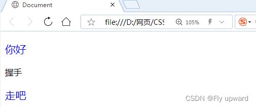
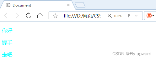
4.4通配符选择器
  /*  * 通配符选择器,页面所以元素都被选中  */
  * {
       color: aqua;
   }
<body>
<style>
/* * 通配符选择器,页面所以元素都被选中 */
* {
color: aqua;
}
</style>
<p id="cpp">
你好
</p>
<p class="two">
握手
</p>
<p id="cpp">
走吧
</p>
</body>如下运行图,所有标签颜色都变了
5.复合选择器
5.1后代选择器
元素 1 元素 2 { 样式声明 }元素 1 和元素 2 要使用空格分割元素 1 是父级 , 元素 2 是子级 , 只选元素 2 , 不影响元素 1
如下,选择父元素ul li , 子元素ol.name
<body>
    <style>
      /* 后代选择器 ,展示两种写法*/
         ul li {
            color: brown;
            font-size: 20px;
        }

         ol .name {
            color: red;
            font-size: 20px;
        }
    </style>
     <ul>
        <li>一起学习</li>
        <li>一起玩游戏</li>
        <li>一起跑步</li>
    </ul>

    <ol>
        <li class="name">一起学习</li>
        <li class="id">一起玩游戏</li>
        <li>一起跑步</li>
    </ol>
</body>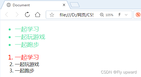
5.2 子选择器
元素 1> 元素 2 { 样式声明 }使用大于号分割只选 亲儿子 , 不选孙子元素
如下,选择 ol 标签里面 class = id 的儿子元素进行修饰
<body>
    <style>
      /* 子选择器 */
        ol>.id {
           color: cyan;
           font-size: 20px;
       }
    </style>

    <ol>
        <li class="name">一起学习</li>
        <li class="id">一起玩游戏</li>
        <li>一起跑步</li>
    </ol>
</body>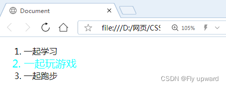
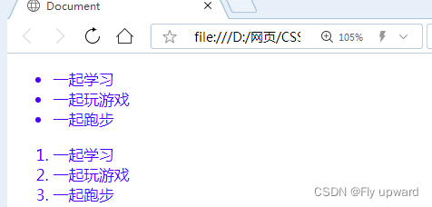
5.3并集选择器
格式:元素 1, 元素 2 { 样式声明 }通过逗号分割等多个元素 .表示同时选中元素 1 和元素 2任何基础选择器都可以使用并集选择器 .并集选择器建议竖着写 . 每个选择器占一行 . ( 最后一个选择器不能加逗号 )
<body>
    <style>
      /* 并集选择器 */
      ul>li, ol>li {
           color: rgb(76, 0, 255);
       }
    </style>

     <ul>
        <li>一起学习</li>
        <li>一起玩游戏</li>
        <li>一起跑步</li>
    </ul>
    <ol>
        <li class="name">一起学习</li>
        <li class="id">一起玩游戏</li>
        <li>一起跑步</li>
    </ol>
</body>
同时选择 ul 中的 li 标签,和 ol 中的 li 标签
5.4伪类选择器
a:link 选择未被访问过的链接a:visited 选择已经被访问过的链接a:hover 选择鼠标指针悬停上的链接a:active 选择活动链接 ( 鼠标按下了但是未弹起 )
如下所示,a:hover 选择鼠标指针悬停上的链接
<body>
    <style>
     /* 鼠标悬停的时候,应用这个样式 */
     div:hover {
           color:red;
       }
    </style>

     <div>
        伪类选择器
    </div>
</body>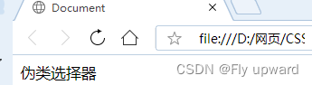
6.字体属性
6.1设置字体
body {
    font-family: '微软雅黑';
    font-family: 'Microsoft YaHei';
}
6.2字体大小
p {
    font-size: 20px;
}
6.3字体的粗细
p{
   font-weight: 900;
}
6.4文字样式
/* 纯字体 */
 text-decoration: none;

/* 下划线 */
 text-decoration:underline

/* 上划线 */
text-decoration: overline;

 /* 删除线 */
text-decoration: line-through;
6.5字体颜色
我们的显示器是由很多很多的 " 像素 " 构成的 . 每个像素视为一个点 , 这个点就能反映出一个具体的颜色 .我们使用 R (red), G (green), B (blue) 的方式表示颜色 ( 色光三原色 ). 三种颜色按照不同的比例搭配 , 就能混合出各种五彩斑斓的效果.计算机中针对 R, G, B 三个分量 , 分别使用一个字节表示 (8 个比特位 , 表示的范围是 0-255, 十六进制表示为 00-FF).数值越大 , 表示该分量的颜色就越浓 . 255, 255, 255 就表示白色 ; 0, 0, 0 就表示黑色 .
color: red;
color: #ff0000;
color: rgb(255, 0, 0);
6.6文本对齐
text-align: center; /*居中对齐*/
text-align: left; /*左对齐*/
text-align: right; /*右对齐*/
6.7文本缩进
text-indent : [ 值 ];
6.8行高
行高是指上下文本之间的基线距离
行高 = 上边距 + 下边距 + 字体大小
line-height: [值];
6.9属性展示
<!DOCTYPE html>
<html lang="en">
<head>
    <meta charset="UTF-8">
    <meta http-equiv="X-UA-Compatible" content="IE=edge">
    <meta name="viewport" content="width=device-width, initial-scale=1.0">
    <title>Document</title>
</head>
<body>
    <style>
        .one {
            font-family:'楷体';
            font-size: 30px;
            font-weight: 900;
            text-align: left;
        }
        .two {
            font-family:'宋体';
            font-size: 20px;
            font-weight: 100;
            text-align: center;
        }
        p {
            text-align: right;
        }
        /* 纯字体 */
        .text .o {
            text-decoration: none;
        }
        /* 下划线 */
        .text .t {
            text-decoration:underline

        }
        /* 上划线 */
        .text .s {
            text-decoration: overline;
        }
        /* 删除线 */
        .text .f {
            text-decoration: line-through;
        }

    </style>

    <div class="one">
        字体设置
    </div>
    <div class="two">
        字体居中
    </div>
    <div>
        <p>字体靠右</p>
    </div>

    <div class="text">
        <div class="o">纯字体</div>
        <div class="t">下划线</div>
        <div class="s">上划线</div>
        <div class="f">删除线</div>
    </div>
</body>
</html>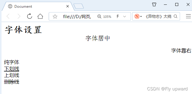
7.背景属性
7.1背景颜色
background-color: [ 指定颜色 ]
其中在body { } ,内进行颜色编写是是全局颜色进行改变的
body {background-color : ;}
背景尺寸
width: ...px;
height: ....px;
代码示例
<body>
    <style>
      /* 全局底层颜色 */
        body {
            background-color: beige;
        }
        .one {
            /* 背景尺寸 */
            width: 200px;
            height: 150px;
            background-color:rgb(0, 174, 255);
            /* 内容*/
            color: rgb(255, 250, 240);
            text-align: center;
            line-height: 150px;  /*将行高设为页面高度就可居中 */
        }
        .two {
             /* 背景框 */
            width: 200px;
            height: 150px;
            background-color:rgb(0, 217, 255);
            /* 内容*/
            color: rgb(255, 240, 254);
            text-align: center;
            line-height: 150px;  /*将行高设为页面高度就可居中 */
        }

    </style>

     <div class="one">
        颜色一
    </div>
    <div class="two">
        颜色二
    </div>
</body>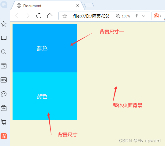
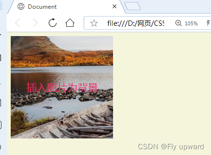
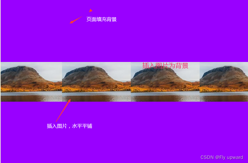
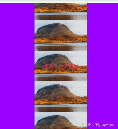
7.2背景图片
背景图片属于中层,即在背景颜色的上面,字体的下面
background-image : url (./ 图片名 );
照片的排版方式有
repeat: 平铺no-repeat: 不平铺repeat-x: 水平平铺repeat-y: 垂直平铺
其中默认是 repeat: 平铺
语句格式
background-repeat : [ 平铺方式 ]
位置
background-position :方位名词
注意
如果参数的两个值都是方位名词 , 则前后顺序无关 . (top left 和 left top 等效 )如果只指定了一个方位名词 , 则第二个默认居中 . (left 则意味着水平居中 , top 意味着垂直居中 . )如果参数是精确值 , 则的的第一个肯定是 x , 第二个肯定是 y. (100 200 意味着 x 为 100, y 为 200)如果参数是精确值 , 且只给了一个数值 , 则该数值一定是 x 坐标 , 另一个默认垂直居中 .如果参数是混合单位 , 则第一个值一定为 x, 第二个值为 y 坐标 . (100 center 表示横坐标为 100, 垂直居中)
代码示例
<body>
    <style>
      /* 全局底层颜色 */
        body {
            background-color: beige;
        }
        .one {
            width: 200px;
            height: 200px;
            font-size: 20px;
            background-color: rgb(153, 0, 255);
           background-image: url(./feng.jpg);
            background-repeat: no-repeat; /*不平铺 */
            /* background-repeat: repeat-x; 水平平铺 */
            /* background-repeat: repeat-y; 垂直平铺 */
            /* 内容*/
            background-position: center;
            color: rgb(233, 37, 102);
            text-align: center;
            line-height: 200px;
        }
    </style>

     <div class="one">
        插入图片为背景
    </div>
</body>
看不平铺效果
水平平铺,repeat-x: 水平平铺
垂直平铺 ,repeat-y
8.形状
布局情况
8.1边框
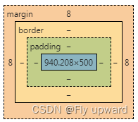
box-sizing 属性可以修改浏览器的行为 , 使边框不再撑大盒子 .粗细 : border-width样式 : border-style, 默认没边框 . solid 实线边框 dashed 虚线边框 dotted 点线边框颜色 : border-color
外边距:
margin-topmargin-bottommargin-leftmargin-right
内边距:
padding 设置内容和边框之间的距离。默认内容是顶着边框来放置的.。用 padding 来控制这个距离,可以给四个方向都加上边距
padding-toppadding-bottompadding-leftpadding-right
8.2圆角矩形
border-radius: --px;
--px 是内切圆的半径. 数值越大, 弧线越强烈
8.3圆形
让 border-radius 的值为正方形宽度的一半即可
8.4代码示例
<body>
<style>
.one {
width: 150px;
height: 100px;
background-color: antiquewhite;
color: red;
text-align: center;
line-height: 100px;
/* 圆角矩形 */
border-radius: 30px;
}
.two {
width: 150px;
height: 150px;
background-color: rgb(171, 175, 236);
color: rgb(218, 58, 85);
text-align: center;
line-height: 150px;
/* 圆角矩形 */
border-radius: 50%;
}
.three {
width: 150px;
height: 100px;
border: 5px black solid;
box-sizing: border-box;
}
.four {
width: 150px;
height: 100px;
border: 5px rgb(63, 31, 207) solid;
box-sizing: border-box;
/* 外边距 */
margin-top: 10px;
}
.six {
width: 150px;
height: 150px;
background-color: bisque;
}
.t {
width: 80px;
height: 80px;
background-color: rgb(86, 50, 172);
margin:10px auto;
}
</style>
<div class="one">
圆角矩形
</div>
<div class="two">
圆形
</div>
<div class="three">
边框
</div>
<div class="four">
外边距
</div>
<div class="six">
<div class="t">
子元素
</div>
</div>
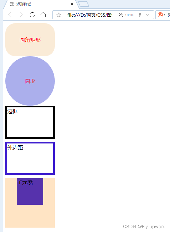
</body>效果展示
9.弹性布局
先创创建一个父亲div ,然后在里面创建三个子div
<body>
<style>
.parent {
width: 100%;
height: 200px;
background-color: antiquewhite;
}
.one, .two, .three {
width: 100px;
height: 100px;
background-color: rgb(86, 86, 241);
}
</style>
<div class="parent">
<div class="one">第一块</div>
<div class="two">第二块</div>
<div class="three">第三块</div>
</div>
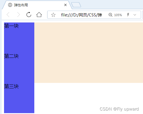
</body>效果如下,三个块状是堆在一起的
当在 .parent { } 中增加以下代码,将进行横向排列
display: flex;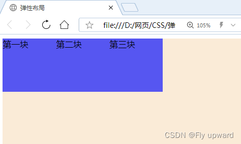
增加下面两语句可进行布局优化
/* 两端对齐 */
 justify-content: space-between;
/* 靠中 */
 align-items: center;
效果如下
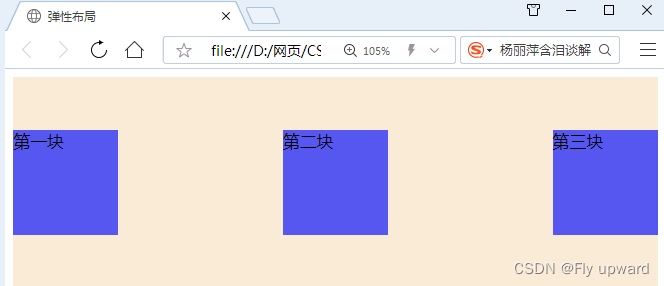
常用属性 justify-content 的取值