系列文章目录
文章目录
HTML
理解 HTML 语义化
- 让人更容易读懂(增加代码可读性)
- 让搜索引擎更容易读懂(SEO)
示例:通过操作这两种方式能实现同样的效果,但我们更倾向于第一种写法
- 第一种:
    <div>
        <ul>
            <li></li>
        </ul>
    </div>
- 第二种:
    <div>
        <div>
            <div></div>
        </div>
    </div>
块状元素和内联元素
块状元素:div、h1-h5、table、ul、ol、p 等
diaplay: block/table
内联元素:span、img、input、button 等
display: inline/inline-bolck
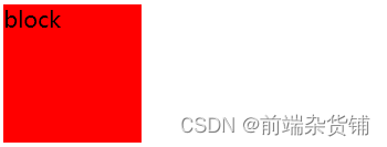
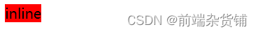
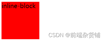
block、inline、inline-block 的区别:
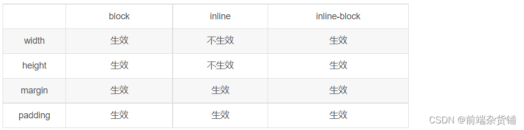
图示区别:
	.box {


	    width: 100px;
	    height: 100px;
	    background-color: red;
	    display: block;
	}

	<div class="box">block</div>
	.box {


	    width: 100px;
	    height: 100px;
	    background-color: red;
	    display: inline;
	}

	<div class="box">inline</div>
	.box {


	    width: 100px;
	    height: 100px;
	    background-color: red;
	    display: inline-block;
	}

	<div class="box">inline</div>
布局
盒模型宽度计算
offsetWidth:(内容宽度 + 内边距 + 边框),无外边距
示例:offsetWidth:100 + 10 + 10 + 1 + 1 = 122px
	#div {


	    width: 100px;
	    padding: 10px;
	    margin: 10px;
	    border: 1px solid #ccc;
	}

	<div id="div"></div>
盒模型
示例:控制 offsetWidth 的值为 100px
	#div {


	    width: 100px;
	    padding: 10px;
	    margin: 10px;
	    border: 1px solid #ccc;
	    box-sizing: border-box;
	}

	<div id="div">this is div</div>
盒模型2
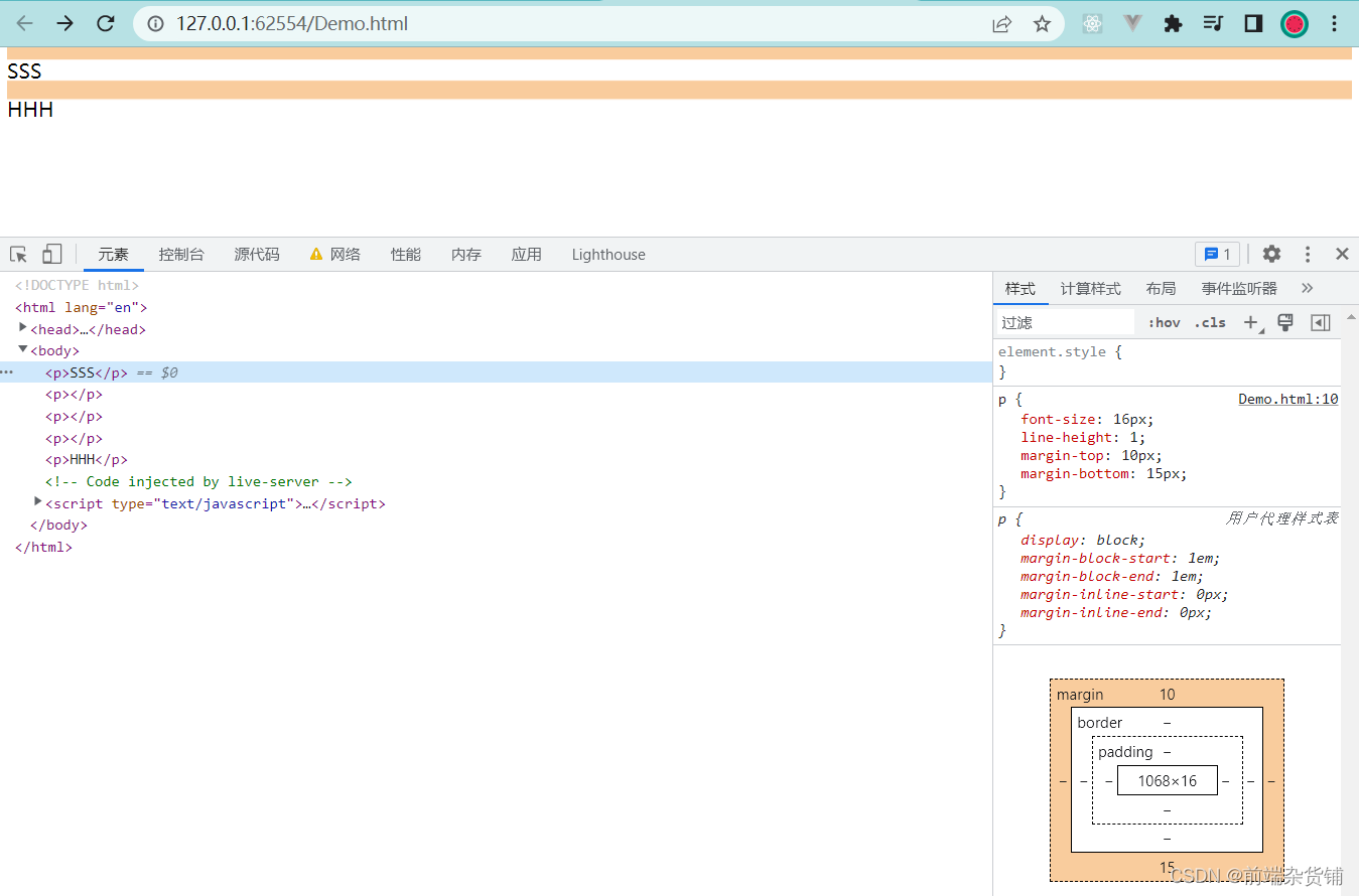
margin 纵向重叠问题
相邻元素 的 margin-top 和 margin-bottom 会发生重叠
空白内容的 <p></p> 也会重叠
示例:S 的 margin-bottom 为 15 px
    p {


        font-size: 16px;
        line-height: 1;
        margin-top: 10px;
        margin-bottom: 15px;
    }

	<p>SSS</p>
    <p></p>
    <p></p>
    <p></p>
    <p>HHH</p>
margin 负值问题
-
margin-top 和 margin-left 负值,元素向上、向左移动
-
margin-right 负值,右侧元素左移,自身不受影响
-
magin-bottom 负值,下方元素上移,自身不受影响
    body {


        margin: 20px;
    }

    .float-left {


        float: left;
    }
    .clearfix:after {


        content: '';
        display: block;
        clear: both;
    }
    .container {


        border: 1px solid #ccc;
        padding: 10px;
    }
    .container .item {


        width: 100px;
        height: 100px;
    }
    .container .border-blue {


        border: 1px solid blue;
    }
    .container .border-red {


        border: 1px solid red;
    }

	<p>用于测试 margin top bottom 的负数情况</p>
    <div class="container">
        <div class="item border-blue">
            this is item 1
        </div>
        <div class="item border-red">
            this is item 2
        </div>
    </div>

    <p>用于测试 margin left right 的负数情况</p>
    <div class="container clearfix">
        <div class="item border-blue float-left">
            this is item 1
        </div>
        <div class="item border-red float-left">
            this is item 2
        </div>
    </div>
- 示例:top left
margin 负数情况
- 示例:right bottom
margin 负数情况2
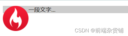
BFC 理解与应用
Block format context,块级格式化上下文
一块独立渲染区域,内部元素的渲染不会影响边界以外的元素
形成 BFC 的常见条件
-
float 不是 none
-
position 是 absolute 或 fixed
-
overflow 不是 visible
-
display 是 flex item(直接子元素) 或 inline-block
示例:(不设置 bfc)
	.container {


	    background-color: #ccc;
	}
	.left {


	    float: left;
	}

	<div class="container">
        <img src="xxx.png" class="left">
        <p>一段文字...</p>
    </div>
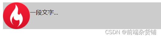
示例:(设置 bfc)
	.container {


	    background-color: #ccc;
	}
	.left {


	    float: left;
	}
	.bfc {


	    overflow: hidden;
	}

	<div class="container bfc">
        <img src="xxx.png" class="left">
        <p class="bfc">一段文字...</p>
    </div>
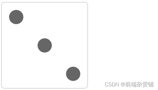
flex 布局
常用语法:flex 布局详解—参考链接
- flex-direction:设置主轴的方向
- justify-content:设置主轴上的子元素排列方式
- align-items:设置侧轴上的子元素排列方式(单行)
- flex-wrap:设置子元素是否换行
- align-self:控制子项自己在侧轴上的排列方式
示例:flex 布局画色子(三点)
    .box {


        width: 200px;
        height: 200px;
        border: 2px solid #ccc;
        border-radius: 10px;
        padding: 20px;

        display: flex; /* flex 布局 */
        justify-content: space-between; /* 两端对齐 */
    }
    .item {


        display: block;
        width: 40px;
        height: 40px;
        border-radius: 50%;
        background-color: #666;
    }
    .item:nth-child(2) {


        align-self: center; /* 第二项居中对齐(垂直轴) */
    }
    .item:nth-child(3) {


        align-self: flex-end; /* 第三项尾对齐 (垂直轴) */
    }

	<div class="box">
        <span class="item"></span>
        <span class="item"></span>
        <span class="item"></span>
    </div>
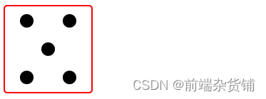
示例:flex 布局画色子(五点)
	body>div {


        display: flex;
        width: 100px;
        height: 100px;
        border-radius: 4px;
        border: 2px solid red;
        box-sizing: border-box;
    }

    p {


        width: 15px;
        height: 15px;
        background-color: black;
        border-radius: 50%;
        margin: 2px;
    }
    .div5 {


        flex-direction: column;
        justify-content: space-around;
    }
    .div5 div {


        display: flex;
        justify-content: space-around;
    }

	<div class="div5">
        <div>
            <p></p>
            <p></p>
        </div>
        <div>
            <p></p>
        </div>
        <div>
            <p></p>
            <p></p>
        </div>
    </div>
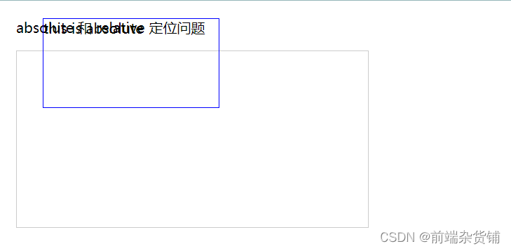
CSS - 定位
absolute 和 relative 定位
- relative 依据 自身 定位
- absolute 依据 最近一层 的定位元素定位
定位元素:absolute relative fixed body
示例:测试 relative 和 absolute
    body {


        margin: 20px;
    }
    .relative {


        position: relative;
        width: 400px;
        height: 200px;
        border: 1px solid #ccc;

        top: 20px;
        left: 50px;
    }
    .absolute {


        position: absolute;
        width: 200px;
        height: 100px;
        border: 1px solid blue;

        top: 20px;
        left: 50px;
    }

	<p>absolute 和 relative 定位问题</p>
    <div class="relative">
        <div class="absolute">
            this is absolute
        </div>
    </div>
不加 top 和 left 时:
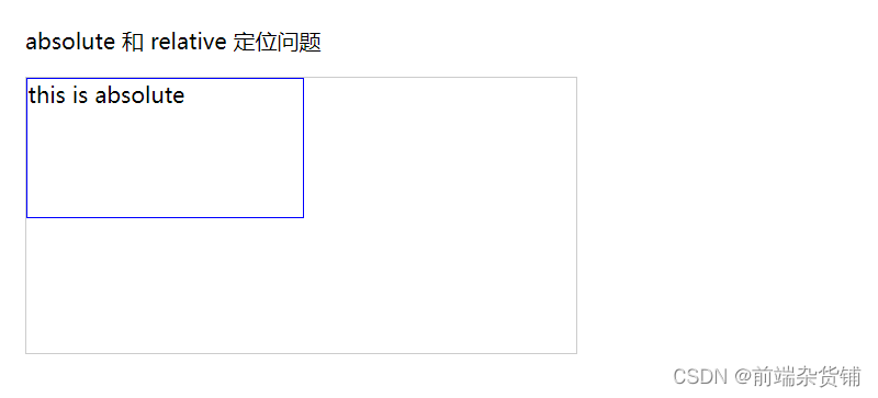
加上 top 和 left 后:

去除 position: relative 后,absolute 盒子相对于最近一层(body)定位:
水平居中和垂直居中
水平居中
- inline 元素:text-align: center
- block 元素:margin: auto
- absolute 元素:left: 50% + margin-left: 负值
示例:
    .container {


        border: 1px solid #ccc;
        margin: 10px;
        padding: 10px;
    }
    .item {


        background-color: #ccc;
    }
    .container-1 {


        text-align: center; /* 居中 */
    }
    .container-2 {


        width: 500px;
        margin: auto; /* 居中 */
    }
    .container-3 {


        position: relative;
        height: 100px;
    }
    .container-3 .item {


        position: absolute;
        width: 300px;
        height: 100px;
        /* 居中 */
        left: 50%;
        margin-left: -150px;
    }

	<div class="container container-1">
        <span>一段文字</span>
    </div>

    <div class="container container-2">
        <div class="item">
            this is block item
        </div>
    </div>

    <div class="container container-3">
        <div class="item">
            this is absolute item
        </div>
    </div>
居中前:

居中后:

垂直居中
- inline 元素:line-height 的值等于 height 值
- absolute 元素:top: 50% + margin-top 负值
- absolute 元素:transform(-50%, -50%)
- absolute 元素:top,left,bottom,right = 0 + margin: auto
示例:
    .container {


        border: 1px solid #ccc;
        margin: 10px;
        padding: 10px;
        height: 130px;
    }
    .item {


        background-color: #ccc;
    }
    .container-1 {


        text-align: center;
        /* 垂直居中 */
        line-height: 130px;
        height: 130px;
    }
    .container-2 {


        position: relative;
    }
    .container-2 .item {


        position: absolute;
        width: 300px;
        height: 100px;
        left: 50%;
        margin-left: -150px;
        /* 垂直居中 */
        top: 50%;
        margin-top: -50px;
    }
    .container-3 {


        position: relative;
    }
    .container-3 .item {


        position: absolute;
        width: 300px;
        height: 100px;
        /* 垂直居中 */
        left: 50%;
        top: 50%;
        transform: translate(-50%, -50%);
    }
    .container-4 {


        position: relative
    }
    .container-4 .item {


        position: absolute;
        width: 100px;
        height: 50px;
		/* 垂直居中 */
        top: 0;
        left: 0;
        bottom: 0;
        right: 0;
        margin: auto;
    }

    <div class="container container-1">
        <span>一段文字</span>
    </div>

    <div class="container container-2">
        <div class="item">
            this is item
        </div>
    </div>

    <div class="container container-3">
        <div class="item">
            this is item
        </div>
    </div>

    <div class="container container-4">
        <div class="item">
            this is item
        </div>
    </div>

CSS - 图文样式
line-height(行高) 如何继承
- 写具体数值,如30px,则继承该值
- 写比例,如 2,则继承该比例
- 写百分比,如200%,则继承计算出来的值(重点注意)
示例:p 标签的行高是多少?
示例 1:继承 body 的行高:30px
    body {


        font-size: 20px;
        line-height: 30px;
    }
    p {


        background-color: #ccc;
        font-size: 16px;
    }

	<p>AAA</p>

示例 2:自身的 font-size 乘以继承的 line-height => 16 * 2 = 32px
    body {


        font-size: 20px;
        line-height: 2;
    }
    p {


        background-color: #ccc;
        font-size: 16px;
    }

	<p>AAA</p>

示例 3:继承的 font-size 乘以继承的 line-height => 20 * 2 = 40px
    body {


        font-size: 20px;
        line-height: 200%;
    }
    p {


        background-color: #ccc;
        font-size: 16px;
    }

	<p>AAA</p>

CSS - 响应式
rem 是什么
- px,绝对长度单位,最常用
- em,相对长度单位,相对于父元素,不常用
- rem,相对长度单位,相对于根元素,常用于响应式布局
示例:设置一个 rem 为 100px,都会继承 html 里的 font-size。在这里,0.2 rem 就是 20px
    html {


        font-size: 100px;
    }
    div {


        background-color: #ccc;
        margin-top: 10px;
        font-size: 0.16rem;
    }

	<p style="font-size: 0.1rem">rem 1</p>
    <p style="font-size: 0.2rem">rem 1</p>
    <p style="font-size: 0.3rem">rem 1</p>

    <div style="width: 1rem">
        this is div1
    </div>
    <div style="width: 2rem">
        this is div2
    </div>
    <div style="width: 3rem">
        this is div3
    </div>

响应式布局的常用方案
- media-query,根据不同的屏幕宽度设置根元素 font-size
- rem,基于根元素的相对单位
示例:iPhone5、iPhone6/7/8、iPhone6/7/8Plus 机型
    @media only screen and (max-width: 374px) {


        /* iphone5 的宽度(320px)比例设置 font-size */
        html {


            font-size: 86px;
        }
    }
    @media only screen and (min-width: 375px) and (max-width: 413px) {


        /* iphone6/7/8 和 iphone x */
        html {


            font-size: 100px;
        }
    }
    @media only screen and (min-width: 414px) {


        /* iphone6/7/8plus 的宽度(414px)比例设置 font-size */
        html {


            font-size: 110px;
        }
    }
    body {


        font-size: 0.16rem; /* 根据机型响应式变化 */
    }
    #div1 {


        width: 1rem; /* 根据机型响应式变化 */
        background-color: #ccc;
    }

	<div id="div1">
        this is div
    </div>


网页视口尺寸
- window.screen.height => 屏幕高度(屏幕总高度)
- window.innerHeight => 网页视口高度(除去刘海和下巴的高度)
- document.body.clientHeight => body 高度(内容撑起来的高度)
vh 和 vw
- vh 网页视口高度的 1/100
- vw 网页视口宽度的 1/100
- vmax 取两者的最大值
- vmin 取两者的最小值
    body {


        margin: 0;
        padding: 0;
    }
    #container {


        background-color: red;
        width: 10vw;
        height: 10vh;
    }

	<p>vm vh 测试</p>
    <div id="container"></div>

不积跬步无以至千里 不积小流无以成江海
点个关注不迷路,持续更新中…