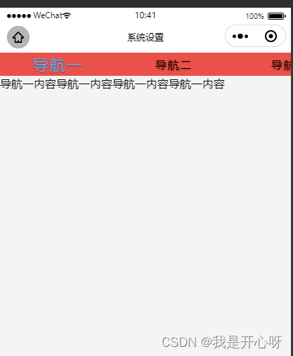
效果图:
<template>
	<view class="content">
		<!-- 导航区域 -->
		<scroll-view class="scroll-view_H" scroll-x="true" scroll-left="0" enable-flex="true">
			<view :class="['scroll-view-item_H',currentTab==index?'active':'']" v-for="(item,index) in navbar"
				:key='index' @click="tabClick(index)">{

    {

    item}}</view>
		</scroll-view>
		<!-- 内容区域 -->
		<swiper class="swiper" :current="currentTab" @change="swiperTab" :style="{height:swiperHeight+'px'}">
			<swiper-item>
				<view class="swiper-item">
					导航一内容导航一内容导航一内容导航一内容
				</view>
			</swiper-item>
			<swiper-item>
				<view class="swiper-item">
					导航二内容导航二内容导航二内容导航二内容
				</view>
			</swiper-item>
			<swiper-item>
				<view class="swiper-item">
					导航三内容导航三内容导航三内容导航三内容
				</view>
			</swiper-item>
			<swiper-item>
				<view class="swiper-item">
					导航四内容导航四内容导航四内容导航四内容
				</view>
			</swiper-item>
		</swiper>
	</view>
</template>

<script>
	export default {


		data() {


			return {


				navbar: ['导航一', '导航二', '导航三', '导航四'], //导航栏类目
				currentTab: 0, //当前选中的导航类目
				swiperHeight: 0 //动态给定swiper的高度
			}
		},
		onLoad(option) {


			this.swiperHeight = uni.getSystemInfoSync().windowHeight - 25;
			console.log(this.swiperHeight);
		},
		methods: {


			tabClick(index) {


				this.currentTab = index
			},
			swiperTab(e) {


				this.currentTab = e.detail.current; //获取索引
				console.log("this.currentTab", this.currentTab)
			}
		}
	}
</script>

<style lang="less" scoped>
	.content {


		width: 100%;

		.scroll-view_H {


			width: 100%;
			height: 60rpx;
			text-align: center;
			line-height: 60rpx;
			display: flex;
			flex-direction: row;
			justify-content: space-between;
			overflow: hidden;

			.scroll-view-item_H {


				flex-shrink: 0;
				width: 300rpx;
				color: #000000;
				font-size: 30rpx;
				font-size: bold;
				background-color: #EA5149;
				letter-spacing: .1em;
				text-shadow: 0px 1px 2px #A42B14;
			}

			.active {


				font-size: 40rpx;
				color: #55aaff;
			}
		}

		.swiper-item {


			height: 100%;
		}
	}
</style>