记录前端使用纯 HTML + CSS 实现 input 输入框的 “placeholder” 提示文本上下移动的过渡效果:(这里的提示文本不是 placeholder 属性提供的值)
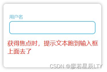
效果图

主要代码
HTML:
<body>
  <div class="from">
    <div class="from-item">
      <!-- 要给 input 添加 required 属性 -->
      <input class="input" type="text" required>
      <span class="placeholder">用户名</span>
    </div>
  </div>
</body>
CSS:
<style>
    body {
      margin: 0;
      padding: 0;
      width: 100%;
      height: 100vh;
      overflow: hidden;
    }

    .from {
      width: 300px;
      height: 200px;
      margin: 50px auto 0;
      padding: 10px 20px;
      border-radius: 10px;
      box-shadow: 0 0 10px rgba(0, 0, 0, 0.4);
    }

    .from-item {
      width: 100%;
      height: 45px;
      margin-top: 50px;
      /* input 和 span 的父盒子要设置相对定位,因为 span 需要使用定位来调整位置 */
      position: relative;
    }

    .input {
      box-sizing: border-box;
      width: 100%;
      height: 100%;
      outline: none;
      border: 0;
      padding: 0 10px;
      border-radius: 10px;
      border: 1px solid #ccc;
      font-size: 16px;
    }

    .input:valid,
    .input:focus {
      border: 2px solid #49bcea;
    }

    /* 给 input 添加 required 属性后,如果输入框中的值是合法的则 .input:valid 选择器样式生效 */
    .input:valid~.placeholder,
    .input:focus~.placeholder {
      top: -35%;
      left: 0;
      color: #49bcea;
    }

    /* span 提示文本默认的位置处于 input 框中充当 placeholder 的效果 */
    .placeholder {
      position: absolute;
      top: 50%;
      transform: translateY(-50%);
      left: 10px;
      /* 让元素不可点击 */
      pointer-events: none;
      /* 添加过渡时间 */
      transition: all 0.3s;
    }
  </style>
核心概要:
CSS的 pointer-events: none; 样式可以使一个元素不响应点击事件变得不可点击从而充当 input 的 placeholder 时不会影响 input 的正常点击获取焦点事件;
input 元素添加 required 属性后,如果输入框中的值是合法的,则 CSS 中的 .input:valid 选择器能被匹配。