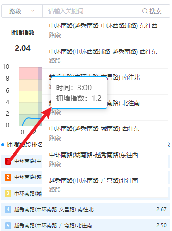
echarts设置tooltip的层级

echarts设置tooltip的层级
在这里插入图片描述
在这里插入图片描述

    tooltip: {
    
    
          trigger: "axis",
          extraCssText: 'z-index:3', // 修改层级
          borderColor: "rgba(0, 170, 255)",
        }, 

完整的option示例如下:

option = {
    
    
        tooltip: {
    
    
          trigger: "axis",
          extraCssText: 'z-index:3',
          axisPointer: {
    
    
            // 方法一
            type: "shadow", // 默认为直线,可选为:'line' | 'shadow'
            shadowStyle: {
    
    
              color: "rgba(41, 95, 204, 0.2)",
            },
          },
          borderColor: "rgba(0, 170, 255)", // 边框颜色
          formatter: function (params) {
    
    
            return [
              "时间:" + params[0].name + ":00",
              "拥堵指数:" + params[0].value,
            ].join("<br/>");
          },
        }, // 坐标轴指示器配置
        textStyle: {
    
    
          color: "#333", // xy轴的提示文字颜色,不包含背景刻度线
        },
        color: ["#1492FF"],
        grid: {
    
    
          top: "20px",
          left: "50px",
          right: "20px",
          bottom: "25px",
        },
        xAxis: [
          {
    
    
            type: "category",
            data: this.chartsData.time,
            axisLine: {
    
    
              show: true,
              lineStyle: {
    
    
                color: "#004080",
                // width: 0,
                // type: "solid",
              }, // x轴线的颜色以及宽度
            },
            // axisLabel: {
    
    
            //   show: true,
            //   textStyle: {
    
    
            //     color: "rgba(255, 255, 255, 0.3)",
            //   }
            // }, // x轴文字的配置
            splitLine: {
    
    
              show: false,
              lineStyle: {
    
    }, // 分割线配置
            },
            axisTick: {
    
    
              show: false,
            }, // x轴的刻度线
          },
        ],
        yAxis: [
          {
    
    
            type: "value",
            max: 10,
            splitLine: {
    
    
              show: true,
              lineStyle: {
    
    
                color: "#333",
                opacity: 0.1,
              }, // 设置横向的线的颜色
            },
            axisLabel: {
    
    
              show: true,
              margin: 20,
              // textStyle: {
    
    
              //   color: "rgba(255, 255, 255, 0.3)",
              // }, // y轴的字体配置
            },

            splitArea: {
    
    
              show: true,
              areaStyle: {
    
    
                color: [
                  "rgb(0, 128, 0, .2)",
                  "rgb(153, 204, 0, .2)",
                  "rgb(255, 255, 0, .2)",
                  "rgb(255, 153, 0, .2)",
                  "rgb(255, 0, 0, .2)",
                ],
              },
            },
          },
        ],
        series: [
          {
    
    
            data: this.chartsData.roadNorm,
            type: "line",
            smooth: true,
            symbolSize: 0, // 设置圆点大小为 0,即不显示圆点
          },
        ],
      };

猜你喜欢

转载自blog.csdn.net/m0_74149462/article/details/135484365