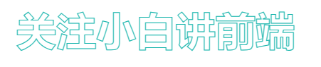
文字镂空
<!DOCTYPE html>
<html lang="en">
<head>
    <meta charset="UTF-8">
    <title>css镂空文字</title>
    <style >
        div
        {


        margin:  10% auto;
        font-size:56px;
        font-weight:bold;
        text-align:center;
        -webkit-text-stroke:1px rgb(28, 182, 174);
        -webkit-text-fill-color:transparent;
        }
    </style>

</head>


<body>
    <div>关注小白讲前端</div>
</body>

</html>
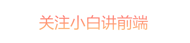
渐变文字
<!DOCTYPE html>
<html lang="en">

<head>

    <meta charset="UTF-8">
    <title>线性渐变的文字</title>
    <style>
        div {


            margin: 10% 0;
            text-align: center;
            font-size: 50px;
            background: -webkit-linear-gradient(top, #ff626e, #ffbe71);
            -webkit-background-clip: text;
            -webkit-text-fill-color: transparent;
        }
    </style>
</head>

<body>
    <div>
        关注小白讲前端
    </div>
</body>

</html>
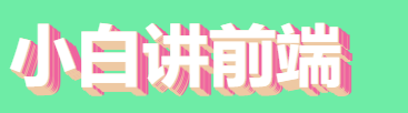
立体文字
<!DOCTYPE html>
<html lang="en">
<head>
    <meta charset="UTF-8">
    <title>立体文字</title>
    <style>
        body {


            background-color: #6eeca6;
        }

        div {


            color: #ffffff;
            font-size: 60px;
            font-weight: 700;
            text-shadow: 1px 0px #EEC9A3, 1px 2px #EEC9A3, 3px 1px #EF629F,
                2px 3px #EEC9A3, 4px 2px #EF629F, 4px 4px #EEC9A3,
                5px 3px #EF629F, 5px 5px #EEC9A3, 7px 4px #EF629F,
                6px 6px #EEC9A3, 8px 5px #EF629F, 7px 7px #EEC9A3,
                9px 6px #EF629F, 9px 8px #EEC9A3, 11px 7px #EF629F
        }
    </style>

</head>

<body>
    <div>小白讲前端</div>
</body>

</html>
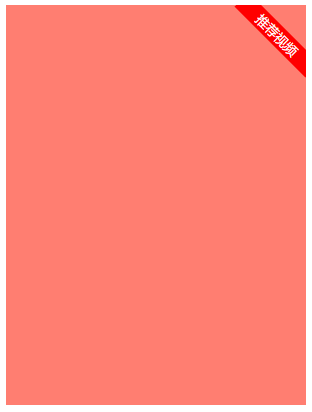
斜角标签
<!DOCTYPE html>
<html lang="zh">


<head>

    <meta charset="UTF-8">
    <title>Document</title>
    <style>
        .box {


            width: 300px;
            height: 400px;
            background-color: #ff7e71;
            position: relative;
            overflow: hidden;
        }

        .tag {


            position: absolute;
            top: 5%;
            right: -21px;
            width: 100px;
            line-height: 20px;
            text-align: center;
            font-size: 13px;
            color: #fff;
            background-color: #ff0000;

            transform: rotate(45deg);
        }
    </style>

</head>


<body>
    <div class="box">
        <div class="tag">推荐视频</div>
    </div>
</body>

</html>
垂直文字
<!DOCTYPE html>
<html lang="en">
<head>
<meta charset="UTF-8">
<title>垂直文本</title>
<style type="text/css">
div {
margin: 10px auto;
padding: 30px 50px;
background: #000000;
font-size: 32px;
color: #989898;
text-align: center;
writing-mode: vertical-rl;
line-height: 55px;
}
</style>
</head>
<body>
<div>
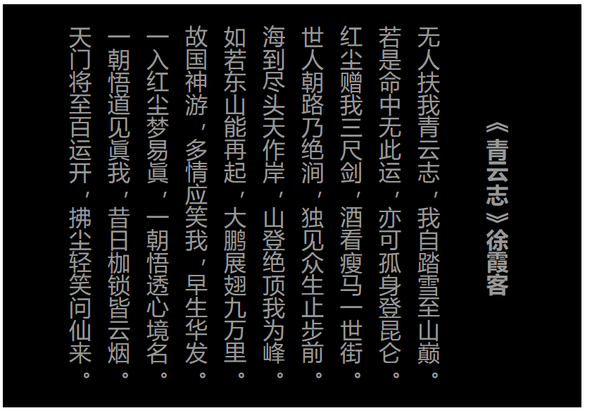
<h4>《青云志》徐霞客</h4>
<p>
无人扶我青云志,我自踏雪至山巅。<br>
若是命中无此运,亦可孤身登昆仑。<br>
红尘赠我三尺剑,酒看瘦马一世街。<br>
世人朝路乃绝涧,独见众生止步前。<br>
海到尽头天作岸,山登绝顶我为峰。<br>
如若东山能再起,大鹏展翅九万里。<br>
故国神游,多情应笑我,早生华发。<br>
一入红尘梦易眞,一朝悟透心境名。<br>
一朝悟道见眞我,昔日枷锁皆云烟。<br>
天门将至百运开,拂尘轻笑问仙来。 <br>
</p>
</div>
</body>
</html>