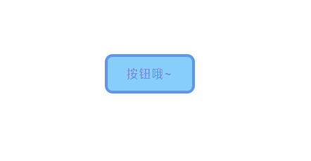
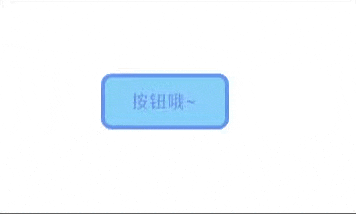
预览效果
源码
<!DOCTYPE html>
<html lang="zh">
<head>
<meta charset="utf-8">
<title>渐隐式按钮</title>
<style>
.app {
width: 100%;
height: 100vh;
background-color: #fff;
position: relative;
display: flex;
justify-content: center;
align-items: center;
}
.macaron-btn {
width: 120px;
height: 48px;
font-size: 16px;
font-weight: bold;
color: #fff;
letter-spacing: 2px;
position: relative;
border: none;
outline: none;
background-color: #87CEFA;
border-radius: 7px;
cursor: pointer;
box-shadow: 0 0 0 4px #6495ED;
transition: all 0.1s linear;
}
.macaron-btn:after {
content: '按钮哦~';
width: 100%;
font-size: 16px;
font-weight: bold;
color: #6495ED;
letter-spacing: 2px;
position: absolute;
left: 0;
opacity: 1;
transition: all 0.3s linear;
}
.macaron-btn:hover:after {
opacity: 0;
transform: translateY(-20px);
}
.macaron-btn:active {
transform: scale(0.99);
box-shadow: 0 0 0 2px #6495ED;
}
</style>
</head>
<body>
<div class="app">
<button class="macaron-btn">按钮哦~</button>
</div>
</body>
</html>