##uniapp_微信小程序_echarts_动态折线图
用来总结和学习,便于自己查找
文章目录
一、为什么使用echarts折线图?
1.1 动态折线图echarts效果?
二、怎么导入echarts折线图?
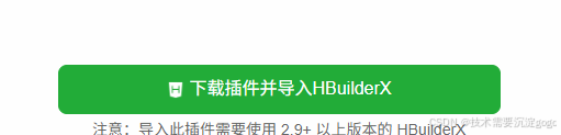
2.1 如何插件市场导入uniapp_echarts?
2.2 导入之后的引用和代码?
三、动态折线图的实现?
3.1 重要代码
四、echarts.js 太大怎么解决?
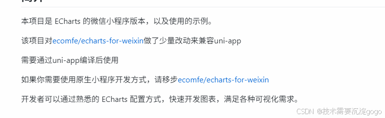
一、为什么使用echarts折线图?
使用了秋云rcharts,优点体积小但是动态实现的时候会刷新整个折线图还有就是x轴的字体倾斜的时候还会挨着x轴,体验不好,所以使用的echarts的折线图。
1.1 动态折线图echarts效果?

二、怎么导入echarts折线图?
2.1 如何插件市场导入uniapp_echarts
2.1.1 上面就是插件地址,要是原生小程序就使用截图另一个
2.1.2 导入你的项目即可
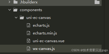
2.2 导入之后的引用和代码?
导入之后有以下文件
2.2.1 在你主页写以下代码(完整版直接就能实现动态效果)
<template>
	<view>
		<uni-ec-canvas class="uni-ec-canvas" id="uni-ec-canvas" ref="canvas" canvas-id="uni-ec-canvas" :ec="ec">
		</uni-ec-canvas>
	</view>
</template>

<script>
	import uniEcCanvas from '@/components/uni-ec-canvas/uni-ec-canvas.vue'
	import * as echarts from '@/components/uni-ec-canvas/echarts'
	let chart = null
	export default {


		components: {


			uniEcCanvas
		},
		data() {


			return {


				ec: {


					lazyLoad: true
				},
				option: {


					tooltip: {


						trigger: 'axis',
						axisPointer: {


							type: 'line'
						}
					},
					grid: {


						left: '40',
						right: '40',
						bottom: '3%',
						containLabel: true
					},
					xAxis: {


						type: 'category',
						axisTick: {


							show: false,
						},
						nameTextStyle: {


							color: '#666666'
						},
						axisLabel: {


							show: true,
							textStyle: {


								color: '#666',
								fontSize: '12',
								fontWeight: 'bold'
							}
						},
						axisLine: {


							lineStyle: {


								color: '#666',
								width: 1
							}
						},
						// 初始的时间数据
						data: this.generateTimeData(),
					},
					yAxis: {


						type: 'value',
						axisLine: {


							show: false,
						},
						axisLabel: {


							show: true,
							textStyle: {


								color: '#666',
								fontSize: '11'
							}
						},
						axisTick: {


							show: false,
						},
					},
					series: [
						{


							name: '心率',
							type: 'line',
							data: [80, 85, 78, 90, 88, 82, 79], // 初始心率数据
							itemStyle: {


								color: '#FF6000'
							},
							label: {


								show: true,
								position: 'top',
								formatter: '{c}', // 只显示数值
								color: '#666666',
								fontWeight: 'bold',
								fontSize: '10'
							}
						},
						{


							name: '呼吸率',
							type: 'line',
							data: [20, 22, 18, 19, 21, 23, 20], // 初始呼吸率数据
							itemStyle: {


								color: '#21A5FF'
							},
							label: {


								show: true,
								position: 'top',
								formatter: '{c}', // 只显示数值
								color: '#666666',
								fontWeight: 'bold',
								fontSize: '10'
							}
						}
					]
				},
			}
		},
		methods: {


			// 生成当前时间数据
			generateTimeData() {


				const now = new Date();
				const result = [];
				for (let i = 0; i < 7; i++) {


					const time = new Date(now - i * 1000); // 每秒一条
					result.unshift(`${

      time.getHours()}:${

      time.getMinutes()}:${

      time.getSeconds()}`);
				}
				return result;
			},
			// 添加新的数据点
			addData() {


				const newTime = this.generateTimeData().slice(-1)[0]; // 获取最新时间点
				const newHeartRate = Math.floor(Math.random() * 40) + 60; // 生成随机心率
				const newBreatheRate = Math.floor(Math.random() * 10) + 15; // 生成随机呼吸率

				// 更新X轴时间数据
				this.option.xAxis.data.shift();
				this.option.xAxis.data.push(newTime);

				// 更新心率数据
				this.option.series[0].data.shift();
				this.option.series[0].data.push(newHeartRate);

				// 更新呼吸率数据
				this.option.series[1].data.shift();
				this.option.series[1].data.push(newBreatheRate);

				// 更新图表
				chart.setOption(this.option);
			},
			initChart(canvas, width, height, canvasDpr) {


				chart = echarts.init(canvas, null, {


					width: width,
					height: height,
					devicePixelRatio: canvasDpr
				})
				canvas.setChart(chart)
				chart.setOption(this.option)
				return chart
			},
		},
		onLoad() {


			this.$refs.canvas.init(this.initChart);
			// 每秒新增数据
			setInterval(() => {


				this.addData();
			}, 1000); // 每秒更新一次数据
		},
	}
</script>

<style>
	.uni-ec-canvas {


		width: 100%;
		height: 500rpx;
		display: block;
		margin-top: 30rpx;
	}
</style>
三、动态折线图的实现?
3.1 重要代码
而是只加载图标,就是只需要替换,如果是mqtt传的数据就直接替换(跟以上无关)
// 更新图表
				chart.setOption(this.option);

//mqtt(与此次demo无关,如果是mqtt就直接替换成数组,chart.setOption(this.option);更新就可以)
  this.heartRateLeft = message1.data_list.map(item => item.heartRateLe
  this.breatheRateLeft = message1.data_list.map(item => item.breatheRateLeft);
	this.xtimes = message1.data_list.map(item => item.createtime)
			this.$set(this.option.series[0], 'data', this.heartRateLeft);
					// 更新呼吸率数据
					this.$set(this.option.series[1], 'data', this.breatheRateLeft);
					this.$set(this.option.xAxis, 'data', this.xtimes)
					chart.setOption(this.option);
四、echarts.js 太大怎么解决?
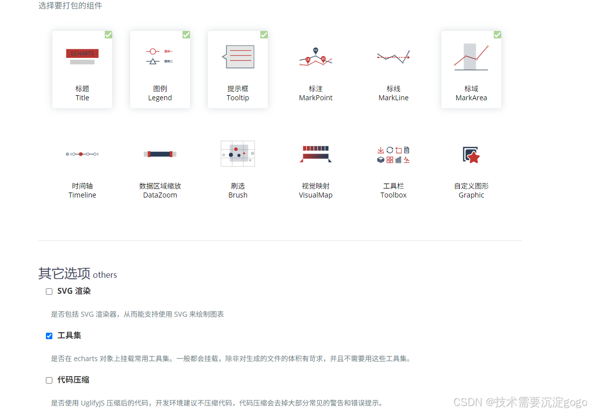
定制echarts左边链接点进去定制
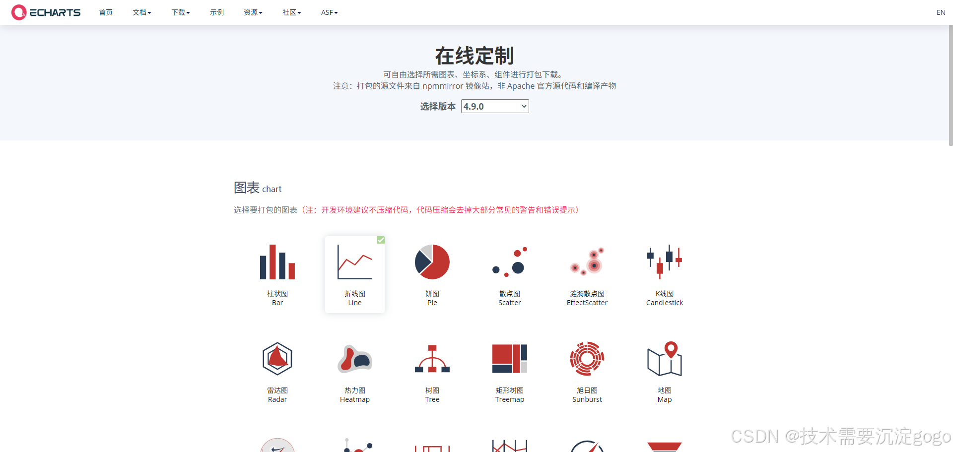
4.1 点击压缩代码,重点下载之后,min.js修改成之前得文件就行,小了将近1000kb
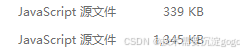
版本最大不能超过5.0 切记