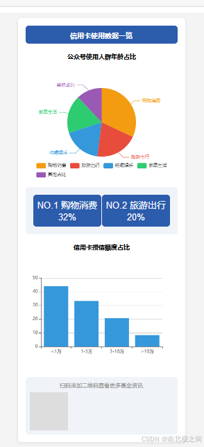
效果图
目录
- 概述
- 步骤一:创建 HTML 文件并引入 Vue 和 ECharts
- 步骤二:搭建基础页面结构
- 步骤三:编写页面样式
- 步骤四:使用 Vue.js 初始化页面
- 步骤五:使用 ECharts 创建图表
- 完整代码
- 结语
概述
在本教程中,我们将学习如何使用 Vue.js 和 ECharts 制作一个简单的信用卡使用数据展示页面。该页面包含数据的饼图和柱状图展示,适合新手理解和学习数据可视化的基本操作。
步骤一:创建 HTML 文件并引入 Vue 和 ECharts
首先,创建一个新的 HTML 文件,在 <head> 部分引入 Vue.js 和 ECharts 的 CDN。
<!DOCTYPE html>
<html>
<head>
  <meta charset="utf-8">
  <title>信用卡使用数据一览 - Vue 示例</title>
  <script src="https://cdn.staticfile.net/vue/2.7.0/vue.min.js"></script>
  <script src="https://cdn.jsdelivr.net/npm/[email protected]/dist/echarts.min.js"></script>
步骤二:搭建基础页面结构
在 <body> 中添加一个 <div id="app">,这是我们 Vue 实例挂载的地方。包括页面的标题、图表容器、数据展示框和二维码区域。
<body>
<div id="app">
  <!-- Header Section -->
  <div class="header">
    <h1>信用卡使用数据一览</h1>
  </div>

  <!-- 饼图 - 年龄占比 -->
  <div class="chart-section">
    <div class="chart-title">公众号使用人群年龄占比</div>
    <div id="pieChart" style="width: 100%; height: 300px;"></div>
  </div>

  <!-- 信息展示 -->
  <div class="info-box">
    <div class="info-item">
      <div>NO.1 购物消费</div>
      <div>32%</div>
    </div>
    <div class="info-item">
      <div>NO.2 旅游出行</div>
      <div>20%</div>
    </div>
  </div>

  <!-- 柱状图 - 授信额度占比 -->
  <div class="chart-section">
    <div class="chart-title">信用卡授信额度占比</div>
    <div id="barChart" style="width: 100%; height: 300px;"></div>
  </div>

  <!-- Footer with QR Code -->
  <div class="footer">
    <p>扫码添加二维码查看更多基金资讯</p>
    <div class="qrcode"></div>
  </div>
</div>
步骤三:编写页面样式
在 <style> 标签中添加 CSS 样式,为页面的每一部分设计样式。包括 .header、.chart-section、.info-box 和 .footer 等。
<style>
  body {


    font-family: Arial, sans-serif;
    background-color: #f4f4f4;
    margin: 0;
    padding: 0;
    display: flex;
    justify-content: center;
    align-items: center;
    height: 100vh;
  }
  #app {


    max-width: 800px;
    background-color: #fff;
    border-radius: 8px;
    padding: 20px;
    box-shadow: 0 2px 8px rgba(0, 0, 0, 0.1);
    text-align: center;
  }
  .header {


    background-color: #2c5cac;
    padding: 10px;
    color: #fff;
    border-radius: 8px;
  }
  .chart-section {


    margin-top: 20px;
  }
  .info-box {


    display: flex;
    justify-content: space-between;
    padding: 20px;
    background-color: #f0f4f8;
    border-radius: 8px;
    margin-top: 20px;
  }
  .info-item {


    width: 45%;
    background-color: #2c5cac;
    color: #fff;
    padding: 10px;
    border-radius: 8px;
    font-size: 24px;
  }
  .footer .qrcode {


    width: 100px;
    height: 100px;
    background-color: #ddd;
    margin-top: 10px;
  }
</style>
步骤四:使用 Vue.js 初始化页面
在 <script> 标签中,创建一个 Vue 实例,并将其挂载到 #app 元素。我们将在 mounted 钩子函数中初始化图表。
<script>
  new Vue({


    el: '#app',
    mounted() {


      this.initPieChart();
      this.initBarChart();
    }
  });
</script>
步骤五:使用 ECharts 创建图表
接下来,我们使用 ECharts 来创建两个图表:一个饼图和一个柱状图。
1. 饼图初始化
在 Vue 实例的 methods 中添加 initPieChart 方法,初始化饼图并设置选项。
methods: {


  initPieChart() {


    const pieChart = echarts.init(document.getElementById('pieChart'));
    const pieOption = {


      color: ['#f39c12', '#e74c3c', '#3498db', '#2ecc71', '#9b59b6'],
      legend: {


        bottom: '0%',
        data: ['购物消费', '旅游出行', '吃喝娱乐', '家居生活', '其他占比']
      },
      series: [
        {


          type: 'pie',
          radius: '60%',
          data: [
            {

     value: 32, name: '购物消费' },
            {

     value: 20, name: '旅游出行' },
            {

     value: 18, name: '吃喝娱乐' },
            {

     value: 18, name: '家居生活' },
            {

     value: 12, name: '其他占比' }
          ]
        }
      ]
    };
    pieChart.setOption(pieOption);
  }
}
2. 柱状图初始化
在 methods 中添加 initBarChart 方法,设置柱状图的选项。
initBarChart() {


  const barChart = echarts.init(document.getElementById('barChart'));
  const barOption = {


    color: ['#3498db', '#f1c40f', '#e74c3c', '#8e44ad'],
    xAxis: {


      type: 'category',
      data: ['<1万', '1-3万', '3-10万', '>10万']
    },
    yAxis: {


      type: 'value'
    },
    series: [
      {


        data: [43.9, 33.2, 20.6, 8.3],
        type: 'bar'
      }
    ]
  };
  barChart.setOption(barOption);
}
完整代码
<!DOCTYPE html>
<html>
<head>
  <meta charset="utf-8">
  <title>信用卡使用数据一览 - Vue 示例</title>
  <script src="https://cdn.staticfile.net/vue/2.7.0/vue.min.js"></script>
  <script src="https://cdn.jsdelivr.net/npm/[email protected]/dist/echarts.min.js"></script>
  <style>
    body {


      font-family: Arial, sans-serif;
      background-color: #f4f4f4;
      margin: 0;
      padding: 0;
      display: flex;
      justify-content: center;
      align-items: center;
      height: 100vh;
    }
    #app {


      max-width: 800px;
      background-color: #fff;
      border-radius: 8px;
      padding: 20px;
      box-shadow: 0 2px 8px rgba(0, 0, 0, 0.1);
      text-align: center;
    }
    .header {


      background-color: #2c5cac;
      padding: 10px;
      color: #fff;
      border-radius: 8px;
    }
    .header h1 {


      margin: 0;
      font-size: 18px;
    }
    .chart-section {


      margin-top: 20px;
    }
    .chart-title {


      font-weight: bold;
      margin: 10px 0;
    }
    .info-box {


      display: flex;
      justify-content: space-between;
      padding: 20px;
      background-color: #f0f4f8;
      border-radius: 8px;
      margin-top: 20px;
    }
    .info-item {


      width: 45%;
      background-color: #2c5cac;
      color: #fff;
      padding: 10px;
      border-radius: 8px;
      font-size: 24px;
    }
    .footer {


      margin-top: 20px;
      background-color: #f0f4f8;
      padding: 10px;
      border-radius: 8px;
    }
    .footer p {


      font-size: 14px;
      color: #888;
      margin: 0;
    }
    .footer .qrcode {


      width: 100px;
      height: 100px;
      background-color: #ddd;
      margin-top: 10px;
    }
  </style>
</head>
<body>
<div id="app">
  <!-- Header Section -->
  <div class="header">
    <h1>信用卡使用数据一览</h1>
  </div>

  <!-- 饼图 - 年龄占比 -->
  <div class="chart-section">
    <div class="chart-title">公众号使用人群年龄占比</div>
    <div id="pieChart" style="width: 100%; height: 300px;"></div>
  </div>

  <!-- 信息展示 -->
  <div class="info-box">
    <div class="info-item">
      <div>NO.1 购物消费</div>
      <div>32%</div>
    </div>
    <div class="info-item">
      <div>NO.2 旅游出行</div>
      <div>20%</div>
    </div>
  </div>

  <!-- 柱状图 - 授信额度占比 -->
  <div class="chart-section">
    <div class="chart-title">信用卡授信额度占比</div>
    <div id="barChart" style="width: 100%; height: 300px;"></div>
  </div>

  <!-- Footer with QR Code -->
  <div class="footer">
    <p>扫码添加二维码查看更多基金资讯</p>
    <div class="qrcode"></div>
  </div>
</div>

<script>
  new Vue({


    el: '#app',
    mounted() {


      this.initPieChart();
      this.initBarChart();
    },
    methods: {


      initPieChart() {


        const pieChart = echarts.init(document.getElementById('pieChart'));
        const pieOption = {


          color: ['#f39c12', '#e74c3c', '#3498db', '#2ecc71', '#9b59b6'],
          tooltip: {


            trigger: 'item'
          },
          legend: {


            bottom: '0%',
            data: ['购物消费', '旅游出行', '吃喝娱乐', '家居生活', '其他占比']
          },
          series: [
            {


              name: '年龄占比',
              type: 'pie',
              radius: '60%',
              data: [
                {

       value: 32, name: '购物消费' },
                {

       value: 20, name: '旅游出行' },
                {

       value: 18, name: '吃喝娱乐' },
                {

       value: 18, name: '家居生活' },
                {

       value: 12, name: '其他占比' }
              ],
              emphasis: {


                itemStyle: {


                  shadowBlur: 10,
                  shadowOffsetX: 0,
                  shadowColor: 'rgba(0, 0, 0, 0.5)'
                }
              }
            }
          ]
        };
        pieChart.setOption(pieOption);
      },
      initBarChart() {


        const barChart = echarts.init(document.getElementById('barChart'));
        const barOption = {


          color: ['#3498db', '#f1c40f', '#e74c3c', '#8e44ad'],
          tooltip: {


            trigger: 'axis',
            axisPointer: {

       type: 'shadow' }
          },
          xAxis: {


            type: 'category',
            data: ['<1万', '1-3万', '3-10万', '>10万']
          },
          yAxis: {


            type: 'value'
          },
          series: [
            {


              data: [43.9, 33.2, 20.6, 8.3],
              type: 'bar'
            }
          ]
        };
        barChart.setOption(barOption);
      }
    }
  });
</script>
</body>
</html>
结语
通过本教程,你已经学会了如何使用 Vue.js 和 ECharts 创建一个基础的数据展示页面。掌握这些基础后,你可以尝试在项目中应用更多的 ECharts 图表,丰富数据展示效果。