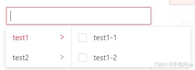
图例:
代码:
组件.vue
html部分
<template>
  <div class="ant-cascader-select">
    <a-select
      v-model="curVal"
      mode="multiple"
      ref="selector"
      dropdownClassName="ant-cascader-select-drop"
      :dropdownMatchSelectWidth="false"
      :open="menuVisible"
      @focus="openMenu"
      @blur="closeMenu"
      style="width: 100%"
      :allowClear="allowClear"
      :placeholder="placeholder"
      :size="size"
      :disabled="disabled"
      :defaultOpen="defaultOpen"
      :suffixIcon="suffixIcon"
      :removeIcon="removeIcon"
      :clearIcon="clearIcon"
      :maxTagCount="maxTagCount"
      :maxTagPlaceholder="maxTagPlaceholder"
      :maxTagTextLength="maxTagTextLength"
      :optionLabelProp="optionLabelProp"
      :optionFilterProp="optionFilterProp"
    >
      <div slot="dropdownRender">
        <!-- cascader-two-leval -->
        <!-- cascader-parent -->
        <a-col>
          <a-list size="small" :data-source="listData" :split="false">
            <a-list-item
              slot="renderItem"
              slot-scope="item, index"
              @click="() => handleClick(item, index)"
              :class="{ active: activeIdx === index }"
            >
              <span>{

   { item[optionName] }}</span>
              <a-icon type="right" />
            </a-list-item>
          </a-list>
        </a-col>
        <!-- cascader-child -->
        <a-col>
          <a-list size="small" :data-source="childList" :split="false">
            <a-list-item slot="renderItem" slot-scope="item, index" @click="() => handleClick(item, index)">
              <a-checkbox :checked="getChecked(item)"></a-checkbox>
              <span>{

   { item[optionName] }}</span>
            </a-list-item>
          </a-list>
        </a-col>
      </div>
    </a-select>
  </div>
</template>
js部分
<script>
// default props by ant-design-vue
import { SelectProps } from 'ant-design-vue/es/select/index'
const metaProps = {
  // only one level is supported by now
  options: {
    required: true,
    type: Array,
    default: () => []
  },
  // function for async data
  asyncAddHandler: {
    required: false,
    type: Function,
    default: null
  },
  // whether you want to add with modal,default is false
  addWithModal: {
    required: false,
    type: Boolean,
    default: false
  }
}
export default {
  props: {
    ...metaProps,
    ...SelectProps
  },
  model: {
    prop: 'value',
    event: 'change'
  },
  data: () => ({
    listData: [],
    curVal: [],
    activeIdx: 0,
    addVisible: false,
    newItemName: '',
    confirmLoading: false,
    i18nObj: {
      zh: {
        add: '新增',
        cancel: '取消',
        confirm: '确认',
        addNew: '新建',
        newName: '名称',
        addSuccess: '添加成功',
        addCommon: '添加失败:该选项已存在',
        addEmpty: '添加失败:名称为必填项',
        addFail: '添加失败:',
        apiFail: '接口错误'
      },
      en: {
        add: 'Add',
        cancel: 'Cancel',
        confirm: 'Confirm',
        addNew: 'Add new',
        newName: 'Name',
        addSuccess: 'Added successfully',
        addCommon: 'Failed to add: the option already exists',
        addEmpty: 'Failed to add: name is required',
        addFail: 'Add failed:',
        apiFail: 'Interface error'
      }
    },
    menuVisible: false,
    isAdding: false // distinguish whether the operation is for adding
  }),
  methods: {
    handleClick(option, index) {
      const val = option[this.optionValue]
      const isParent = option.children && option.children.length
      if (isParent) {
        // get the active list's data
        this.activeIdx = index
      } else {
        // change the model's data
        if (this.curVal.includes(val)) {
          const curIdx = this.curVal.findIndex((item) => {
            return val === item
          })
          this.curVal.splice(curIdx, 1)
        } else {
          this.curVal.push(val)
        }
      }
      // keep menu display
      this.$refs.selector.focus()
    },
    handleAdd() {
      this.addVisible = true
    },
    asyncAdd() {
      this.confirmLoading = true
      this.asyncAddHandler(this.newItemName).then(
        (item) => {
          this.confirmLoading = false
          this.closeAdd(true)
          // 将选项添加到列表中
          this.addItem(item)
        },
        (error) => {
          this.confirmLoading = false
          this.$message.error(this.getI18nText('addFail') + (error || this.getI18nText('apiFail')))
        }
      )
    },
    localAdd() {
      const item = this.createLocalItem()
      if (item) {
        this.addItem(item)
      } else {
        this.$message.error(this.getI18nText('addCommon'))
      }
      this.closeAdd(true)
    },
    handleOk() {
      if (this.newItemName) {
        if (typeof this.asyncAddHandler === 'function') {
          this.asyncAdd()
        } else {
          this.localAdd()
        }
      } else {
        this.$message.error(this.getI18nText('addEmpty'))
      }
    },
    createLocalItem() {
      const values = this.childList.map((item) => {
        return item[this.optionValue]
      })
      if (values.includes(this.newItemName)) {
        return false
      } else {
        return {
          [this.optionName]: this.newItemName,
          [this.optionValue]: this.newItemName
        }
      }
    },
    addItem(item) {
      this.$message.success(this.getI18nText('addSuccess'))
      this.listData[this.activeIdx]['children'].push(item)
    },
    initMenu(afterClose) {
      if ((this.addVisible || (afterClose && !this.isAdding)) && !this.confirmLoading) {
        // TODO:whether we want to close the menu after we close the container for add
        // should:
        // this.closeAdd()
        // this.closeMenu()
        // should not:
        this.closeAdd(true)
      } else {
        this.isAdding = false
      }
    },
    handleCancel() {
      this.isAdding = false
      this.addVisible = false
    },
    getI18nText(key) {
      return this.i18nObj[this.isZh ? 'zh' : 'en'][key]
    },
    setList(val) {
      this.listData = val
    },
    getChecked(item) {
      return this.curVal.includes(item[this.optionValue])
    },
    handleInputConfirm() {
      this.handleOk()
    },
    showInput() {
      this.addVisible = true
    },
    closeAdd(needFocus) {
      this.newItemName = ''
      this.addVisible = false
      this.isAdding = false
      if (needFocus) {
        this.$refs.selector.focus()
      }
    },
    openMenu() {
      this.menuVisible = true
    },
    closeMenu() {
      if (!this.addVisible) {
        this.menuVisible = false
      }
    },
    setValue(val) {
      this.curVal = val || []
    }
  },
  computed: {
    childList() {
      return this.listData[this.activeIdx]['children']
    },
    curLang() {
      return (this.$i18n && this.$i18n.locale) || 'zh-CN'
    },
    isZh() {
      return this.curLang === 'zh-CN'
    },
    optionName() {
      return this.optionLabelProp || 'label'
    },
    optionValue() {
      return this.optionFilterProp || 'value'
    }
  },
  watch: {
    options: {
      handler: 'setList',
      immediate: true
    },
    curVal(val) {
      this.$emit('change', val)
    },
    value: {
      handler: 'setValue',
      immediate: true
    }
  }
}
</script>
css部分:
<style lang="less">
.ant-cascader-select-drop {
  display: flex;
  // z-index: 100;
}
.ant-cascader-select-drop
  .ant-list-something-after-last-item
  .ant-spin-container
  > .ant-list-items
  > .ant-list-item:last-child {
  border-bottom: none;
}
.ant-cascader-select-drop .ant-select-dropdown-content {
  width: 100%;
  display: flex;
}
.ant-cascader-select-drop .ant-select-dropdown-content .ant-col:first-child {
  min-width: 120px;
}
.ant-cascader-select-drop .ant-select-dropdown-content .ant-col + .ant-col {
  border-left: 1px solid #e8e8e8;
  flex: 1;
  min-width: 220px;
}
.ant-cascader-select-drop .ant-select-dropdown-content .ant-col:last-child li {
  justify-content: flex-start;
}
.ant-cascader-select-drop .ant-select-dropdown-content .ant-col:last-child li .ant-checkbox-wrapper {
  margin-right: 12px;
}
.ant-cascader-select-drop .ant-list-items .ant-list-item {
  padding-left: 12px;
  padding-right: 12px;
  cursor: pointer;
}
.ant-cascader-select-drop .ant-list-items .ant-list-item > span {
  white-space: nowrap;
}
.ant-cascader-select-drop .ant-list-footer .ant-tag {
  margin-left: 12px;
  cursor: pointer;
}
.ant-cascader-select-drop .ant-list-footer .ant-input {
  margin-left: 12px;
  width: calc(100% - 24px) !important;
}
.ant-cascader-select-drop .ant-list-footer .ant-input + .ant-input-suffix {
  margin-right: 6px;
}
.ant-cascader-select-drop .ant-list-footer .ant-input + .ant-input-suffix i {
  color: #1890ff;
}
.ant-cascader-select-drop .ant-list-items .ant-list-item:hover,
.ant-cascader-select-drop .ant-list-items .ant-list-item.active {
  color: #1890ff;
}

.ant-cascader-select-drop .ant-list-items .ant-list-item:hover i,
.ant-cascader-select-drop .ant-list-items .ant-list-item.active i {
  color: #1890ff;
}
.ant-cascader-select-drop .ant-list-items .ant-list-item i {
  font-size: 10px;
  color: #7d8292;
  margin-left: 6px;
}
</style>
组件.js
import CascaderSelect from './CascaderSelect'
// component style
import './index.css'
export default CascaderSelect
页面使用:
<CascaderSelect v-model="searchParam.city" :options="optionsCity" />数据格式:
optionsCity: [
        {
          label: 'test1',
          value: 'test1',
          children: [
            {
              label: 'test1-1',
              value: 'test1-1'
            },
            {
              label: 'test1-2',
              value: 'test1-2'
            }
          ]
        },
        {
          label: 'test2',
          value: 'test2',
          children: [
            {
              label: 'test2-1',
              value: 'test2-1'
            },
            {
              label: 'test2-2',
              value: 'test2-2'
            }
          ]
        }
]参考文章:[Vue2]AntDesignVue基于Select封装「多选 + 二级级联+ 可自定义添加item 组件」_doit-ui-web-CSDN博客
ant.design-vue 级联多选组件 - bomdeyada - 博客园 (cnblogs.com)
基于ant-design-vue二次开发的级联多选组件_doit-ui-web-CSDN博客
原文说的组件文档doit-ui-web打不开QAQ
根据需求二次修改,需要一级可选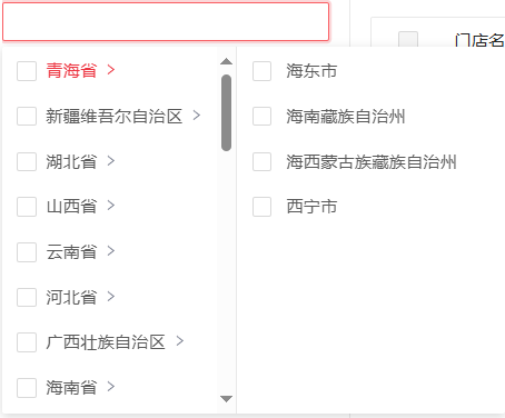
html:
<a-list size="small" :data-source="listData" :split="false">
            <a-list-item
              slot="renderItem"
              slot-scope="item, index"
              @click="() => handleClick(item, index)"
              :class="{ active: activeIdx === index }"
            >
              <a-checkbox :checked="getChecked(item)" :indeterminate="getIndeterminate(item)" style="margin-right:8px">
                <!-- <span style="z-index:100">{

   { item[optionName] }}</span> -->
              </a-checkbox>
              <span >{

   { item[optionName] }}</span>
              <a-icon style="" type="right" />
            </a-list-item>
          </a-list>
js:
handleClick(option, index) {
      const val = option[this.optionValue]
      const isParent = option.children && option.children.length
      if (isParent) {
        const m = []
      option.children.forEach((item) => {
        m.push(item.value)
      })
        // get the active list's data
        if (this.curVal.includes(val)) {
          const curIdx = this.curVal.findIndex((item) => {
            return val === item
          })
          this.curVal.splice(curIdx, 1)
        } else if (this.curVal.some((val) => m.includes(val))) {
          m.forEach(i => {
            if (this.curVal.includes(i)) {
            const curIdx = this.curVal.findIndex((item) => {
            return i === item
          })
          this.curVal.splice(curIdx, 1)
            }
          })
          this.curVal.push(val)
        } else {
          this.curVal.push(val)
        }
        this.activeIdx = index
      } else {
        // change the model's data
        const n = [] // 当前父级的全部子集
      this.listData[this.activeIdx].children.forEach((item) => {
        n.push(item.value)
      })
        if (this.curVal.includes(this.listData[this.activeIdx].value)) {
          const securIdx = this.curVal.findIndex((item) => {
            return this.listData[this.activeIdx].value === item
          })
          this.curVal.splice(securIdx, 1)
          // this.curVal = this.curVal.concat(this.listData[this.activeIdx].children)
          this.listData[this.activeIdx].children.forEach((item) => {
            this.curVal.push(item.value)
          })
          const curIdx = this.curVal.findIndex((item) => {
            return val === item
          })
          this.curVal.splice(curIdx, 1)
        } else if (this.curVal.includes(val)) {
          const curIdx = this.curVal.findIndex((item) => {
            return val === item
          })
          this.curVal.splice(curIdx, 1)
        } else {
          // this.selectVal.push(val)
          this.curVal.push(val)
          if (n.every((val) => this.curVal.includes(val))) {
            // 删除子集添加父级
            n.forEach((i) => {
              const curIdx = this.curVal.findIndex((item) => {
                return i === item
              })
              this.curVal.splice(curIdx, 1)
            })
            this.curVal.push(this.listData[this.activeIdx].value)
          }
        }
      }
      // keep menu display
      this.$refs.selector.focus()
    },

getChecked(item) {
      var m = false
      const isParent = item.children && item.children.length
      // console.log('checked', isParent)
      const n = [] // 当前父级的全部子集
      this.listData[this.activeIdx].children.forEach((item) => {
        n.push(item.value)
      })
      if (isParent) {
        // console.log('this.curVal', this.curVal)
        if (this.listData[this.activeIdx].children && this.listData[this.activeIdx].children.length > 1) {
            m = this.curVal.includes(item[this.optionValue]) || n.every((val) => this.curVal.includes(val))
        } else if (this.listData[this.activeIdx].children && this.listData[this.activeIdx].children.length === 1) {
            m = this.curVal.includes(item[this.optionValue])
        }
      } else {
        m = this.curVal.includes(this.listData[this.activeIdx].value) || this.curVal.includes(item[this.optionValue])
      }
      return m
    },
    getIndeterminate(item) {
      const m = []
      item.children.forEach((item) => {
        m.push(item.value)
      })
      const n = this.listData[this.activeIdx].children && this.listData[this.activeIdx].children.length > 1
      console.log(this.curVal.every((val) => m.includes(val)))
      return this.curVal.some((val) => m.includes(val)) && !m.every((val) => this.curVal.includes(val)) && n
    },
css:
<style lang="less">
.ant-cascader-select-drop {
  height: 300px;
  display: flex;
  // overflow: auto;
  // z-index: 100;
}
.ant-cascader-select-drop
  .ant-list-something-after-last-item
  .ant-spin-container
  > .ant-list-items
  > .ant-list-item:last-child {
  border-bottom: none;
}
.ant-cascader-select-drop .ant-select-dropdown-content {
  width: 100%;
  display: flex;
}
.ant-cascader-select-drop .ant-select-dropdown-content .ant-col:first-child {
  overflow: auto;
  min-width: 120px;
}
.ant-cascader-select-drop .ant-select-dropdown-content .ant-col + .ant-col {
  border-left: 1px solid #e8e8e8;
  // height: 100%;
  flex: 1;
  min-width: 220px;
}
.ant-cascader-select-drop .ant-select-dropdown-content .ant-col:first-child li {
  justify-content: flex-start;
}
.ant-cascader-select-drop .ant-select-dropdown-content .ant-col:last-child {
  overflow: auto;
  justify-content: flex-start;
}
.ant-cascader-select-drop .ant-select-dropdown-content .ant-col:last-child li {
  justify-content: flex-start;
}
.ant-cascader-select-drop .ant-select-dropdown-content .ant-col:last-child li .ant-checkbox-wrapper {
  margin-right: 12px;
}
.ant-cascader-select-drop .ant-list-items .ant-list-item {
  padding-left: 12px;
  padding-right: 12px;
  cursor: pointer;
}
.ant-cascader-select-drop .ant-list-items .ant-list-item > span {
  white-space: nowrap;
  // justify-content: flex-start;
}
.ant-cascader-select-drop .ant-list-footer .ant-tag {
  margin-left: 12px;
  cursor: pointer;
}
.ant-cascader-select-drop .ant-list-footer .ant-input {
  margin-left: 12px;
  width: calc(100% - 24px) !important;
}
.ant-cascader-select-drop .ant-list-footer .ant-input + .ant-input-suffix {
  margin-right: 6px;
}
.ant-cascader-select-drop .ant-list-footer .ant-input + .ant-input-suffix i {
  color: #1890ff;
}
.ant-cascader-select-drop .ant-list-items .ant-list-item:hover,
.ant-cascader-select-drop .ant-list-items .ant-list-item.active {
  color: #1890ff;
}

.ant-cascader-select-drop .ant-list-items .ant-list-item:hover i,
.ant-cascader-select-drop .ant-list-items .ant-list-item.active i {
  color: #1890ff;
}
.ant-cascader-select-drop .ant-list-items .ant-list-item i {
  font-size: 10px;
  color: #7d8292;
  margin-left: 6px;
}
</style>