目录
引言
对话框是图形用户界面中不可或缺的组件,它为用户提供了临时的交互界面,用于显示信息、获取输入或进行关键操作的确认。在Qt Quick应用程序开发中,对话框通常用于以下场景:提示用户进行确认、显示警告或错误信息、收集用户输入数据、以及选择文件或目录等。
Qt Quick提供了灵活而强大的Dialog组件,开发者可以通过它创建各种类型的对话框以满足不同应用场景的需求。本文将通过一个实际的示例项目,详细介绍Qt Quick对话框的基本用法、属性配置以及自定义方法,帮助读者快速掌握Qt QML对话框的开发技巧。
相关阅读
Dialog组件基本属性
根据Qt官方文档,Dialog组件具有以下重要的基本属性:
| 属性 | 类型 | 描述 |
|---|---|---|
| title | string | 设置对话框的标题文本 |
| modal | bool | 控制对话框是否为模态,当设为true时,用户必须先响应对话框才能与应用的其他部分交互 |
| standardButtons | StandardButton | 设置对话框要显示的标准按钮(如OK、Cancel、Save等) |
| header | Component | 对话框的头部内容 |
| footer | Component | 对话框的底部内容,通常包含按钮 |
| contentItem | Item | 对话框的主要内容区域 |
| visible | bool | 控制对话框的可见性 |
| width | real | 对话框的宽度 |
| height | real | 对话框的高度 |
| x | real | 对话框的X坐标位置 |
| y | real | 对话框的Y坐标位置 |
| parent | Item | 对话框的父项 |
| anchors | Object | 控制对话框的布局锚点 |
此外,Dialog还提供了以下常用的信号和方法:
| 信号/方法 | 描述 |
|---|---|
| accepted() | 当对话框被接受时发射的信号(如点击OK按钮) |
| rejected() | 当对话框被拒绝时发射的信号(如点击Cancel按钮) |
| open() | 打开/显示对话框的方法 |
| close() | 关闭/隐藏对话框的方法 |
| accept() | 接受对话框并关闭它的方法 |
| reject() | 拒绝对话框并关闭它的方法 |
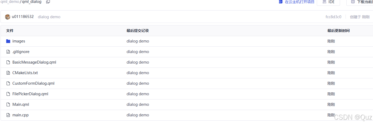
项目结构
下面是示例项目的结构图:
这个示例项目包含了三种不同类型的对话框:
- 基础消息对话框 - 用于显示简单的消息提示
- 自定义表单对话框 - 用于收集用户输入数据
- 文件选择对话框 - 用于让用户选择文件
示例代码解析
Main.qml - 主界面
import QtQuick
import QtQuick.Controls
import QtQuick.Layouts

Window {
    width: 640
    height: 480
    visible: true
    title: "QML对话框示例"

    ColumnLayout {
        anchors.centerIn: parent
        spacing: 20

        Label {
            text: "QML对话框示例"
            font.pixelSize: 24
            font.bold: true
            Layout.alignment: Qt.AlignHCenter
        }

        Button {
            text: "基础消息对话框"
            Layout.preferredWidth: 200
            onClicked: messageDialog.open()
        }

        Button {
            text: "自定义表单对话框"
            Layout.preferredWidth: 200
            onClicked: formDialog.open()
        }

        Button {
            text: "文件选择对话框"
            Layout.preferredWidth: 200
            onClicked: filePickerDialog.open()
        }
    }

    BasicMessageDialog {
        id: messageDialog
        width: 300
        height: 200
        anchors.centerIn: parent
        messageText: "这是一个演示用的消息对话框!"
    }

    CustomFormDialog {
        id: formDialog
        width: 300
        height: 200
        anchors.centerIn: parent
    }

    FilePickerDialog {
        id: filePickerDialog
        width: 300
        height: 200
        anchors.centerIn: parent
    }
}
代码解释:
主界面设计了一个简洁的布局,包含三个按钮,每个按钮对应打开一种不同类型的对话框:
- 界面使用
ColumnLayout垂直排列组件,并通过anchors.centerIn: parent将布局居中显示。 - 设置了三个按钮,并为每个按钮分配了相应的点击事件处理器,通过
onClicked属性调用各自对话框组件的open()方法。 - 在窗口中创建了三个不同类型的对话框组件实例,并设置了统一的尺寸和居中锚点。
- 对于基础消息对话框,还设置了自定义的消息文本。
BasicMessageDialog.qml - 基础消息对话框
import QtQuick
import QtQuick.Controls
import QtQuick.Layouts

Dialog {
    id: messageDialog
    title: "消息提示"
    modal: true
    standardButtons: Dialog.Ok | Dialog.Cancel

    property alias messageText: messageLabel.text

    ColumnLayout {
        anchors.fill: parent
        spacing: 20

        Image {
            Layout.alignment: Qt.AlignHCenter
            source: "images/info.png"
            width: 48
            height: 48
        }

        Label {
            id: messageLabel
            text: "这是一个基本的消息对话框"
            wrapMode: Text.WordWrap
            Layout.fillWidth: true
            horizontalAlignment: Text.AlignHCenter
        }
    }

    onAccepted: console.log("确认按钮被点击")
    onRejected: console.log("取消按钮被点击")
}
代码解释:
这是一个基础的消息对话框实现:
- 通过继承
Dialog组件创建自定义对话框,设置标题为"消息提示",并启用模态特性。 - 使用
standardButtons属性添加标准的"确定"和"取消"按钮。 - 定义了一个自定义属性
messageText,通过alias将其绑定到内部标签组件的文本属性,便于外部设置消息内容。 - 使用
ColumnLayout垂直布局内容,包含一个信息图标和消息文本标签。 - 实现了
onAccepted和onRejected信号处理器,在用户点击相应按钮时打印日志消息。
CustomFormDialog.qml - 自定义表单对话框
import QtQuick
import QtQuick.Controls
import QtQuick.Layouts

Dialog {
    id: formDialog
    title: "用户信息"
    modal: true
    standardButtons: Dialog.Save | Dialog.Cancel

    property string username: nameField.text
    property string email: emailField.text
    property string birthDate: birthDateField.text

    GridLayout {
        anchors.fill: parent
        columns: 2
        columnSpacing: 10
        rowSpacing: 10

        Label {
            text: "姓名:"
        }
        TextField {
            id: nameField
            Layout.fillWidth: true
            placeholderText: "请输入姓名"
        }

        Label {
            text: "邮箱:"
        }
        TextField {
            id: emailField
            Layout.fillWidth: true
            placeholderText: "请输入邮箱"
            validator: RegularExpressionValidator {
                regularExpression: /^[A-Za-z0-9._%+-]+@[A-Za-z0-9.-]+\.[A-Za-z]{2,}$/
            }
        }

        Label {
            text: "出生日期:"
        }
        TextField {
            id: birthDateField
            Layout.fillWidth: true
            placeholderText: "YYYY-MM-DD"
            validator: RegularExpressionValidator {
                regularExpression: /^\d{4}-\d{2}-\d{2}$/
            }
        }
    }

    onAccepted: {
        console.log("保存用户信息:")
        console.log("姓名:", username)
        console.log("邮箱:", email)
        console.log("出生日期:", birthDate)
    }
}
代码解释:
这是一个用于收集用户信息的表单对话框:
- 设置对话框标题为"用户信息",并使用"保存"和"取消"标准按钮。
- 定义了三个自定义属性来存储表单数据:
username、email和birthDate。 - 使用
GridLayout创建一个双列的表单布局,左侧为标签,右侧为输入字段。 - 为邮箱和出生日期字段添加了正则表达式验证器,确保用户输入的格式正确。
- 实现了
onAccepted信号处理器,在用户点击"保存"按钮时,将表单数据打印到控制台。
FilePickerDialog.qml - 文件选择对话框
import QtQuick
import QtQuick.Controls
import QtQuick.Dialogs
import QtQuick.Layouts

Dialog {
    id: filePickerDialog
    title: "文件选择"
    modal: true
    standardButtons: Dialog.Open | Dialog.Cancel

    property string selectedFilePath: ""
    property var fileDialog: null

    ColumnLayout {
        anchors.fill: parent
        spacing: 10

        Label {
            text: "选择的文件:"
            font.bold: true
        }

        TextField {
            id: filePathField
            Layout.fillWidth: true
            readOnly: true
            text: selectedFilePath
            placeholderText: "未选择文件"
        }

        Button {
            text: "浏览..."
            Layout.alignment: Qt.AlignRight
            onClicked: {
                if (!fileDialog) {
                    fileDialog = fileDialogComponent.createObject(filePickerDialog)
                }
                fileDialog.open()
            }
        }
    }

    Component {
        id: fileDialogComponent
        FileDialog {
            title: "请选择文件"
            nameFilters: ["所有文件 (*.*)"]
            onAccepted: {
                selectedFilePath = selectedFile
                filePathField.text = selectedFile
            }
        }
    }

    onAccepted: {
        if (selectedFilePath) {
            console.log("选择的文件:", selectedFilePath)
        }
    }
}
代码解释:
这是一个文件选择对话框,它组合了两种对话框:一个自定义的Dialog和一个系统的FileDialog:
- 设置了标题为"文件选择",并使用"打开"和"取消"标准按钮。
- 定义了
selectedFilePath属性来存储选择的文件路径。 - 使用
ColumnLayout垂直排列内容,包含一个标签、一个只读文本字段(显示选择的文件路径)和一个"浏览"按钮。 - 使用
Component定义了一个FileDialog组件,并在点击"浏览"按钮时动态创建它(如果尚未创建)。 - 当系统文件对话框接收到选择结果时,更新自定义属性和文本字段。
- 在对话框被接受时,如果已选择文件,则打印文件路径到控制台。
运行效果展示

图1:基础消息对话框运行效果

图2:自定义表单对话框运行效果

图3:文件选择对话框运行效果
总结
本文通过一个实际的QML项目,介绍了Qt Quick中对话框的开发和使用方法。主要内容包括:
-
Dialog组件的基本属性和用法:了解了Dialog组件的核心属性和方法,如标题、模态、标准按钮等。
-
三种常见对话框的实现:
- 基础消息对话框:用于显示简单信息和获取用户确认
- 自定义表单对话框:用于收集结构化的用户输入数据
- 文件选择对话框:结合系统文件对话框实现文件选择功能
-
对话框的自定义和扩展:通过示例展示了如何自定义对话框内容、添加验证逻辑和处理用户交互。
工程下载
完整的项目源代码可以从以下链接下载:GitCode QML Dialog示例