Android studio 中六大布局的使用
前言
Android studio的基本知识学起来还是很快的,但如果想要真正学会,还需要不断地去联系,网上小项目也可以去看看,Gitee上面的大作业也是一个非常好的参考对象,话不多说,继续本篇的学习内容。
注意:本次所学习的布局有很多性质,由于篇幅原因不能全部展示,需要读者自己去亲身实践,有什么什么疑问,欢迎私信或在评论区留言。
本次的学习内容
1.线性布局LinearLayout
2.相对布局RelativeLayout
3.表格布局TableLayout
4.帧布局FrameLayout
5.绝对布局AbsoluteLayout
6.网格布局GridLayout
一、线性布局(LinearLayout)
线性布局算是Android 开发页面中最常用的布局了,线性布局中最重要的属性:orientation :horizontal(水平布局)和vertical(垂直布局)两种方式,这个属性会直接影响你的页面美观程度。
1.性质及两种布局方式
1.orientation 布局方式,有horizontal(水平布局)和vertical(垂直布局)两种方式
2.id 组件名称
3.layout_width 该组件的宽度
4.layout_height 该组件的高度
5.layout_weight 权重
6.layout_gravity 该组件(在父容器)中的对齐方式
7.gravity 该组件所含子组件在其内部的对齐方式
8.background 设置背景图片或填充颜色
这里给一个示例代码xml:
<?xml version="1.0" encoding="utf-8"?>
<LinearLayout xmlns:android="http://schemas.android.com/apk/res/android"
    android:id="@+id/main"
    android:layout_width="match_parent"
    android:layout_height="match_parent"
    android:orientation="vertical"
    tools:context=".MainActivity8">


    <LinearLayout
        android:layout_marginTop="20dp"
        android:background="@color/white"
        android:layout_width="match_parent"
        android:gravity="center"
        android:layout_height="wrap_content">
        <TextView
            android:text="第一个布局"
            android:layout_width="wrap_content"
            android:layout_height="wrap_content"
            />
    </LinearLayout>
    <LinearLayout
        android:background="@color/white"
        android:layout_width="match_parent"
        android:gravity="center"
        android:layout_height="wrap_content">
        <TextView
            android:text="第二个布局"
            android:layout_width="wrap_content"
            android:layout_height="wrap_content"
            />
    </LinearLayout>
    <LinearLayout
        android:background="@color/white"
        android:layout_width="match_parent"
        android:gravity="center"
        android:layout_height="wrap_content">
        <TextView
            android:text="第三个布局"
            android:layout_width="wrap_content"
            android:layout_height="wrap_content"
            />
    </LinearLayout>
</LinearLayout>
效果图如下:
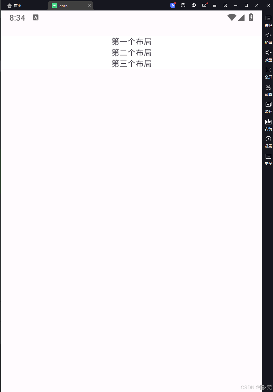
在线性布局下,页面尽然有序,我们再试一下,水平布局:
xml:
<?xml version="1.0" encoding="utf-8"?>
<LinearLayout xmlns:android="http://schemas.android.com/apk/res/android"
    xmlns:app="http://schemas.android.com/apk/res-auto"
    xmlns:tools="http://schemas.android.com/tools"
    android:id="@+id/main"
    android:layout_width="match_parent"
    android:layout_height="match_parent"
    android:orientation="horizontal"
    tools:context=".MainActivity8">

<LinearLayout
android:background="@color/white"
android:layout_width="0dp"
android:layout_weight="1"
android:gravity="center"
android:layout_height="wrap_content">
<TextView
    android:text="第一个布局"
    android:layout_width="wrap_content"
    android:layout_height="wrap_content"
    />
</LinearLayout>

    <LinearLayout
        android:background="@color/white"
        android:layout_width="0dp"
        android:layout_weight="1"
        android:gravity="center"
        android:layout_height="wrap_content">
        <TextView
            android:text="第二个布局"
            android:layout_width="wrap_content"
            android:layout_height="wrap_content"
            />
    </LinearLayout>

    <LinearLayout
        android:background="@color/white"
        android:layout_width="0dp"
        android:layout_weight="1"
        android:gravity="center"
        android:layout_height="wrap_content">
        <TextView
            android:text="第三个布局"
            android:layout_width="wrap_content"
            android:layout_height="wrap_content"
            />
    </LinearLayout>


    </LinearLayout>
效果图如下:
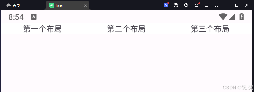
可以很明显的看出,水平与垂直布局的不同。
2.权重
权重,顾名思义就是每块内容在固定范围内所占的比例大小不同,我们还是以实例展示:
xml:
<?xml version="1.0" encoding="utf-8"?>
<LinearLayout xmlns:android="http://schemas.android.com/apk/res/android"
    xmlns:app="http://schemas.android.com/apk/res-auto"
    xmlns:tools="http://schemas.android.com/tools"
    android:id="@+id/main"
    android:layout_width="match_parent"
    android:layout_height="match_parent"
    android:orientation="vertical"
    tools:context=".MainActivity8">

    <LinearLayout
        android:layout_marginTop="20dp"
        android:layout_width="match_parent"
        android:orientation="horizontal"
        android:layout_height="wrap_content">
        <TextView
            android:text="权重1"
            android:layout_width="0dp"
            android:layout_weight="2"
            android:layout_height="wrap_content"/>
        <TextView
            android:text="权重2"
            android:layout_width="0dp"
            android:layout_weight="1"
            android:layout_height="wrap_content"/>
        <TextView
            android:text="权重3"
            android:layout_width="0dp"
            android:layout_weight="1"
            android:layout_height="wrap_content"/>
        <TextView
            android:text="权重4"
            android:layout_width="0dp"
            android:layout_weight="1"
            android:layout_height="wrap_content"/>
        <TextView
            android:text="权重5"
            android:layout_width="0dp"
            android:layout_weight="1"
            android:layout_height="wrap_content"/>
    </LinearLayout>

    <LinearLayout
        android:layout_marginTop="20dp"
        android:background="@color/white"
        android:layout_width="match_parent"
        android:gravity="center"
        android:layout_height="wrap_content">
        <TextView
            android:text="第一个布局"
            android:layout_width="wrap_content"
            android:layout_height="wrap_content"
            />
    </LinearLayout>
    <LinearLayout
        android:background="@color/white"
        android:layout_width="match_parent"
        android:gravity="center"
        android:layout_height="wrap_content">
        <TextView
            android:text="第二个布局"
            android:layout_width="wrap_content"
            android:layout_height="wrap_content"
            />
    </LinearLayout>
    <LinearLayout
        android:background="@color/white"
        android:layout_width="match_parent"
        android:gravity="center"
        android:layout_height="wrap_content">
        <TextView
            android:text="第三个布局"
            android:layout_width="wrap_content"
            android:layout_height="wrap_content"
            />
    </LinearLayout>
</LinearLayout>
效果图如下:
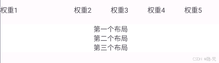
可以看到上面的权重比为2:1:1:1:1,权重的使用可以重点突出主要功能,使用户能够更加明了,核心代码为:
android:layout_weight=“2”
这里的2代表权重。
二、相对布局(RelativeLayout)
相对布局,顾名思义就是就是一个组件相对于另一个组件的位置。
1.性质
属性:
android:layout_marginTop=“25dip” //顶部距离
android:gravity=“left” //空间布局位置
android:layout_marginLeft="15dip //距离左边距
相对于给定ID控件
android:layout_above 将该控件的底部置于给定ID的控件之上;
android:layout_below 将该控件的底部置于给定ID的控件之下;
android:layout_toLeftOf 将该控件的右边缘与给定ID的控件左边缘对齐;
android:layout_toRightOf 将该控件的左边缘与给定ID的控件右边缘对齐;
android:layout_alignBaseline 将该控件的baseline与给定ID的baseline对齐;
android:layout_alignTop 将该控件的顶部边缘与给定ID的顶部边缘对齐;
android:layout_alignBottom 将该控件的底部边缘与给定ID的底部边缘对齐;
android:layout_alignLeft 将该控件的左边缘与给定ID的左边缘对齐;
android:layout_alignRight 将该控件的右边缘与给定ID的右边缘对齐;
相对于父组件
android:layout_alignParentTop 如果为true,将该控件的顶部与其父控件的顶部对齐;
android:layout_alignParentBottom 如果为true,将该控件的底部与其父控件的底部对齐;
android:layout_alignParentLeft 如果为true,将该控件的左部与其父控件的左部对齐;
android:layout_alignParentRight 如果为true,将该控件的右部与其父控件的右部对齐;
居中
android:layout_centerHorizontal 如果为true,将该控件的置于水平居中;
android:layout_centerVertical 如果为true,将该控件的置于垂直居中;
android:layout_centerInParent 如果为true,将该控件的置于父控件的中央;
指定移动像素
android:layout_marginTop 上偏移的值;
android:layout_marginBottom 下偏移的值;
android:layout_marginLeft 左偏移的值;
android:layout_marginRight 右偏移的值;
我们直接用一份代码直接全部展示出来:
<?xml version="1.0" encoding="utf-8"?>
<RelativeLayout xmlns:android="http://schemas.android.com/apk/res/android"
    xmlns:app="http://schemas.android.com/apk/res-auto"
    xmlns:tools="http://schemas.android.com/tools"
    android:id="@+id/main"
    android:layout_width="match_parent"
    android:layout_height="match_parent"
    android:orientation="vertical"
    tools:context=".MainActivity9">

    <TextView
        android:id="@+id/center0"
        android:layout_width="100dp"
        android:layout_height="100dp"
        android:background="#123456"
        android:textSize="20dp"
        android:textColor="#ffffff"
        android:gravity="center"
        android:text="中间"
        android:layout_centerInParent="true"/>
    <TextView
        android:layout_width="100dp"
        android:layout_height="100dp"
        android:background="#123456"
        android:textSize="20dp"
        android:textColor="#ffffff"
        android:gravity="center"
        android:text="左下"
        android:layout_alignParentLeft="true"
        android:layout_alignParentBottom="true"/>

    <TextView
        android:layout_width="100dp"
        android:layout_height="100dp"
        android:background="#123456"
        android:textSize="20dp"
        android:textColor="#ffffff"
        android:gravity="center"
        android:text="水平居中"
        android:layout_centerHorizontal="true"/>

    <TextView
        android:layout_width="100dp"
        android:layout_height="100dp"
        android:background="#123456"
        android:textSize="20dp"
        android:textColor="#ffffff"
        android:gravity="center"
        android:text="垂直居中"
        android:layout_centerVertical="true"/>


    <TextView
        android:layout_width="100dp"
        android:layout_height="100dp"
        android:background="#098765"
        android:textSize="20dp"
        android:textColor="#ffffff"
        android:gravity="center"
        android:text="相对右边"
        android:layout_toRightOf="@+id/center0"
        android:layout_centerVertical="true"/>

    <TextView
        android:layout_width="100dp"
        android:layout_height="100dp"
        android:background="#098765"
        android:textSize="20dp"
        android:textColor="#ffffff"
        android:gravity="center"
        android:text="相对左上"
        android:layout_toLeftOf="@+id/center0"
        android:layout_above="@+id/center0"/>


    <TextView
        android:layout_width="150dp"
        android:layout_height="30dp"
        android:layout_alignBottom="@+id/center0"
        android:background="#abcd12"
        android:gravity="center"
        android:text="相对下边线对齐"
        android:textColor="#ffffff"
        android:textSize="20dp" />
</RelativeLayout>
效果图如下:
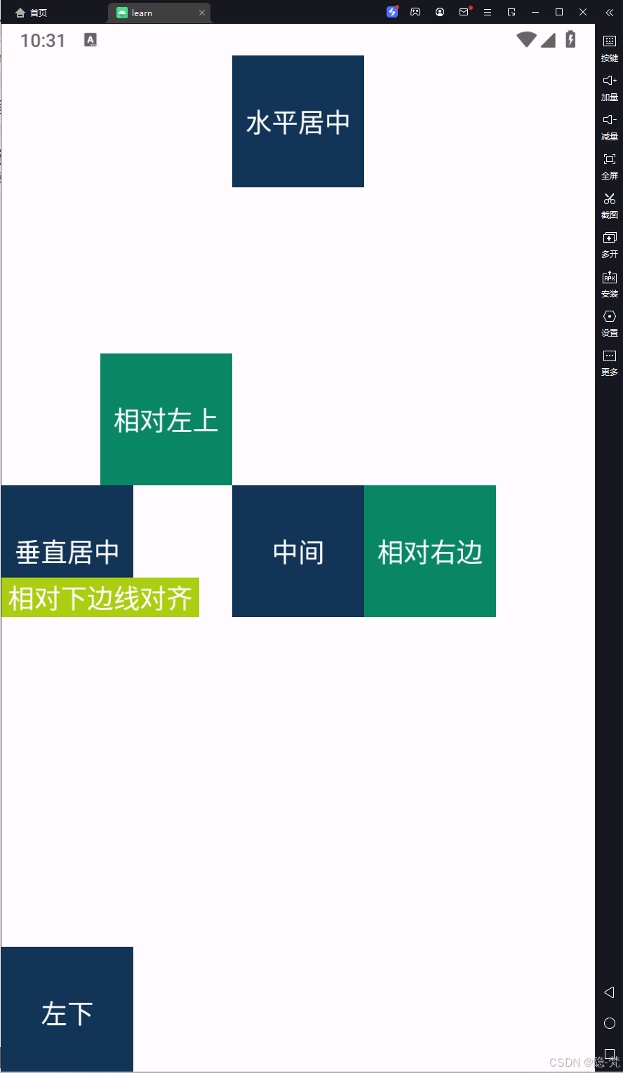
这里只展示一部分性质与内容,其他性质也相似,有兴趣的读者可以自行去试试。
2.相对于父组件
上一节,我们只看了相对于整个屏幕的相对布局,这一节我们来看,相对于父组件的相对组件,好比与学生座位,以小红为中心,小明在小红的左边,小刚在小红的右下边。
因为这些性质也是极为相似的,所以我们同样直接给出代码来理解:
<?xml version="1.0" encoding="utf-8"?>
<RelativeLayout xmlns:android="http://schemas.android.com/apk/res/android"
    xmlns:app="http://schemas.android.com/apk/res-auto"
    xmlns:tools="http://schemas.android.com/tools"
    android:id="@+id/main"
    android:layout_width="match_parent"
    android:layout_height="match_parent"
    android:orientation="vertical"
    tools:context=".MainActivity9">

    <TextView
        android:id="@+id/tv_center"
        android:layout_width="wrap_content"
        android:layout_height="wrap_content"
        android:layout_centerInParent="true"
        android:background="#ffffff"
        android:text="我在中间"
        android:textSize="11sp"
        android:textColor="#000000"
        />

    <TextView
        android:id="@+id/tv_center_horizontal"
        android:layout_width="wrap_content"
        android:layout_height="wrap_content"
        android:layout_centerHorizontal="true"
        android:background="#ffffff"
        android:text="水平中间"
        android:textColor="#000000"
        android:textSize="11sp"
        />

    <TextView
        android:id="@+id/tv_center_vertical"
        android:layout_width="wrap_content"
        android:layout_height="wrap_content"
        android:layout_centerVertical="true"
        android:background="#ffffff"
        android:text="垂直中间"
        android:textColor="#000000"
        android:textSize="11sp"
        />

    <TextView
        android:id="@+id/tv_parent_left"
        android:layout_width="wrap_content"
        android:layout_height="wrap_content"
        android:layout_alignParentLeft="true"
        android:background="#ffffff"
        android:text="和上级左边对齐"
        android:textColor="#000000"
        android:textSize="11sp"
        />

    <TextView
        android:id="@+id/tv_parent_right"
        android:layout_width="wrap_content"
        android:layout_height="wrap_content"
        android:layout_alignParentRight="true"
        android:background="#ffffff"
        android:text="和上级右边对齐"
        android:textColor="#000000"
        android:textSize="11sp"
        />

    <TextView
        android:id="@+id/tv_parent_top"
        android:layout_width="wrap_content"
        android:layout_height="wrap_content"
        android:layout_alignParentTop="true"
        android:background="#ffffff"
        android:text="和上级顶部对齐"
        android:textColor="#000000"
        android:textSize="11sp"
        />

    <TextView
        android:id="@+id/tv_parent_bottom"
        android:layout_width="wrap_content"
        android:layout_height="wrap_content"
        android:layout_alignParentBottom="true"
        android:background="#ffffff"
        android:text="和上级底部对齐"
        android:textColor="#000000"
        android:textSize="11sp"
        />

    <TextView
        android:id="@+id/tv_left_center"
        android:layout_width="wrap_content"
        android:layout_height="wrap_content"
        android:layout_toLeftOf="@+id/tv_center"
        android:background="#ffffff"
        android:text="在中间的左边"
        android:textColor="#000000"
        android:textSize="11sp"
        />

    <TextView
        android:id="@+id/tv_right_center"
        android:layout_width="wrap_content"
        android:layout_height="wrap_content"
        android:layout_toRightOf="@+id/tv_center"
        android:layout_alignBottom="@+id/tv_center"
        android:background="#ffffff"
        android:text="在中间的右边"
        android:textColor="#000000"
        android:textSize="11sp"
        />

    <TextView
        android:id="@+id/tv_above_center"
        android:layout_width="wrap_content"
        android:layout_height="wrap_content"
        android:layout_above="@+id/tv_center"
        android:layout_alignLeft="@+id/tv_center"
        android:background="#ffffff"
        android:text="在中间的上面"
        android:textColor="#000000"
        android:textSize="11sp"
        />

    <TextView
        android:id="@+id/tv_below_center"
        android:layout_width="wrap_content"
        android:layout_height="wrap_content"
        android:layout_below="@+id/tv_center"
        android:layout_alignRight="@+id/tv_center"
        android:background="#ffffff"
        android:text="在中间的下面"
        android:textColor="#000000"
        android:textSize="11sp"
        />


</RelativeLayout>
效果图如下:
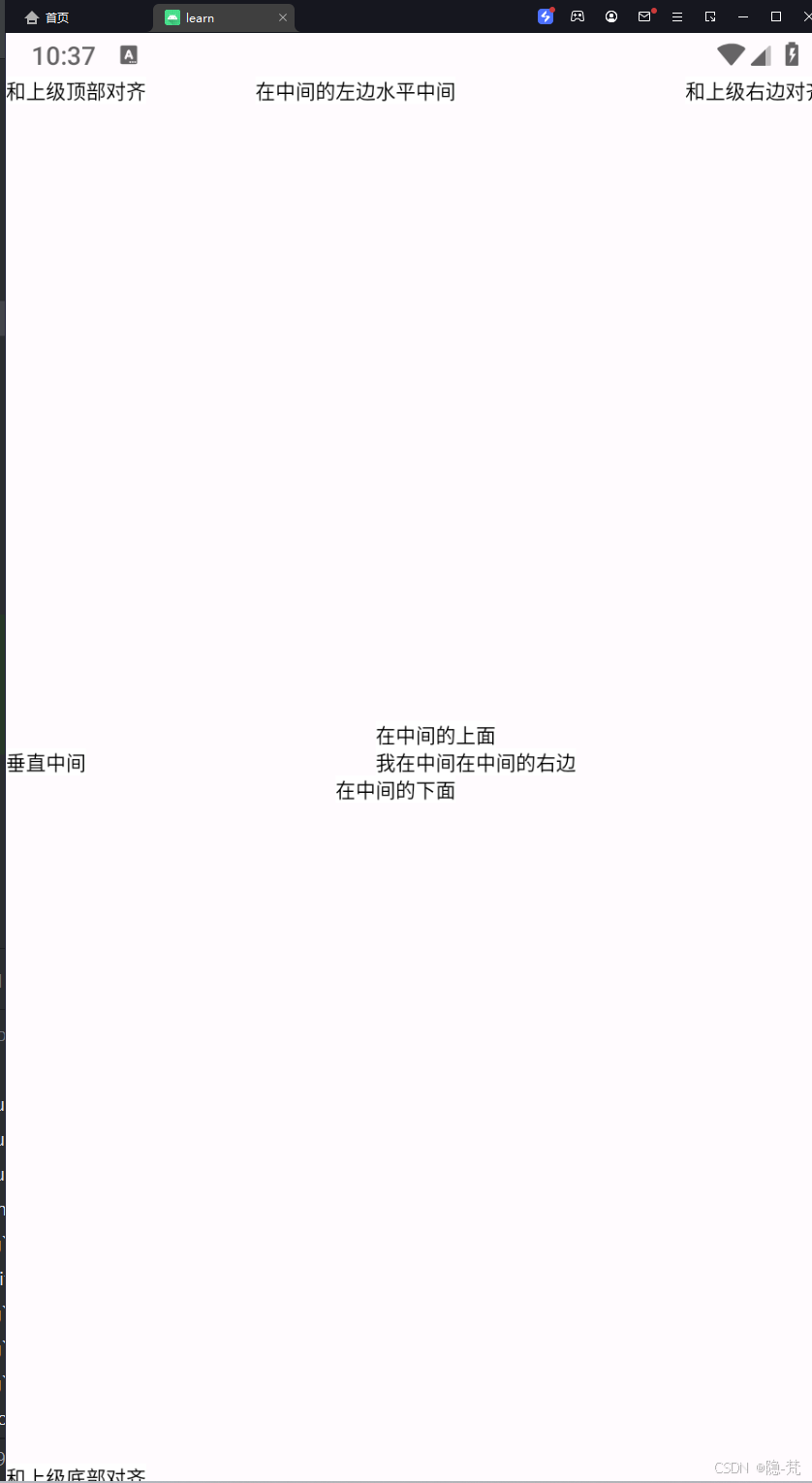
可以看出,这里不仅展示了相对于屏幕的相对布局,也展示了相对于"我是中间“的相对布局。
三、表格布局(TableLayout)
这后面的布局就很简单了,基本上没有多少性质,用的也不多,就简单带过来,让大家了解一下。
三个常用属性
android:collapseColumns:设置需要被隐藏的列的序号
android:shrinkColumns:设置允许被收缩的列的列序号
android:stretchColumns:设置运行被拉伸的列的列序号
代码如下:
<?xml version="1.0" encoding="utf-8"?>
<GridLayout xmlns:android="http://schemas.android.com/apk/res/android"
    android:layout_width="match_parent"
    android:layout_height="match_parent"
    android:columnCount="2"
    android:rowCount="2">

    <TextView
        android:layout_width="0dp"
        android:layout_height="60dp"
        android:background="#ffcccc"
        android:text="浅红色"
        android:gravity="center"
        android:layout_columnWeight="1"
        android:textColor="#000000"
        android:textSize="17sp"
        />

    <TextView
        android:layout_width="0dp"
        android:layout_height="60dp"
        android:background="#ffaa00"
        android:text="橙色"
        android:layout_columnWeight="1"
        android:gravity="center"
        android:textColor="#000000"
        android:textSize="17sp"
        />

    <TextView
        android:layout_width="0dp"
        android:layout_height="60dp"
        android:background="#00ff00"
        android:text="绿色"
        android:layout_columnWeight="1"
        android:gravity="center"
        android:textColor="#000000"
        android:textSize="17sp"
        />

    <TextView
        android:layout_width="0dp"
        android:layout_height="60dp"
        android:background="#660066"
        android:text="深紫色"
        android:layout_columnWeight="1"
        android:gravity="center"
        android:textColor="#000000"
        android:textSize="17sp"
        />


</GridLayout>
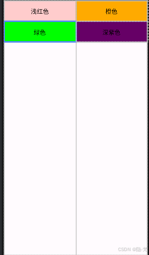
效果图如下:
四、帧布局(FrameLayout)
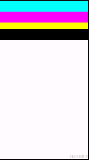
帧布局(FrameLayout)是 Android 中最简单的一个布局容器。在帧布局中,所有的子视图(View)都会固定在容器的左上角,而且后添加的子视图会覆盖在先添加的子视图之上。这意味着如果多个子视图重叠,它们的显示顺序将取决于它们在 XML 布局文件中的位置,后定义的视图会显示在先定义的视图之上。
直接放代码:
<?xml version="1.0" encoding="utf-8"?>
<FrameLayout xmlns:android="http://schemas.android.com/apk/res/android"
    android:layout_width="match_parent"
    android:background="@color/white"
    android:layout_height="match_parent">
    <TextView
        android:background="#000000"
        android:layout_width="fill_parent"
        android:layout_height="180dp"/>
    <TextView
        android:background="#ffff00"
        android:layout_width="fill_parent"
        android:layout_height="130dp"/>
    <TextView
        android:background="#ff00ff"
        android:layout_width="fill_parent"
        android:layout_height="100dp"/>
    <TextView
        android:background="#00ffff"
        android:layout_width="fill_parent"
        android:layout_height="50dp"/>
</FrameLayout>
效果图:
五、绝对布局(AbsoluteLayout)
属性:
绝对布局又可以叫做坐标布局,可以直接指定子元素的绝对位置
由于手机屏幕尺寸差别比较大使用绝对定位的适应性会比较差,在屏幕的适配上有缺陷
常用属性:
android:foreground:*设置改帧布局容器的前景图像
android:foregroundGravity:设置前景图像显示的位置
android:layout_x=”” 控制当前子类控件的x位置
android:layout_y=”” 控制当前子类控件的y位置
代码:
<?xml version="1.0" encoding="utf-8"?>
<AbsoluteLayout xmlns:android="http://schemas.android.com/apk/res/android"
   android:layout_width="match_parent"
   android:background="@color/gray"
   android:layout_height="match_parent">
   <Button
       android:id="@+id/button"
       android:layout_width="wrap_content"
       android:layout_height="wrap_content"
       android:layout_x="26dp"
       android:layout_y="124dp"
       android:text="Button1" />
   <Button
       android:id="@+id/button2"
       android:layout_width="wrap_content"
       android:layout_height="wrap_content"
       android:layout_x="66dp"
       android:layout_y="224dp"
       android:text="Button2" />

   <Button
       android:id="@+id/button3"
       android:layout_width="wrap_content"
       android:layout_height="wrap_content"
       android:layout_x="126dp"
       android:layout_y="323dp"
       android:text="Button3" />
</AbsoluteLayout>
效果图: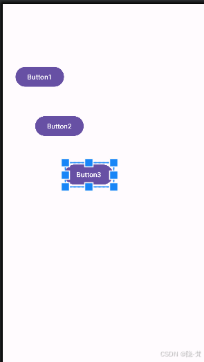
六、网格布局(GridLayout)
和之前的TableLayout(表格布局) 有点类似,不过网格布局的好处是:
1.可以自己设置布局中组件的排列方式
2.可以自定义网格布局有多少行,多少列
3.可以直接设置组件位于某行某列
4.可以设置组件横跨几行或者几列
基础属性:
<GridLayout android:layout_width=“fill_parent”:网格布局宽度为填满屏幕
<GridLayout android:layout_height=“wrap_content”:网格布局高度为包裹内容
<GridLayout android:columnCount=“4”:网格布局设置 4 列
<GridLayout android:rowCount=“6”:网格布局设置 6 行
<GridLayout android:layout_columnSpan=“2”:清空和回退横跨两列
<GridLayout android:orientation=“horizontal”:网格布局设置为水平布局
这里给出一个类似与计算器的页面
代码:
<GridLayout xmlns:android="http://schemas.android.com/apk/res/android"
    xmlns:tools="http://schemas.android.com/tools"
    android:id="@+id/GridLayout1"
    android:layout_width="wrap_content"
    android:layout_height="wrap_content"
    android:columnCount="4"
    android:orientation="horizontal"
    android:rowCount="6" >
    <TextView
        android:layout_columnSpan="4"
        android:layout_gravity="fill"
        android:layout_marginLeft="5dp"
        android:layout_marginRight="5dp"
        android:background="#15CBE3"
        android:text="0"
        android:textSize="50sp" />

    <Button
        android:layout_columnSpan="2"
        android:layout_gravity="fill"
        android:text="回退" />

    <Button
        android:layout_columnSpan="2"
        android:layout_gravity="fill"
        android:text="清空" />

    <Button android:text="1" />

    <Button android:text="2" />

    <Button android:text="3" />
    <Button android:text="+" />


    <Button android:text="4" />

    <Button android:text="5" />

    <Button android:text="6" />
    <Button android:text="-" />


    <Button android:text="7" />

    <Button android:text="8" />

    <Button android:text="9" />
    <Button android:text="*" />


    <Button android:text="0" />
    <Button android:text="." />

    <Button android:text="=" />
    <Button android:text="/" />
</GridLayout>
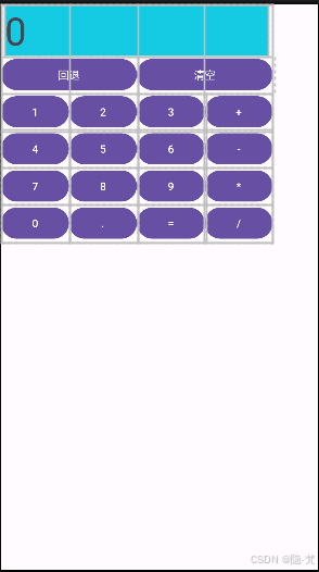
其实有那味了,我曾经做过一个完整的计算器:
跟这个布局也差不多,只不过需要更复杂的Java算法,由于项目的保密效果,这里不能放出代码,有想学的,可以联系我,我可以帮你点一下思路。
结尾
本次的内容还是不少的,需要读者去好好消化一下,尤其是相对布局和线性布局,需要多做一些连线进行熟练,愿大家都能坚持下去。