第七天到第八天,学习布局
2018年8月4日 学习时长:N个小时
前面花费的时间有一点点的长,编码
分别尝试使用Float、Position或者Flexbox来实现如下需求:
- 实现一个两栏布局,左侧占30%宽度,右侧占70%宽度
- 实现一个两栏布局,左侧固定宽度,右侧根据浏览器宽度进行自适应变化
- 实现一个两栏布局,右侧固定宽度,左侧根据浏览器宽度进行自适应变化
- 实现一个三栏布局,左侧固定宽度,右侧固定宽度,中间部分宽度随浏览器宽度变化而自适应变化
- 实现一个三栏布局,左侧固定宽度,中间固定宽度,右侧根据浏览器宽度变化而自适应变化
要求:
- 每一个需求都尽可能多地用多种方式来实现
这些还不是很难,看最后的的大boss:
参考如下设计稿实现HTML页面及CSS样式:链接: https://pan.baidu.com/s/1IndqG9nanVhKxwysibZZRg 密码: vfs6
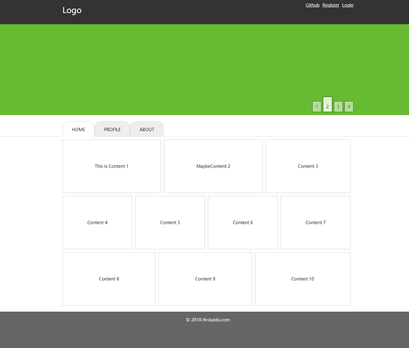
- 设计稿分为头部,中间的Banner,主导航,内容区域,底部
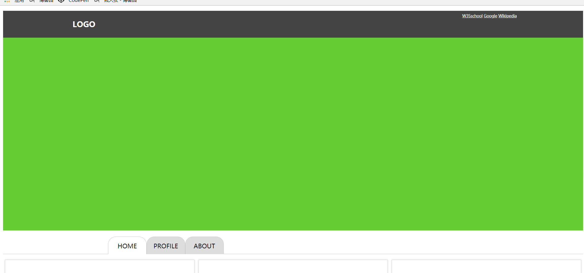
- 头部区域为100%宽的一个深色背景,头部中间有一块960px的定宽居中区域,里面包括了左边的Logo和右上角导航
- Banner为100%宽的区块,中间右下方有banner轮显的当前图片数字的示例,其中正在显示的图片对应的数字有特殊样式(注意不需要实现轮显banner的业务逻辑,只是按照设计稿做静态样式)
- 主导航区域,有一个100%宽的灰色线条,线条之上,在中间960px区域是导航菜单,当前正在浏览页对应的菜单有特殊样式
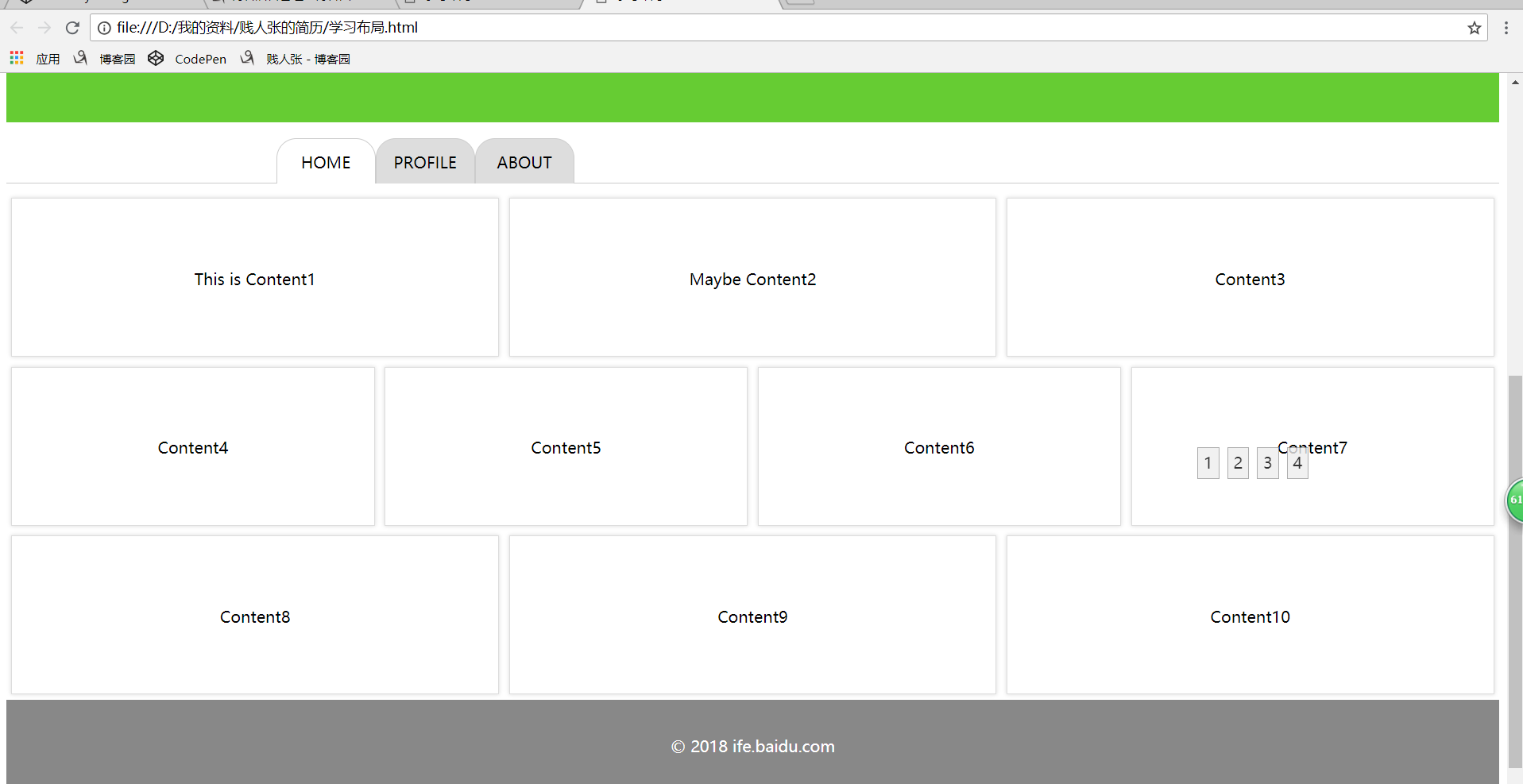
- 主要内容区域,宽度为960px,里面每个内容都有至少80px的padding,每一个内容的宽度均为自适应,可以使用flex布局
附源码:
<html>
<link rel="stylesheet" href="学习布局.css" type="text/css" />
<body>
<div class="头部">
<h1>LOGO</h1>
<div class="右上角导航">
<a href="http://www.w3school.com.cn">W3Sschool</a>
<a href="http://www.google.com">Google</a>
<a href="http://www.wikipedia.org">Wikipedia</a></div>
</div>
<div class="中间的Banner"></div>
<div class="右下角轮显">
<div class="轮显1">1</div>
<div class="轮显2">2</div>
<div class="轮显3">3</div>
<div class="轮显4">4</div>
</div>
<div class="主导航">
<div class="导航菜单">
<div class="nav-home">HOME</div>
<div class="nav-profile">PROFILE</div>
<div class="nav-about">ABOUT</div>
</div>
</div>
<div class="内容区域"></div>
<div class="文本框">
<div class="Content">This is Content1</div>
<div class="Content">Maybe Content2</div>
<div class="Content">Content3</div>
</div>
<div class="文本框">
<div class="Content">Content4</div>
<div class="Content">Content5</div>
<div class="Content">Content6</div>
<div class="Content">Content7</div>
</div>
<div class="文本框">
<div class="Content">Content8</div>
<div class="Content">Content9</div>
<div class="Content">Content10</div>
</div>
</div>
<div class="底部">
<p>© 2018 ife.baidu.com<p>
</div>
</body>
</html>
css:
.头部{
background:#444444;
height:70px;
text-indent:180px;
color:white;
}
.中间的Banner{
height:500px;
background:#66CC33;
}
h1{
font-size:20px;
line-height:70px;
}
.主导航{
width: 100%;
height: 60px;
border-bottom: 1px solid #CCC;
}.内容区域{
margin: 10px auto;
width: 960px;
}
.文本框{
display: flex;
}
.Content {
flex: 1 1 auto;
box-sizing: border-box;
margin: 5px;
min-width: 200px;
height: 160px;
line-height: 160px;
text-align: center;
border: 1px solid #DDD;
box-shadow: 0 0 5px #DDD;
}
.底部{
box-sizing: border-box;
padding-top: 20px;
width: 100%;
height: 120px;
color: #fff;
text-align: center;
background-color: #888888;
}
.右上角导航{
position:absolute;
right:180px;
top:20px;
font-size:10px;
}
.右上角导航 a{ color:white;font-size:10px;}
.右上角导航 a:hover{ color:red;}
.轮显1,.轮显2,.轮显3,.轮显4{
position: absolute;
bottom: -210px;
width: 20px;
height: 30px;
line-height: 30px;
text-align: center;
border: 1px solid #999999;
background-color: #EEEEEE;
opacity: 0.8;
}.轮显4{
right: 200px;
}
.轮显3{
right: 230px;
}
.轮显2{
right: 260px;
}
.轮显1{
right: 290px;
}
.导航菜单 {
margin: 0 auto;
width: 960px;
height: 60px;
}.nav-home,
.nav-profile,
.nav-about {
float: left;
box-sizing: border-box;
margin-top: 16px;
width: 100px;
height: 45px;
text-align: center;
line-height: 45px;
border: 1px solid #CCC;
border-bottom: none;
border-top-left-radius: 20px;
border-top-right-radius: 20px;
background-color: #fff;
}
.nav-profile,
.nav-about {
background-color: #DDD;
}