版权声明:ByRisonBoy https://blog.csdn.net/Rison_Li/article/details/83956680
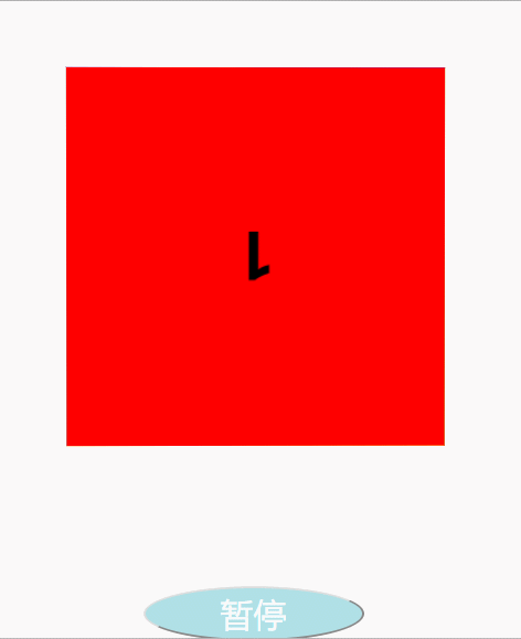
html5 旋转样例:
代码片段:
<!DOCTYPE html>
<html>
	<head>
		<meta charset="utf-8" />
		<title>3D旋转</title>
		<style>
			*{
				margin: 0px;
				padding: 0px;
			}
			#box{
				width: 300px;
				height: 300px;
				/*background-color: red*/
				margin: 100px auto;
				/*相对定位*/
				position: relative;
				transform-style: preserve-3d;
				animation: moveRect 2s linear infinite paused;
			}
			@keyframes moveRect{
				from{
					/*perspective表示透视点*/
					/*transform:perspective()*/
					transform: perspective(1200px) rotateX(0) rotateY(0);
				}
				to{
					transform: perspective(1200px) rotateX(360deg) rotateY(360deg);
				}
			}
				#box div{
					width: 300px;
				    height: 300px;
				    /*绝对定位*/
				   position: absolute;
				   font-size: 50px;
				   text-align: center;
				   line-height: 300px;
				   font-weight: bold;
				}
				#box div:nth-of-type(1){
					background-color: red;
					transform: translateZ(150px);
				}
				#box div:nth-of-type(2){
					background-color: orange;
					transform: translateZ(-150px);
				}
				#box div:nth-of-type(3){
					background-color: yellow;
					transform: rotateX(90deg) translateZ(150px);
				}
				#box div:nth-of-type(4){
					background-color: blue;
					transform: rotateX(-90deg) translateZ(150px);
				}
				#box div:nth-of-type(5){
					background-color: turquoise;
					transform: rotateY(90deg) translateZ(150px);
				}
				#box div:nth-of-type(6){
					background-color: lawngreen;
					transform: rotateY(-90deg) translateZ(150px);
				}
			    input{
			    	width: 200px;
			    	height: 50px;
			    	background-color:powderblue ;
			    	font-size: 30px;
			    	color: white;
			    	margin: 150px auto;
			    	display: block;
			    	border-radius: 50%;
			    	outline: none;
			    	align-content: center;
			    }
		</style>
	</head>
	<body>
		<div id="box">
			<div>1</div>
			<div>2</div>
			<div>3</div>
			<div>4</div>
			<div>5</div>
			<div>6</div>
		</div>
		<input type="button" value="开始"/>
	</body>
	<script>
		var btn = document.querySelector("input");
		var box = document.querySelector("#box");
		btn.onclick = function(){
			if(this.value == '开始'){
				this.value = '暂停';
				box.style.animationPlayState = 'running';
			}else{
				this.value = '开始';
				box.style.animationPlayState = 'paused';
			}
		}
	</script>
</html>
效果展示: