参考资料1:https://juejin.im/post/5b0784566fb9a07abd0e14ae
参考资料2:https://blog.csdn.net/u014607184/article/details/52661760
参考资料3:https://segmentfault.com/q/1010000010545728
1、原理:当用百分比定义高宽的时候以及padding的时候,padding和margin都是相对于父元素的宽度来计算的,我们可以利用这一属性来实现我们的需求,通过设置元素的width:50%; padding_bottom:50%; height:0;,高度与padding_bottom的比例值也可设置为其他,此时高度由padding-bottom撑开并保持,百分比宽度,百分比padding均使用父元素宽度计算,即可实现元素跟随父元素的宽度变化等比例自适应大小。由于高度为0,该元素的子元素overflow溢出到padding所在的区域。
以下为示例,重点设置width,height:0,padding_bottom,参考:http://jsfiddle.net/luin/25BbH/7/
<div class="item"></div>
<div class="item"></div>
<div class="item"></div>
<div class="item"></div>
<div class="item"></div>
<div class="item"></div>
<div class="item"></div>
<div class="item"></div>
<div class="item"></div>
<div class="item"></div>
.item {
float: left;
width: 21%;
margin: 10px 2%;
height: 0;
padding-bottom: 33.98%;
background-color: #dbe0e4;
}2、修改为可设置外部宽度,以及可设置内部子元素的高度,参考:https://juejin.im/post/5b0784566fb9a07abd0e14ae
其中设置宽度需要在外层再套一个父元素,将宽度的控制交给这个父元素来做,如果不需要控制宽度,则该div可以取消。
为元素的height为 0,导致该元素里面再有子元素的时候,就无法正常设置高度。所以我们需要用到position: absolute;此时设置子元素高度则利用子元素绝对定位absolute使得计算子元素的百分比高度是相对于元素的(padding区域+内容区域=整个元素的高度)。
<div class="box">
  <div class="scale">
    <div class="item">
      this is a demo;
    </div>
  </div>
  <div class="scale">
    <div class="item">
      this is a demo;
    </div>
  </div>
  <div class="scale">
    <div class="item">
      this is a demo;
    </div>
  </div>
  <div class="scale">
    <div class="item">
      this is a demo;
    </div>
  </div>
</div>
.box {
width: 90%;
background-color: blue;
}
.scale {
float:left;
width: 45%;
margin: 10px 2%;
padding-bottom: 56.25%;
height: 100px;
position: relative;
background-color: red;
}
.item {
width: 100%;
height: 100%;
background-color: aquamarine;
position: absolute;
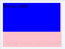
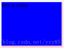
}关于设置position: absolute; 后,再设置height,高度可以设置,如果没有设置absolute,高度依然为0;
原因:
The percentage is calculated with respect to the height of the generated box's containing block.

未设置position: absolute; 的元素的百分比高度的计算是相对于已将产生的盒子的内容块的高度,本文即是父元素,父元素高度为0,则该元素高度也为0,但是里面有内容,内容有多少就撑开多高,不会占据100%高度;
Note: For absolutely positioned elements whose containing block is based on a block-level element, the percentage is calculated with respect to the height of the padding box of that element.
设置 position: absolute; 的元素的百分比高度的计算是相对于父元素的padding区域+内容区域,所以设置height:100%后,该元素的高度撑满了整个父元素,同时也可以设置其它百分比高度,同时可以有效撑开元素。
<body>
    <div class="parent">
        <div class="child"> this is child</div>
    </div>
</body>
body {
width: 200px;
height:200px;
}
.parent {
width:100%;
height: 100px;
padding-bottom:50px;
background-color: pink;
position: relative;
}
.child {
width:98%;
height:98%;
background-color: black;
position: absolute;
}不设置absolute结果:仅计算内容区域高度100px; 设置absolute结果,计算内容区域100px+padding区域50px=150px
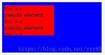
3、如果自适应块内只有单个元素,也可以使用伪类实现,即父元素的伪类定义width和padding_bottom,实现以父元素的宽度为基准计算伪类定义的百分比,然后将父元素空间撑开高度的功能,则同级别子元素共享该高度即可设置自己的高度;
<div class="parent">
  <div class="child">
    this is a pseudo_element</br>
    this is a pseudo_element</br>
    this is a pseudo_element
  </div>
</div>
.parent {
position: relative;
width: 50%;
background-color: blue;
}
.child {
position: absolute;
width:50%;
height:60%;
margin: 10px 2%;
overflow:hidden;
background-color: red;
}
.parent:after{
content: '';
display: inline-block;
width: 1px;
padding-top: 50%;
background-color: black;
}结果如下,改变浏览器大小时,蓝色框和红色框都会同步等比例适应大小: