在机器学习的过程中,需要对数据进行可视化分析,其中matplotlib是一个广泛被应用的库,我主要用其中的pyplot模块,因此在这里总结一下。(以后再随时添加)
一. matplotlib的图像组成
通常情况下,我们可以将一副Matplotlib图像分成三层结构:
- 第一层是底层的容器层,主要包括Canvas(画板)、Figure(画布、图片)、Axes(图表); 一个axes代表一个图表,包含一个plot,一个figure代表一张画布绘制一张图片,一张图片或一张画布可以有多个图表;canvas画板,摆放画布的工具。关系:画板—>画布或图片–>线条、饼图等图片;
- 第二层是辅助显示层,主要包括外观(facecolor)、边框线(spines)、坐标轴(axis)、坐标轴名称(axis label)、坐标轴刻度(tick)、坐标轴刻度标签(tick label)、网格线(grid)、图例(legend)、标题(title)等内容,该层可通过set_axis_off()或set_frame_on(False)等方法设置不显示;
- 第三层为图像层,即通过plot折线图、scatter散点图、hist柱状图、contour轮廓图、bar柱状图、pie饼图等函数绘制图像。
具体可以参考下面的图

二. pyplot的使用
1 导入库
import matplotlib.pyplot as plt
import numpy as np
#使用jupyter notebook的时候加下面这一句
%matplotlib inline
2 简单图像绘制
x = np.arange(10)
y = x * x
#折线图
plt.plot(x, y)

1.可以使用格式化字符改变图形样式,fmt = “[color][marker][line]”,
如plt.plot(x, y, ‘y±-’)
2.也可以通过添加参数改变图行样式
| 参数 | 作用 |
|---|---|
| linewidth | 线宽 |
| linestyle | 线的样式 |

详细可看: https://matplotlib.org/api/_as_gen/matplotlib.pyplot.plot.html?highlight=plot#matplotlib.pyplot.plot
#散点图
plt.scatter(x, y)
可以添加的参数有:
| 参数 | 作用 |
|---|---|
| s | 标记的大小 |
| c | 图形颜色 |
| marker | 标记形式 |

#条形图
plt.bar(x, y)
具体参数可查: https://matplotlib.org/api/_as_gen/matplotlib.pyplot.bar.html?highlight=bar#matplotlib.pyplot.bar

#扇形图
x1 = np.array([0.1, 0.6, 0.4])
plt.pie(x1)

主要的参数只要一个就行了, 其他常用的参数有:
| 参数 | 作用 |
|---|---|
| labels | 类别标签,字符串 |
| autopac | 显示所占比例, 如"%.0f%%" |
具体参数:https://matplotlib.org/api/_as_gen/matplotlib.pyplot.pie.html?highlight=pie#matplotlib.pyplot.pie
#频率直方图
x1 = np.array([1,1,1,3,3,3,3,2,5,5,5,5,5,5])
plt.hist(x1)
参数有:
bins: 直方图的柱数,可选项,默认为10
normed: 是否将得到的直方图向量归一化。默认为False
facecolor: 直方图颜色
histtype: 直方图类型,‘bar’, ‘barstacked’, ‘step’, ‘stepfilled’
如何想在柱子上面显示数字,可以参考 http://baijiahao.baidu.com/s?id=1591715401379954937&wfr=spider&for=pc

只要一个基本的参数,统计出现的频率.具体可查看:https://matplotlib.org/api/_as_gen/matplotlib.pyplot.hist.html?highlight=hist#matplotlib.pyplot.hist
3 坐标,标签,标题等的添加
plt.plot(x, y, label = "x^2")
plt.plot(x, y - 20, label = "y - 1")

plt.title("title1")
plt.xlabel("xx")
#横坐标范围
plt.xlim(0, 11)
#图例
plt.legend()
#坐标范围[xmin, xmax, ymin, ymax]
# plt.axis([-1,2,1,3])
#文本注释 annotate(s, xy, *args, **kwargs)
plt.annotate('(6, 36)', xy = (6, 36))
#显示表格
plt.grid(True)
#添加文本
plt.text(2, 40, "(2, 40)")
#坐标轴
plt.xticks()

三. 常用函数集合
#使x和y轴显示的刻度一样长
plt.axis('equal')
#基于seed产生随机数
rdm = np.random.RandomState(seed)
train_x = rdm.randn(300, 2)
#print(train_x, "\n");
train_y = [int(x0*x0 + x1*x1 < 1) for (x0, x1) in train_x]
train_y_color = [['red' if y else 'blue'] for y in train_y]

train_x = train_x.reshape((-1, 2))
train_y = np.array(train_y).reshape((-1, 1))
#print(train_y)

plt.scatter(train_x[:,0], train_x[:,1], c = np.squeeze(train_y_color))

# xx在-3到3之间以步长为0.01,yy在-3到3之间以步长0.01,生成二维网格坐标点
xx, yy = np.mgrid[-3:3:.1, -3:3:.1]
# 将xx , yy拉直,并合并成一个2列的矩阵,得到一个网格坐标点的集合
grid = np.c_[xx.ravel(), yy.ravel()]
print(grid.shape)
# 将网格坐标点喂入神经网络 ,probs为输出
probs = sess.run(y2, feed_dict={x: grid})
# probs的shape调整成xx的样子
probs = probs.reshape(xx.shape)
plt.scatter(train_x[:,0], train_x[:,1], c = np.squeeze(train_y_color))
#画出等高线图
plt.contour(xx, yy, probs, levels = [0.5])

四. 样式集合
1.标记点样式
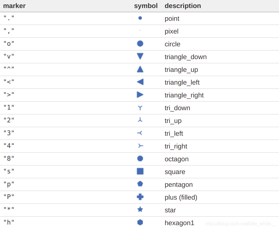
完整可查: https://matplotlib.org/api/markers_api.html#module-matplotlib.markers
2.线的格式linestyle

3.颜色集合

https://matplotlib.org/api/colors_api.html#module-matplotlib.colors