1. 思路
怎么用CSS3画一个带阴影的三角形呢 ? 有童鞋说, 这还不简单吗 网上有很多解决方案, 但其实大多都是实现不太完美的, 存在一些问题
假设我们做一个向下的三角形箭头 常见的方法大致有两种
- 通过边框控制, border-left和border-right设为透明, border-top设为预定的颜色即可
- 通过 transform 旋转盒子
方法一可以画三角形, 但是画阴影是很难做到的(如果做到的朋友, 欢迎给我留言)
2. 设计
2.1 边框法
html结构
|
1
2
3
|
<
body
>
<
div
class
=
"box"
></
div
>
</
body
>
|
|
1
2
3
4
5
6
7
8
9
10
11
12
13
14
15
16
|
.box {
position
:
relative
;
width
:
200px
;
height
:
100px
;
background
:
#ff8605
;
box-shadow:
2px
2px
2px
rgba(
0
,
0
,
0
, .
2
);
}
.box::after {
content
:
''
;
position
:
absolute
;
bottom
:
-9px
;
left
:
45px
;
border-left
:
10px
solid
transparent
;
border-right
:
10px
solid
transparent
;
border-top
:
10px
solid
#ff8605
;
}
|
缺点很明显, 我们不能通过box-shadow的方式来设置阴影, 阴影会是一个盒子
但如果不用设阴影, 只是需要边框的话, 我们可以再定义一个伪类元素, 覆盖到三角形的下面即可
|
1
2
3
4
5
6
7
8
9
|
.box::before {
position
:
absolute
;
bottom
:
-10px
;
left
:
45px
;
content
:
''
;
border-left
:
10px
solid
transparent
;
border-right
:
10px
solid
transparent
;
border-top
:
10px
solid
rgba(
0
,
0
,
0
, .
1
);
}
|
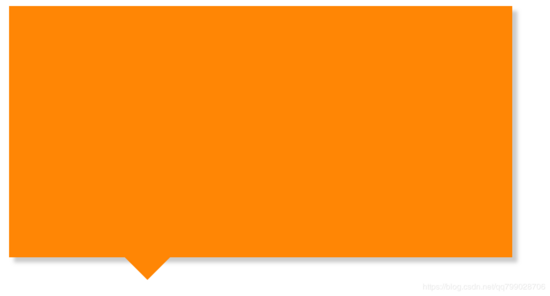
如图所示
如果要求不严格似乎也够用了. 但作为一个严峻的前端工程师! 我们还是不能容忍这种实现方法, 下面我们看一看 tranform 方法是如何解决的
2.2 transform方法
这种方法的思路就是使用transform旋转盒子, 一半被上面的容器遮挡, 一半显示出来
|
1
2
3
4
5
6
7
8
9
10
11
|
.box::before {
position
:
absolute
;
bottom
:
-5px
;
left
:
45px
;
content
:
''
;
width
:
10px
;
height
:
10px
;
background
:
#ff8605
;
transform: rotate(
135
deg);
box-shadow:
1px
-2px
2px
rgba(
0
,
0
,
0
, .
2
);
}
|
我们似乎实现了我们想要的结果, 但是, 其实是存在一个问题的, 但因为我们的阴影面积不够大, 所以图片上看起来不明显
当我们把 box-shadow 的阴影面积扩大时, 我们发现到问题的所在了
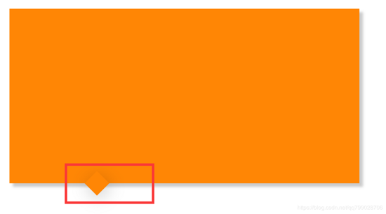
盒子突出来了, 那怎么解决呢
我们再定义一个与容器颜色相同的盒子, 将上半部分盖住就可以啦.
|
1
2
3
4
5
6
7
8
9
10
11
12
13
14
15
16
17
18
19
20
21
|
/* transform方法 */
.box::before {
position
:
absolute
;
bottom
:
-5px
;
left
:
45px
;
content
:
''
;
width
:
10px
;
height
:
10px
;
background
:
#ff8605
;
transform: rotate(
135
deg);
box-shadow:
1px
-2px
5px
rgba(
0
,
0
,
0
, .
2
);
}
.box::after {
position
:
absolute
;
bottom
:
0px
;
left
:
40px
;
content
:
''
;
width
:
20px
;
height
:
20px
;
background
:
#ff8605
;
}
|
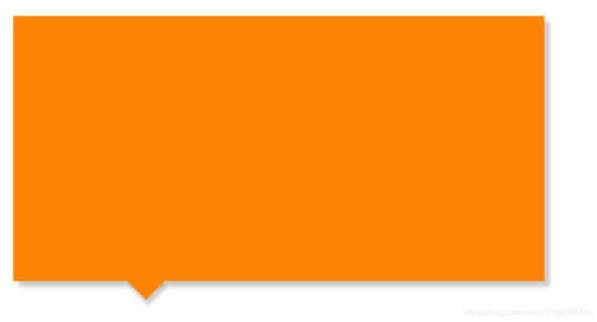
要注意三角形应该用 before 定义, 覆盖的盒子应该用 after 定义, 这样盒子才能覆盖到三角形上面
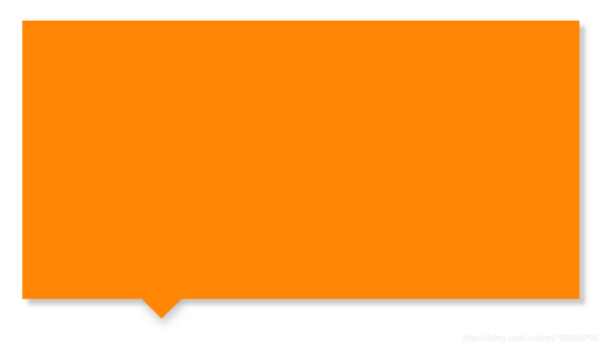
实现效果:
3. 最终解决方案代码
|
1
2
3
4
5
6
7
8
9
10
11
12
13
14
15
16
17
18
19
20
21
22
23
24
25
26
27
28
29
30
31
32
33
34
35
36
37
38
39
40
|
<!DOCTYPE html>
<
html
>
<
head
>
<
meta
charset
=
"utf-8"
/>
<
meta
name
=
"viewport"
content
=
"width=device-width"
/>
<
title
>CSS实现带阴影效果的三角形</
title
>
<
style
>
.box {
position: relative;
width: 200px;
height: 100px;
background: #ff8605;
box-shadow: 2px 2px 2px rgba(0, 0, 0, .2);
}
.box::before {
position: absolute;
bottom: -5px;
left: 45px;
content: '';
width: 10px;
height: 10px;
background: #ff8605;
transform: rotate(135deg);
box-shadow: 1px -2px 5px rgba(0, 0, 0, .2);
}
.box::after {
position: absolute;
bottom: 0px;
left: 40px;
content: '';
width: 20px;
height: 20px;
background: #ff8605;
}
</
style
>
</
head
>
<
body
>
<
div
class
=
"box"
></
div
>
</
body
>
</
html
>
|