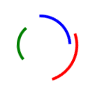
<!DOCTYPE html>
<html>
<head>
<meta charset="UTF-8" />
<title>css</title>
</head>
<body>

<div id="example"></div>
<div style="position:relative;width:100px;height:100px">
<div class="rotateline1"></div>
<div class="rotateline2"></div>
<div class="rotateline3"></div>
</div>


</body>
</html>

<style>
.rotateline1{
    position:absolute;
    left:0;
    top:0;
    width: 100%;
    height: 100%;
    border-radius:50%;
    border:4px solid transparent;
    border-left: 4px solid red;
    animation:spin .7s ease  infinite;
}
.rotateline2{
    position:absolute;
    left:10%;
    top:10%;
    width: 80%;
    height: 80%;
    border-radius:50%;
    border:4px solid transparent;
    border-left: 4px solid blue;
    animation:spin 1s ease  infinite;
}
.rotateline3{
    position:absolute;
    left:20%;
    top:20%;
    width: 60%;
    height: 60%;
    border-radius:50%;
    border:4px solid transparent;
    border-left: 4px solid green;
    animation:spin 1.2s ease  infinite;
}
@keyframes spin{
    0%{
        transform:rotate(0deg)
    }
    100%{
        transform:rotate(360deg)
    }
}
</style>