版权声明:署名,允许他人基于本文进行创作,且必须基于与原先许可协议相同的许可协议分发本文 (Creative Commons)
讲解PopupMenuButton 菜单组件时,我们应该了解以下类:
- PopupMenuItem,单个值的弹出菜单项。
- PopupMenuDivider,一个弹出式菜单项,只是一条水平线。
- CheckedPopupMenuItem,带有复选标记的弹出菜单项。
- showMenu,一种在给定位置动态显示弹出菜单的方法。
参数详解
| 属性 | 说明 |
| showMenu | |
| context | 上下文 |
| position | 位置 |
| items | List<PopupMenuEntry<T>> PopupMenuItem子项集合 |
| initialValue | 初始值 |
| elevation | 阴影高度 |
| semanticLabel | 标签 |
| PopupMenuItem | |
| value |
值 |
| child |
子组件 |
| enabled |
默认true |
| height |
高 |
| PopupMenuDivider | |
| height |
分隔条的高度。默认16像素 |
| CheckedPopupMenuItem | |
| value |
值 |
| child |
子组件 |
| enabled |
默认true |
| checked |
是否显示 标记,默认false |
| PopupMenuButton | |
| itemBuilder | |
| initialValue | 初始值 |
| onSelected | 点击子项监听 |
| onCanceled | 没有点击子项 关闭监听 |
| tooltip | 长按显示文本 |
| elevation | 背景高,默认8.0 |
| padding | 内边距 默认8.0 |
| child | 子组件 |
| icon | 图标 |
| offset | 偏移量 |
| enabled | 默认true |
代码示例
使用showMenu 显示菜单,代码如下:
showMenu(
context: context,
items: <PopupMenuEntry>[
//items 子项
PopupMenuItem(
value: '1',
child: Text('Item 1'),
),
PopupMenuItem(
value: '2',
child: Text('Item 2'),
),
// 分割线
PopupMenuDivider(),
// 带有复选标记的子项
CheckedPopupMenuItem(
value: '2',
child: Text('Item 2'),
checked:true,
),
],
position: RelativeRect.fill,
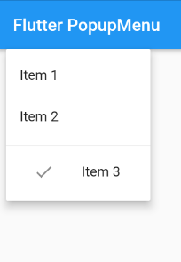
);使用PopupMenuButton显示菜单,代码如下:
PopupMenuButton(
  onCanceled: (){
    print('object');
  },
  onSelected: (v){
    print('object   $v');
  },
  itemBuilder: (BuildContext context) {
    List<PopupMenuEntry> list = List<PopupMenuEntry>();
    list.add(PopupMenuItem(
          value: '1',
          child: Text('Item 1'),
        ),);

    list.add(PopupMenuItem(
          value: '2',
          child: Text('Item 2'),
        ),);
    list.add(PopupMenuDivider(),);
    list.add(CheckedPopupMenuItem(
          value: '3',
          child: Text('Item 3'),
          checked:true,
        ),);
    return list;
  },
),
效果图