只学了初级的几种布局方式,在这里整理一下
一、一列布局
<!DOCTYPE html>
<html>
<head>
    <title>一列布局</title>
    <style type="text/css">
        body {
            margin: 0;
            padding: 0;
            font-size: 30px;
        }

        div {
            text-align: center;
            font-weight: bold;
        }

        .main,
        .footer {
            width: 960px;
            margin: 0 auto;
        }

        .head {
            width: 100%;
            height: 100px;
            background: #ccc;
        }

        .main {
            height: 600px;
            background: #FCC;
            margin: 0 auto;
        }

        .footer {
            height: 50px;
            background: #9CF ;margin: 0 auto;
        }
    </style>
</head>

<body>
    <div class="head">head</div>
    <div class="main">main</div>
    <div class="footer">footer</div>
</body>

</html>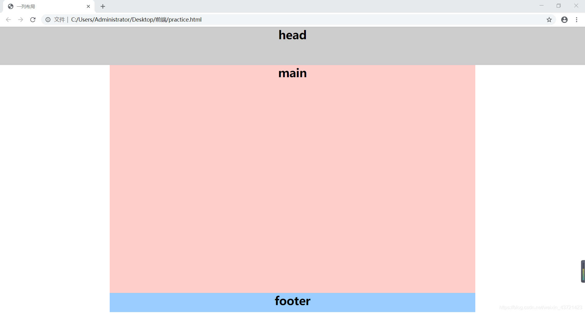
二、 二列布局
<!DOCTYPE html>
<html>
<head>
    <title>二列布局</title>
    <style type="text/css">
        body {
            margin: 0;
            padding: 0;
            font-size: 30px;
            font-weight: bold;
        }

        div {
            text-align: center;
            line-height: 50px;
        }

        .main {
            height: 600px;
            margin: 0 auto;
        }

        .left {
            width: 300px;
            height: 600px;
            background: #ccc;
            float: left;/*左浮动样式*/
        }
        .right {
            width: 600px;
            height: 600px;
            background: #FCC;
            float: right;/*右浮动样式*/
        }
    </style>
</head>

<body>
    <div class="main">
        <div class="left">left</div>
        <div class="right">right</div>
    </div>
</body>

</html>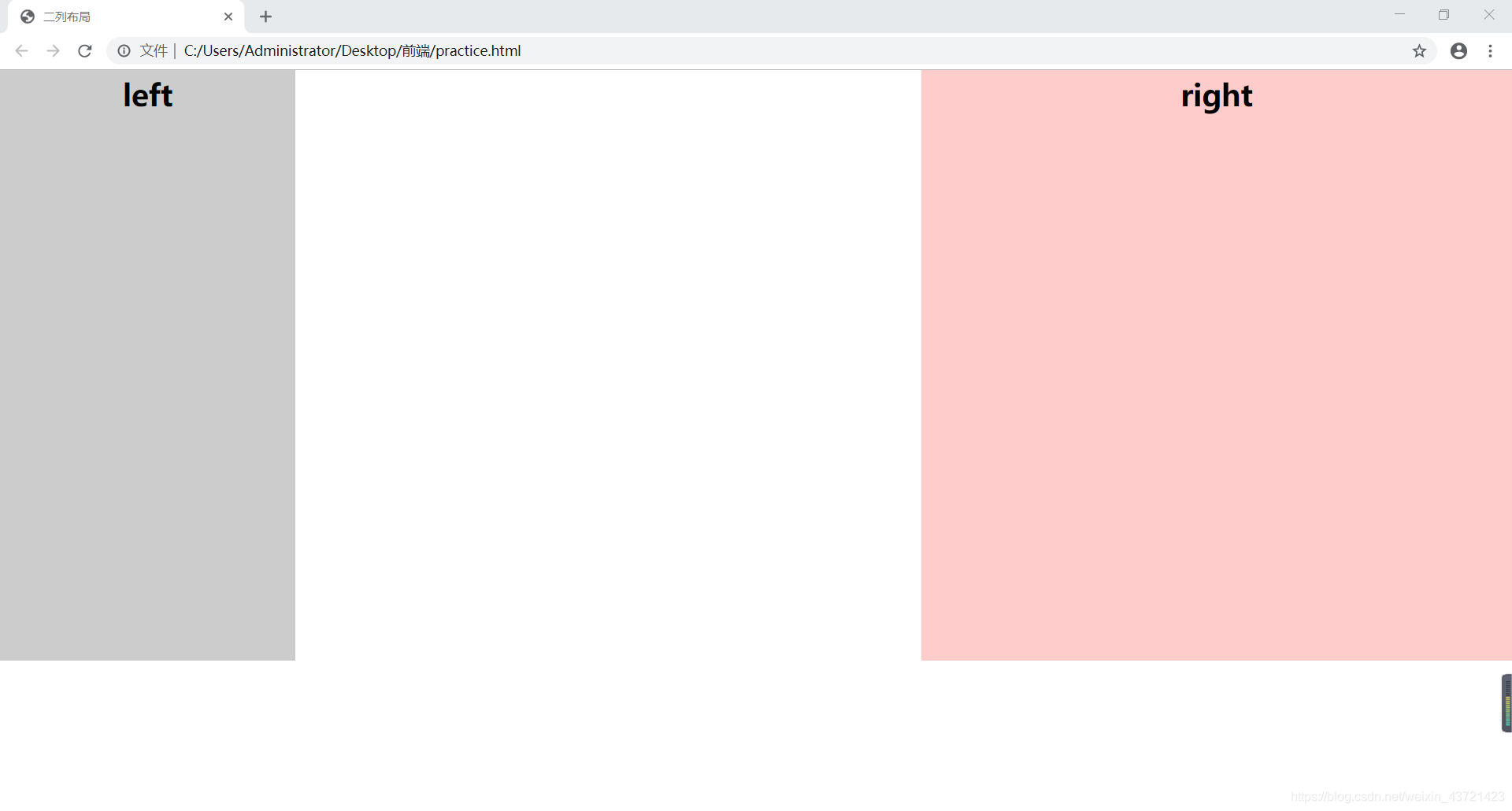
三、三列布局
<!DOCTYPE html>
<html>

<head>
    <title>三列布局</title>
    <style type="text/css">
        body {
            margin: 0;
            padding: 0;
            font-size: 30px;
            font-weight: bold;
        }

        div {
            line-height: 50px;
        }

        .left {
            width: 200px;
            height: 600px;
            background: #ccc;
            position: absolute;
            top: 0;
            left: 0;
        }

        .main {
            height: 600px;
            margin: 0 310px 0 210px;
            background: #9CF;
        }

        .right {
            height: 600px;
            width: 300px;
            position: absolute;
            top: 0;
            right: 0;
            background: #FCC;
        }
    </style>
</head>

<body>
    <div class="left">left</div>
    <div class="main">设计首页的第一步是设计版面布局。就象传统的报刊杂志编辑一样,我们将网页看作一张报纸,一本杂志来进行排版布局。
        虽然动态网页技术的发展使得我们开始趋向于学习场景编剧,但是固定的网页版面设计基础依然是必须学习和掌握的。它们的基本原理是共通的,你可以领会要点,举一反三。</div>
    <div class="right">right</div>
</body>

</html>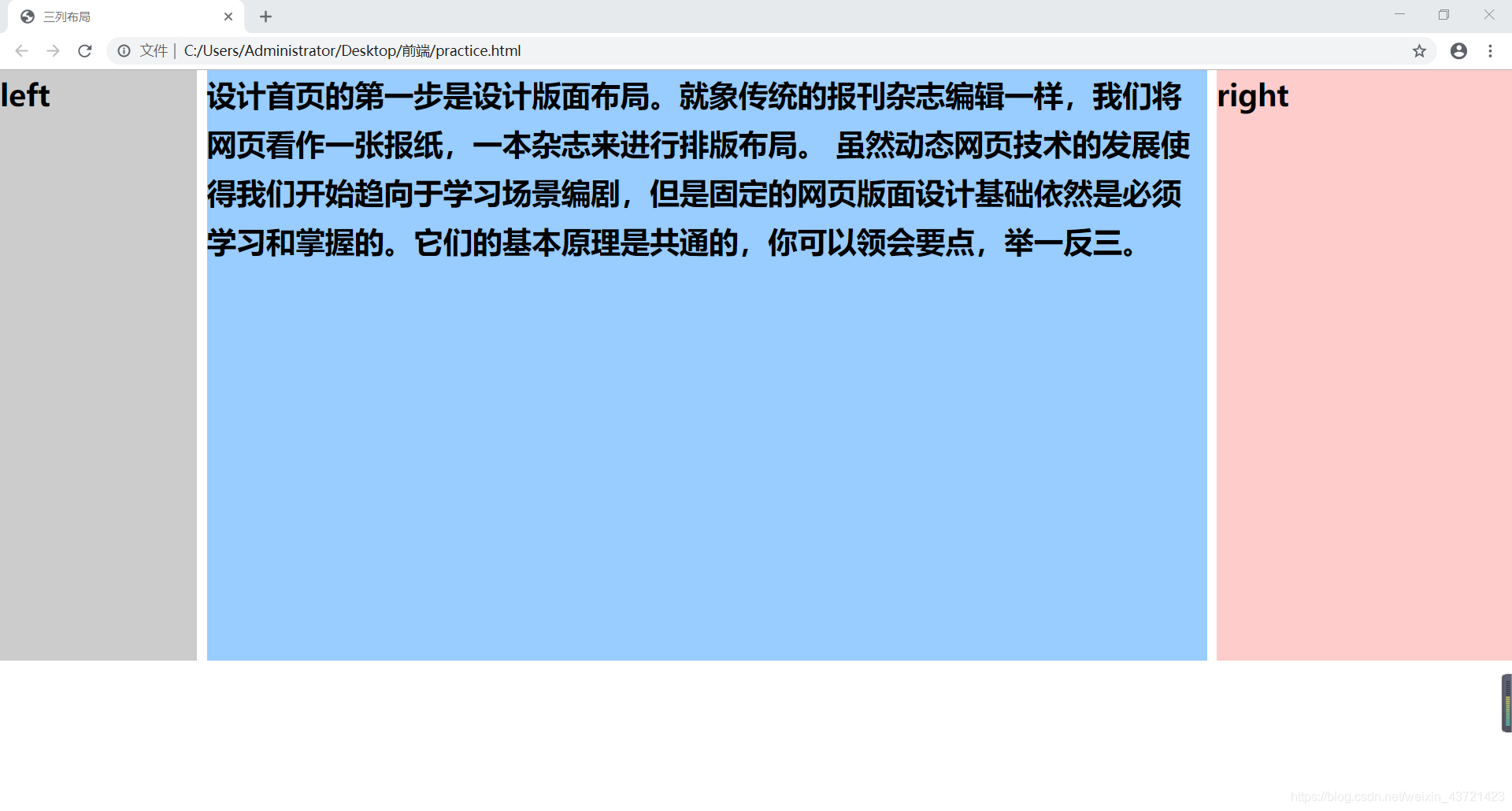
四、混合布局
<!DOCTYPE html>
<html>

<head>
    <title>混合布局</title>
    <style type="text/css">
        body {
            margin: 0;
            padding: 0;
            font-size: 30px;
            color: #fff;
        }

        .top {
            height: 200px;
            margin: 0 auto;
            background: gray;
        }

        .main {
            height: 600px;
        }

        .left {
            width: 29%;
            height: 600px;
            float: left;
            background: blue;
        }

        .right {
            width: 69%;
            height: 600px;
            float: right;
            background: #9C9;
        }

        .foot {
            height: 200px;
            margin: 0 auto;
            background: orange;
        }
    </style>

</head>

<body>
    <div class="top">top</div>
    <div class="main">
        <div class="right">right</div>
        <div class="left">left</div>
    </div>
    <div class="foot">foot</div>

</body>

</html>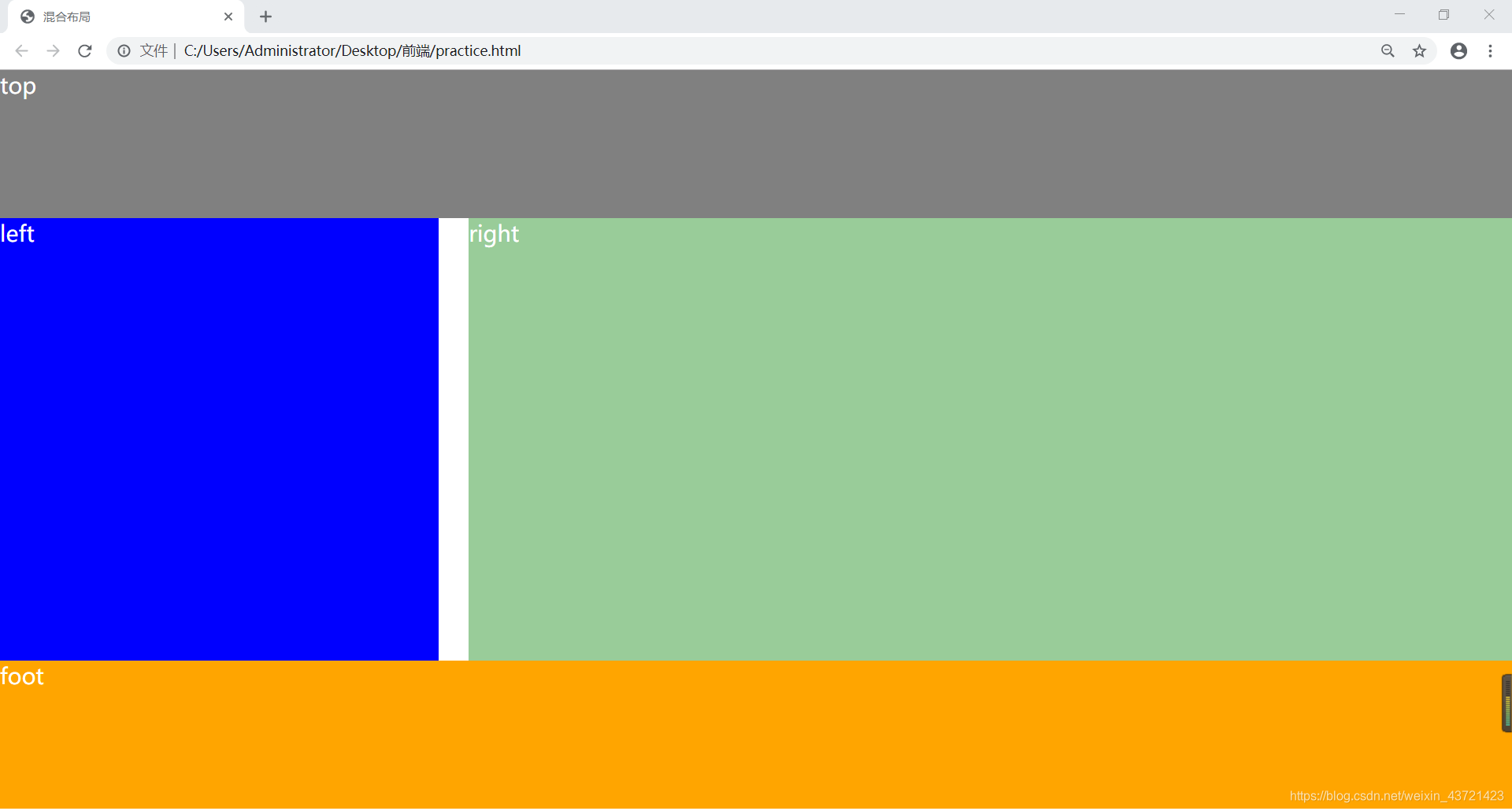
好了,我觉得更高层次的布局也应该是以这些为基础进行操作,所以先整理这些吧。
