box-shadow盒子阴影
语法:
外阴影:box-shadow: X轴 Y轴 Rpx color;
属性说明(顺序依次对应): 阴影的X轴(可以使用负值) 阴影的Y轴(可以使用负值) 阴影模糊值(大小) 阴影的颜色
内阴影:box-shadow: X轴 Y轴 Rpx color inset;
默认是外阴影 内阴影:inset 可以设置成内部阴影
注(PS):此属性使用于盒模型 如(div,p,h1,h2,h3,h4,h5,h6等) 不是用来设置文字阴影 如果设置文字阴影请参考知识点:text-shadow(同理)
因为是新属性,为了兼容各主流浏览器并支持这些主浏览器的较低版本,基于主流浏览器上使用box-shadow属性时,我们需要将属性的名称写成-webkit-box-shadow的形式。Firefox浏览器则需要写成-moz-box-shadow的形式
欧朋浏览器 -o-box-shadow IE>9 -ms-box-shadow
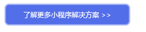
以下是一个例子:
html+css:
<div class="routineLearn"><a href="javascript:;">了解更多小程序解决方案 >></a></div>.routineLearn a {
display: inline-block;
font-size: 22px;
color: #ffffff;
background: #405DE6;
border-radius: 10px;
padding: 16px 56px;
text-align: center;
}
.routineLearn a:hover {
opacity: .9;
box-shadow: 0 0px 3px 4px rgba(64,93,230,0.6);
-webkit-box-shadow: 0 0px 3px 4px rgba(64,93,230,0.6); //Google Chrome
-moz-box-shadow: 0 0px 3px 4px rgba(64,93,230,0.6); //Firefix
-o-box-shadow: 0 0px 3px 4px rgba(64,93,230,0.6); //opera
-ms-box-shadow: 0 0px 3px 4px rgba(64,93,230,0.6); //IE
-webkit-transition: all .25s linear;
-moz-transition: all .25s linear;
-ms-transition: all .25s linear;
-o-transition: all .25s linear;
transition: all .25s linear;
}效果:

鼠标hover之后的效果:四周均有阴影