Translation | "JavaScript Everywhere" Chapter 13 Setting Application Style
Write at the top
Hello everyone, I am Mao Xiaoyou, a front-end development engineer. An English technical book is being translated.
In order to improve everyone's reading experience, the structure and content of sentences are slightly adjusted. If you find any flaws in this article, or if you have any comments or suggestions, you can leave a message in the comment area, or add my WeChat: code_maomao, welcome to communicate and learn from each other.
(σ゚∀゚)σ…:*☆Oh, good
Chapter 13 Setting Application Style
Elvis Costello ( Elvis Costello) laughed at this sentence 1978in his single "Lip Service" ( Lip Service): "Don't be taller than me, but look at your shoes." This kind of kiss "It means that by kissing someone's shoes, the narrator can detect that he wants to achieve a higher social status, no matter how sophisticated their suits and how elegant their clothes are.
For better or worse, certain customs are an important part of human culture, and we are all accustomed to accepting these types of social methods. Archaeologists even discovered that Paleolithic humans used bones, teeth, berries and stones to make necklaces and bracelets. Our clothes not only serve the functional purpose of protecting the human body from various elements, but also convey information about our culture, social status, interests, etc. to others.
Without Webthe default style, the Webapplication can still work normally, but through the application CSS, we can communicate with users more clearly. In this chapter, we will explore how to use the CSS-in-JSstyle component library to introduce layouts and styles into our application. This will enable us to make more practical and beautiful applications in a maintainable, component-based code structure.
Create layout components
Many pages of the application (in our case all) will share a common layout. For example, all pages of our application will have a title, sidebar, and content area (picture 13-1).
Instead of importing shared layout elements in each page component, we can create components dedicated to our layout and wrap each page component in it.

Figure 13-1. Wireframe of page layout
In order to create our component, we will src/components/Layout.jsstart by creating a new file . In this file, we will import the shared components and lay out the content. Our Reactcomponent function will receive an childrenattribute, which will tell us where to place the content of the child element in the layout.
Let's src/components/Layout.jscreate our component in:
import React from 'react';

import Header from './Header';
import Navigation from './Navigation';

const Layout = ({

     children }) => {


  return (
   <React.Fragment> <Header /> <div className="wrapper"> <Navigation /> <main>{

    children}</main> </div> </React.Fragment> );
};

export default Layout;
Now in the src/pages/index.jsfile, we can wrap the page components in the newly created Layoutcomponents to apply the shared layout to each page:
 // import React and routing dependencies
import React from 'react';
import {

     BrowserRouter as Router, Route } from 'react-router-dom';

// import shared layout component
import Layout from '../components/Layout';

// import routes
import Home from './home';
import MyNotes from './mynotes';
import Favorites from './favorites';

// define routes
const Pages = () => {


  return (
   <Router>
    {

    /* Wrap our routes within the Layout component */}
    <Layout>
     <Route exact path="/" component={

    Home} />
     <Route path="/mynotes" component={

    MyNotes} />
     <Route path="/favorites" component={

    Favorites} />
    </Layout>
   </Router>
  );
};

export default Pages;
The last step is to delete all instances in or within the page component. For example, our src/pages/Home.jsfile will now have the following simplified code:
import React from 'react';

const Home = () => {


  return (
   <div> <p>This is the home page</p> </div>
  );
};

export default Home;
After doing this, you can view your application in the browser. When switching between routes, we will see our title and navigation links on each page. Currently, they have not been styled, and our page has no visual layout. Let's explore adding styles in the next part.
CSS
Cascading style sheets are precisely named: they are a set of rules that allow us to write Webstyles. The style is "cascading", which means that the last or most clearly defined style will be presented. E.g:
p {


  color: green
}

p {


  color: red
}
This CSSwill render all paragraphs red so that the color: green rule is overwritten. This is a very simple idea, but in order to avoid mistakes, it has produced many patterns and techniques.
BEM(Block element modifiers), OOCSS(object-oriented CSS), and Atomic CSSother CSSstructural techniques use descriptive class naming to help scope style. Preprocessors such as SASS(a style sheet with great syntax) and Less(a more condensed style sheet) provide tools to simplify CSSsyntax and enable modular files. Although they have their own advantages and disadvantages, they provide compelling use cases CSS-in-JavaScriptfor development Reactor other- JavaScriptdriven applications.
What about CSS frameworks?
CSSAnd UIframeworks are popular choices for developing applications, and for good reason, they provide a solid foundation of styles and reduce the amount of code developers need to write by providing styles and features for common application patterns. The trade-off is that applications using these frameworks may become visually similar and may increase the size of the file package. However, this trade-off may be worthwhile for you. My personal favorite use Reactof some of the UIframework is the Ant Design, Bootstrap, Grommet, andRebass
CSS-in-JS
When I first encountered CSS-in-JSit, my initial reaction was surprised. I Webpassed the Webearly stages of my development career in the standard age . I continue to advocate Webthe accessibility and reasonable gradual enhancement of development. For more than ten years, "separation of concerns" has been the core of my network practice. Therefore, if you are like me, just reading " CSS-in-JS" will disgust you, then you are not alone. However, once I made a proper (and unjudgmental) attempt, I was quickly conquered. CSS-in-JSThis allows us to easily think of our user interface as a series of components, which is what I have been trying CSSto accomplish by combining modular technology and preprocessors for many years .
In this book, we will use Styled Componentsas our CSS-in-JSlibrary. It is fast, flexible, is developing rapidly, and is the most popular CSS-in-JSlibrary. Airbnb, Reddit, Patreon, Lego, BBC News, AtlassianAnd other companies also use it.
The styled component library works by allowing us to use JavaScripttemplate string syntax to define the style of the element. We create a JavaScriptvariable that will reference the HTMLelement and its associated style. Since it sounds abstract, let's look at a simple example:
import React from 'react';
import styled from 'styled-components'

const AlertParagraph = styled.p`
  color: green;
`;

const ErrorParagraph = styled.p`
  color: red;
`;

const Example = () => {


  return (
   <div>
    <AlertParagraph>This is green.</AlertParagraph>
    <ErrorParagraph>This is red.</ErrorParagraph>
   </div>
  );
};

export default Example;
As you can see, we can easily determine the range of styles. In addition, we limit the style to that specific component. This helps us avoid class name conflicts between different parts of the application.
Create a button component
Now that we have a basic understanding of styled components, let's integrate them into our application. First, we will write some styles for the element, which will allow us to reuse the component throughout the application. In the previous example, we integrated the style with the React/JSXcode, but we can also write independent style components. First, src/components/Button.jscreate a new file at from styled-componentsimport style library, and then export the component is set to be a template string, as follows:
import styled from 'styled-components';

const Button = styled.button` /* our styles will go here */ `;

export default Button;
After placing the component, we can fill it with some styles. Add some baseline button styles and hover and active state styles, as shown below:
import styled from 'styled-components';

const Button = styled.button`
  display: block;
  padding: 10px;
  border: none;
  border-radius: 5px;
  font-size: 18px;
  color: #fff;
  background-color: #0077cc;
  cursor: pointer;

  :hover {
   opacity: 0.8;
  }

  :active {
   background-color: #005fa3;
  }
`;

export default Button;
Now we can use buttons throughout the application. For example, to use it on the home page of the application, we can import the component and use the element wherever we normally use it.
In src/pages/home.js:
import React from 'react';

import Button from '../components/Button';

const Home = () => {


  return (
   <div>
    <p>This is the home page</p>
    <Button>Click me!</Button>
   </div>
  );
};

export default Home;
In this way, we have written a styled component that can be used anywhere in the application. This is very useful for maintainability because we can easily find styles and make changes in our code base. In addition, we can couple styled components with markup, allowing us to create small, reusable, and maintainable components.
Add global style
Although many of our styles will be contained in individual components, each site or application also has a set of global styles (such as CSSresets, fonts, and base colors). We can create a GlobalStyle.jscomponent to accommodate these styles.
This will be different from the previous example because we will create a style sheet instead of HTMLa style attached to a specific element. For this, we will styled-componentsimport the createGlobalStylemodule. We will also import the normalize.csslibrary to ensure consistent HTMLelements are rendered across browsers . Finally, we will HTMLadd some global rules for the main body of the application and the default link style.
In src/components/GlobalStyle.js:
// import createGlobalStyle and normalize
import {

     createGlobalStyle } from 'styled-components';
import normalize from 'normalize.css';

// we can write our CSS as a JS template literal
export default createGlobalStyle` ${

    normalize}

  *, *:before, *:after {


    box-sizing: border-box;
  }

  body,
  html {

     height: 100%;
    margin: 0;
  }

  body {


    font-family: -apple-system, BlinkMacSystemFont, 'Segoe UI', Roboto,
      Oxygen-Sans, Ubuntu, Cantarell, 'Helvetica Neue', sans-serif;
    background-color: #fff;
    line-height: 1.4;
  }

  a:link, a:visited {

     color: #0077cc;
  }

  a:hover, a:focus {

     color: #004499;
  }

  code,
  pre {


    max-width: 100%;
  } `;
To apply these styles, we import them into a App.jsfile and add elements to the application:
import React from 'react';
import ReactDOM from 'react-dom';

// import global styles import GlobalStyle from '/components/GlobalStyle';
// import routes import Pages from '/pages';

const App = () => {


  return (
    <div> <GlobalStyle /> <Pages /> </div>
  );
};

ReactDOM.render(<App />, document.getElementById('root'));
In this way, our global style will be applied to the application. When you preview the application in your browser, you will see that the font has changed, the link has a new style, and the margins have been removed (picture 13-2).
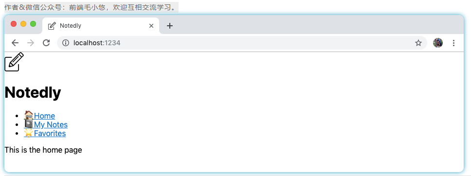
Figure 13-2Our application now has global styles applied
Component style
Now that we have applied some global styles in the application, we can start to style individual components. In this process, we will also introduce the overall layout of the application. For each component we style, we first need to styled-componentsimport the style library. Then, we define some element styles as variables. Finally, we will use these elements in the Reactcomponent JSX.
Styled component naming
To avoid HTMLconflicts with elements, the names of styled components must be capitalized.
We can src/components/Layout.jsstart from the beginning, where we add styles to the structure and labels of the application layout.
import React from 'react';
import styled from 'styled-components';

import Header from './Header';
import Navigation from './Navigation';

// component styles
const Wrapper = styled.div`
  /* We can apply media query styles within the styled component */
  /* This will only apply the layout for screens above 700px wide */
  @media (min-width: 700px) {
    display: flex;
    top: 64px;
    position: relative;
    height: calc(100% - 64px);
    width: 100%;
    flex: auto;
    flex-direction: column;
  }
`;

const Main = styled.main`
  position: fixed;
  height: calc(100% - 185px);
  width: 100%;
  padding: 1em;
  overflow-y: scroll;
  /* Again apply media query styles to screens above 700px */
  @media (min-width: 700px) {
    flex: 1;
    margin-left: 220px;
    height: calc(100% - 64px);
    width: calc(100% - 220px);
  }
`;

const Layout = ({

     children }) => {


  return (
    <React.Fragment> <Header /> <Wrapper> <Navigation /> <Main>{

    children}</Main> </Wrapper> </React.Fragment> );
};

export default Layout;
As we Layout.jscomplete ingredients, we can in our Header.jsand Navigation.jsadd some style file:
In src/components/Header.js:
import React from 'react';
import styled from 'styled-components';
import logo from '../img/logo.svg';

const HeaderBar = styled.header`
  width: 100%;
  padding: 0.5em 1em;
  display: flex;
  height: 64px;
  position: fixed;
  align-items: center;
  background-color: #fff;
  box-shadow: 0 0 5px 0 rgba(0, 0, 0, 0.25);
  z-index: 1;
`;

const LogoText = styled.h1`
  margin: 0;
  padding: 0;
  display: inline;
`;

const Header = () => {


  return (
    <HeaderBar> <img src={

    logo} alt="Notedly Logo" height="40" /> <LogoText>Notedly</LogoText> </HeaderBar> );
};

export default Header;
Finally, in src/components/Navigation.js:
import React from 'react';
import {

     Link } from 'react-router-dom';
import styled from 'styled-components';

const Nav = styled.nav`
  padding: 1em;
  background: #f5f4f0;

  @media (max-width: 700px) {
    padding-top: 64px;
  }

  @media (min-width: 700px) {
    position: fixed;
    width: 220px;
    height: calc(100% - 64px);
    overflow-y: scroll;
  }
`;

const NavList = styled.ul`
  margin: 0;
  padding: 0;
  list-style: none;
  line-height: 2;

  /* We can nest styles in styled-components */
  /* The following styles will apply to links within the NavList component */
  a {
    text-decoration: none;
    font-weight: bold;
    font-size: 1.1em;
    color: #333;
  }

  a:visited {
    color: #333;
  }

  a:hover,
  a:focus {
    color: #0077cc;
  }
`;

const Navigation = () => {


  return (
    <Nav> <NavList> <li> <Link to="/">Home</Link> </li> <li> <Link to="/mynotes">My Notes</Link> </li> <li> <Link to="/favorites">Favorites</Link> </li> </NavList> </Nav>
  );
};

export default Navigation;
After applying these styles, we now have a fully styled application (picture 13-3). Going forward, we can apply styles when creating individual components.
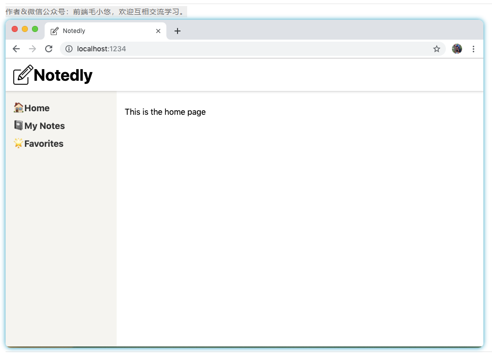
Figure 13-3. Our application has applied styles
in conclusion
In this chapter, we introduced the layout and styles to the application. Using the CSS-in-JSlibrary Styled Components, we can write concise and concise CSSstyles. These styles can then be applied to individual components or to the entire application. In the next chapter, we will develop a fully functional application by implementing the GraphQLclient and calling ours API.
If there is any inadequate understanding, please correct me. If you think it's okay, please like to collect or share it, hoping to help more people.