Article Directory
Average Candlestick Chart Overview
The average K-line chart is a branch of the candlestick chart. In Japan, Heikin means "average" and Ashi means "rhythm". Compared with the traditional K-line chart, the average K-line chart can reflect the change and intensity of the trend, but in the average K-line chart, the highest, lowest, opening, and closing prices do not represent the real market price, but the processed price. data results.
OHLC calculation method
The opening price Open, the highest price High, the lowest price Low, and the closing price Close of the average K-line chart are all calculated based on the K-line chart
In the basic candlestick chart:
- Open: the opening price of the day
- Close: the closing price of the day
- High: the highest price of the day
- Low: the lowest price of the day
- Pre open: yesterday's opening price
- Pre close: yesterday's closing price
The calculation method of the first K line of the average K line chart:
- Heikin Ashi opening price = (open + close)/2
- Heikin Ashi highest price = high
- Heikin Ashi lowest price = low
- Heikin Ashi closing price = (open + high + low + close)/4
K-line calculation method after the average K-line chart:
- Heikin AshiOPEN 盘价 = (pre open + pre close)/2
- Heikin Ashi highest price = Max(open, high, close)
- Heikin Ashi minimum price = Min(open, low, close)
- Heikin Ashi closing price = (open + high + low + close)/4
According to the calculation method, we can see the characteristics of the average K-line chart:
- The opening price of the average K-line chart is started in the middle of the opening and closing of the actual K-line yesterday, so the continuity of the average K-line chart is relatively strong
- The highest price and the lowest price of the average K-line chart have not changed, so yesterday's price fluctuation range will be reflected on the image
- The closing price of the average K-line chart is the average price of today's high opening and low closing prices. Therefore, whether the average K-line chart is red or green depends on the difference between today's high opening and low closing average price and yesterday's opening and closing prices. The difference between them, the color of the average K-line chart itself can express
K-line chart trend comparison
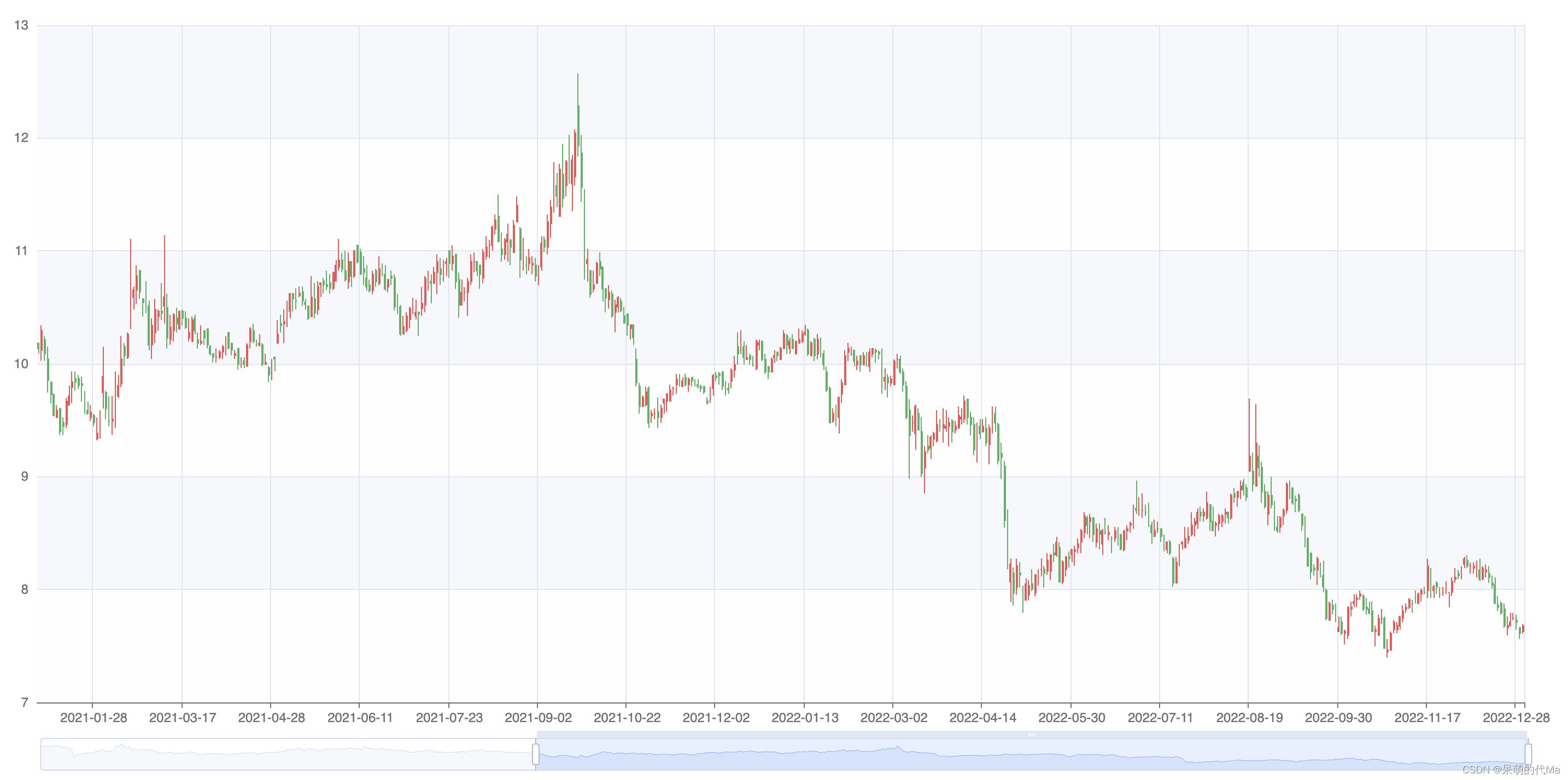
The common candlestick chart accurately represents the situation of the day:
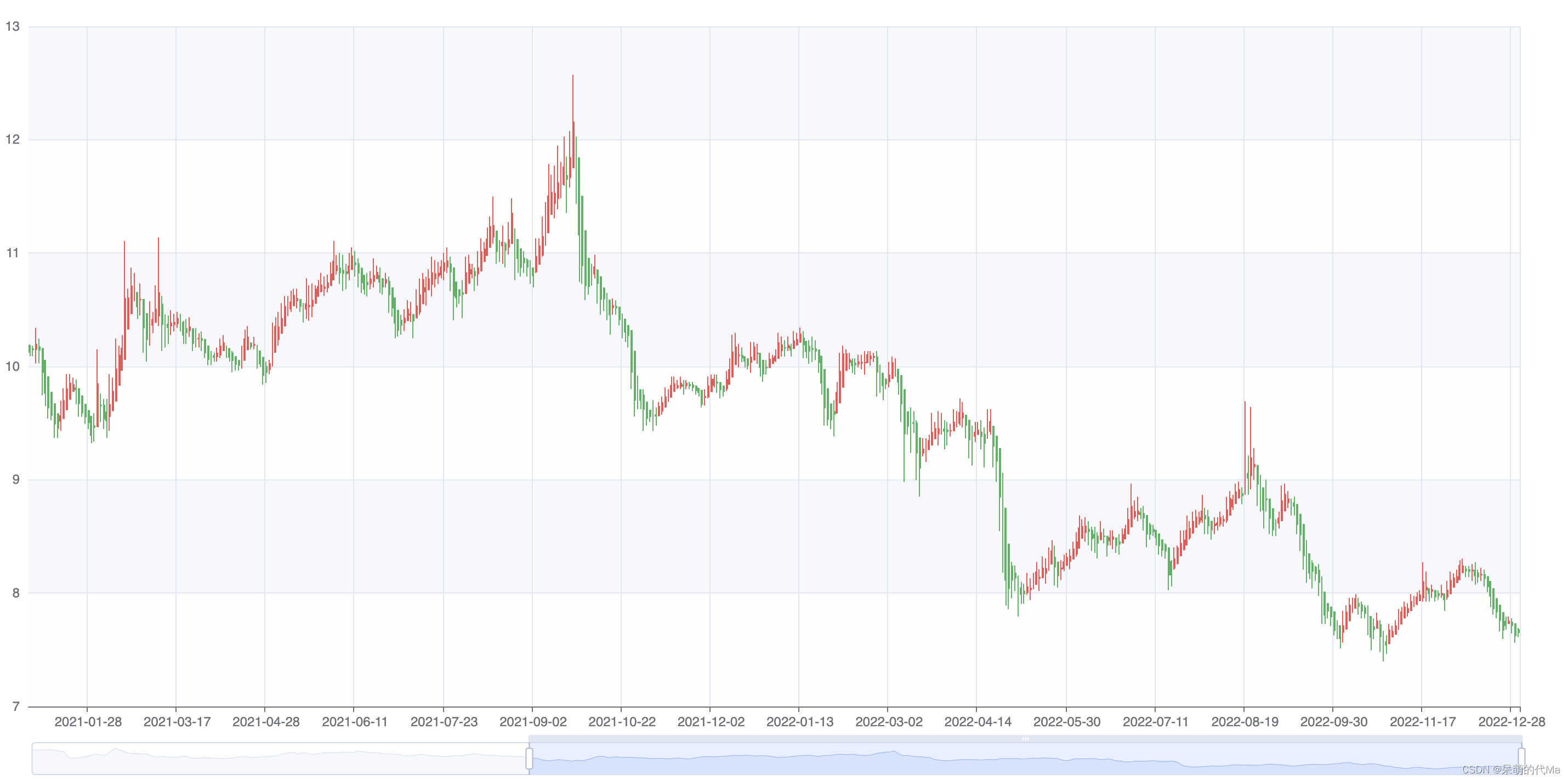
The representation effect of the average K-line chart is as follows:
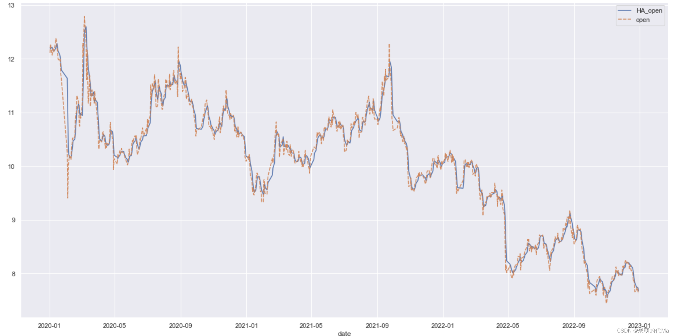
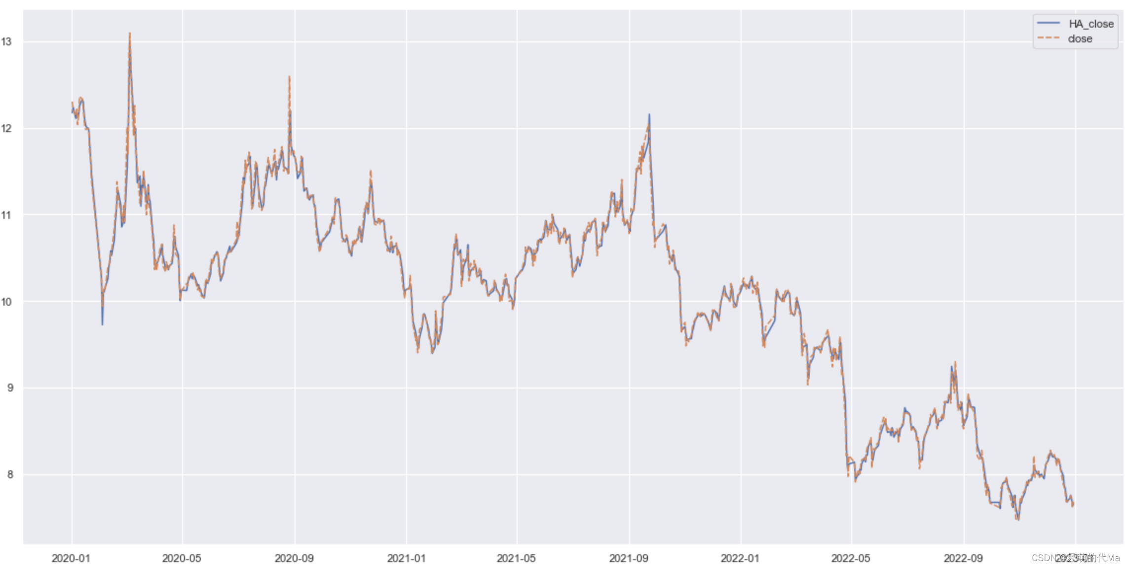
It will be more obvious if you only look at the price of one dimension, such as:
Opening price:
Closing price:
Average K-line Chart Yin-Yang Line Trading Strategy
Since the average K-line chart shows the meaning of "trend", the trend itself is a trading signal
Trading Rules
- When the opening price of the average K-line chart < the closing price, buy at the real closing price of the day
- When the opening price of the average K-line chart > closing price, sell at the real closing price of the day
Calculation conclusion
| index | average value |
|---|---|
| winning percentage | 0.35 |
| Average number of transactions | 128.25 |
| Annualized rate of return - mean | -2.34 |
| Annualized rate of return - variance | 6.23 |
| Annualized rate of return -25% | -4.11 |
| Annualized rate of return -75% | 0.74 |
| Annualized rate of return - median | -1.05 |
| Days of trading duration - mean | 5.94 |
| Days of trade duration - median | 4.23 |
Double moving average strategy calculation
Calculation rules
In this part, we measure the impact of the double moving average strategy on individual stocks, and divide the time period into two parts:
- Estimated: January 1, 2015 to January 1, 2020
- Backtest: January 1, 2020 to November 1, 2022
When calculating, only select stocks with data volume greater than 200 trading days during the period from January 1, 2015 to January 1, 2020, and stocks that have not been marked as ST in history
According to the trading strategy of the double moving average strategy, we use the 5-day moving average of [average K-line chart closing price] as the short-term, and the 10-trading-day moving average of [average K-line chart closing price] as the long-term
- When the short line crosses the long line, forming a golden cross, the actual closing price is used as the buying price
- When the short-term crosses the long-term, a dead cross is formed, and the actual closing price is used as the selling price
At the same time, here we count the duration and yield of each transaction (from buying point to selling point):
- Converted to annualized rate of return
- An annualized rate of return > 2% is regarded as a win, winning rate = number of wins/total number of transactions
Calculation conclusion
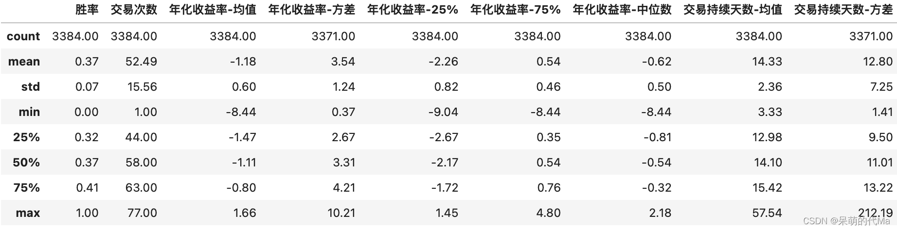
On the whole, the winning rate of using the average K-line chart alone is low, but it can be seen from the number of trading days that the average K-line chart is relatively accurate in grasping the trend. In actual combat, the double moving average strategy can be combined with other indicators to give a comprehensive evaluation result