This article was first published on the WeChat public account: Daqian World, my WeChat: qq449245884, I will share with you the front-end industry trends, learning paths, etc. as soon as possible.
For more open source works, please see GitHub https://github.com/qq449245884/xiaozhi , including the complete test sites, materials and my series of articles for interviews with first-line manufacturers.
Vue provides a simple and elegant way to handle animations. You can easily apply them by adding a directive that does all the heavy lifting for you. Alternatively, you can leverage JavaScript hooks to incorporate more complex logic into your animations, and even add third-party libraries such as gsap for more advanced use cases.
In this article, we'll examine these different options, but first, let's put Vue.js aside for a moment and discuss the differences between CSS transitions and animations.
Transitions and Animations
Transitions are made between two different states. start state and end state. For example, with a modal component, the start state might be hidden and the end state might be visible. You set these states, and the browser fills in the state changes with a series of intermediate frames.
button {
  background-color: #0ff1ce;
  transition: background-color 0.3s ease-in;
}
button:hover {
  background-color: #c0ffee;
}
If you want to perform something that doesn't involve an explicit start and end state, or if you need finer control over the keyframes in the transition, then you have to use animation.
button:hover {
  animation-duration: 3s;
  animation-iteration-count: infinite;
  animation-name: wobble;
}

@keyframes wobble {
  0%,
  100% {
    transform: translateX(0%);
    transform-origin: 50% 50%;
  }

  15% {
    transform: translateX(-32px) rotate(-6deg);
  }

  30% {
    transform: translateX(16px) rotate(6deg);
  }

  45% {
    transform: translateX(-16px) rotate(-3.6deg);
  }

  60% {
    transform: translateX(10px) rotate(2.4deg);
  }

  75% {
    transform: translateX(-8px) rotate(-1.2deg);
  }
}
result:
When you consider that many properties can be animated , that multiple animations can be applied to an element, and that they can be controlled using javascript , the animation possibilities are endless.
To learn more, read our article on using CSS animations (MDN) and give this CSS animation generator a try.
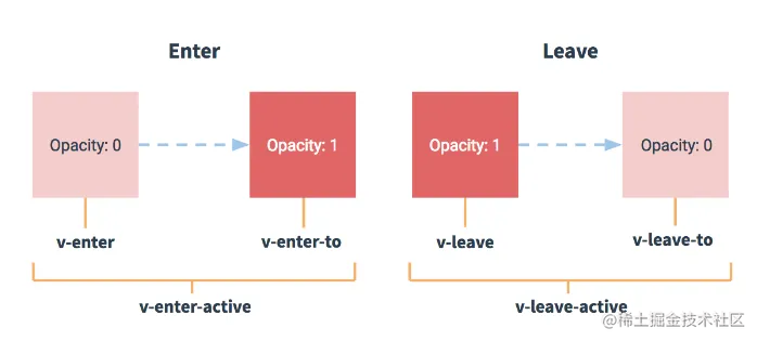
Transitions and animations can be easily used in Vue.js projects by using the built-in transitiondirective . During the animation, Vue will add the appropriate class to the enclosing element.
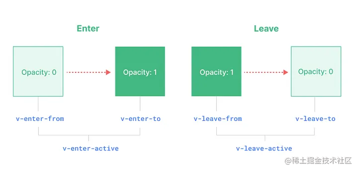
Transition Classes
Enter
- v-enter-from: start state.
- v-enter-active: Active state. Applied throughout the animation stage.
- v-enter-to: End state.
Leave
- v-leave-from: starting state.
- v-leave-active: The active state of leaving. Applied throughout the animation stage.
- v-leave-to: End state.
In the case of named transitions, the name will replace v-the prefix .
At first, it was a bit confusing to me, but as we dive into the code, everything becomes easier to understand. Let's start with an example.
animation example
For brevity, some marked-up details were omitted, but everything including a live demo is available on Github .
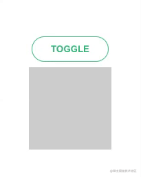
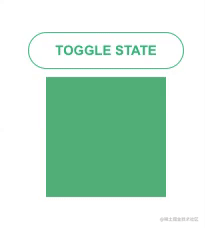
Toggle with gradient animation
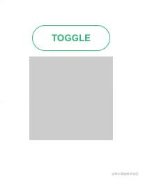
<button @click="toggle">Toggle</button>
<transition name="fade">
  <div class="box" v-if="!isHidden"></div>
</transition>
.fade-enter-active,
.fade-leave-active {
  transition: opacity 0.3s;
}
.fade-enter-from,
.fade-leave-to {
  opacity: 0;
}
Toggle with sliding animation
switch between two buttons

<transition name="fade" mode="out-in">
  <button @click="toggle" v-if="!isHidden" key="first">First State</button>
  <button @click="toggle" v-else key="second">Second State</button>
</transition>
<transition name="fade" mode="out-in">
  <button @click="toggle" v-if="!isHidden" key="first">First State</button>
  <button @click="toggle" v-else key="second">Second State</button>
</transition>
switch between two countries
.bounce-enter-active {
  animation: bounce 0.3s;
}
.bounce-leave-active {
  animation: bounce 0.3s reverse;
}

@keyframes bounce {
  0% {
    transform: scale(1);
    opacity: 0;
  }
  60% {
    transform: scale(1.1);
  }
  100% {
    transform: scale(1);
    opacity: 1;
  }
}
List addition, deletion and shuffling
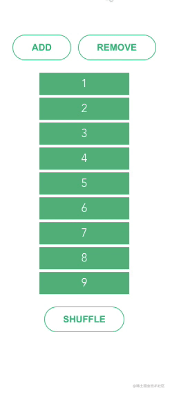
.list-enter-active,
.list-leave-active {
  transition: all 0.3s;
}

.list-enter-from,
.list-leave-to {
  opacity: 0;
  transform: scale(0);
}

/* Shuffle */
.list-move {
  transition: transform 0.6s;
}
Modal
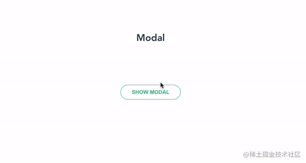
.modal-enter-from {
  opacity: 0;
}

.modal-leave-active {
  opacity: 0;
}

.modal-enter-from .modal-container,
.modal-leave-active .modal-container {
  -webkit-transform: scale(1.1);
  transform: scale(1.1);
}
card animation
/* moving */
.slideLeft-move {
  transition: all 0.6s ease-in-out 0.05s;
}

/* appearing */
.slideLeft-enter-active {
  transition: all 0.4s ease-out;
}

/* disappearing */
.slideLeft-leave-active {
  transition: all 0.2s ease-in;
  position: absolute;
  z-index: 0;
}

/* appear at / disappear to */
.slideLeft-enter-from,
.slideLeft-leave-to {
  opacity: 0;
}
Expand/collapse animation
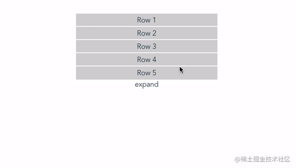
.list-enter-active,
.list-leave-active {
  transition: all 0.5s;
}
.list-enter-from,
.list-leave-to {
  opacity: 0;
  height: 0;
}
advanced animation
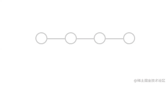
<div class="progress-steps">
    <div class="progress">
      <div class="percent" :style="{width: `${ (progress-1) * 30 }%`}"></div>
    </div>
    <div class="steps">
      <div class="step" v-for="index in 4" @click="setProgress(index)" :key="index" :class="{'selected': progress === index,
     'completed': progress > index }"></div>
    </div>
  </div>
.container {
  position: relative;
  margin-top: 100px;
}
.progress-steps {
  position: absolute;
  top: 50%;
  left: 50%;
  transform: translate(-50%, -50%);
}
.steps {
  position: relative;
  display: flex;
  justify-content: space-between;
  width: 200px;
}
.step {
  width: 20px;
  height: 20px;
  background: #ffffff;
  border: 2px solid lightgray;
  border-radius: 50%;
  transition: all 0.6s;
  cursor: pointer;
}
.step.selected {
  border: 2px solid #42b983;
}
.step.completed {
  border: 2px solid #42b983;
  background: #42b983;
  border-radius: inherit;
}
.step.completed:before {
  font-family: "FontAwesome";
  color: white;
  content: "\f00c";
}
.progress {
  position: absolute;
  width: 100%;
  height: 50%;
  border-bottom: 2px solid lightgray;
  z-index: -1;
}
.percent {
  position: absolute;
  width: 0;
  height: 100%;
  border-bottom: 2px solid #42b983;
  z-index: 1;
  transition: width 0.6s;
}
navigation animation
导航动画
This example heavily levarages javascript and the gsap library
source code
Differences from Vue 2
Animations are one of many features affected by the Vue 3 migration. The migration build doesn't report this as a breaking change, which can be confusing.
The old class is as follows:
As you can see, the .v-enterand .v-leaveclasses are now replaced by .v-enter-fromand .v-leave-from. 从enter-classAlso, the name and of the transition element props that control the animation class name leave-classwere changed to enter-class-fromand leave-class-from.
Summarize
This article presents real-life examples of how Vue.js implements transitions and microinteractions, and how these features improve user experience. The author points out that Vue.js is a flexible framework that can be used to implement a wide variety of functions. The article introduces some common transitions and micro-interactions, such as pop-up windows, dragging, pull-to-refresh, etc., and how to use Vue.js to achieve these effects.
The article emphasizes the importance of user experience and provides tips such as utilizing animation and color to grab user attention and increase user engagement. The author also introduces some Vue.js plugins and libraries, such as Vue-Router, Vuex, and Axios, and how to use them to simplify code and improve efficiency.
Finally, the article reminds readers to pay attention to the precautions when using these effects, such as avoiding the use of too many animations and effects, so as not to reduce performance and user experience.
The bugs that may exist after the code is deployed cannot be known in real time. In order to solve these bugs afterwards, a lot of time is spent on log debugging. By the way, I would like to recommend a useful bug monitoring tool, Fundebug .
Original: https://fadamakis.com/vue-js-real-life-transitions-and-micro-interactions-e86bd51301b8
comminicate
If you have dreams and dry goods, search [Daqian World] on WeChat to pay attention to this dishwashing wisdom who is still washing dishes in the early morning.
The GitHub https://github.com/qq449245884/xiaozhi of this article has been included, and there are complete test sites, materials and my series of articles for interviews with first-line manufacturers.