Article Directory
The github link of the wheel: the documents of the two projects must be viewed in combination
# vue-simple-uploader
https://github.com/simple-uploader/vue-uploader/blob/master/README_zh-CN.md

# simple-uploader
https://github.com/simple-uploader/Uploader/blob/develop/README_zh-CN.md#%E9%85%8D%E7%BD%AE
For specific use, please refer to the other two articles of the blog [uploader]
Then, if you want to refer to the blogger's exploration process and usage of the component, you can check several articles on the uploader on the homepage, which simply records your own exploration of the component.
1. Introduction to vue-simple-uploader
Super powerful front-end vue component for uploading files, compared to elementui's upload component, it can meet most file uploading needs. Including common services such as intermittent retransmission. However, many functions of the upload component of elementui cannot be realized. But both are compatible with each other.
- Support file, multi-file, folder upload
- Support drag and drop file and folder upload
- You can pause and continue uploading
- Support breakpoint resume, second transmission
- Support progress, estimated remaining time, error automatic retry, retransmission and other operations
- Upload queue management, support maximum concurrent upload, support block upload
For the convenience of viewing, here is a copy of the quickstart code. The uploader only has these tags, but there are many attributes and methods.
<template>
  <uploader :options="options" class="uploader-example">
    <uploader-unsupport></uploader-unsupport>
    <uploader-drop>
      <p>Drop files here to upload or</p>
      <uploader-btn>select files</uploader-btn>
      <uploader-btn :attrs="attrs">select images</uploader-btn>
      <uploader-btn :directory="true">select folder</uploader-btn>
    </uploader-drop>
    <uploader-list></uploader-list>
  </uploader>
</template>

<script>
  export default {


    data () {


      return {


        options: {


          // https://github.com/simple-uploader/Uploader/tree/develop/samples/Node.js
          target: '//localhost:3000/upload',
          testChunks: false
        },
        attrs: {


          accept: 'image/*'
        }
      }
    }
  }
</script>

<style>
  .uploader-example {


    width: 880px;
    padding: 15px;
    margin: 40px auto 0;
    font-size: 12px;
    box-shadow: 0 0 10px rgba(0, 0, 0, .4);
  }
  .uploader-example .uploader-btn {


    margin-right: 4px;
  }
  .uploader-example .uploader-list {


    max-height: 440px;
    overflow: auto;
    overflow-x: hidden;
    overflow-y: auto;
  }
</style>
2. Installation and configuration
npm install vue-simple-uploader --save
# 在main.js中
import uploader from 'vue-simple-uploader'
Vue.use(uploader)
3. Documentation of component labels
There are several tags in total:
-
uploader
-
uploader-btn
-
uploader-drop
-
uploader-list
-
uploader-file
3.1 uploader label
The root component tag, which can be understood as an uploader
Props attribute:
| parameter | illustrate | type | optional value | default |
|---|---|---|---|---|
| options | The most important configuration item, create an uploader after reading the configuration item | Object | - | {} |
| autostart | Whether to automatically upload immediately after selection | boolean | true/false | true |
| fileStatusText | Respond according to the status code returned by the server, the default is fine | Object | - | { success: ‘success’, error: ‘error’, uploading: ‘uploading’, paused: ‘paused’, waiting: ‘waiting’ } |
Supplement the configurable items of options [commonly used first, △ is marked as important, and others that are not written are defaulted to optimal]:
| parameter | illustrate | type | optional value | default |
|---|---|---|---|---|
| △target | The url uploaded by the target, required | String | - | ‘/’ |
| △singleFile | Single file upload, if true is set, when multiple files are selected, only the last one will be uploaded | boolean | true/false | false |
| △chunkSize | Chunk, the value size of a single data block, used for uploading in chunks to achieve intermittent retransmission | number | - | 1*1024*1024【1Mb】 |
| forceChunkSize | Whether to enforce that all chunks must be less than or equal to chunkSize | boolean | - | false |
| △simultaneousUploads | concurrent uploads | number | - | 3 |
| fileParameterName | The parameter name of the file when uploading the file, the default is multipart upload, and the parameter name is file by default | String | - | “file” |
| △query | Other parameters carried when requesting url | json | - | {} |
| headers | Set request header information | json | - | {} |
| △withCredentials | Standard CORS requests will not bring cookies, if you want to bring cookies, you need to set it to true | boolean | true/false | false |
| method | The current method of uploading files, the default is the same as the form form multipart | String | multipart/octet | “multipart” |
| testMethod | The HTTP method used when testing the interface | String | “GET”/“POST” | Default "GET" |
| △uploadMethod | The HTTP method used when actually uploading | String | “GET”/“POST” | Default "POST" |
| prioritizeFirstAndLastChunk | Whether to send the first and last chunks with high priority for the file. It is generally used to send to the server, and then determine whether it is a legal file; for example, the meta data of a picture or video is generally placed in the first part of the file, so that you can know whether it is supported according to the first block | boolean | true/false | false |
| △testChunks | Whether to test whether each block has been uploaded on the server side, mainly used to realize instant transmission, cross-browser upload, etc. [general default] | boolean | true/false | true |
| △checkChunkUploadedByResponse | The value is a function, and functions cannot be written directly. It is the server fragment verification function, which is shared with the testChunks above, and is the basis of second transfer and breakpoint resume transfer. Judge according to the response body parameter returned by the result, return true or false | function | ||
| maxChunkRetries | Maximum number of retries | number | - | 0 |
| chunkRetryInterval | retry interval, null means retry immediately | number | - | null |
| △processParams | Just write the function named processParams directly in the options object. Customize the parameters passed to the background for each fragmentation. params is the formal parameter returned by this method, including fragmentation information. The actual situation is adjusted according to the interface agreement, and a json object is returned | function |
Slot events:
| name | illustrate |
|---|---|
| file-added(file) | Added a file event, generally used for file verification |
| files-added(files, fileList) | Added a batch of file events, generally used for verification of multiple files selected at one time |
| file-success(rootFile, file, message, chunk) | The file is successfully uploaded. The first parameter rootFile is or contains a File object, file is a File object, message is a string of response content from the server, and chunk is a chunk instance, which should be the last block instance of this file. chunk.xhr.status is the response code for this file upload |
| file-progress(rootFile, file, chunk) | A file is uploading event |
| file-removed(file) | a file was removed |
| file-error(rootFile, file, message, chunk) | Error during file upload |
methods method:
Need to get uploader instance
# 我们先给uploader标签指定ref
<uploader :options="options" class="uploader-example" ref="uploader">
# 然后可以从当前vue组件的子组件refs列表里获取uploader组件,uploader组件有个uploader属性表示uploader组件本身
const uploaderInstance = this.$refs.uploader.uploader
# 然后实例.方法就可以使用了
| method | illustrate |
|---|---|
| upload() | start or continue uploading |
| pause() | pause upload |
| resume() | continue uploading |
| progress() | Returns a floating point number of 0-1, indicating the current upload progress |
| isUploading() | 返回一个布尔值标示是否还有文件正在上传中 |
| cancel() | 文件会被移除掉 |
| addFile(file) | 添加一个原生的文件对象到上传列表中 |
| removeFile(file) | 从上传列表中移除一个指定的 Uploader.File 实例对象 |
| getSize() | 上传文件的总大小 |
| timeRemaining() | 剩余时间,单位秒;这个是基于平均上传速度计算出来的,如果说上传速度为 0,那么这个值就是 Number.POSITIVE_INFINITY |
| on(event, callback) | 监听各种事件 |
3.2 uploader-btn标签
点击后能够展示文件选择器的按钮。一般就只使用directory参数
props属性:
| 参数 | 说明 | 类型 | 可选值 | 默认 |
|---|---|---|---|---|
| directory | 表示当前上传是否是文件夹上传,如果true则只能选择文件夹 | boolean | true/false | false |
| single | 表示是否一次只能选择一个文件,如果false则可以多选 | boolean | true/false | false |
| attrs | 添加到input元素上的额外属性。因为文件上传的本质是一个input文档对象,比如input元素有的accept="image/*"表示只允许图片上传 | json object | accept等 | {} |
3.3 uploader-drop标签
声明该区域允许拖动文件进来后上传
3.4 uploader-list标签
一个列表外标签,类似于form一样,仅仅是用来装载uploader-file组件的容器。
下面有使用演示
3.5 uploader-file标签
就是你拉取后的一个文件单位对象,可以展示,拥有自己的很多属性可以展示。
Props属性:
| 参数 | 说明 | 类型 | 可选值 | 默认 |
|---|---|---|---|---|
| file | file实例本身 | Uploader.File | - | - |
| list | 如果在UploaderList使用,设置为true | boolean | false |
slot插槽:就是通过file对象能直接的file信息
| 参数 | 说明 | 类型 |
|---|---|---|
| file | 文件实例 | Uploader.File |
| list | 是否在 UploaderList 组件中使用 |
boolean |
| status | 当前状态【success,error,uploading,paused,waiting】 | String |
| paused | 是否暂停了 | boolean |
| error | 是否出错了 | boolean |
| averageSpeed | 平均上传速度,单位字节每秒 | number |
| formatedAverageSpeed | 格式化后的平均上传速度类似:3 KB / S |
String |
| currentSpeed | 当前上传速度 | number |
| isComplete | 是否已经上传完成 | boolean |
| isUploading | 是否在上传中 | boolean |
| size | 文件或者文件夹大小 | number |
| formatedSize | 格式化后文件或者文件夹大小,类似:10 KB |
number |
| uploadedSize | 已经上传大小,单位字节 | number |
| progress | 介于 0 到 1 之间的小数,上传进度 | number |
| progressStyle | 进度样式,transform 属性,类似:{transform: '-50%'} |
String |
| progressingClass | 正在上传中的时候值为:uploader-file-progressing |
String |
| timeRemaining | 预估剩余时间,单位秒 | number |
| formatedTimeRemaining | 格式化后剩余时间,类似:3 miniutes |
String |
| type | 文件类型 | String |
| extension | 文件名后缀,小写 | String |
| fileCategory | 文件分类,其中之一:folder, document, video, audio, image, unknown |
String |
简单演示一下list和file的使用,用于可视化文件上传进度
- uploader设置自动上传为false: `autoStart=“false”
- 在uploader内引入uploader-list
- 通过slot-scope绑定文件实例,选择文件后自动传递实例
- v-for展示uploader-file即可,file实例的属性、方法和事件看上方文档,自己设计可视化即可
<uploader
	:options="this.options"
	@file-added="this.fileAdded"
	@file-error="this.fileError"
	@file-success="this.fileSuccess"
	:autoStart="false">
	<uploader-unsupport></uploader-unsupport>
	<uploader-btn class="uploader-btn">点击上传</uploader-btn>

	<uploader-list>
		<!--通过slot-scope绑定文件实例-->
	     <div slot-scope="props">
	         <div v-for="(file,i) in props.fileList" :key="i">
	             <uploader-file :list="true" :file="file"></uploader-file>
	         </div>
	     </div>
	 </uploader-list>
</uploader>
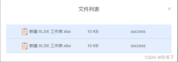
原生的效果长这样。
3.6 uploader-unsopport标签
不支持 HTML5 File API 的时候会显示。
一般就写在uploader根组件里就行了,遇到低版本的浏览器不兼容组件的时候才会展示。
<uploader :options="options" class="uploader-example">
	<uploader-unsupport></uploader-unsupport>

</uploader>
4.请求中的参数
可通过 query 参数配置扩充,也可以通过 processParams 自定义
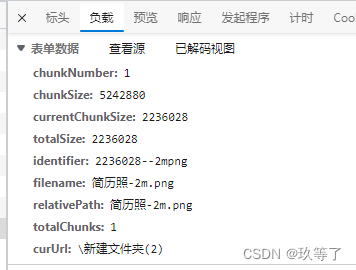
- chunkNumber,当前分片
- chunkSize,分片上限大小
- currentChunkSize,当前分片的真实大小
- totalSize,文件总大小
- identifier,唯一标识,可自定义
- filename,文件名
- totalChunks,总分片数量
- 从totalChunks往下,是自己在options配置中配置的query参数,比如我配置了curUrl这个参数
然后如果想要参考博主对该组件的使用的探索过程以及使用情况,可以查看主页中的uploader的几篇文章,那是简单记录自己对该组件的探索。