Write the directory title here
1. What is Matplotlib?
Matplotlib is a Python library for drawing 2D graphics. It offers a wide range of features to create various types of charts, including line graphs, scatter plots, bar charts, pie charts, contour plots, 3D plots, and more. Matplotlib allows users to easily create visual charts for data analysis and presentation.
Here are four examples using Matplotlib:
1: Draw a line chart
import matplotlib.pyplot as plt

x = [1, 2, 3, 4, 5]
y = [2, 4, 6, 8, 10]

plt.plot(x, y)
plt.xlabel('X轴')
plt.ylabel('Y轴')
plt.title('折线图')
plt.show()
This example creates a simple line chart, uses plt.plot(x, y)the function to draw a line, and then uses plt.xlabelthe, plt.ylabeland plt.titlefunctions to set the X-axis, Y-axis, and chart title. Finally call plt.show()the function to display the chart.
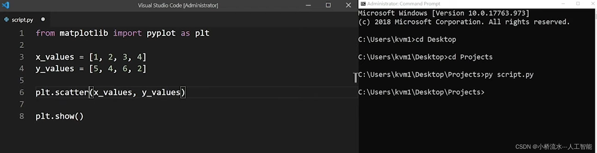
2: Draw a scatter plot
import matplotlib.pyplot as plt

x = [1, 2, 3, 4, 5]
y = [2, 4, 6, 8, 10]

plt.scatter(x, y)
plt.xlabel('X轴')
plt.ylabel('Y轴')
plt.title('散点图')
plt.show()
This example creates a scatter plot, uses plt.scatter(x, y)the function to plot a set of scatter points, and then uses the plt.xlabel, plt.ylabeland plt.titlefunctions to set the X-axis, Y-axis, and title of the chart. Finally call plt.show()the function to display the chart.
3: Draw a histogram
import matplotlib.pyplot as plt

x = ['A', 'B', 'C', 'D']
y = [10, 20, 15, 25]

plt.bar(x, y)
plt.xlabel('类别')
plt.ylabel('数量')
plt.title('柱状图')
plt.show()
This example creates a bar chart, uses plt.bar(x, y)the function to draw a set of bars, and then uses plt.xlabelthe, plt.ylabeland plt.titlefunctions to set the X-axis, Y-axis, and chart title. Finally call plt.show()the function to display the chart.
4: Draw a pie chart
import matplotlib.pyplot as plt

labels = ['A', 'B', 'C', 'D']
sizes = [30, 20, 25, 25]

plt.pie(sizes, labels=labels, autopct='%1.1f%%')
plt.title('饼图')
plt.show()
This example creates a pie chart, uses plt.pie(sizes, labels=labels, autopct='%1.1f%%')a function to draw a set of sectors, and labelssets the sector labels via parameters autopct='%1.1f%%'to display percentages. Then use plt.titlethe function to set the title of the chart. Finally call plt.show()the function to display the chart.
The above are four simple Matplotlib examples. You can use Matplotlib to create a variety of charts according to your needs.
Summarize
Matplotlib can draw various types of statistical charts, including line graphs, scatter plots, histograms, pie charts, box plots, contour plots, etc. By visualizing data, we can better understand the distribution, trends and relationships of data, facilitating data analysis and insights.