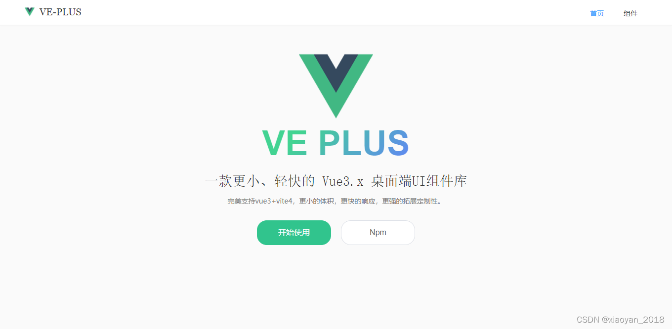
vue3 desktop component library | vue3-ui component library | vite4 component library | VEPlus component library
Ve-Plus , a desktop UI component library developed based on vue3.x, contains 37+ commonly used components. Supports global import and on-demand import. It is compact, fast and highly customizable.
The use of ve-plus is similar to the element-ui component library, and it is easy to get started.
Install
npm install ve-plus -S
cnpm install ve-plus -S
yarn add ve-plus
Quick to use
- Global introduction
import {

     createApp } from "vue"
import App from "./App.vue"
import VEPlus from "ve-plus"

const app = createApp(App)
app.use(VEPlus)
app.mount("#app")
- Introduce on demand
import {

     Button, Input, Checkbox } from "ve-plus"

<Button type="success" round>按钮</Button>
<Input v-model="value" />
<Checkbox v-model="checked" label="选中" />
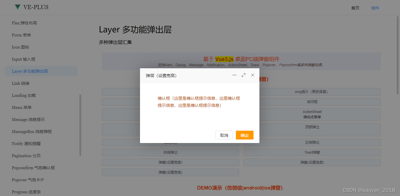
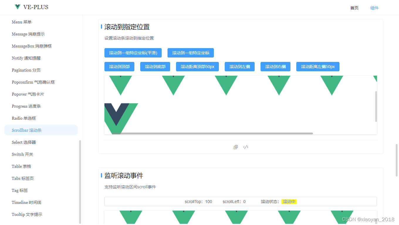
In addition, ve-plus also integrates two independent components, the previous vue3-layer pop-up window and vue3-scrollbar scroll bar.
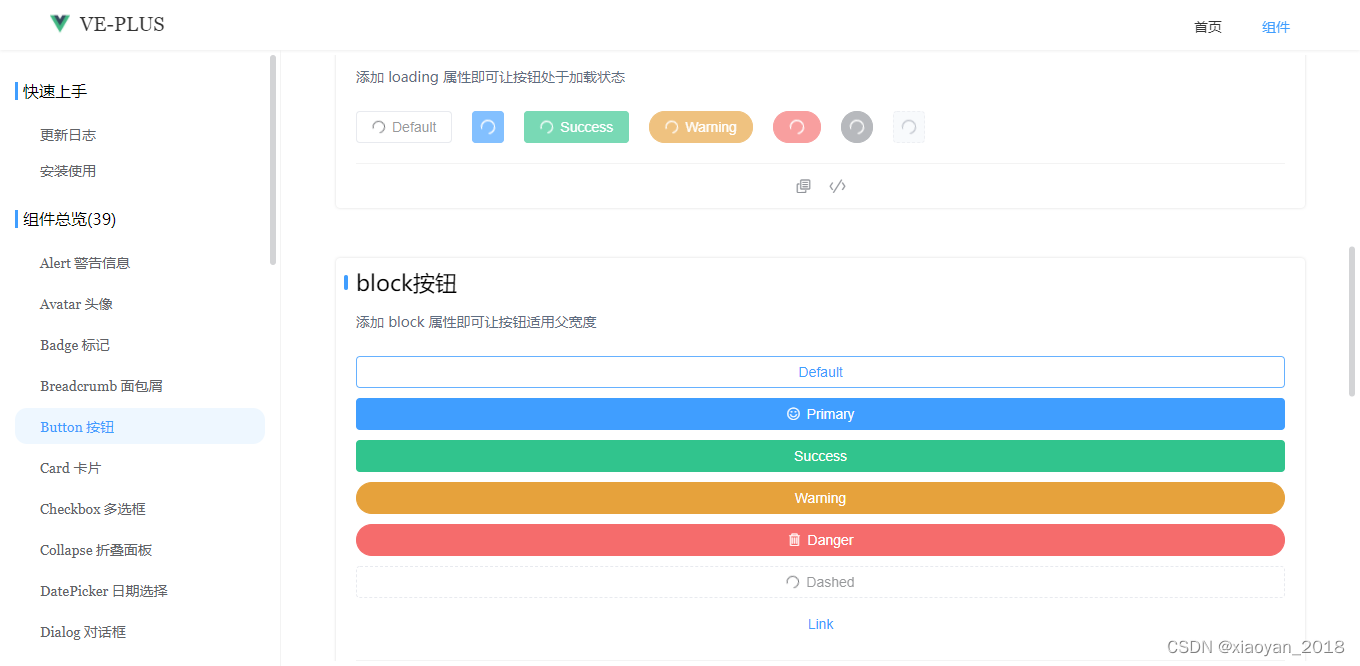
Use components
<Button type="primary">Primary</Button>
<Button type="success">Success</Button>
<Button type="warning" round>Warning</Button>
<Button type="primary" icon="ve-icon-filetext" circle></Button>
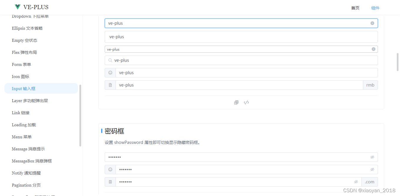
<Input v-model="inputVal" placeholder="输入用户名" />
<Checkbox v-model="checkboxValue" label="Checkbox" />
<Select v-model="selectVal" :options="options" size="large" clearable />
...
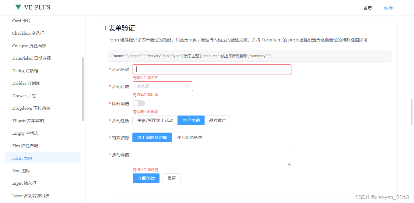
The Form component provides the form validation function. You only need to pass in the agreed validation rules for the rules attribute and set the prop attribute of the FormItem to the special key value that needs to be verified.
<script setup>
    const formRuleRef = ref()
    const rules = ref({


        name: [
            {

     required: true, message: "请输入活动名称", trigger: ["blur", "input"] },
            {

     min: 3, max: 5, message: "长度在 3 到 5 个字符", trigger: "blur" }
        ],
        region: [
            {

     required: true, message: "请选择活动区域", trigger: "change" }
        ],
        type: [
            {

     type: "array", required: true, message: "请至少选择一个活动性质", trigger: "change" }
        ],
        resource: [
            {

     required: true, message: "请选择活动资源", trigger: "change" }
        ],
        // summary: [
        //     { required: true, message: "请填写活动详情", trigger: "blur" }
        // ]
    })
    const handleSubmit = () => {


        formRuleRef.value.validate(valid => {


            if(valid) {


                console.log("submit")
            }else {


                console.log("error...")
                return false
            }
        })
    }
    const handleReset = () => {


        formRuleRef.value.resetFields()
    }
</script>

<template>
    <Form
        ref="formRuleRef"
        :model="formObj"
        labelWidth="80px"
        :rules="rules"
        style="width: 600px;"
    >
        <FormItem label="活动名称" prop="name">
            <Input v-model="formObj.name" />
        </FormItem>
        <FormItem label="活动区域" prop="region">
            <Select v-model="formObj.region" :options="regionOptions" clearable multiple />
        </FormItem>
        <FormItem label="即时配送" prop="delivery" required message="请勾选即时配送" trigger="change">
            <Switch v-model="formObj.delivery" />
        </FormItem>
        <FormItem label="活动性质" prop="type">
            <CheckboxGroup v-model="formObj.type">
                <Checkbox label="美食/餐厅线上活动" button />
                <Checkbox label="亲子主题" button />
                <Checkbox label="品牌推广" button />
            </CheckboxGroup>
        </FormItem>
        <FormItem label="特殊资源" prop="resource">
            <RadioGroup v-model="formObj.resource">
                <Radio label="线上品牌商赞助" button />
                <Radio label="线下场地免费" button />
            </RadioGroup>
        </FormItem>
        <FormItem label="活动详情" prop="summary" :rule="[{ required: true, message: "请填写活动详情", trigger: "blur" }]">
            <Input v-model="formObj.summary" type="textarea" rows={

    3} />
        </FormItem>
        <FormItem>
            <Button type="primary" @click="handleSubmit">立即创建</Button>
            <Button @click="handleReset">重置</Button>
        </FormItem>
    </Form>
</template>
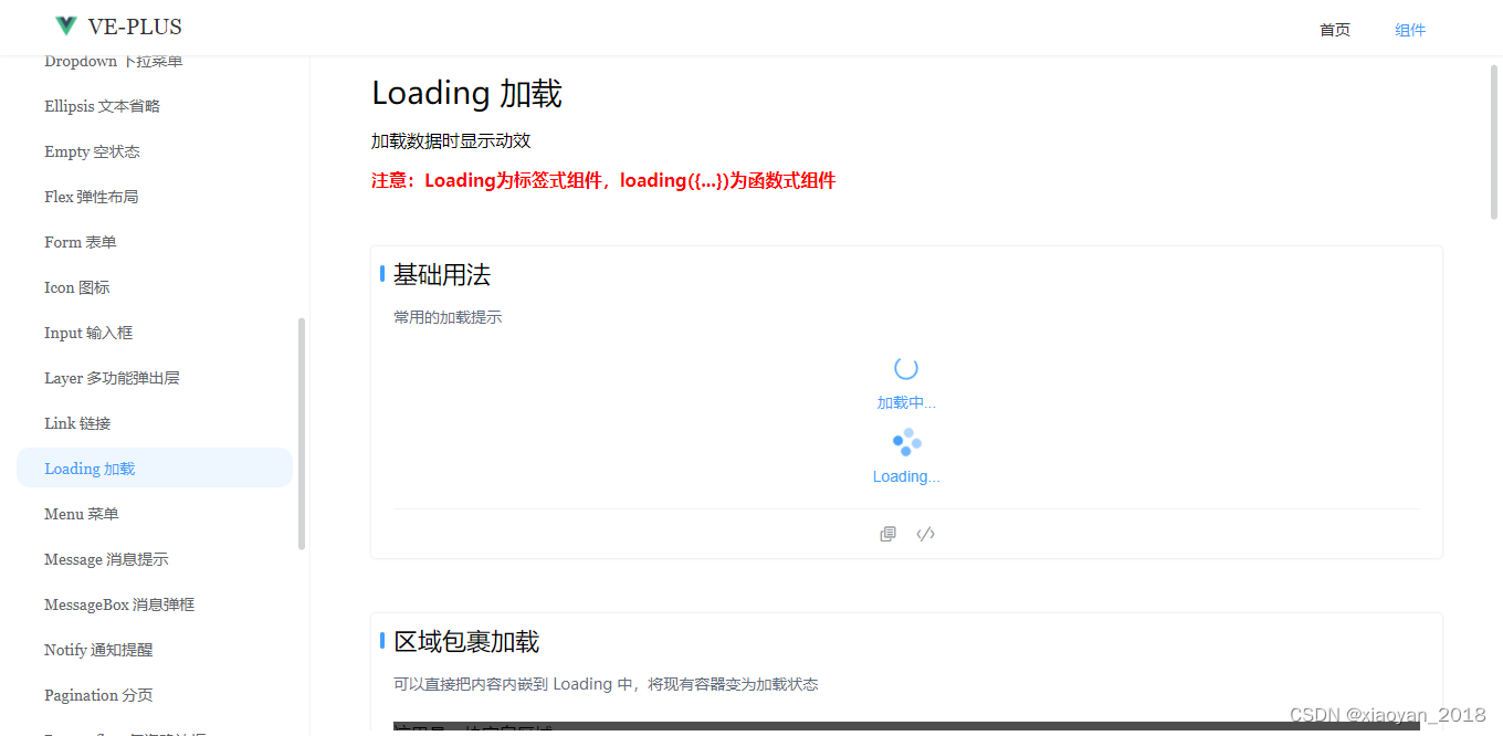
The Loading loading component also supports the loading({}) function call.
<template>
    <Loading v-model="loaded" background="rgba(0,0,0,.75)" spinner="ve-icon-loading" fullscreen="false">
        <template #text><div>加载中...</div></template>
    </Loading>

    <Loading v-model="loaded" text="Loading..." background="rgba(0,0,0,.75)" fullscreen="false" />
</template>
<script setup>
    const handleLoading = () => {


        loading({


            // spinner: "sv-icon-loading",
            text: "Loading...",
            background: "rgba(0,0,0,.75)",
            size: 32,
            // time: 3, // 3s后关闭
            shadeClose: true,
            onOpen: () => {


                console.log("开启loading")
            },
            onClose: () => {


                console.log("关闭loading")
            }
        })
        // setTimeout(() => {


        //     loading.close()
        // }, 3000)
    }
</script>
<template>
    <Button type="primary" @click="handleLoading">全屏loading</Button>
</template>
<template>
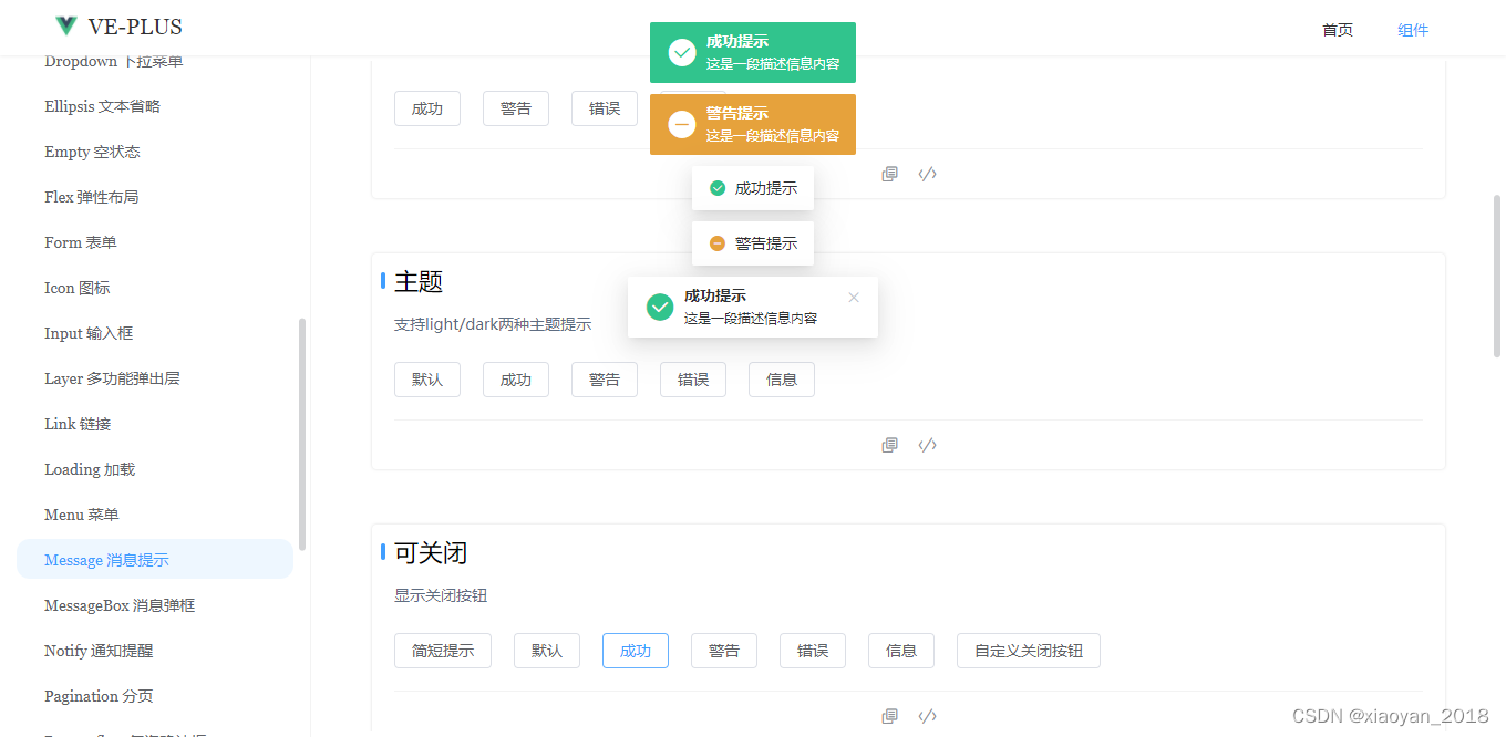
<Button @click="Message.success("成功提示")">成功</Button>
<Button @click="Message({title: "警告提示", type: "warning"})">警告</Button>
<Button @click="Message.danger("错误提示")">错误</Button>
<Button @click="Message.info("消息提示")">消息</Button>
</template>
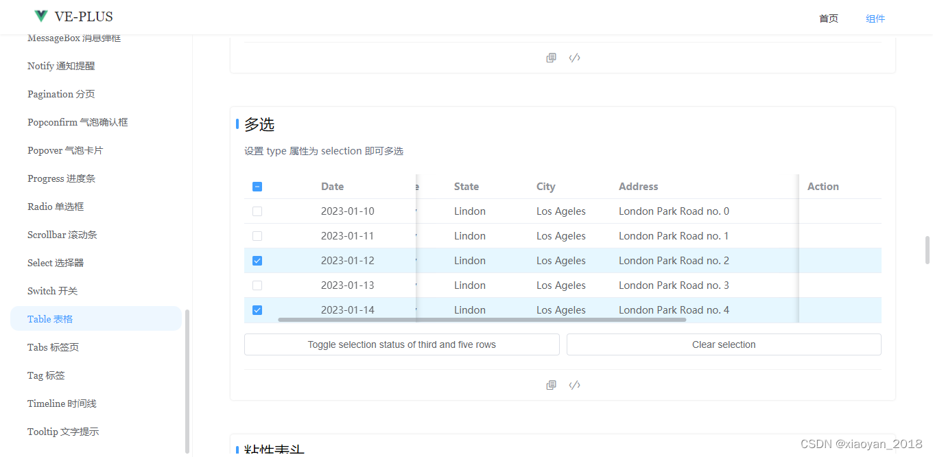
<script setup>
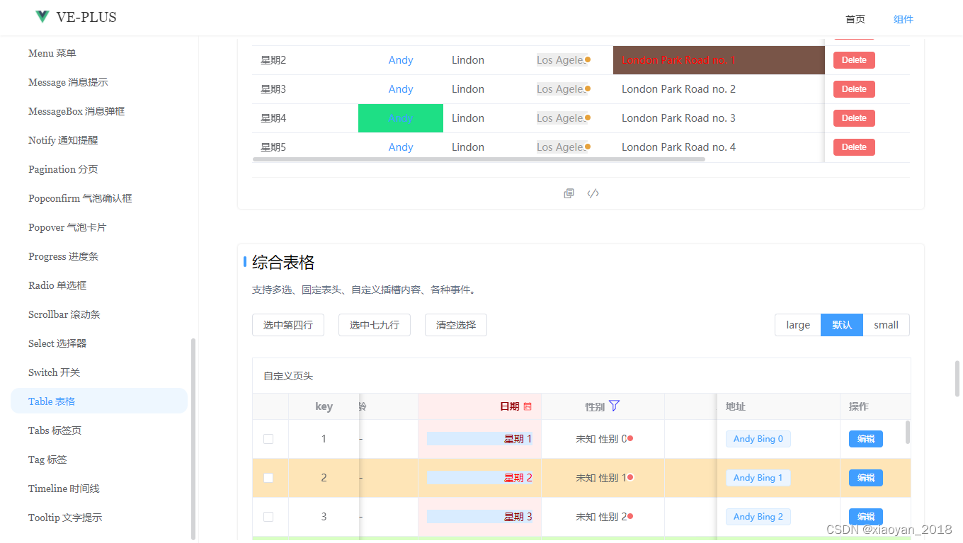
// 设置多选
const tableToggleRef = ref()
const toggleSelection = (value) => {
tableToggleRef.value.setCurrentRow(value)
}
const toggleTableData = ref([...Array(5)].map((_, i) => ({
date: `2023-01-${
10+i}`,
name: "Andy",
state: "Lindon",
city: "Los Ageles",
address: `London Park Road no. ${
i}`,
zip: "CA 90036"
})))
const toggleTableColumns = ref([
{
type: "selection", width: 100, fixed: true},
{
prop: "date", label: "Date", width: 150, fixed: true},
{
prop: "name", label: "Name", align: "center", width: 120},
{
prop: "state", label: "State", width: 120},
{
prop: "city", label: "City", width: 120},
{
prop: "address", label: "Address", width: 600},
{
prop: "zip", label: "Zip", width: 120},
{
prop: "action", label: "Action", width: 120, fixed: "right"}
])
</script>
<template>
<Table
ref="tableToggleRef"
:dataSource="toggleTableData"
:columns="toggleTableColumns"
highlight-current-row
:highlight-multiple="true"
/>
<Button block @click="toggleSelection([2,4])">Toggle selection status of third and five rows</Button>
<Button block @click="toggleSelection()">Clear selection</Button>
</template>
Okay, let’s share the introduction here. If you are interested, you can install and use it.
vue3-tauriChat is based on tauri+vue3 cross-desktop chat EXE
