Twenty-seven, CSS3 advanced
1. CSS3 2D conversion
Transform is one of the disruptive features in CSS3, which can achieve effects such as displacement, rotation, and scaling of elements.
Transform can be simply understood as deformation
Move: translate; rotate: rotate; scale: scale
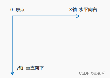
1.1 Two-dimensional coordinate system
2D transformation is a technique that changes the position and shape of labels on a two-dimensional plane
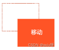
1.2 2D conversion mobile translate
2D movement is a function in 2D conversion, which can change the position of elements on the page, similar to positioning
grammar:
transform: translate(x,y); or write them separatelytransform: translateX(n);transform: translateY(n);
Key points:
Defines movement in 2D transformation, moving elements along the X and Y axes
The biggest advantage of translate is that it does not affect the position of other elements.
    <style>
        /* 移动盒子的位置:定位、盒子的外边距、2d转换移动 */
        div {
            width: 200px;
            height: 200px;
            background-color: saddlebrown;
            /* 1、 transform: translate(x,y); x就是x轴上移动位置,y就是y轴上移动位置,中间用逗号分割 */
            /* transform: translate(100px, 100px); */
            /* 2、只移动x坐标 */
            /* transform: translate(100px, 0); */
            /* transform: translateX(100px); */
            /* 3、只移动y坐标 */
            /* transform: translate(0,100px); */
            /* transform: translateY(100px); */
        }

        /* div:first-child {
            transform: translate(100px, 100px);
        } */

        div:last-child {
            background-color: salmon;
        }
    </style>
</head>

<body>
    <div></div>
    <div></div>
</body>
The percentage unit in translate is relative to its own element translate:(50%,50%);
Has no effect on inline tags
<style>
.three {
position: relative;
width: 500px;
height: 500px;
background-color: sandybrown;
}
p {
position: absolute;
top: 50%;
left: 50%;
width: 200px;
height: 200px;
background-color: aqua;
/* margin-top: -100px;
margin-left: -100px; */
/* translate(-50%, -50%) 盒子往上走自己高度的一半 */
transform: translate(-50%, -50%);
}
span {
/* translate 对于行内元素是无效的 */
transform: translate(300px, 300px);
}
</style>
</head>
<body>
<div class="three">
<p></p>
</div>
<span>123</span>
</body>
1.3 2D conversion value rotation rotate
2D rotation refers to rotating an element clockwise or counterclockwise in a 2-dimensional plane.
Syntax: transform:rotate( degree )
Key points:
rotate contains degrees, and the unit is deg. For example, rotate(45deg)
When the angle is positive, it is clockwise; when it is negative, it is counterclockwise.
The default rotation center point is the center point of the element
    <style>
        img {
            width: 150px;
            /* rotate(45deg) 顺时针45度 */
            transform: rotate(45deg);
            border-radius: 50%;
            border: 5px solid palegreen;
            /* 过渡写到本身上,谁做动画给谁加 */
            transition: all 1.0s;
        }

        img:hover {
            transform: rotate(360deg);
        }
    </style>
</head>

<body>
    <img src="img/oldman.jpg" alt="">
</body>
1.4 2D transformation center point transform-origin
Syntax: transform-origin: xy;
Key points:
Note that the following parameters x and y are separated by spaces.
The default center point of xy conversion is the center point of the element (50% 50%)
You can also set pixels or orientation nouns for xy (top bottom left right center)
    <style>
        div {
            width: 200px;
            height: 200px;
            background-color: darkblue;
            margin: 100px auto;
            transition: all 0.1s;
            /* 1.可以跟方位名词 */
            transform-origin: left bottom;
            /* 2. 默认的是50% 50% 等价于center center*/
            /* 3. 可以是px,px */
        }

        div:hover {
            transform: rotate(360deg);
        }
    </style>
</head>

<body>
    <div></div>
</body>
1.5 2D conversion scaling
Zoom, as the name suggests, can zoom in and out. As long as you add this attribute to an element, you can control whether it is enlarged or reduced.
Syntax: transform: scale( x,y);

Notice:
Note that x and y are separated by commas
transform:scale(1,1): The width and height are doubled, compared with no magnification.
transform:scale(2,2): Both width and height are enlarged by 2 times
transform:scale(2): Write only one parameter, the second parameter is the same as the first parameter, equivalent to scale(2,2)
transform:scale(0.5,0.5): reduce
The biggest advantage of sacle scaling: you can set the transformation center point scaling. The default scaling is based on the center point and does not affect other boxes.
    <style>
        div {
            width: 200px;
            height: 200px;
            background-color: salmon;
            margin: 100px auto;
            /* transform-origin: left bottom; */
        }

        div:hover {
            /* 1. 里面写的数字不跟单位,就是倍数的意思 1就是1倍 2就是2倍 */
            /* transform:scale(x,y) */
            /* transform: scale(2, 2); */
            /* 2、修改了宽度为原来的2倍 高度不变 */
            /* transform: scale(2, 1); */
            /* 3、等比例缩放 同时修改宽度和高度, */
            /* transform: scale(2); */
            /* 4、小于1就是缩放 */
            transform: scale(0.2);
            /* scale 的优势之处:可以设置转换中心点缩放 */
            transform: scale(2);

        }
    </style>
</head>

<body>
    <div></div>
</body>
1.6 Comprehensive writing method of 2D conversion
Notice:
1. Use multiple transformations at the same time, the format is: transform: translate() rotate() scale() ...etc.,
2. The order affects the conversion effect. (Rotating first will change the direction of the coordinate axis)
3. When we have displacement and other attributes at the same time, remember to put the displacement first
    <title>2D 转换综合写法</title>
    <style>
        div {
            width: 200px;
            height: 200px;
            background-color: saddlebrown;
            transition: all .5s;
        }

        /* 用空格隔开 */
        div:hover {
            /* transform: translate(150px, 50px) rotate(45deg); */
            /* 同时有位移和其他属性,需要把位移放到最前面 */
            transform: translate(150px, 50px) rotate(180deg) scale(1.2);
        }
    </style>
</head>

<body>
    <div></div>
</body>
1.7 2D conversion summary
Our simple understanding of transformation is that transformation can be divided into 2D and 3D.
For the time being, we have learned three things: displacement, rotation and scaling.
The biggest advantage of 2D moving translate(x, y) is that it does not affect other boxes. The parameters inside are calculated in % relative to its own width and height.
You can write them separately, such as translateX(x) and translateY(y)
2D rotation rotate(degree) can realize the degree of rotating elements. The unit is deg.
The parameters in 2D scaling sacle(x,y) are numbers without units and can be decimals. The biggest advantage is that it does not affect other boxes.
Set the transformation center point transform-origin: xy; the parameter can be percentage, pixel or orientation noun
When we write comprehensively and have displacement and other attributes at the same time, remember to put the displacement first