1.Principle
Restricted cubic spline (RCS) is one of the most common methods for analyzing nonlinear relationships. RCS uses a cubic function to fit the curves between different nodes and connect them smoothly, thereby achieving the process of fitting the entire curve and testing its linearity. As you can imagine, the number of nodes in RCS is very important to the fitting results. Usually, 3 nodes are used for small samples with less than 30 samples, and 5 nodes are used for large samples.
2.R implementation
1.cox returns
#Used for RCS(Restricted Cubic Spline)
#我们使用rms包

library(ggplot2)
library(rms)
library(survminer)
library(survival)
Here we use the lung data in the survival package
#####基于cox回归
#这里用survival包里的lung数据集来做范例分析
head(lung)

# inst time status age sex ph.ecog ph.karno pat.karno meal.cal wt.loss
#    3  306      2  74   1       1       90       100     1175      NA
#    3  455      2  68   1       0       90        90     1225      15
#    3 1010      1  56   1       0       90        90       NA      15
#    5  210      2  57   1       1       90        60     1150      11
#    1  883      2  60   1       0      100        90       NA       0
#   12 1022      1  74   1       1       50        80      513       0
#status:	censoring status 1=censored, 2=dead
#sex:	Male=1 Female=2
#ph.ecog:医生对患者的体能状态评级
#ph.karno:医生对患者的另一种体能状态评级karnofsky
#pat.karno:患者karnofsky自评
#meal.cal:摄入卡路里
#wt.loss:过去半年体重减轻


# 对数据进行打包,整理
dd <- datadist(lung) #为后续程序设定数据环境
options(datadist='dd') #为后续程序设定数据环境


#用AIC法计算不同节点数选择下的模型拟合度来决定最佳节点数
for (knot in 3:10) {
  fit <- cph(Surv(time,status) ~ rcs(meal.cal,knot) + sex+age , x=TRUE, y=TRUE,data=lung)
  tmp <- extractAIC(fit)
  if(knot==3){AIC=tmp[2];nk=3}
  if(tmp[2]<AIC){AIC=tmp[2];nk=knot}
}
nk  #3


#cox回归中自变量对HR的rcs
fit <- cph(Surv(time,status) ~ rcs(meal.cal,3) + sex+age , x=TRUE, y=TRUE,data=lung)#大样本5节点,小样本(<30)3节点
#比例风险PH假设检验,p>0.05满足假设检验
cox.zph(fit,"rank")
#非线性检验,p<0.05为有非线性关系
anova(fit)
#这里的结果是
#               Wald Statistics          Response: Surv(time, status)
#
# Factor     Chi-Square d.f. P
# meal.cal    0.42      2    0.8113
#  Nonlinear  0.09      1    0.7643,呈线性
# sex         6.61      1    0.0101
# age         1.99      1    0.1582
# TOTAL      10.29      4    0.0358
#查看各meal.cal对应的HR值
HR<-Predict(fit, meal.cal,fun=exp)
head(HR)
#画图
ggplot()+
  geom_line(data=HR, aes(meal.cal,yhat),
            linetype="solid",size=1,alpha = 0.7,colour="#0070b9")+
  geom_ribbon(data=HR,
              aes(meal.cal,ymin = lower, ymax = upper),
              alpha = 0.1,fill="#0070b9")+
  theme_classic()+
  geom_hline(yintercept=1, linetype=2,size=1)+
  labs(title = "Lung Cancer Risk", x="Age", y="HR (95%CI)")
The result is drawn as shown in the figure:
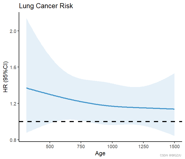
Results from anova(fit) and visual presentation show a linear relationship between dietary energy intake and mortality under RCS.
Let’s find another nonlinear example. This example uses the colon data of the survival package:
#结肠癌病人数据
Colon <- colon
Colon$sex <- as.factor(Colon$sex)#1 for male,0 for female
Colon$etype <- as.factor(Colon$etype-1)
dd <- datadist(Colon)
options(datadist='dd')
for (knot in 3:10) {
  fit <- cph(Surv(time,etype==1) ~ rcs(age,knot) +sex , x=TRUE, y=TRUE,data=Colon)
  tmp <- extractAIC(fit)
  if(knot==3){AIC=tmp[2];nk1=3}
  if(tmp[2]<AIC){AIC=tmp[2];nk1=knot}
}
nk1 #3
fit <- cph(Surv(time,etype==1) ~ rcs(age,3) +sex , x=TRUE, y=TRUE,data=Colon)
cox.zph(fit,"rank")
anova(fit)
#               Wald Statistics          Response: Surv(time, etype == 1)
#
# Factor     Chi-Square d.f. P
# age        6.90       2    0.0317
#  Nonlinear 6.32       1    0.0120,非线性
# sex        1.20       1    0.2732
# TOTAL      7.54       3    0.0565
HR<-Predict(fit, age,fun=exp)
head(HR)
ggplot()+
  geom_line(data=HR, aes(age,yhat),
            linetype="solid",size=1,alpha = 0.7,colour="#0070b9")+
  geom_ribbon(data=HR,
              aes(age,ymin = lower, ymax = upper),
              alpha = 0.1,fill="#0070b9")+
  theme_classic()+
  geom_hline(yintercept=1, linetype=2,size=1)+
  geom_vline(xintercept=47.35176,size=1,color = '#d40e8c')+#查表HR=1对应的age
  geom_vline(xintercept=65.26131,size=1,color = '#d40e8c')+
  labs(title = "Colon Cancer Risk", x="Age", y="HR (95%CI)")
The result is as follows: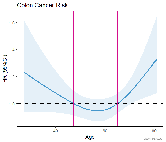
The results of anova(fit) and the visual presentation show that the example exhibits a non-linear relationship
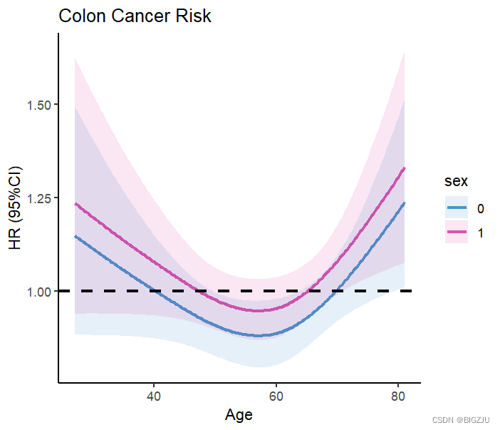
We can also perform grouped research and visual presentation, just modify the parameters in the Predict() function
HR1 <- Predict(fit, age, sex=c('0','1'),
               fun=exp,type="predictions",
               conf.int = 0.95,digits =2)
HR1
ggplot()+
  geom_line(data=HR1, aes(age,yhat, color = sex),
            linetype="solid",size=1,alpha = 0.7)+
  geom_ribbon(data=HR1,
              aes(age,ymin = lower, ymax = upper,fill = sex),
              alpha = 0.1)+
  scale_color_manual(values = c('#0070b9','#d40e8c'))+
  scale_fill_manual(values = c('#0070b9','#d40e8c'))+
  theme_classic()+
  geom_hline(yintercept=1, linetype=2,size=1)+
  labs(title = "Colon Cancer Risk", x="Age", y="HR (95%CI)")
result:
2.logistic regression
If instead of cox regression, logistic regression is used, the overall result is almost the same. You just need to replace the model.
#####基于logistic回归的rcs
#建模型
fit <-lrm(status ~ rcs(age, 3)+sex,data=lung)
OR <- Predict(fit, age,fun=exp)
#画图
ggplot()+
  geom_line(data=OR, aes(age,yhat),
            linetype="solid",size=1,alpha = 0.7,colour="#0070b9")+
  geom_ribbon(data=OR,
              aes(age,ymin = lower, ymax = upper),
              alpha = 0.1,fill="#0070b9")+
  theme_classic()+
  geom_hline(yintercept=1, linetype=2,size=1)+
  geom_vline(xintercept=38.93970,size=1,color = '#d40e8c')+ #查表OR=1对应的age
  labs(title = "Lung Cancer Risk", x="Age", y="OR (95%CI)")
3. Linear regression
Same goes for linear regression
#####基于线性回归的rcs
fit <- ols(meal.cal ~rcs(age,3)+sex,data=lung)
Kcal <- Predict(fit,age)
#画图
ggplot()+
  geom_line(data=Kcal, aes(age,yhat),
            linetype="solid",size=1,alpha = 0.7,colour="#0070b9")+
  geom_ribbon(data=Kcal,
              aes(age,ymin = lower, ymax = upper),
              alpha = 0.1,fill="#0070b9")+
  theme_classic()+
    labs(title = "RCS", x="Age", y="Kcal")