table of Contents
EDITORIAL
Recently, when doing a project. Visualization was required graph data. Finally, select the Baidu's Echarts.
Download Echarts and themes
1. Get Echarts
- This is the address that the official website of the portal directly download the latest version of Echarts

2. Download Echarts
- Select the download, pulled below, click on the online customization

- Then jump online to build page, select only the conventional histogram charts, line charts, pie charts

- Do not choose a coordinate system

- Component selection titles, legends, balloon

- Other options selection tool sets, code compression

- Jump download interface, the download is complete
3. Download theme
- Select Download -> Download Themes
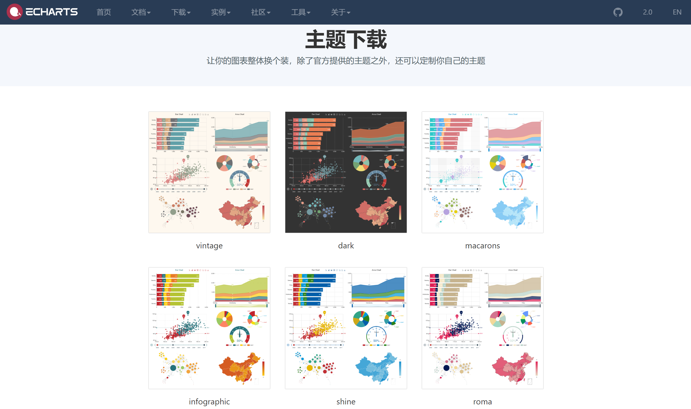
- Choose your favorite theme

- click to download

Draw a simple chart
1. reference Echats
<!DOCTYPE html>
<html>
<head>
    <meta charset="utf-8">
    <!-- 引入 ECharts 文件 -->
    <script src="echarts.min.js"></script>
</head>
</html>
2. Before drawing ECharts we need to prepare a container with high DOM width.
<body>
    <!-- 为 ECharts 准备一个具备大小(宽高)的 DOM -->
    <div id="main" style="width: 600px;height:400px;"></div>
</body>
3. echarts.init then be initialized by a method echarts instance and generates a histogram by setOption simple method, the following is the complete code.
<!DOCTYPE html>
<html>
<head>
    <meta charset="utf-8">
    <title>ECharts</title>
    <!-- 引入 echarts.js -->
    <script src="echarts.min.js"></script>
</head>
<body>
    <!-- 为ECharts准备一个具备大小(宽高)的Dom -->
    <div id="main" style="width: 600px;height:400px;"></div>
    <script type="text/javascript">
        // 基于准备好的dom,初始化echarts实例
        var myChart = echarts.init(document.getElementById('main'));

        // 指定图表的配置项和数据
        var option = {
            title: {
                text: 'ECharts 入门示例'
            },
            tooltip: {},
            legend: {
                data:['销量']
            },
            xAxis: {
                data: ["衬衫","羊毛衫","雪纺衫","裤子","高跟鞋","袜子"]
            },
            yAxis: {},
            series: [{
                name: '销量',
                type: 'bar',
                data: [5, 20, 36, 10, 10, 20]
            }]
        };

        // 使用刚指定的配置项和数据显示图表。
        myChart.setOption(option);
    </script>
</body>
</html>
So your first chart was born!

This is the simplest example given in the official website. If you still have do not understand, you can see a detailed document Quguan network.
Off the column (FIG area) FIG.
1. Static fold column chart
<!DOCTYPE html>
<html>
<head>
    <meta charset="utf-8">
    <title>ECharts</title>
    <!-- 引入 echarts.js -->
    <script src="echarts.min.js"></script>
</head>
<body>
    <!-- 为ECharts准备一个具备大小(宽高)的Dom -->
    <div id="main" style="width: 100%;height:400px;"></div>
    <script type="text/javascript">
       // 基于准备好的dom,初始化echarts实例
        var myChart = echarts.init(document.getElementById('main', 'walden'));
        // 指定图表的配置项和数据
        var var option = {
            title: {
                text: '未来一周气温变化',
                subtext: '纯属虚构'
            },
            tooltip: {
                trigger: 'axis'
            },
            legend: {
                data: ['最高气温', '最低气温']
            },
            toolbox: {
                show: true,
                feature: {
                    mark: { show: true },
                    dataView: { show: true, readOnly: false },
                    magicType: { show: true, type: ['line', 'bar'] },
                    restore: { show: true },
                    saveAsImage: { show: true }
                }
            },
            calculable: true,
            xAxis: [
                {
                    type: 'category',
                    boundaryGap: false,
                    data: ['周一', '周二', '周三', '周四', '周五', '周六', '周日']
                }
            ],
            yAxis: [
                {
                    type: 'value',
                    axisLabel: {
                        formatter: '{value} °C'
                    }
                }
            ],
            series: [
                {
                    name: '最高气温',
                    type: 'line',
                    data: [11, 11, 15, 13, 12, 13, 10],
                    markPoint: {
                        data: [
                            { type: 'max', name: '最大值' },
                            { type: 'min', name: '最小值' }
                        ]
                    },
                    markLine: {
                        data: [
                            { type: 'average', name: '平均值' }
                        ]
                    }
                },
                {
                    name: '最低气温',
                    type: 'line',
                    data: [1, -2, 2, 5, 3, 2, 0],
                    markPoint: {
                        data: [
                            { name: '周最低', value: -2, xAxis: 1, yAxis: -1.5 }
                        ]
                    },
                    markLine: {
                        data: [
                            { type: 'average', name: '平均值' }
                        ]
                    }
                }
            ]
        };
        // 使用刚指定的配置项和数据显示图表。
        myChart.setOption(option);
    </script>
</body>
</html>
Renderings:

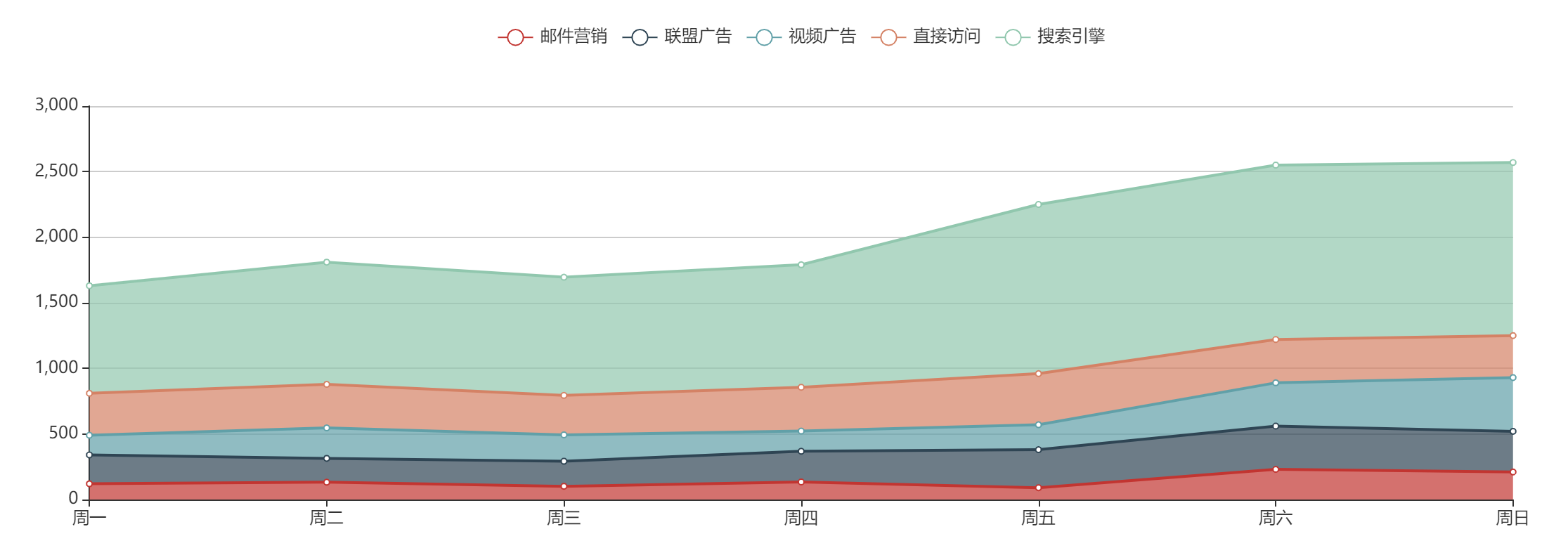
FIG 2. Static stacking area
<!DOCTYPE html>
<html>
<head>
    <meta charset="utf-8">
    <title>ECharts</title>
    <!-- 引入 echarts.js -->
    <script src="echarts.min.js"></script>
</head>
<body>
    <!-- 为ECharts准备一个具备大小(宽高)的Dom -->
    <div id="main" style="width: 100%;height:400px;"></div>
    <script type="text/javascript">
        // 基于准备好的dom,初始化echarts实例
        var myChart = echarts.init(document.getElementById('main'));

        // 指定图表的配置项和数据
        var option = {
            tooltip: {
                trigger: 'axis'
            },
            legend: {
                data: ['邮件营销', '联盟广告', '视频广告', '直接访问', '搜索引擎']
            },
            toolbox: {
                show: true,
                feature: {
                    mark: { show: true },
                    dataView: { show: true, readOnly: false },
                    magicType: { show: true, type: ['line', 'bar', 'stack', 'tiled'] },
                    restore: { show: true },
                    saveAsImage: { show: true }
                }
            },
            calculable: true,
            xAxis: [
                {
                    type: 'category',
                    boundaryGap: false,
                    data: ['周一', '周二', '周三', '周四', '周五', '周六', '周日']
                }
            ],
            yAxis: [
                {
                    type: 'value'
                }
            ],
            series: [
                {
                    name: '邮件营销',
                    type: 'line',
                    stack: '总量',
                    itemStyle: { normal: { areaStyle: { type: 'default' } } },
                    data: [120, 132, 101, 134, 90, 230, 210]
                },
                {
                    name: '联盟广告',
                    type: 'line',
                    stack: '总量',
                    itemStyle: { normal: { areaStyle: { type: 'default' } } },
                    data: [220, 182, 191, 234, 290, 330, 310]
                },
                {
                    name: '视频广告',
                    type: 'line',
                    stack: '总量',
                    itemStyle: { normal: { areaStyle: { type: 'default' } } },
                    data: [150, 232, 201, 154, 190, 330, 410]
                },
                {
                    name: '直接访问',
                    type: 'line',
                    stack: '总量',
                    itemStyle: { normal: { areaStyle: { type: 'default' } } },
                    data: [320, 332, 301, 334, 390, 330, 320]
                },
                {
                    name: '搜索引擎',
                    type: 'line',
                    stack: '总量',
                    itemStyle: { normal: { areaStyle: { type: 'default' } } },
                    data: [820, 932, 901, 934, 1290, 1330, 1320]
                }
            ]
        };

        // 使用刚指定的配置项和数据显示图表。
        myChart.setOption(option);
    </script>
</body>
</html>
Renderings:
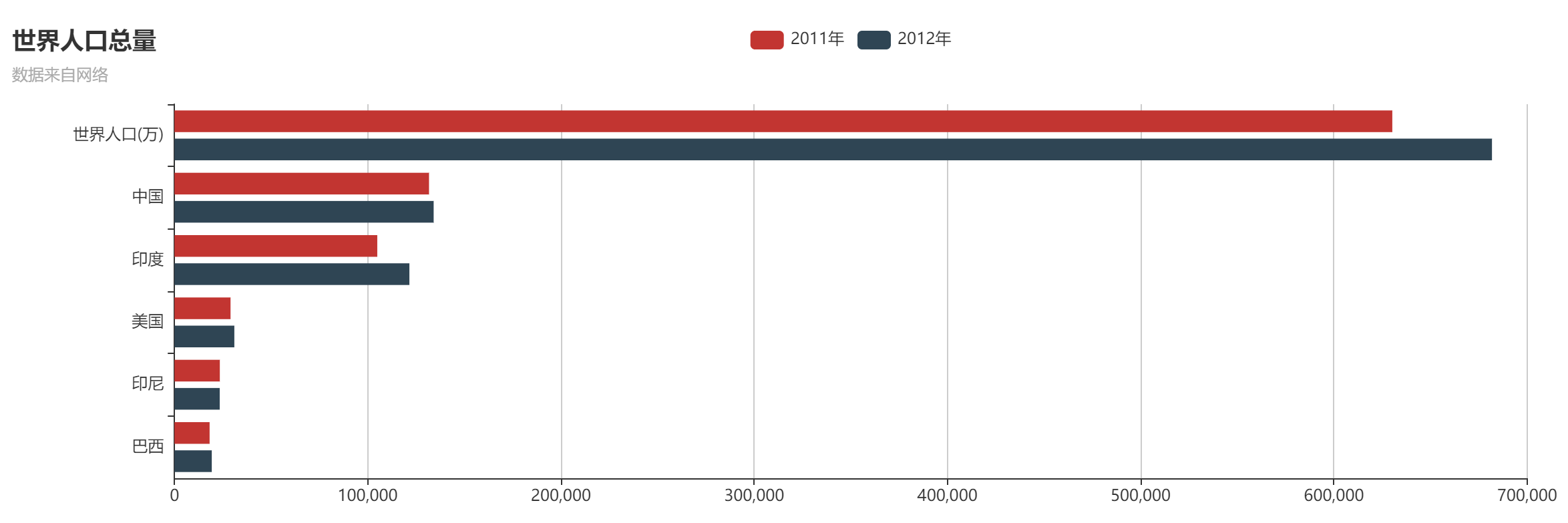
Columnar (bar) in FIG.
1. Static histogram
<!DOCTYPE html>
<html>
<head>
    <meta charset="utf-8">
    <title>ECharts</title>
    <!-- 引入 echarts.js -->
    <script src="echarts.min.js"></script>
</head>
<body>
    <!-- 为ECharts准备一个具备大小(宽高)的Dom -->
    <div id="main" style="width: 600px;height:400px;"></div>
    <script type="text/javascript">
        // 基于准备好的dom,初始化echarts实例
        var myChart = echarts.init(document.getElementById('main'));

        // 指定图表的配置项和数据
        var option = {
            title: {
                text: 'ECharts 入门示例'
            },
            tooltip: {},
            legend: {
                data:['销量']
            },
            xAxis: {
                data: ["衬衫","羊毛衫","雪纺衫","裤子","高跟鞋","袜子"]
            },
            yAxis: {},
            series: [{
                name: '销量',
                type: 'bar',
                data: [5, 20, 36, 10, 10, 20]
            }]
        };

        // 使用刚指定的配置项和数据显示图表。
        myChart.setOption(option);
    </script>
</body>
</html>
2. Static bar
<!DOCTYPE html>
<html>
<head>
    <meta charset="utf-8">
    <title>ECharts</title>
    <!-- 引入 echarts.js -->
    <script src="echarts.min.js"></script>
</head>
<body>
    <!-- 为ECharts准备一个具备大小(宽高)的Dom -->
    <div id="main" style="width: 100%;height:400px;"></div>
    <script type="text/javascript">
       // 基于准备好的dom,初始化echarts实例
        var myChart = echarts.init(document.getElementById('main', 'walden'));
        // 指定图表的配置项和数据
        var option = {
            title: {
                text: '世界人口总量',
                subtext: '数据来自网络'
            },
            tooltip: {
                trigger: 'axis'
            },
            legend: {
                data: ['2011年', '2012年']
            },
            toolbox: {
                show: true,
                feature: {
                    mark: { show: true },
                    dataView: { show: true, readOnly: false },
                    magicType: { show: true, type: ['line', 'bar'] },
                    restore: { show: true },
                    saveAsImage: { show: true }
                }
            },
            calculable: true,
            xAxis: [
                {
                    type: 'value',
                    boundaryGap: [0, 0.01]
                }
            ],
            yAxis: [
                {
                    type: 'category',
                    data: ['巴西', '印尼', '美国', '印度', '中国', '世界人口(万)']
                }
            ],
            series: [
                {
                    name: '2011年',
                    type: 'bar',
                    data: [18203, 23489, 29034, 104970, 131744, 630230]
                },
                {
                    name: '2012年',
                    type: 'bar',
                    data: [19325, 23438, 31000, 121594, 134141, 681807]
                }
            ]
        };
        // 使用刚指定的配置项和数据显示图表。
        myChart.setOption(option);
    </script>
</body>
</html>
Renderings:
Cake (Ring) FIGS.
1. Static Pie
<!DOCTYPE html>
<html>
<head>
    <meta charset="utf-8">
    <title>ECharts</title>
    <!-- 引入 echarts.js -->
    <script src="echarts.min.js"></script>
</head>
<body>
    <!-- 为ECharts准备一个具备大小(宽高)的Dom -->
    <div id="main" style="width: 100%;height:400px;"></div>
    <script type="text/javascript">
        // 基于准备好的dom,初始化echarts实例
        var myChart = echarts.init(document.getElementById('main'));

        // 指定图表的配置项和数据
        var option = {
            title: {
                text: '某站点用户访问来源',
                subtext: '纯属虚构',
                x: 'center'
            },
            tooltip: {
                trigger: 'item',
                formatter: "{a} <br/>{b} : {c} ({d}%)"
            },
            legend: {
                orient: 'vertical',
                x: 'left',
                data: ['直接访问', '邮件营销', '联盟广告', '视频广告', '搜索引擎']
            },
            toolbox: {
                show: true,
                feature: {
                    mark: { show: true },
                    dataView: { show: true, readOnly: false },
                    magicType: {
                        show: true,
                        type: ['pie', 'funnel'],
                        option: {
                            funnel: {
                                x: '25%',
                                width: '50%',
                                funnelAlign: 'left',
                                max: 1548
                            }
                        }
                    },
                    restore: { show: true },
                    saveAsImage: { show: true }
                }
            },
            calculable: true,
            series: [
                {
                    name: '访问来源',
                    type: 'pie',
                    radius: '55%',
                    center: ['50%', '60%'],
                    data: [
                        { value: 335, name: '直接访问' },
                        { value: 310, name: '邮件营销' },
                        { value: 234, name: '联盟广告' },
                        { value: 135, name: '视频广告' },
                        { value: 1548, name: '搜索引擎' }
                    ]
                }
            ]
        };

        // 使用刚指定的配置项和数据显示图表。
        myChart.setOption(option);
    </script>
</body>
</html>
Renderings:

Figure 2. Static ring
<!DOCTYPE html>
<html>
<head>
    <meta charset="utf-8">
    <title>ECharts</title>
    <!-- 引入 echarts.js -->
    <script src="echarts.min.js"></script>
</head>
<body>
    <!-- 为ECharts准备一个具备大小(宽高)的Dom -->
    <div id="main" style="width: 100%;height:400px;"></div>
    <script type="text/javascript">
        // 基于准备好的dom,初始化echarts实例
        var myChart = echarts.init(document.getElementById('main'));

        // 指定图表的配置项和数据
        var option = {
            tooltip: {
                trigger: 'item',
                formatter: "{a} <br/>{b} : {c} ({d}%)"
            },
            legend: {
                orient: 'vertical',
                x: 'left',
                data: ['直接访问', '邮件营销', '联盟广告', '视频广告', '搜索引擎']
            },
            toolbox: {
                show: true,
                feature: {
                    mark: { show: true },
                    dataView: { show: true, readOnly: false },
                    magicType: {
                        show: true,
                        type: ['pie', 'funnel'],
                        option: {
                            funnel: {
                                x: '25%',
                                width: '50%',
                                funnelAlign: 'center',
                                max: 1548
                            }
                        }
                    },
                    restore: { show: true },
                    saveAsImage: { show: true }
                }
            },
            calculable: true,
            series: [
                {
                    name: '访问来源',
                    type: 'pie',
                    radius: ['50%', '70%'],
                    itemStyle: {
                        normal: {
                            label: {
                                show: false
                            },
                            labelLine: {
                                show: false
                            }
                        },
                        emphasis: {
                            label: {
                                show: true,
                                position: 'center',
                                textStyle: {
                                    fontSize: '30',
                                    fontWeight: 'bold'
                                }
                            }
                        }
                    },
                    data: [
                        { value: 335, name: '直接访问' },
                        { value: 310, name: '邮件营销' },
                        { value: 234, name: '联盟广告' },
                        { value: 135, name: '视频广告' },
                        { value: 1548, name: '搜索引擎' }
                    ]
                }
            ]
        };

        // 使用刚指定的配置项和数据显示图表。
        myChart.setOption(option);
    </script>
</body>
</html>
Renderings: